a Gnome WIP
Printed From: Pixel Joint
Category: Pixel Art
Forum Name: WIP (Work In Progress)
Forum Discription: Get crits and comments on your pixel WIPs and other art too!
URL: https://pixeljoint.com/forum/forum_posts.asp?TID=7273
Printed Date: 12 September 2025 at 9:08am
Topic: a Gnome WIP
Posted By: minipuck
Subject: a Gnome WIP
Date Posted: 19 October 2008 at 1:53am
i need help with his pants.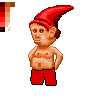 i know anatomy isn't right, and the angle of his body and his head isn't right either, but im still not that good at all. |
Replies:
Posted By: Hapiel
Date Posted: 19 October 2008 at 3:44am
|
A quick and sloppy edit containing some suggestions. If you did everything you did by now with a purpose, it should not be too hard to find those differences.. If you did not think of every pixel you placed if it was nececerily, it might become harder.  ------------- |
Posted By: minipuck
Date Posted: 19 October 2008 at 4:09am
|
i see stuff you changed. Eyebrows, nipples, belly button, mouth, nose. you used 1 lighter color when i used 2. What you did with the legs really looks as i imagined how i wanted it to be. Thanks for the helpfull edit. and i normally don't consider each pixel i place, i guess i will have to start doing that. edit: Not as clean as yours, but then you're way better. 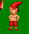 BTW light is supposed to come straight from above. |
Posted By: Fatalis67
Date Posted: 19 October 2008 at 10:42am
| Round out the left side of the head, its a straight line and looks unnatural. |
Posted By: Hapiel
Date Posted: 19 October 2008 at 11:48am
|
If the light would come from the top, how would there ever fall light on his legs? Take a look at my version again, they look better the tin way too I think.. Also, I would flip his left shoe in your version. ------------- |
Posted By: minipuck
Date Posted: 26 October 2008 at 7:23am
|
thanks for the help lollige http://www.pixeljoint.com/pixelart/36767.htm |
Posted By: pixelblink
Date Posted: 03 November 2008 at 10:00pm
|
well i dunno, dude. The head bothers me more than anything so I'll start there: where's his neck?? his forehead seems to run into his hat and then square off to the right. Very unnatural and awkward. Trying drawing a head form over the hat and see how it'd look. You've got the potential for a great piece but I think you need to use a bit more real life reference when dealing with the human form... even in a fantasy image such as this :) |
Posted By: Ravey
Date Posted: 11 November 2008 at 1:48am
|
15 colours is way too many! The two main colours you're using should already be quite similar and you should pick colours that can be reused. I managed to cut it down to 6 colours and did some really rough editing to make the lighting look better and to round things out a little... Made the head fit the body a little more too.
Here's a quick edit: 
|
Posted By: minipuck
Date Posted: 11 November 2008 at 10:24am
|
waddja mean 15 colors? it's 11 +transparency. i started this piece as just a head, im going to restart it, to make everything better. lineart so far   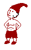 i know his ear is way too big xD |
Posted By: jalonso
Date Posted: 11 November 2008 at 10:43am
|
You are doing a good thing revisiting and improving on this pixelart. I think Ravey's edit shows how the pixelling can really improve your art here. Zoom and learn from that. I think that its the somewhat chaotic pixel work that has been most questionable. Be patient. ------------- |
Posted By: Ravey
Date Posted: 11 November 2008 at 11:00am
Looks to me like 14 colours + transparency.

Regardless though, good luck with the new version. |