I love all the style in the characters, but all of the characters left arm could use a bit more work, otherwise its a lovley piece.
Very interesting designs here, especially the second and third guys.
The tiger guy needs a bit of work on that left arm (his anatomical right). It looks like his shoulder just drops off (as if he had no arm there) and then the lower part comes out from behind him, it's a bit strange.
sending back for for unneeded background...please transparify and resubmit...
there are all pretty good, there's a lot to like in the character designs and colors. stances, anatomy, contrast, hue shifting are all pretty good, but could be stretched a bit further. the lobster guy seemed most interesting, so i did an edit of him:
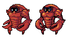
wasn't sure what was going on up top/around the face so forgive me if i changed the features. you can get a lot more bang out of the colors you're using by making sure your palette is spread out nice and even. right now you've got one highlight, several midtones, and no real shadow colors, then black. when using black, you need to make sure to have dark enough shadow colors so the outline isn't too harsh. just generally make sure you've got enough contrast between all your colors. anywhere that jagged lines are obvious is a good place to try some aa, as I did in the lines across the belly. also make sure to apply your lightsource consistently, the claws have no highlights and thus are very flat. watch the use of interior black lines as well.
as a final note, the green bg will need to be made transparent


Nice designs! You could probably use some AA on the outlines, though.