| |||||||||||
I love how nintendo was worked his sprites in the contra 4.
I think they are very realistic.
good work with this one. it looks amazing.
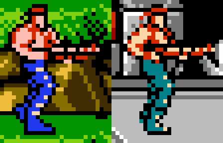
Thanks for the input! Added a texture to his leg that look like scales, based on the shading used on the original sprite. Since he has to move through water and swampy environment, I think this could help his mobility xD Made his leg shorter too
The sprite itself is very cool and the details are well done. The only thing that bother me a bit, is that I see that his leg is too long. and weird. Maybe if you put a little bit of muscle & volume on the legs, and you do them 3 pixels shorter or something, I will looks better.
Anyway, very good one, Contra is one of my favorite shooters.
I licked but nothing happened D^:
@Zizka because it's Contra Force!
Looks cool. I never understood why they chose to call the game ''Contra'' considering it doesn't exactly refer to role models. Unless the Aliens are supposed to represent the reds... which I doubt.


Just a tad too many lines in the chest for my taste, but I understand it's an aesthetic choice.
Other than that, looks amazing, especially what you did with the 4 colors.