| |||||||||||||
@king_bobston: Thanks! I did experiment a bit, but ultimately I couldn't find anything I liked. And I really wanted to get some blue and yellow in there, which made it harder to find good pixel art references. :)
@scottiand: Thanks a lot! :)
@clefairykid: Ah, that's the best compliment one can wish for :)
I really like your recent pieces and am looking forward to your other islands!
"I'm not really happy with the grass at all. Any tips would be welcome."
Don't know how you approached it but trying out as many ways as you can think of to make it work and then look at how other people do it and doing it again is pretty helpful (if you haven't already). It's quite fun, too (except for water, I hate pixelling water)!
@Mr Hk, that's an amazing edit! Thanks a lot! Something I will keep in mind in future landscapes :)
That's a very nice image Mr CELS !
This calm mood is settled by a nice contrast between warm/cold areas.
I would only add a few details to block the composition and add a pinch of eye guidelines.
More particles to lead frome the highest saturation (tree) to the main stage (the castle) then lock the diagonal by adding a dark first plan and some particules.
<img src="https://dl.dropboxusercontent.com/u/5708588/compo_lockup.gif" alt="compo" />
EDIT = arrg, sorry, don't know how to display img on PJ comments...
Also Manupix advises on contrast are golden.
@Manupix: Oh, I see what you're saying now. Thanks a lot for taking the time to do the edit! The forest does look like it belongs in those clouds in your version, whereas the contrast is a bit high in the original. The hue shifting for the castle makes a lot of sense as well. Something to consider in the future - you can be certain this isn't the last time I'll be pixelling castles in the clouds :)
@hapiel: Thanks a lot! The second image was where I decided things were looking too boring and I had to pimp my pixel art :)
@beetleking: Thanks, always nice to hear :)
@Decroded: Much appreciated! If I'm improving, it's thanks to help from guys like you. :)
as I've said I love ur stuff cels I'm feeling the vision behind it and ur technique is improving I hope u keep going :-)
Whoa you improving very fast! This piece looks amazing...
Rough and sloppy edit:
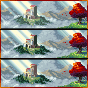
From bottom up: original, more contrast on building (not optimal because I didn't bother to make correct volume guesses, also added colors), more 'misty' on contrasted building (quick dirty brightening in PS). The final dark values are close to what they were, the difference isn't as obvious as I thought it would, it's actually more efficient in the trees which only got the misty treatment. Would likely work better if done more carefully though =)
Very well done! From on the second WIP image you can already see the greatness that was about to come!
@Cyangmou: Thans, that's always a nice compliment to get. I tried to imitate the way you pixelled distant trees in "Thus Spoke the Dragon" , which was a great help.
@Mandrill: Thank you, sir! I think you're right about the composition. Not really guiding the eye too well. Never really considered a vignette effect in pixel art. Interesting idea :)
@Pixelart_kid: Thanks a lot :)
Damn, chap! You work is getting better and better with every piece.
Beautifuly done. Very soft rendering with the right amount of hard lines to mix it all up. The composition makes my eyes jump around a bit too much, but it's still a brilliant idea to place that red tree right hand corner. I think, a vignette effect on the corners can help with this issue.
Not much to criticize. You rock! :)
@Manupix: Thanks a lot for the detailed feedback! I'll respond point by point. :)
- I'm not sure what you mean about making the building more misty, while increasing contrast. Do you mean the colours should have less saturation and be colder, to blend more with the background?
- I tried to recycle some colours for the foliage, but couldn't make it look good. There's a tiny bit from the castle roof in the tree and there's a little bit of the distant trees in the foreground grass. I guess it's a matter of picking colours better or learning how to use them better.
- Great idea for the composition!
@Friend: Good idea about the border, will try it out :)
@slym, Theoden & PyroFrosty: Thanks! :)
@helcril: Thanks! And you're definitely right about the distant cloud not being as good. I keep pixelling them and it's taking me some time to get the hang of it :)
@Zudzement: Cheers!
@Naji: Thanks a lot, most appreciated. I agree with you in regards to the shading on top of the tree, good point. :)
The clouds turned out really beautiful :D
i agree with manupix
maybe the preview border would look better than the current one?
Awesome atmosphere in this. Looks like a place for an adventure. Good job.
Wow lurvly!
A few things maybe:
the building might be more contrasted, bc harsh light, and yet a bit misty, bc distance; it's not clear if the light is grazing, more from the front or from the back: I'll take grazing but it's not entirely consistent; the foliage could recycle some colors from elsewhere; I'd make the tree much closer, a large foreground that would extent at least halfway to the left, you'd only see the foliage underside and lots of crazy shadowy detail on the ground =)
Agree with Naji, I like grass too. It looks exactly like the grass on the wind.
Clouds/fog around the hill looks better than clouds on background. Pretty realistic, almost like you can touch them.
imo the grass looks great
I'm personally not a huge fan of sunrays but I can see it working in this piece
the clouds and especially the spots where the trees and clouds link is really well done.
Love it.
edit: only thing I could point out is that the tip of the red tree seems to be abit too dark on the right side
even if it's not hit by a sunray it shouldn't be that dark I think. But that's literally the only minor critic I have.
Keep it up


Thanks, albertov! Good luck with your game, you have my vote :)