| Active TopicsSearchRegisterLogin |
| WIP (Work In Progress) | |
| |
  |
| << Prev Page of 3 Next >> |
| Author | Message |
|
meagz
Commander 
Joined: 09 December 2009 Online Status: Offline Posts: 123 |
 Posted: 07 March 2010 at 11:13pm Posted: 07 March 2010 at 11:13pm |
|
the curly flourishes on the capitals look waaaaay better than the CapitaL at the EnD of words style you had before.
why does he have a wand? |
|
 IP Logged IP Logged |
|
|
jalonso
Admiral 
Joined: 29 November 2022 Online Status: Offline Posts: 13537 |
Posted: 08 March 2010 at 1:00am |
|
Originally posted by meagz ...why does he have a wand? I felt he needed to hold something to make the player sprite a bit more interesting since he's an old man. The collection screen was very boring looking and I thought the velvety pillow with something missing would look nice. The general idea is loosely based on historical facts but I have to use fantasy/magic to make it into a game. Magic wands made sense. I personally knew him, he had a wand  ____ The Last Supper painting is very boring when the peeps are removed. The only architectural detail is the ceiling so I kinda had to make the squared border. Does it read like that? I think here is a great place to put his Rhombicuboctahedron drawing. However the name is so long-assed. Will I get flamed if I rename it to something more gamey...like, Rhomcubon?  Edited by jalonso - 08 March 2010 at 1:04am |
|
|
|
|
|
IP Logged |
|
|
jalonso
Admiral
Joined: 29 November 2022 Online Status: Offline Posts: 13537 |
Posted: 08 March 2010 at 12:17pm |
|
Originally posted by mozzie i can make websites  With this mockup taking a hard turn to the puzzle/quest/adventure sort of game the candle life meters wasn't making much sense. I've changed that to Levels now. Besides, DaVinci lives forever. I might just use the Rhom picture on this screen but with some other name. If I put plates and cups on the table will it be distracting? Does it read the "Last Supper"?  Edited by jalonso - 08 March 2010 at 12:19pm |
|
|
|
|
|
IP Logged |
|
|
greenraven
Commander
Joined: 08 September 2016 Online Status: Offline Posts: 2598 |
Posted: 08 March 2010 at 1:44pm |
|
I think you should put plates on the table, I thought it was a hospital table up until I read "Last Supper".
|
|
 "pwnage comes with patience, practice and planning." ~ Jalonso "pwnage comes with patience, practice and planning." ~ Jalonso 
|
|
|
IP Logged |
|
|
onek
Commander
Joined: 19 May 2009 Online Status: Offline Posts: 416 |
Posted: 08 March 2010 at 2:56pm |
|
great project!
i think u should definitely do those plates... maybe some spilled wine and little crumbs of bread aswell .... also id suggest u make the table a bit more narrow, i never imagined it beeing that wide seeing the painting.... the rhombuchoctragfdbejkxolberon obviously needs some work too, but i think its still in a fairly rough state so ´... yeah, shouldnt be much of a problem for iso master jalonso anyway |
|
|
IP Logged |
|
|
Petrichor
Midshipman 
Joined: 09 October 2009 Online Status: Offline Posts: 59 |
Posted: 08 March 2010 at 3:26pm |
|
I can tell that this is going to be a point of contention, but I love the new Mona face, for what it's worth :P
I think the dialogue text is still suffering from readability issues. I don't think it comes down to the outlining (although the latest tweaks are improving readability)... I think it's the characters themselves. They seem a bit cramped and over-serifed for such a tiny dialogue font. It's attractive, but I feel like form is coming in on top of function in this case and I have actually given myself a headache squinting at the screens D:
This is tricky, though, because it puts you in a position (possibly) of either needing wider characters which disrupts the room you have, or of eliminating the serifs and flourishes, which is going to make it harder to make the text fit the aesthetic. Or something. The lowercase u, n, and o are particular offenders.
I tried it at x2 and it was still pretty hard =/
It's worth observing that I am a stickler for readable text, and possibly more obsessed with it than your average person (having the lethal combination of terrible eyesight and a tendency to headaches), but I think there are still some MAJOR readability issues. And if I were playing this game I'd be whining about it, or even putting the game down, if you want total honesty.
It's an especial shame because the whole thing is so damn pretty. But I'm not going to give you any specific asspats because you don't need them :nod:
|
|
|
IP Logged |
|
|
jalonso
Admiral
Joined: 29 November 2022 Online Status: Offline Posts: 13537 |
Posted: 08 March 2010 at 4:31pm |
|
Overall touchups and plates on the table.
 |
|
|
|
|
|
IP Logged |
|
|
Robinhood
Commander
Joined: 18 May 2009 Online Status: Offline Posts: 245 |
Posted: 08 March 2010 at 4:43pm |
|
May I say that this is looking so interesting (and a lot more advanced than my thread)
Can't wait to see it finished. Really loving the "Dada! I found something!" shine ;) Love your tilesets too :D Great style, but the words are hard to read as Petrichor said earlier. Like the "n". If not for the fact I knew it was dialouge, I would have thought it was Asian text. The words shouldn't touch like in "hungry" :c I think we sort of own the WIP forum at the moment. |
|
|
IP Logged |
|
|
greenraven
Commander
Joined: 08 September 2016 Online Status: Offline Posts: 2598 |
Posted: 08 March 2010 at 6:29pm |
|
One small thing, bottom right, the Mona Lisa screenshot, I noticed you went with the "GBA Zelda" graphical style. It always annoyed me. The perspective is royally screwed up with that style. The room it self is top-down, yet everything in the room itself is on a 45 degree angle.
Just for kicks and giggles quickly copy/paste Da Vince next to one of the windows, it's going to look like he's laying down. And if you take away the Mona Lisa dialogue and place Da Vince on the bottom, it's going to look like he's walking on the walls. I've always hated the "Zelda" style because it screws with your mind. Everything else though, I think it goes without saying, awesomeness!  |
|
|
"pwnage comes with patience, practice and planning." ~ Jalonso
|
|
|
IP Logged |
|
|
jalonso
Admiral
Joined: 29 November 2022 Online Status: Offline Posts: 13537 |
Posted: 08 March 2010 at 7:01pm |
|
@TheRobinHood, When I make mockups I go for style/look/feel and ignore things like type which is just a design element for me. For commissions/projects and other paid stuff then I do take things like that into account. The main reason type size is never an issue for me is because the arrow at the bottom right of dialogue boxes can go on forever.
In this mockup I was trying to keep the type look like they are manuscripts and parchments so I didn't care if it was clear or not... its just a mockup, ya noes. That said here is a type revised version of all screens. More like it would be in a real game but uglier in a mockup.  @greenie, I hear you brotha, its a bigger pain in the ass to draw when I keep tripping myself. Its not quite as extreme as GBA Zelda games, btw. I just needed a vehicle to keep the mockup under control...its just a mockup. Edited by jalonso - 08 March 2010 at 7:00pm |
|
|
|
|
|
IP Logged |
|
|
meagz
Commander
Joined: 09 December 2009 Online Status: Offline Posts: 123 |
Posted: 08 March 2010 at 8:04pm |
|
"you found some UNOBTAINIUM!"
oops, wrong game. i love this project. how did you decide you wanted to do a game mockup this intense? |
|
|
IP Logged |
|
|
meagz
Commander
Joined: 09 December 2009 Online Status: Offline Posts: 123 |
Posted: 08 March 2010 at 8:07pm |
|
Originally posted by jalonso
I personally knew him, he had a wand man, da vinci was awesome. all the cool kids have wands these days. |
|
|
IP Logged |
|
|
jalonso
Admiral
Joined: 29 November 2022 Online Status: Offline Posts: 13537 |
Posted: 09 March 2010 at 6:01pm |
|
update
and DaVincopter  |
|
|
|
|
|
IP Logged |
|
|
meagz
Commander
Joined: 09 December 2009 Online Status: Offline Posts: 123 |
Posted: 09 March 2010 at 8:32pm |
|
nitpicking, your level indicator looks like it says L+number, and the 1's look like skinny T's. and 'you found a puzzle' could be bumped up a pixel.
its looking amazing and shiny though :) |
|
|
IP Logged |
|
|
greenraven
Commander
Joined: 08 September 2016 Online Status: Offline Posts: 2598 |
Posted: 10 March 2010 at 8:02am |
|
jal, you seriously need to find someone who is good with programing code who can compliment your artistic ying with their technical yang, so you can go start an indie game company!
 |
|
|
"pwnage comes with patience, practice and planning." ~ Jalonso
|
|
|
IP Logged |
|
|
jalonso
Admiral
Joined: 29 November 2022 Online Status: Offline Posts: 13537 |
Posted: 10 March 2010 at 3:21pm |
|
Originally posted by greenraven jal, ...find someone who is good with programing code who can compliment your artistic ying with their technical yang... I have been searching for years  update  |
|
|
|
|
|
IP Logged |
|
|
jalonso
Admiral
Joined: 29 November 2022 Online Status: Offline Posts: 13537 |
Posted: 10 March 2010 at 7:12pm |
 Treating the copter this way works, right? With the sail on, it looks like a seashell to me. Edited by jalonso - 10 March 2010 at 7:12pm |
|
|
|
|
|
IP Logged |
|
|
jeremy
Rear Admiral 
Joined: 25 November 2024 Location: New Zealand Online Status: Offline Posts: 1704 |
Posted: 10 March 2010 at 8:36pm |
|
Maybe cut it down by about half a coil?
Looking at this it's the way it actually was too. O_o 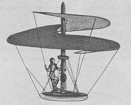
Needs ropes! (I like the second-to newest version )
EDIT: And the ends of the coils aren't 90 degrees, the taper off! Should make it much less shelly Edited by Jeremy - 10 March 2010 at 8:40pm |
|
|
IP Logged |
|
|
jalonso
Admiral
Joined: 29 November 2022 Online Status: Offline Posts: 13537 |
Posted: 10 March 2010 at 9:51pm |
|
@Jeremy, Are you saying it shouldn't be top-down view but head-on view?
90 degrees is to keep AA to a minimum  |
|
|
|
|
|
IP Logged |
|
|
jeremy
Rear Admiral
Joined: 25 November 2024 Location: New Zealand Online Status: Offline Posts: 1704 |
Posted: 11 March 2010 at 2:31am |
|
As far as I can tell, the beginning and end of the coil are on opposite sides. Like, there is about half a coil more on yours than on his.
Scrappy-ass edit: 
Your palette has been added to my palette collection XP |
|
|
IP Logged |
|
|
Ninja Crow
Commander
Joined: 02 June 2009 Online Status: Offline Posts: 323 |
Posted: 11 March 2010 at 10:52am |
|
Originally posted by jalonso Really? You mean you'd seriously make this into a game if you could find someone willing to do it for you?
I have been searching for years  I don't think your helicopter looks too much like a shell for anyone who's seen the design, and with that translucent sheeting and everything, it's just gorgeous. And what an inspired idea for having a building mini-game. It would be so much fun to scrounge for materials and use collected books to inspire new designs which you could then build! This is such an impressive sequence of images! Yes, I think the plates & cups make the table look better; yes I like your latest garden maze; no I don't think the 'look down into a box' perspective is too much to ask for in order to reap all the obvious benefits; ha ha, 'book of engineering'!; Mona needs a more obvious quirk to her smile, unless she has more than one portrait and this one is annoyed because she hasn't gotten what she wants yet (you've made this such a believable mockup that I can easily imagine this as an extended sequence, especially since you could put more than one thing after the ellipses in the dialogue box, and players would need to bring her many things before she'd be ready to be painted!); and I still can't get over that cathedral interior. Oh, and casting Leo as an adventuring dude is apparently not too far out of an idea! |
|
|
IP Logged |
|
|
jalonso
Admiral
Joined: 29 November 2022 Online Status: Offline Posts: 13537 |
Posted: 11 March 2010 at 11:28am |
|
@Ninja, not just someone willing, someone committed!
I like making mockups where the viewer sees more than is actually there. I find when working on commisions that storyboarding the mokups, helps the programmer, the client, animators and creatives, get it. This benefits the casual viewer too. All new copter 9.9  |
|
|
|
|
|
IP Logged |
|
|
Ninja Crow
Commander
Joined: 02 June 2009 Online Status: Offline Posts: 323 |
Posted: 11 March 2010 at 12:20pm |
|
Oh...my...DOG!
I love that 'Vincopter'! Definitely the level of detail (especially in a GUI) that I would hope for as a programmer! (trying hard not to swoon here and embarrass you) I'm gonna be so sad to see this project finished! |
|
|
IP Logged |
|
|
jalonso
Admiral
Joined: 29 November 2022 Online Status: Offline Posts: 13537 |
Posted: 11 March 2010 at 1:23pm |
|
Swooning is cool, harsh crits are better.
...on to the Title Screen.  |
|
|
|
|
|
IP Logged |
|
|
Robinhood
Commander
Joined: 18 May 2009 Online Status: Offline Posts: 245 |
Posted: 11 March 2010 at 2:06pm |
|
Looks good ;)
Only thing I don't like it the zoomed words, and it takes away from the rest of the screen. |
|
|
IP Logged |
|
|
Ninja Crow
Commander
Joined: 02 June 2009 Online Status: Offline Posts: 323 |
Posted: 11 March 2010 at 2:35pm |
|
Some kind of amazing, flowery, Florentine script might seem more appropriate - the pixel letters are lovely, but are hard to read and look too modern.
For the menu box, I would like a second tone in there if it's not too hard (I know the look was created by having a faux transparency for your yellow boxes, but it really spices them up). I'm also intrigued by 'build' and 'paint' (what do they do, I wonder...) and if you can go right to the pending puzzles plucked from previous play periods but postponed for purposes of pinched productivity, well then that's a positive point in my playbook! (I also assume there will be a more interesting background eventually....) |
|
|
IP Logged |
|
|
Petrichor
Midshipman
Joined: 09 October 2009 Online Status: Offline Posts: 59 |
Posted: 11 March 2010 at 3:28pm |
|
I'll add to that to say that I looked at this twice before I noticed the Vitruvian Man. I suppose it's a balancing act to not have him overpower/drown out the text, but I think he's maybe *too* subtle currently.
|
|
|
IP Logged |
|
|
jalonso
Admiral
Joined: 29 November 2022 Online Status: Offline Posts: 13537 |
Posted: 11 March 2010 at 5:45pm |
|
@Robin, The text is just a placeholder that I showed mostly to get feedback on the game title.
@Ninja, I only added the create and paint because you suggested it in your previous post and it seemed clever to build your own stuff. Think Mario Paint. @Petricor, Vetruvian Man scroll is just roughly laid in so that once I place the title and whatever else I only pixel whats needed and make sure he shows up enough. E: update  |
|
|
|
|
|
IP Logged |
|
|
jalonso
Admiral
Joined: 29 November 2022 Online Status: Offline Posts: 13537 |
Posted: 13 March 2010 at 9:11pm |

|
|
|
|
|
|
IP Logged |
|
|
Manupix
Commander
Joined: 07 May 2026 Online Status: Offline Posts: 771 |
Posted: 14 March 2010 at 3:44am |
|
Unfortunately I don't have the time these days to give this the attention it deserves. Just looks so damn cool.
|
|
|
IP Logged |
|
|
AtomicMushroom
Midshipman
Joined: 27 September 2007 Online Status: Offline Posts: 75 |
Posted: 14 March 2010 at 1:41pm |
|
I don't know if it's been said before, but shouldn't Mona be smiling a bit more?
|
|
|
IP Logged |
|
|
jalonso
Admiral
Joined: 29 November 2022 Online Status: Offline Posts: 13537 |
Posted: 14 March 2010 at 2:45pm |
|
Atomic, I don't think Mona being exactly like the original is needed or even a good idea. Its a game dialog portrait and as long as you instantly know its her, its cool. Of course, if not just like her every comment I ever get on this will be that :/
So, it turns out Florence in the Renaissance was a pretty boring looking city. All clay tiles and stone walls. Building all touch each other too. I'm treating them as you would trees in an RPG. I'm also trying to liven it up with pink and blue to make it cuter. All buildings here are based actual buildings in Florence.  Edited by jalonso - 14 March 2010 at 2:47pm |
|
|
|
|
|
IP Logged |
|
|
kenpokis
Commander
Joined: 09 January 2010 Online Status: Offline Posts: 202 |
Posted: 14 March 2010 at 2:48pm |
|
I like the newest building a lot. I really like the roof tiles. I think the ground is a bit bland, maybe make it look more like streets. Looking good.
|
|
|
IP Logged |
|
|
jalonso
Admiral
Joined: 29 November 2022 Online Status: Offline Posts: 13537 |
Posted: 14 March 2010 at 4:39pm |
|
Ground is last to touch. A lot will be covered with people and stuff.
|
|
|
|
|
|
IP Logged |
|
|
jalonso
Admiral
Joined: 29 November 2022 Online Status: Offline Posts: 13537 |
Posted: 14 March 2010 at 10:03pm |
|
Drawing a bit of a blank with what the second item piece should be.
No grass in Renaissance Italy, apparently. I have the chest already, the others are some stone urn and some fancy kind of box. Ideas glad taken. Also a fountain...dunno if it fits.  Edited by jalonso - 14 March 2010 at 10:03pm |
|
|
|
|
|
IP Logged |
|
|
inphy
Commander
Joined: 24 June 2014 Online Status: Offline Posts: 116 |
Posted: 15 March 2010 at 10:38am |
|
Maybe it's by design, or all in my silly, silly head... but it looks to me like the roof of this building is concave due to how the horizontal tile lines work with the perspective.

|
|
|
IP Logged |
|
|
jalonso
Admiral
Joined: 29 November 2022 Online Status: Offline Posts: 13537 |
Posted: 15 March 2010 at 11:34am |
|
Originally posted by inphy ... but it looks to me like the roof of this building is concave due to how the horizontal tile lines work with the perspective.
It sure does! This building has been ditched for this project. Too Colonial looking. Update: Includes trees...couldn't help it >.< Kinda works for Leo's house and landing pad screen to have some green.  |
|
|
|
|
|
IP Logged |
|
|
Robinhood
Commander
Joined: 18 May 2009 Online Status: Offline Posts: 245 |
Posted: 15 March 2010 at 11:53am |
|
There's nothing wrong with trees!
Why'd you change the title of the thread? :D |
|
 |
|
|
IP Logged |
|
|
Ninja Crow
Commander
Joined: 02 June 2009 Online Status: Offline Posts: 323 |
Posted: 15 March 2010 at 12:20pm |
|
Love the trees!
Love the fountain. The little urn item would look more like an urn if it had a small lid on top with a knob handle (which would also make it more obvious that it was something to open). Love the cathedral. If the ground is still WIP, then nevermind, but the cracks at the sides of the cathedral look drawn on, not part of the stone, especially since they span more than one stone tile with no shift (as if the two tiles were one piece). Love the environment for Leo's house. Too much love for now, gonna go hate on something. 
|
|
|
!Strange Atoll - The Amazing Wilbot Game Project! |
|
|
IP Logged |
|
|
jalonso
Admiral
Joined: 29 November 2022 Online Status: Offline Posts: 13537 |
Posted: 15 March 2010 at 7:33pm |
|
Small update of everything so far.
On to Round 1 of refining colors that have gotten ALL out of control. Somehow I'm at 150   |
|
|
|
|
|
IP Logged |
|
|
Petrichor
Midshipman
Joined: 09 October 2009 Online Status: Offline Posts: 59 |
Posted: 15 March 2010 at 9:10pm |
|
:P Your working habits are such that it is difficult to critique because it's hard to say what's a placeholder and what isn't.
I am so in love with the build screen. But whatever the purple-y stuff is, it looks uncomfortable like dog poop =/ I'm immature though. Take with grain of salt. |
|
|
IP Logged |
|
|
mozzie
Seaman 
Joined: 18 January 2010 Online Status: Offline Posts: 21 |
Posted: 16 March 2010 at 1:45am |
|
I need permission i want to make a nintendo ds game for this if its fine with you...
|
|
|
IP Logged |
|
|
Elk
Commander
Joined: 12 May 2024 Online Status: Offline Posts: 483 |
Posted: 16 March 2010 at 5:34am |
|
Lol mozzie...
I love Da Vinci, he was gay, just like me <3 |
|
|
IP Logged |
|
|
Robinhood
Commander
Joined: 18 May 2009 Online Status: Offline Posts: 245 |
Posted: 16 March 2010 at 8:32am |
|
@Mozzie - that's what you asked me...
Was he? |
|
|
|
|
|
IP Logged |
|
|
AngelOTG
Commander
Joined: 28 February 2009 Online Status: Offline Posts: 258 |
Posted: 16 March 2010 at 12:06pm |
|
Originally posted by TheRobinHood Was he? No one knows for sure. Historians argue on both sides, but there's no actual proof that he was gay. The only reason people thought he might be gay is because of his work. In that time, his art subjects (naked men) were completely unheard of and put him on bad grounds with the church. But, when you think about it, they would have had the same reaction if his Virtruvian Man was a naked woman instead. But does it really matter? Nonetheless, he's still an awesome historical figure. |
|
|
IP Logged |
|
|
jalonso
Admiral
Joined: 29 November 2022 Online Status: Offline Posts: 13537 |
Posted: 16 March 2010 at 2:32pm |
|
Records still exist that he was legally charged with sodomy. I think
this is the basis for some thinking he was in fact gay. No mention of
animals were involved in this crime so maybe he was into everything, as
shown in his work >.<
@Elk, I have mailed you a sheep, have fun. too busy? 
|
|
|
|
|
|
IP Logged |
|
|
kenpokis
Commander
Joined: 09 January 2010 Online Status: Offline Posts: 202 |
Posted: 16 March 2010 at 3:27pm |
|
I think the side view of the character is a little off perspective compared to the bird's eye view of the environment. idk, it may be fine.
|
|
|
IP Logged |
|
|
Phones
Seaman
Joined: 08 August 2009 Online Status: Offline Posts: 14 |
Posted: 16 March 2010 at 5:09pm |
|
What makes it too busy are those text boxes for saving and stats. They don't stand out, and add to the background, and thus clutter.
|
|
|
IP Logged |
|
|
Robinhood
Commander
Joined: 18 May 2009 Online Status: Offline Posts: 245 |
Posted: 16 March 2010 at 5:30pm |
|
Have you ever used (semi) transparent layers?
That might be your color issue... dunno. Agree with kenpokis about side views. It makes it look like a more horizontal view. Save and quit button do need to stand out more. |
|
|
|
|
|
IP Logged |
|
|
jalonso
Admiral
Joined: 29 November 2022 Online Status: Offline Posts: 13537 |
Posted: 16 March 2010 at 6:46pm |
|
@kenpokis, The time has come to make the player and non-player sprites. I've been putting it off because looking at the tiny Mona Lisa painting thrills me (red box).
@Phones, Gotta have a GUI in a mockup. @Robin, Never on purpose. However my stylus on occasion gets wonky and goes to 90% opacity, urghhh. @Petricor, forgot to redo the purple poop. Next update. _____ Some colors removed. I can see many more that will go later on too. Some more stuff added, revised...  Edited by jalonso - 16 March 2010 at 6:56pm |
|
|
|
|
|
IP Logged |
|
| << Prev Page of 3 Next >> |
| |
||
Forum Jump |
You cannot post new topics in this forum You cannot reply to topics in this forum You cannot delete your posts in this forum You cannot edit your posts in this forum You cannot create polls in this forum You cannot vote in polls in this forum |
|
