| Active TopicsSearchRegisterLogin |
| WIP (Work In Progress) | |
| |
  |
| Author | Message |
|
Sleepless
Seaman 
Joined: 14 May 2010 Online Status: Offline Posts: 26 |
  Topic: [WIP] Piplup Flying(In a bubble) Topic: [WIP] Piplup Flying(In a bubble)Posted: 15 August 2010 at 9:14am |
|
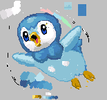
It isn't done yet but, heres, my WIP. It is NOT color reduced
 Please tell me how to make it beter, and if you like it! I have to figure out how to draw the bubble though, any suggestions? Please tell me how to make it beter, and if you like it! I have to figure out how to draw the bubble though, any suggestions?
|
|
 IP Logged IP Logged |
|
|
cure
Commander 
Joined: 23 March 2022 Online Status: Offline Posts: 2859 |
Posted: 15 August 2010 at 10:25am |
|
i think the dithering is overdone, if you've got the colors to avoid it then i would. it's fine here and there, but it's easy to over-dither. head is shaped like a sideways egg ie the top right corner of the circle that forms the head is deflated/dented. the leg on our right seems to be positioned much higher on his body, give yourself a bigger canvas so that you're not trying to cram the features in this square.
|
|
|
IP Logged |
|
|
Sleepless
Seaman
Joined: 14 May 2010 Online Status: Offline Posts: 26 |
Posted: 15 August 2010 at 10:45am |
|
Iguess I could add more colors, as there is an unlimited color palette. Thanks, I'll work on it to your critique. Could you please show me your take on it?
|
|
|
IP Logged |
|
|
cure
Commander
Joined: 23 March 2022 Online Status: Offline Posts: 2859 |
Posted: 15 August 2010 at 12:15pm |
|
you've got plenty of colors now, you just need more contrast between your colors. some colors are close enough in shade that it isn't really necessary to have both. copy+pasted the blue eye 'cause i couldn't tell what the other one was doing really. moved the eyes higher up since they're basically aligned with the beak right now, which is pretty low on the face.
 worry about the bubble later, right now you should just focus on the piplup itself. |
|
|
IP Logged |
|
|
GraphicDesignC
Seaman
Joined: 15 August 2010 Online Status: Offline Posts: 4 |
Posted: 15 August 2010 at 4:30pm |
|
I think you should have done the bubble first and then used different shades of blue mixed with the color of the bubble to give it the appearance that piplup is actually inside the bubble, when actually it is just in the foreground with different shades of color that give it the appearance of being inside of an object.
|
|
|
IP Logged |
|
|
Always Black.
Seaman
Joined: 06 July 2010 Online Status: Offline Posts: 32 |
Posted: 20 August 2010 at 5:09pm |
|
The body-shape you had before was just way to weird. The one cure made looks a lot better.
|
|
|
IP Logged |
|
|
Sleepless
Seaman
Joined: 14 May 2010 Online Status: Offline Posts: 26 |
Posted: 22 August 2010 at 10:24am |
|
I have a new WIP, but i feel like I have to work on it, and this mouse is annoying, so I need to get a new battery for my tablet lol
|
|
|
IP Logged |
|
|
Sleepless
Seaman
Joined: 14 May 2010 Online Status: Offline Posts: 26 |
Posted: 28 August 2010 at 11:58am |
 Can't see it? Here's a GIF Can't see it? Here's a GIF
 I added texture, And made the body a little shiny/oily from hanging around in the water. I really can;t shade the head that well. Any advice? I added texture, And made the body a little shiny/oily from hanging around in the water. I really can;t shade the head that well. Any advice?Edited by Sleepless - 28 August 2010 at 12:07pm |
|
|
IP Logged |
|
|
TheKovenant
Seaman
Joined: 11 September 2009 Online Status: Offline Posts: 26 |
Posted: 28 August 2010 at 12:01pm |
|
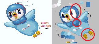
You should really of taken the advice from cure, the head is a bit off (right side of the head) and doesn't look right on the body. Try making the shape look like the one in cure's example. The feet need work aswell
  The shading is fine, I'm talking about the shape, if you look at the screen comparison above I have circled the parts which you should consider changing on your picture. Also the circles on the chest don't seem to line up! Edited by TheKovenant - 28 August 2010 at 12:39pm |
|
|
IP Logged |
|
|
Sleepless
Seaman
Joined: 14 May 2010 Online Status: Offline Posts: 26 |
Posted: 28 August 2010 at 1:53pm |
|
Wow, thanks for that! I will get to working on it. Can more people please critique? I reeeally want to work on this so I can submit it to thae gallery and hopefully get better.
|
|
|
IP Logged |
|
|
cure
Commander
Joined: 23 March 2022 Online Status: Offline Posts: 2859 |
Posted: 28 August 2010 at 2:26pm |
|
plenty of critique has been provided. why worry about more critique when you haven't addressed all of the issues that have already been mentioned?
|
|
|
IP Logged |
|
|
Sleepless
Seaman
Joined: 14 May 2010 Online Status: Offline Posts: 26 |
Posted: 10 October 2010 at 10:32am |
|
Update:
 |
|
|
IP Logged |
|
|
cure
Commander
Joined: 23 March 2022 Online Status: Offline Posts: 2859 |
Posted: 10 October 2010 at 11:13am |
 also your light source doesn't make any sense so the shading is all off Edited by cure - 10 October 2010 at 11:13am |
|
|
IP Logged |
|
|
Sleepless
Seaman
Joined: 14 May 2010 Online Status: Offline Posts: 26 |
Posted: 10 October 2010 at 11:32am |
|
I'll try to fix that up, but I don;t really know how, so here goes nothing
 Edited by Sleepless - 10 October 2010 at 12:35pm |
|
|
IP Logged |
|
|
cure
Commander
Joined: 23 March 2022 Online Status: Offline Posts: 2859 |
Posted: 10 October 2010 at 12:08pm |
|
pick a light source and shade accordingly. it kinda look like you've chosen the top left. if the light is coming from above, why is his underside illuminated? think about cast shadows- if the light strikes the head at this angle, where will the head cast its shadow?
etc |
|
|
IP Logged |
|
|
Riva
Midshipman 
Joined: 22 April 2026 Online Status: Offline Posts: 47 |
Posted: 11 October 2010 at 7:40am |
|
Might help you, but you might have to start from scratch.
|
|
|
IP Logged |
|
|
Sleepless
Seaman
Joined: 14 May 2010 Online Status: Offline Posts: 26 |
Posted: 21 November 2010 at 1:11pm |
 I think I'm getting the hang opf it, I'll need to fix some stray pixels and reshade some parts. Anything else?
|
|
|
IP Logged |
|
|
cure
Commander
Joined: 23 March 2022 Online Status: Offline Posts: 2859 |
Posted: 21 November 2010 at 2:52pm |
|
you still haven't fixed any of the problems addressed in the edit on the right
|
|
|
IP Logged |
|
|
Sleepless
Seaman
Joined: 14 May 2010 Online Status: Offline Posts: 26 |
Posted: 27 November 2010 at 7:18am |
|
I tried to make them symetrical... I'm not quite sure what to do with the feet, though |
|
|
IP Logged |
|
|
Riva
Midshipman
Joined: 22 April 2026 Online Status: Offline Posts: 47 |
Posted: 28 November 2010 at 4:34am |
|
Buddy, I think your problem is that you have no idea about a shape of the object you are painting here.
And Im not taking about creating a crumbled 2d outline and starting to fill it with color. Im taking about having an exact idea about the 3d shape (volume) of the bird-creature and its position in perspective and relative to view (camera). It would really help you to dump this nonsensical image and instead create a low detail unshaded, 'wireframe' representation of the object first, also employing accurate perspective. Dont forget to post it here. Then you can start shading the wireframe according to the light source with as few as 3 shades of grey (spred evenly between black and white, while not using white and black itself for shading). When you get thru that succesfully you will have at least some idea how pixelart (and any art) is really made, and you'll stop wasting your time with gum-wad outlines filled with 2 same color shades, and with trolling around the forum for comments and edits on that. Also after that you should go thru all the newb-torials and other pixelart tutorials linked to on PJ, because looking at your image, you didnt. Its mandatory before asking for CC on anything. Edited by Riva - 28 November 2010 at 4:36am |
|
|
IP Logged |
|
|
Sleepless
Seaman
Joined: 14 May 2010 Online Status: Offline Posts: 26 |
Posted: 05 December 2010 at 12:27pm |
|
I didn't get what you were trying to tell me before. It wasn't until now that I got it. I'm going to try to start it over with a wireframe. I am currently working on the wireframe right now, and I'm sorry I was so ignorant. I read all the tutorials already, and I thought that I needed practice so I could absorb what I was learning, anyway, I will put up the wireframe soon.
|
|
|
IP Logged |
|
| |
||
Forum Jump |
You cannot post new topics in this forum You cannot reply to topics in this forum You cannot delete your posts in this forum You cannot edit your posts in this forum You cannot create polls in this forum You cannot vote in polls in this forum |
|
