| Active TopicsSearchRegisterLogin |
| WIP (Work In Progress) | |
| |
  |
| Author | Message |
|
Ixolite
Seaman 
Joined: 13 January 2015 Online Status: Offline Posts: 24 |
  Topic: [not-quite-done-yet] sci-fi character Topic: [not-quite-done-yet] sci-fi characterPosted: 25 January 2011 at 4:11am |
|
After a long break in pixeling I decided I'd try to do something that I will actually finish for a change. I am struggling a tiny wee bit though, hence my need to start this topic.
Anyways, this is the reference, that I base my pixel on: http://www.gamedecverse.com/tapety/Torkil_1680x1050.jpg And this is what I have so far:   
There are some mistakes in the lineart that I am aware of but I thought I'd correct them while shading/colouring. Anyways, its the shading I'm not too happy about so far, especially the armour. I want to keep the color count low but I keep running out of shades there... The pallete probably needs tweaking as well since some of the hues just blend together when zoomed out to 1:1 zoom. EDIT2: I replaced the 3x zoomed images with 1:1 sized ones. Forgot about the click-to-zoom feature here :P Edited by Ixolite - 10 February 2011 at 4:27am |
|
 IP Logged IP Logged |
|
|
Gecimen
Admiral 
Joined: 17 October 2021 Online Status: Offline Posts: 3856 |
Posted: 25 January 2011 at 5:19am |
|
Make sure you have a stable lightsource before you start the shading. At he moment it doesn't seem like it. You skills are pretty good however. Is the head's size deliberately this small? Like a mech drivers?
|
|
|
IP Logged |
|
|
Ixolite
Seaman
Joined: 13 January 2015 Online Status: Offline Posts: 24 |
Posted: 25 January 2011 at 6:48am |
|
I was trying to base on the reference image lightning but I guess it won't translate well into this scale, too much scattered light there. Fixed light source should work better now that I think about it, thanks.
The head should be relatively small, partly due to shadows hiding the details in area around the neck. But I guess it does look a little too small. Hmm... I'll see what I can come up with. Edited by Ixolite - 25 January 2011 at 6:48am |
|
|
IP Logged |
|
|
Gecimen
Admiral
Joined: 17 October 2021 Online Status: Offline Posts: 3856 |
Posted: 25 January 2011 at 9:16am |
|
You can grow the face elements to make it look like shadowed. Still it's the same lightsource problem you're having there. The face is being shadowed from all directions. It should be shadowed from 1 direction.
PS: If you put a link to the reference we can make better comments. |
|
|
IP Logged |
|
|
Ixolite
Seaman
Joined: 13 January 2015 Online Status: Offline Posts: 24 |
Posted: 25 January 2011 at 11:56am |
|
The link is there on the top, second paragraph :P
|
|
|
IP Logged |
|
|
Ixolite
Seaman
Joined: 13 January 2015 Online Status: Offline Posts: 24 |
Posted: 26 January 2011 at 7:22am |
|
I enchanced the face some and tried to make the light more defined (in the area above/behind head so far).
I'm wondering if the face didn't get a bit too round and flat in the process... 
EDIT: Worked some more on the face to make it less flat and moved on to upper body armour shading:  Edited by Ixolite - 27 January 2011 at 7:22am |
|
|
IP Logged |
|
|
Ixolite
Seaman
Joined: 13 January 2015 Online Status: Offline Posts: 24 |
Posted: 30 January 2011 at 9:04am |
|
Another update on the shading, also adjusted the palette a little.
I know I'm doing something wrong, especially not happy with the darker areas :( 
|
|
|
IP Logged |
|
|
yaomon17
Commander 
Joined: 07 September 2022 Online Status: Offline Posts: 136 |
Posted: 30 January 2011 at 12:48pm |
|
Maybe chill a bit on the dithering? Metal should be smooth with high contrast.
|
|
|
IP Logged |
|
|
Velrio
Midshipman 
Joined: 14 January 2014 Online Status: Offline Posts: 60 |
Posted: 30 January 2011 at 1:58pm |
|
I like the character concept so far, but I can't really help with tips.
|
|
|
IP Logged |
|
|
Ixolite
Seaman
Joined: 13 January 2015 Online Status: Offline Posts: 24 |
Posted: 30 January 2011 at 2:35pm |
|
Originally posted by yaomon17
Maybe chill a bit on the dithering? Metal should be smooth with high contrast. Yeah, you're right. Dithering was a bit of an experiment - I kind of like the effect but I do think it doesn't work quite as well as I hoped. Another update - removed most of the dithering in favor of smooth shading, not too happy about it again :( I think I'll re-work it while adding the details later. I also think I found a way for the dark areas, and tweaked and expanded the pallete in the process. 
Arghh... I see something that needs fixing every time I look at it in different size :( |
|
|
IP Logged |
|
|
vlad61
Midshipman
Joined: 22 April 2015 Online Status: Offline Posts: 96 |
Posted: 31 January 2011 at 9:21am |
|
Blargh can you post it at the regular size and let us zoom in on our own? I dont feel like I get to see the real character like this.
I like the shading and the whole thing over all. will wait for more before I feedback |
|
|
IP Logged |
|
|
Ixolite
Seaman
Joined: 13 January 2015 Online Status: Offline Posts: 24 |
Posted: 01 February 2011 at 7:29am |
|
Originally posted by vlad61
Blargh can you post it at the regular size and let us zoom in on our own? Yeah, no problem. Thats because I use 1920x1200 screen and 1:1 scale is a bit small at times. Anyways, update: 
3x zoom in here Mostly done with the basic shading, adding the details to the armour will be my next step. I think I'll make a lot of adjustments to the shading then, unless I stop thinking that it sucks after taking a break from looking at it ;) |
|
|
IP Logged |
|
|
Adcrusher
Commander
Joined: 04 January 2016 Online Status: Offline Posts: 148 |
Posted: 01 February 2011 at 8:43am |
|
In this forum you can just click the image to make it larger. I noticed all of your armor is completely gray, which is pretty boring. I mad an edit for you, to show how you could change the color.
  I just gave all the armor a little tint of blue/purple. I hope it helps, good luck! |
|
|
IP Logged |
|
|
Ixolite
Seaman
Joined: 13 January 2015 Online Status: Offline Posts: 24 |
Posted: 01 February 2011 at 9:20am |
|
Originally posted by Adcrusher524
In this forum you can just click the image to make it larger. I noticed all of your armor is completely gray, which is pretty boring. I mad an edit for you, to show how you could change the color. I just gave all the armor a little tint of blue/purple. I hope it helps, good luck! Ahh, forgot about the zoom feature - I don't use it since opera blurs zoomed images... I was actually thinking about adding some colour to the armour. Can I use your re-color palette? |
|
|
IP Logged |
|
|
Photocopier
Midshipman
Joined: 08 July 2014 Online Status: Offline Posts: 41 |
Posted: 01 February 2011 at 11:21am |
|
Originally posted by Ixolite
Ahh, forgot about the zoom feature - I don't use it since opera blurs zoomed images... No it doesn't! :D Type 'opera:config' into your address bar, find the multimedia settings and turn off interpolate images. |
|
|
IP Logged |
|
|
Ixolite
Seaman
Joined: 13 January 2015 Online Status: Offline Posts: 24 |
Posted: 01 February 2011 at 11:46am |
|
Can I hug you?
/me hugs Photocopier Why didn't I know you can switch that feature? Life is so much better now :D Thanks! Edited by Ixolite - 01 February 2011 at 11:45am |
|
|
IP Logged |
|
|
Ixolite
Seaman
Joined: 13 January 2015 Online Status: Offline Posts: 24 |
Posted: 03 February 2011 at 1:18pm |
|
After seeing Adcrusher524's edit I had some fun with trying out different color schemes. At first I really liked his edit scheme, minus the violet for shade. But after playing some more I went with a variant of my original idea of bluish colouring which let me re-use the colours for the, erm, apron.
Also made small adjustments to the legs shading. Next step - details.  Edited by Ixolite - 03 February 2011 at 1:18pm |
|
|
IP Logged |
|
|
yaomon17
Commander
Joined: 07 September 2022 Online Status: Offline Posts: 136 |
Posted: 03 February 2011 at 3:16pm |
|
Moar contrast.
|
|
|
IP Logged |
|
|
Ixolite
Seaman
Joined: 13 January 2015 Online Status: Offline Posts: 24 |
Posted: 07 February 2011 at 2:51pm |
|
I tried changing contrast per your advice but it didn't really work - I was loosing details, especially in the dark areas, and got it under- or over-exposed. Unless I was doing something wrong and there is some better way to get higher contrast that I just wasn't able to work out.
Contrast aside, I made some more tweaks and added some details - much fewer than I orignally intended as the reference image details mostly don't translate into this scale. I just made a mess while trying to add most of those, so I abandoned them and left the couple ones that do work in here. I'm rather unhappy about not being able to add the greave engraving :( So this is it for now, thank you everyone for your comments. 
|
|
|
IP Logged |
|
|
H|F
Commander
Joined: 14 March 2020 Online Status: Offline Posts: 363 |
Posted: 08 February 2011 at 12:31pm |
|
His face needs eyes, unless you ment for him to be looking downward. |
|
|
IP Logged |
|
|
Gecimen
Admiral
Joined: 17 October 2021 Online Status: Offline Posts: 3856 |
Posted: 08 February 2011 at 5:49pm |
|
It's generally ok but here's a few things
-Too much banding here and there. -No AA -Face is still flat |
|
|
IP Logged |
|
|
ChrisButton
Commander
Joined: 10 September 2010 Online Status: Offline Posts: 371 |
Posted: 09 February 2011 at 6:00am |
|
The face just isn't doing it for me, I believe it's in the colours themselves and the shading.
|
|
|
IP Logged |
|
|
Elk
Commander
Joined: 12 May 2024 Online Status: Offline Posts: 483 |
Posted: 09 February 2011 at 6:13am |
|
The plates look way too soft...
the lightsource is wrong reflections are wrong pastictity is pictured wrong :D not done! all because you traced... you cant comprehend with the lines, you may be in the middle of learning the techniques, but you cant just trace and try to shade something realistically by taking the lineart of it :P Edited by Elk - 09 February 2011 at 6:14am |
|
|
IP Logged |
|
|
Ixolite
Seaman
Joined: 13 January 2015 Online Status: Offline Posts: 24 |
Posted: 09 February 2011 at 2:59pm |
|
Thanks for the additional feedback!
As for the face - yeah, I am still not happy with it at 1:1 scale, though my intention was for this piece to be seen at 2x or 3x scale and I think it does look better (the face) on that larger scale. I did struggle with the palette, having spots too bright or too dark on the face and ended up with not enough contrast I guess. One lesson learned. Originally posted by Gecimen I find it really hard to even see banding, apart from obvious cases, I'd appreciate if you could show me couple spots that need attention in this regard?
It's generally ok but here's a few things -Too much banding here and there. -No AA AA issue is probably a result of inadequate palette again? I tried to soften the lines here and there but I was missing proper colours to do the AA in most places I think. Another lesson learned. Elk: I'm not sure I understand what your are trying to say - what does lineart have to do with other elements of the image? If I drew the lineart from scratch, how would that improve the shading/lightning? EDIT: formatting Edited by Ixolite - 09 February 2011 at 2:59pm |
|
|
IP Logged |
|
|
Elk
Commander
Joined: 12 May 2024 Online Status: Offline Posts: 483 |
Posted: 09 February 2011 at 3:18pm |
|
it wouldnt, im just saying it doesnt fit your skill :O
two different dimensional mediums |
|
|
IP Logged |
|
|
cure
Commander
Joined: 23 March 2022 Online Status: Offline Posts: 2859 |
Posted: 09 February 2011 at 4:33pm |
|
too late for an edit? naw, never.
edit: >> 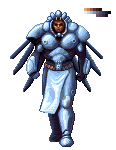 fixed a lot of banding. played with the lighting a bit (shadows appear on planes, but nothing seems to be casting shadows onto other planes). Edited by cure - 09 February 2011 at 4:33pm |
|
|
IP Logged |
|
|
Ixolite
Seaman
Joined: 13 January 2015 Online Status: Offline Posts: 24 |
Posted: 09 February 2011 at 5:59pm |
|
Much appreciated :)
While, at a quick glance, I don't agree with all the edits, it certainly is a great study material. I can already see some of the mistakes I made. |
|
|
IP Logged |
|
|
Gecimen
Admiral
Joined: 17 October 2021 Online Status: Offline Posts: 3856 |
Posted: 10 February 2011 at 10:02am |
|
Originally posted by Ixolite I find it really hard to even see banding, apart from obvious cases, I'd appreciate if you could show me couple spots that need attention in this regard? AA issue is probably a result of inadequate palette again? I tried to soften the lines here and there but I was missing proper colours to do the AA in most places I think. Another lesson learned. Yeah sure here's an edit to show the problems here:  Red borders show some of the banding. Notice how people call the armor is soft and fluffy? Now observe the 2 breastplate pieces on the right. Upper one is yours. It has banding on the edges which renders those places like a soft outline rather than the edges of the pieces. Notice how I broke the banding here and there. Examine the difference in feeling it gives. But the main reason the armor is soft is using all the colors in a ramp in almost equal shares. It destroys the metallic sharpness that should be in an armor. Actually it makes it look as soft as wool. In my edit I took out some of those colors out and used those colors as AA. Now it looks more sharper, and the single color shapes are smoother thanks to the AA. Note that your palette is more than adequete. Also my edit is far from perfect, I'm sure you can do even better. |
|
|
IP Logged |
|
| |
||
Forum Jump |
You cannot post new topics in this forum You cannot reply to topics in this forum You cannot delete your posts in this forum You cannot edit your posts in this forum You cannot create polls in this forum You cannot vote in polls in this forum |
|
