| Active TopicsSearchRegisterLogin |
| WIP (Work In Progress) | |
| |
  |
| << Prev Page of 2 |
| Author | Message |
|
Lakelezz
Commander 
Joined: 28 January 2023 Online Status: Offline Posts: 172 |
  Posted: 17 October 2014 at 2:52pm Posted: 17 October 2014 at 2:52pm |
|
I am of course interested to see an edit!
The bushes are the most complicated pattern I ever worked on. Every edit I do on them does not feel like progress rather like running in a maze. Thanks for your feedback, friend! PixelSnader, thank you for the references! I will take a look onto these. However two of the references were rather less useful due those trees being really old and giant. Nonetheless I got your idea with rather bowed/curved form. Edited by Lakelezz - 17 October 2014 at 2:54pm |
|
 IP Logged IP Logged |
|
|
Friend
Commander
Joined: 01 April 2015 Online Status: Offline Posts: 710 |
Posted: 17 October 2014 at 5:29pm |
|
cool, I'm working on my edit of your piece :]. Will post it tomorrow
|
|
|
IP Logged |
|
|
Friend
Commander
Joined: 01 April 2015 Online Status: Offline Posts: 710 |
Posted: 18 October 2014 at 9:46am |
  while playing around with your piece, I realized how well drawn everything is. :] the most obvious things that were cleaned up were the two characters. For example, you may notice that the harmony between the dress and hair is much improved, simply by paying more attention to every single pixel and every single pixel cluster. After just a few clicks, I was amazed at the potential that was right below the surfaceAgain, your drawing was very good, but some of the greatness was hidden behind a few mindless pixels here and there. This is also noticeable in the outlines of things. For instance, the outline of the hair of the little boy. If you look closely on your version, the outline is a little sketchy. But again, a few pixels here and there and proper understanding of AA and somehow fine tuning the outline of the hair really brings out the greatness of the design of the character, because again, a few technical problems were hiding some greatness. I also played with the bushes. I copy and pasted some of your older bushes because the shape better fit your pixeling of the bushes. Lo and behold, again, with a few more mindful pixel changes here and there in the bushes, even the very dirty pixeling there can look ok. And obviously, because other things have been touched up and cleaned, it allows for the bushes to be messy. (When everything is sketchy, the bushes just reinforce it. When everything is tightened up, the bushes can be dirty, as long as you can achieve a uniform, controlled and mindful look within the dirtiness.) (little tweaks throughout the whole image as well.) I really liked the cobblestones in the second image still though :] Edited by Friend - 18 October 2014 at 9:50am |
|
|
IP Logged |
|
|
Lakelezz
Commander
Joined: 28 January 2023 Online Status: Offline Posts: 172 |
Posted: 18 October 2014 at 4:50pm |
|
Thanks for your edit!
First of all, you took an old version of my piece, haha :P It was of course the last image I posted but actually I reposted this without thinking about it. I simply wanted to show the bushes again - that is why I took the next version I found. Actually this is the latest version: 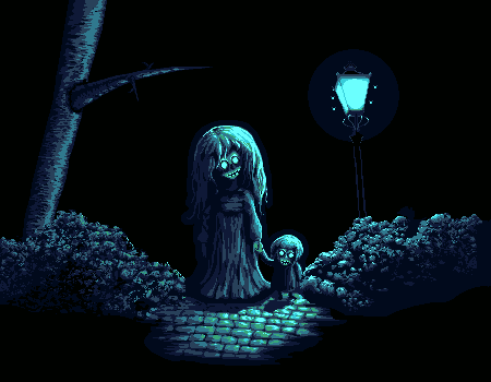 I does not matter that much, though. So let me comment on the edit. It feels rather like you focused on something I had no problems with: The palette. I really like my palette and there is no need for me to do such huge changes. However I like how the light source is "glowing" in your palette. On the other hand the green around it does not fit. You might have thought a lot about your changes on the bushes but sadly it still looks messy / dirty. That is actually what I want to try to solve, to create a good pixel art bush pattern. In the end, thanks for your work. I will take your edit into account of course. Whenever I work on updates I often check a lot of posts and edits to see how I am developing! |
|
|
IP Logged |
|
|
Friend
Commander
Joined: 01 April 2015 Online Status: Offline Posts: 710 |
Posted: 19 October 2014 at 7:36am |
|
To clarify, the palette change I made was not part of my critique, but just playing around and to differentiate my edit. My critique is solely about your sketchy pixeling
|
|
|
IP Logged |
|
|
Lakelezz
Commander
Joined: 28 January 2023 Online Status: Offline Posts: 172 |
Posted: 20 October 2014 at 5:42pm |
|
There is no reason to change the palette then since the colours on the bushes are harder to differ on your edit.
However I am still struggling. I browsed through the gallery, internet and several other sources but could not find pixel bushes being similar to mine. When I try to clean those bushes up it is often minimal and rather changing the general look. I tried to part the bush in areas to not lose my overview but still. In the end it is simply that I do not know how (specially the left) bush could be cleaned up. Maybe someone could enlighten me, pointing me out what is already done well on the left bush (if even) by marking the area. Thanks everyone for helping me :) Edited by Lakelezz - 20 October 2014 at 5:43pm |
|
|
IP Logged |
|
|
Teapot[ISO]
Seaman 
Joined: 31 January 2015 Online Status: Offline Posts: 13 |
Posted: 20 October 2014 at 7:24pm |
|
That is one seriously creepy picture.
Looks good though! |
|
|
IP Logged |
|
|
Lakelezz
Commander
Joined: 28 January 2023 Online Status: Offline Posts: 172 |
Posted: 22 October 2014 at 7:56am |
|
Thanks! I am still not happy with the bushes, haha.
|
|
|
IP Logged |
|
|
Limes
Commander
Joined: 15 September 2021 Online Status: Offline Posts: 683 |
Posted: 22 October 2014 at 9:44am |
|
Keep playing with it until your satisfied.
|
|
|
IP Logged |
|
|
Lakelezz
Commander
Joined: 28 January 2023 Online Status: Offline Posts: 172 |
Posted: 25 October 2014 at 8:33am |
|
I made some changes.
The shadows on the ground were removed. Ghosts do not cast shadows. Also even if I simply could not make shadows which would not cover 70% of the shadows. However if one has an idea how to do good and fitting shadows which are not 'destroying' the pavement, feel free to share your draft! The bushes are still a pretty hard thing to change. I guess I have to stick with this way. Old: This is my current version:  Edited by Lakelezz - 25 October 2014 at 8:33am |
|
|
IP Logged |
|
|
MrHai
Commander
Joined: 12 January 2014 Location: Norway Online Status: Offline Posts: 119 |
Posted: 25 October 2014 at 10:19am |
|
Couldn't you keep the 'highlights' even in the shadows? Now, this image is only to illustrate my point, I'm not suggesting you overlay semi-transparent black over the cobbles, neither am I suggesting you add a bunch of new colours to make the shadows. However, would it be possible to bring each value in the shadow area down a step or two in the palette, maybe even going all the way to black?

I really like the image by the way, amazing development from the first post :) |
|
|
"Work is more fun than fun"
-John Cale |
|
|
IP Logged |
|
|
Lakelezz
Commander
Joined: 28 January 2023 Online Status: Offline Posts: 172 |
Posted: 25 October 2014 at 12:39pm |
|
This is what ended up with:
 With highlights:  I do not like how that works out :/ Without shadows is probably better. Any ideas/tips/thoughts about the bushes? |
|
|
IP Logged |
|
|
PixelSnader
Commander
Not a troll! Joined: 08 January 2026 Online Status: Offline Posts: 3194 |
Posted: 25 October 2014 at 1:05pm |
|
No. That's not how highlights and shadows work.
Highlights are specular reflections, which are dependent on a direct line between the lightsource and the object that's lit. It will still be lit diffusely, from light bouncing off of other objects, but because of the nature of diffuse (i.e. 'widely spread out') light, there won't be any highlights. It could be possible if we were to work with a translucent material for the ghost, but then you'd have to be able to somewhat accurately work in diffraction. And then you'd still only get a very minor specular effect, because of how the ghost's body diffracts and distorts the light bundle, making it more scattered and less uniform/directional. Here is a simple shape, and you can see how much caustics/refraction already affect the direction and intensity of the light. 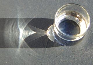
And as the shape becomes more complex, the resulting lightcast becomes even more complex. We could assume that the ghost is a sort of smoke? Smoke are small bits of a material, but not small enough to be separate molecules; they're clumps. And they are like mini-objects. They won't bend light uniform, but scatter it around, again making it diffused light. Not entirely diffuse, but enough to make highlights spread out. You can create a striking effect of translucency without a precise model of how the light moves, sure, but then you have to base it on diffuse light. And you'd have to add a lot of extra colors plus it wouldn't work well with the monochromatic aestetic. And even though it could be a decent effect for the ghost, it still won't do anything for the specular reflection of the cobblestones. In short, you can't reasonably pixel the specular reflections from a light inside the shadow of that same light. It could sort of work in a case like this: 
But that's because the specular reflections in the shadows are from different lights than the ones casting those shadows. In this ghost image, however, there's one dominant lightsource; the streetlight. Related to this babbling about physics, I suggest you make the shadows a bit blurry, because the lamppost isn't a point light, but a fairly large box, and thus should give a noticable penumbra: 
The longer the relative distance (compared the distance to the lightsource) between a point on an object, and that same point on the object's shadow, the blurrier it becomes. In most cases this means that shadows are sharp at the feet, blurry at the head: This effect is much more pronounced with artificial lights, because the sun is 'infinitely' far away. And now I gotta run and pick someone up from the airpoirt kthxbye |
|
|
▄▄█ ▄▄█ ▄█▄ ▄█▄ |
|
|
IP Logged |
|
|
MrHai
Commander
Joined: 12 January 2014 Location: Norway Online Status: Offline Posts: 119 |
Posted: 25 October 2014 at 2:06pm |
|
That's all great info, and I'm all for the idea that all artists need a firm grasp of how things look in real life and why they look that way. However, I also think that there is a time to put realism before aesthetics, and a time to put aesthetics before realism.
Edited by MrHai - 25 October 2014 at 2:08pm |
|
|
"Work is more fun than fun"
-John Cale |
|
|
IP Logged |
|
|
Lakelezz
Commander
Joined: 28 January 2023 Online Status: Offline Posts: 172 |
Posted: 25 October 2014 at 4:20pm |
|
Wow, thanks for your comprehensive post, PixelSnader :)
It will probably help me quite a lot while I try to improve generally! However I guess that shadows will just destroy the pavement. Specially when I follow what you wrote o: I might try it again when I fixed my bushes :( Could my piece be denied on the gallery if I would stick to the current bush style? Edited by Lakelezz - 25 October 2014 at 4:21pm |
|
|
IP Logged |
|
|
PixelSnader
Commander
Not a troll! Joined: 08 January 2026 Online Status: Offline Posts: 3194 |
Posted: 26 October 2014 at 1:29pm |

You don't need to completely ruin your road. You can simply tone it down a few shades, and remove the highlights. Like I said, the specular is impossible, but diffuse lighting can work (although less bright). 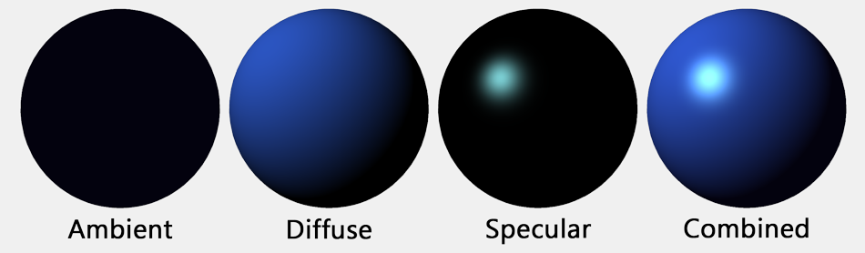
This work only has a point light; so no ambient lighting aside from the clouds and whatever bounces off of the bushes and tree. And only specular highlights in places where there's no shadow. You're probably able to rework the shadowed pathway with just two colors without losing too much. If not, try adding one color. |
|
|
▄▄█ ▄▄█ ▄█▄ ▄█▄ |
|
|
IP Logged |
|
|
Lakelezz
Commander
Joined: 28 January 2023 Online Status: Offline Posts: 172 |
Posted: 27 October 2014 at 6:32pm |
|
Thank you very much(!), PixelSnader :)
I really like the idea of your edit. When I start working on the animation I will try to do some diffused shadows. Nonetheless I want the shadows to change in their strength according to the flicker (weak, strong, no light) of the lamp. However the bushes were really freaking me out. I edited them again. Old: This is what I ended up with for now: 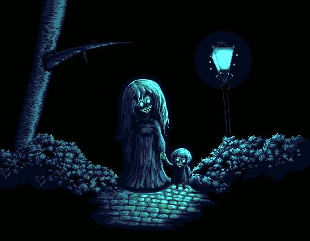 |
|
|
IP Logged |
|
|
Lakelezz
Commander
Joined: 28 January 2023 Online Status: Offline Posts: 172 |
Posted: 28 October 2014 at 3:52pm |
|
I started to work on the animation but did not add shadow, yet.
There will be one test at least when the animation is complete. Right now the flickering and flies can be seen. Flies are much smoother in terms of movement and the blending of the flicker-effect is much nicer. As I mentioned: The animation is not finished due time lack - the flies will stop existing at some frame. I will fix the first two frames soon, where the upper left fly is "spawning" and directly disappearing (flying behind the lamp) too weirdly. 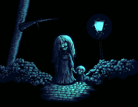 Edited by Lakelezz - 28 October 2014 at 3:58pm |
|
|
IP Logged |
|
|
DrTripwire
Commander
Joined: 29 October 2014 Online Status: Offline Posts: 174 |
Posted: 28 October 2014 at 9:33pm |
|
I don't have a big critique for you, but encouragement. I hope that's okay. c:
I just read the entirety of this thread - dude, you're amazing. Not only have you improved so much in a single thread, you responded maturely to the critique. Your textures are fantastic! What you have now is probably going to give me nightmares. (My only comment might not even be relevant.) The lantern's light extends to the background, too. I'm fond of the pitch black background, but if you ever wanted to expand and show a dim background, that would be cool. I dunno. That is all. Fantastic job, you. c: Keep it up! PS: Stop hatin' on the bushes. They're beautiful. |
|
|
IP Logged |
|
|
Lakelezz
Commander
Joined: 28 January 2023 Online Status: Offline Posts: 172 |
Posted: 29 October 2014 at 8:29am |
|
Thank you a lot, DrTripwire :)!
By the way, welcome to pixeljoint! It is a good characteristic to read through a whole thread!! That will often lead to make your help very precise. Often people tend to repeat (by mistake) but you would of course avoid this. I am glad that you like my improvement and hope that you will of course be unable to sleep until Halloween, haha. About the background: It will stay black. Though I added a soft purple shade around the lantern. That should be enough. There is no reason to add more objects to this piece. On this way it wont overload - specially with the animation on, this can be a threat - I guess. The old bushes were dirty. They were not actually hating on them but telling me that is rather not like it should be. The bushes had not intentionally placed pixels which was leading to a too strong random, less logical, and very messy (dirty) pattern. If you meant the new bushes, gladly nobody "hated" about them, yet, haha :P I finished my animation:  Nonetheless there might be a last update (including several sub-fix-updates). Fizzick suggested that the branch should cast a shadow onto the tree. I guess that is right? Generally I want to try to cast more shadows. PixelSnader gave me so much input (which I am really thankful for) that I now want to put into this piece - at least for an attempt. Edited by Lakelezz - 29 October 2014 at 8:31am |
|
|
IP Logged |
|
|
DrTripwire
Commander
Joined: 29 October 2014 Online Status: Offline Posts: 174 |
Posted: 29 October 2014 at 9:06am |
|
Thanks!
I do like the new purple. :) Oh! I was talking to you because you kept saying you didn't like them. I guess I don't know much about the technical side of pixeling and all the terms, haha. Is it just me, or is the flicker different? I don't see the actual "flicker" movement now; I'm only seeing off and on. A very short flicker if anything. |
|
|
IP Logged |
|
|
Lakelezz
Commander
Joined: 28 January 2023 Online Status: Offline Posts: 172 |
Posted: 29 October 2014 at 9:19am |
|
Oh no! The "new purple" was already added back then! I just mentioned it.
The flicker is the same as before. I just added the last fly-animation-frames. |
|
|
IP Logged |
|
|
Limes
Commander
Joined: 15 September 2021 Online Status: Offline Posts: 683 |
Posted: 29 October 2014 at 9:23am |
|
If someone doesn't mind could you post a version of the pic not through deviant art?
|
|
|
IP Logged |
|
|
Lakelezz
Commander
Joined: 28 January 2023 Online Status: Offline Posts: 172 |
Posted: 29 October 2014 at 9:35am |
|
Oh, what is wrong with sta.sh-links?
This is not uploaded on sta.sh / dA:  |
|
|
IP Logged |
|
|
H|F
Commander
Joined: 14 March 2020 Online Status: Offline Posts: 363 |
Posted: 30 October 2014 at 9:45am |
|
Are they floating? There is so much light under them where I feel like they would cast shadows from the lamp.
|
|
|
IP Logged |
|
|
Lakelezz
Commander
Joined: 28 January 2023 Online Status: Offline Posts: 172 |
Posted: 30 October 2014 at 2:27pm |
|
Oh! No no, they are not floating, haha. I mentioned it somewhere already, I will add the shadows in the last update :)
I just had the feeling that they would take over too much place of the pavement. There are some drafts in thread to look at, just if you are curious. I made some different animation:  It is mixing the rather calm frames and then some rapid ones. I do not want to go for a strobelight festival, so I guess this rather fits? I am not quite sure. Additionally I added the darkest shade to the dark frames. Edited by Lakelezz - 30 October 2014 at 2:36pm |
|
|
IP Logged |
|
|
Finlal
Rear Admiral 
Joined: 08 November 2016 Online Status: Offline Posts: 404 |
Posted: 31 October 2014 at 3:51pm |
|
That is good. But in my opinion lantern blinks too much. It's quite hard to check out all details. Could you make it stand turned on for about 3 seconds?
Edited by Finlal - 31 October 2014 at 3:51pm |
|
|
IP Logged |
|
|
Lakelezz
Commander
Joined: 28 January 2023 Online Status: Offline Posts: 172 |
Posted: 31 October 2014 at 5:27pm |
|
Haha, your suggestion is already in the final version. However not three seconds.
Lately I finished my piece. I worked for such a long time on this that I feel like moving on. The gallery just accepted the piece, you can find it here: http://www.pixeljoint.com/pixelart/90021.htm -The flickering-pattern was optimized. -Some areas got slightly redefined -The tree pattern was changed a little bit The piece is done now. I probably wont change things from this point on. In the end I want to thank you all for you great support, ideas, and edits! Edited by Lakelezz - 31 October 2014 at 5:28pm |
|
|
IP Logged |
|
|
jalonso
Admiral 
Joined: 29 November 2022 Online Status: Offline Posts: 13537 |
Posted: 31 October 2014 at 6:15pm |
|
You did awesome!
More PJers should take advantage of the forum as you have. |
|
|
|
|
|
IP Logged |
|
| << Prev Page of 2 |
| |
||
Forum Jump |
You cannot post new topics in this forum You cannot reply to topics in this forum You cannot delete your posts in this forum You cannot edit your posts in this forum You cannot create polls in this forum You cannot vote in polls in this forum |
|
