| Active TopicsSearchRegisterLogin |
| WIP (Work In Progress) | |
| |
  |
| Author | Message |
|
Flameruler13
Commander 
Joined: 20 January 2006 Online Status: Offline Posts: 140 |
 Topic: Art quality... Topic: Art quality...Posted: 22 April 2006 at 8:04pm |
|
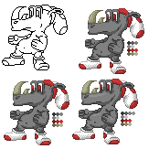
I colored this line art.. cant remember who made it but i just wanna know what you think of it:
|
|
 IP Logged IP Logged |
|
|
Pixel_Outlaw
Commander
Joined: 01 September 2005 Online Status: Offline Posts: 3829 |
Posted: 22 April 2006 at 9:03pm |
|
well i'm glad you didn't pillowshade that. Maybe try having a very light yellow colored lightsource and blending accordingly. I almost never shade to white but this is a stylistic choice. Decent job there. |
|

|
|
|
IP Logged |
|
|
leel
Commander
Joined: 29 June 2005 Online Status: Offline Posts: 3001 |
Posted: 22 April 2006 at 9:32pm |
|
maybe add some highlights? The shading is pretty good ^_^ Also, this should probably go in WIP forum.. though if you're done..eh I dunno |
|
|
IP Logged |
|
|
Brian the Great
Commander
RED! Joined: 03 March 2005 Location: United Kingdom Online Status: Offline Posts: 2221 |
Posted: 23 April 2006 at 2:09am |
|
I'm guessing the lineart is Flaber's.
|
|
|
IP Logged |
|
|
PixelSnader
Commander
Not a troll! Joined: 21 May 2026 Online Status: Offline Posts: 3194 |
Posted: 23 April 2006 at 5:07am |
|
i'd lose the horn's dithering and add some highlights
|
|
|
▄▄█ ▄▄█ ▄█▄ ▄█▄ |
|
|
IP Logged |
|
|
Flameruler13
Commander
Joined: 20 January 2006 Online Status: Offline Posts: 140 |
Posted: 23 April 2006 at 6:05am |
|
ya i didnt put it in the WIP section cause its done and im not submitting it
|
|
|
IP Logged |
|
|
Brian the Great
Commander
RED! Joined: 03 March 2005 Location: United Kingdom Online Status: Offline Posts: 2221 |
Posted: 23 April 2006 at 6:25am |
|
Either way, pixel art topics go in WIP.
|
|
|
IP Logged |
|
|
Flameruler13
Commander
Joined: 20 January 2006 Online Status: Offline Posts: 140 |
Posted: 23 April 2006 at 6:32am |
|
I took away the horn dithering and i tried to do highlights.... i need help, he looks likes a baloon
|
|
|
IP Logged |
|
|
AndyOaks
Midshipman 
Joined: 07 August 2006 Location: United Kingdom Online Status: Offline Posts: 55 |
Posted: 23 August 2006 at 8:51am |
|
The outline and final shading looks pretty good to me. I'd reduce the pupil size but that's just me
 I especially like the shoes. Originally posted by Flameruler13
I colored this line art.. cant remember who made it but i just wanna know what you think of it:
|
|
|
IP Logged |
|
|
alkaline
Commander
Joined: 25 August 2020 Online Status: Offline Posts: 868 |
Posted: 23 August 2006 at 9:29am |
|
looks like flaber's to me.
either dither the body or add another tone in between your two. |
|
|
IP Logged |
|
|
Skull
Commander
PJ Pioneer Joined: 03 August 2019 Online Status: Offline Posts: 1521 |
Posted: 23 August 2006 at 9:53am |
|
It's looking pretty good to me. Might want to AA between the skin tone and highlight / shade.. make it smoother.
|
|
|
IP Logged |
|
|
Brian the Great
Commander
RED! Joined: 03 March 2005 Location: United Kingdom Online Status: Offline Posts: 2221 |
Posted: 23 August 2006 at 10:18am |
|
Originally posted by AndyOaks Omg necropost.The outline and final shading looks pretty good to me. I'd reduce the pupil size but that's just me I especially like the shoes. Originally posted by Flameruler13 I colored this line art.. cant remember who made it but i just wanna know what you think of it:
|
|

|
|
|
IP Logged |
|
| |
||
Forum Jump |
You cannot post new topics in this forum You cannot reply to topics in this forum You cannot delete your posts in this forum You cannot edit your posts in this forum You cannot create polls in this forum You cannot vote in polls in this forum |
|