| Active TopicsSearchRegisterLogin |
| WIP (Work In Progress) | |
| |
  |
| << Prev Page of 2 |
| Author | Message |
|
Metaru
Commander 
Joined: 28 December 2025 Online Status: Offline Posts: 3305 |
  Posted: 24 May 2008 at 11:57am Posted: 24 May 2008 at 11:57am |
|
your shading is messing the perspective actually. the desing of the teeth suggest a 3/4 point of view, but the smaller eyes are in a frontal PoV, and the bigger ones are in a more angular 3/4. this is caused by the aligment of each part size and placement. i suggest you tu unify and define the anatomy of your character asap, or else any futher progress would be messed too. i'm not telling you to mirror it. it doesn't need to be simetrical. but your current settings make it look twisted, while it should be more like a smooth caparace, similar to the ones seen in the Zerg's Hydralisk(wich i may assume may be a source of inspiration for this desing).
also, i want to point that you mentioned that you want to give this a metal slug feel. you should be aware that most metal slug sprites have their ligthsource placed at the top  Edited by Metaru - 24 May 2008 at 11:58am |
|
|
I ate leel's babies
|
|
 IP Logged IP Logged |
|
|
QuaziGNRLnose
Midshipman 
Joined: 16 September 2018 Online Status: Offline Posts: 81 |
Posted: 24 May 2008 at 3:31pm |
|
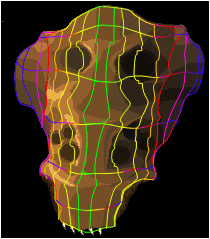
im aware of the lighting but in my game the light is coming from the right so you can see why its placed like so, and yea i noticed it looks hydralisk esc, but that was unintentional, it was actually based off a little character i made as a small child (7 yrs old) its not really supossed to be that smooth, more of a rough ridged surface, and the teeth are not done at all yet, there actually still in a concept stage, and the eyes are messed up a little i realise now, thanks for the help though im gonna fix those problems now, but u still have to look at the full line art to understand how angled this actually is, and its quite big so perspectivve is affecting it alot compared to the caracters size
|
|
|
IP Logged |
|
|
QuaziGNRLnose
Midshipman
Joined: 16 September 2018 Online Status: Offline Posts: 81 |
Posted: 24 May 2008 at 3:38pm |
|
wait, would you care to quickly show me what to fix on the eyes cause i see the prob a bit but im not to sure how to fix it, like just draw red circles where the deppest point should be on my pic, cause im not to familiar with all these 3/4th angle thingys n sh*t like that, i know what you mean but im still a bit of "TH3 N00B"
Edited by QuaziGNRLnose - 16 June 2008 at 8:39am |
|
|
IP Logged |
|
|
QuaziGNRLnose
Midshipman
Joined: 16 September 2018 Online Status: Offline Posts: 81 |
Posted: 24 May 2008 at 4:17pm |
swweeet i made a useless height map thingy
|
|
|
IP Logged |
|
|
Bengoshia
Seaman 
Joined: 17 May 2022 Online Status: Offline Posts: 19 |
Posted: 24 May 2008 at 6:14pm |
|
I can't tell, is this just a kid or a troll? Seriously.
|
|
|
IP Logged |
|
|
Metaru
Commander
Joined: 28 December 2025 Online Status: Offline Posts: 3305 |
Posted: 24 May 2008 at 9:17pm |
|
neither. he is just a bit confused I believe.
|
|
|
I ate leel's babies
|
|
|
IP Logged |
|
|
QuaziGNRLnose
Midshipman
Joined: 16 September 2018 Online Status: Offline Posts: 81 |
Posted: 26 May 2008 at 6:35pm |
|
well actually i am a kid, and yeah, im pretty confused because i have alot of choices i can make and i just want this to be done perfectly
|
|
|
IP Logged |
|
|
Metaru
Commander
Joined: 28 December 2025 Online Status: Offline Posts: 3305 |
Posted: 26 May 2008 at 8:42pm |
|
like everyone else
 . . But its going to take ages since you're trying to learn the basics with a very big picture full of small technical details that require a bit more experience. not trying to discourage you in any way, but as I said a few post before, you should start with something smaller and less complex, or you'll just get messed and frustrated. |
|
|
I ate leel's babies
|
|
|
IP Logged |
|
|
QuaziGNRLnose
Midshipman
Joined: 16 September 2018 Online Status: Offline Posts: 81 |
Posted: 27 May 2008 at 5:38pm |
|
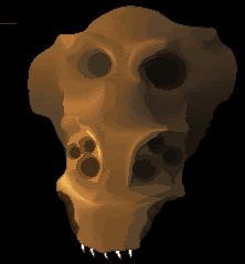
i know alot of ppl are interested in SHUMP's and i wanna advertise my WIP shump DDF, so plz take a look at it :D and i know this isnt the right place but wtv http://www.moddb.com/games/10088/ddf-side-scrolling-shooter oh ya i added more colours to my alien thingy, making it smoother im gonna dither it all when its done
  compared to old
|
|
|
IP Logged |
|
|
Metaru
Commander
Joined: 28 December 2025 Online Status: Offline Posts: 3305 |
Posted: 27 May 2008 at 5:57pm |
|
I believe you're using way too many colors for the skin only(34 at the moment). you need to simplify these shades if you want to aim for a 'sprite' look.
and you should put this in a contex. aka, pixel the whole creature instead of shading individual parts. because you'll have to unify every element of his construction in order to make them organic and conected, and that would mean, in the worst case, that you should redo parts of what you've made already(wasting the progress you've made to the moment). |
|
|
I ate leel's babies
|
|
|
IP Logged |
|
|
QuaziGNRLnose
Midshipman
Joined: 16 September 2018 Online Status: Offline Posts: 81 |
Posted: 27 May 2008 at 6:16pm |
|
i know its alot of colours, but the game is gonna be all high res images, i dont want it to cartoonish, i want it to look very realistic, but retain some elements that keep it from being a little too realistic, im aiming for shading similar to the santa with the tommygun if youve seen that piece
the problem with making my piece all out of one layer is that my layers are animated seperately using the games engine (for collision detection ect.), rather than being a single sprite, which means the pieces will need a layer hierachy controlled by the game engine in real time, rather than just being animated pixels, anyways im in understanding of what you mean, but i chose a carapace like structure for this reason, i wont have to make it one single smooth surface, it will be animated in chunks of body, arms, head ect for it to work, the only parts which are really butted togheter in the face are the main face plate (current piece), and the back faceplate, when i get to making the main caracter and some other bosess which arent insects ill need to do what you said
i think theres 28 colours?
anyways if worst comes to worst and i decide to have less, ill just replace the transitional shades
anyways this piece is just a test of what i can do, and how i want this to be done, ill probably end up redoing this piece again from the rough shading anyways
im going for this type of MS feel
 which uses alot of colours for its size compared to my piece Edited by QuaziGNRLnose - 27 May 2008 at 6:25pm |
|
|
IP Logged |
|
|
leel
Commander
Joined: 29 June 2005 Online Status: Offline Posts: 3001 |
Posted: 27 May 2008 at 6:40pm |
|
It's your choice as to how many colors you use in a pixel piece. But consider the following:
1. using less colors to accomplish what can be easily accomplished with unlimited colors is far more impressive and beneficial to your own growth. 2. in this particular pixel the colors you used are so close together that they just blur and dull the subject. And while that may work in some cases, I don't think it really fits this time. |
|
|
IP Logged |
|
|
Metaru
Commander
Joined: 28 December 2025 Online Status: Offline Posts: 3305 |
Posted: 27 May 2008 at 7:02pm |
|
you might be surprised if I tell you that the whale has 18~20 colors, and yours has 34?
|
|
|
I ate leel's babies
|
|
|
IP Logged |
|
|
QuaziGNRLnose
Midshipman
Joined: 16 September 2018 Online Status: Offline Posts: 81 |
Posted: 28 May 2008 at 3:48am |
|
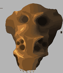
my colour ladder currently goes, 0% (lower colour): 25% : 50% : 75% : 100% (higher colour) im going to reduce it to 0% : 50% : 100%
 this should better show that, im gonna take you guys' choice on this one, it was getting to cramped for me, and i wanted it a tad less realistic.
|
|
|
IP Logged |
|
|
QuaziGNRLnose
Midshipman
Joined: 16 September 2018 Online Status: Offline Posts: 81 |
Posted: 28 May 2008 at 3:51am |
|
if you consider the size of the whale though, its a diff story, my piece real big, so i tend to need more colours to get the same effect, also do you think my pallette looks right?, it seems a little strange how grey it gets, im not sure exactly how saturated some colours should or shouldnt be, and what hue they should get to
Edited by QuaziGNRLnose - 28 May 2008 at 3:56am |
|
|
IP Logged |
|
|
leel
Commander
Joined: 29 June 2005 Online Status: Offline Posts: 3001 |
Posted: 28 May 2008 at 9:46am |
|
It's not all about the pixel by pixel size of the picture - but the complexity of the picture. The whale has at least 3 different color areas, while yours is all one color/textures/surface. Just cause it's bigger is no reason to add a bunch of colors.
As for the colors, there's a perfect tutorial that would explain the saturation question way better than I can - now I just have to find it! ... might take a little while though. |
|
|
IP Logged |
|
|
QuaziGNRLnose
Midshipman
Joined: 16 September 2018 Online Status: Offline Posts: 81 |
Posted: 28 May 2008 at 12:32pm |
|
i dont mean that size is the #1 factor, but i do mean that if i want to get the same affect but imagine the head is on the same style and scale as the whale, it would need more colours to bridge the gap, i do realise i use way too many colours, but for my colour area to look similar to the whales white colour area i will need more colours, or else it will look over dithered and too much space between shades, giving it a rocky surface, instead of kinda smooth surface
|
|
|
IP Logged |
|
|
Metaru
Commander
Joined: 28 December 2025 Online Status: Offline Posts: 3305 |
Posted: 28 May 2008 at 9:09pm |
|
This your current palette
 See it by yourself how many colors have you wasted. what your palette needs its not an automated crop of colors. what you need is to sudy-as leel said- to use a wider spectrum of colors. this is using saturation and hue for you benefic and for color echonomy(not to mention that it is more attractive and accurate than a simple gradient.  please read this and study it. its the best thing you could do for your image. |
|
|
I ate leel's babies
|
|
|
IP Logged |
|
|
QuaziGNRLnose
Midshipman
Joined: 16 September 2018 Online Status: Offline Posts: 81 |
Posted: 29 May 2008 at 3:41am |
|
ill use Paintshop pro, HSL image divider to change the pallette a bit
also its not just a gradient, its just not dark enough IMO Edited by QuaziGNRLnose - 29 May 2008 at 3:42am |
|
|
IP Logged |
|
|
Aleiav
Commander
Joined: 08 April 2016 Online Status: Offline Posts: 2380 |
Posted: 29 May 2008 at 8:19am |
|
You don't need a lot of colours to bridge a gap in a large image. Take this one for example:
By lief Made with 8 colours, still realistic. |
|
|
IP Logged |
|
|
Garrett
Commander
Joined: 04 May 2008 Online Status: Offline Posts: 147 |
Posted: 29 May 2008 at 12:29pm |
|
Am I the only one who dont know what are those programs mentionned?
Sorry I am not able to help you more than the others, but I think your alien is a bit deformed: prospectively the left "wing" should be smaller than the right one, but in your drawing it's the opposite, and is quite evident in your height map: have the red lines to be symmetrical? |
|
|
You'll hear your steps making no noise
|
|
|
IP Logged |
|
|
QuaziGNRLnose
Midshipman
Joined: 16 September 2018 Online Status: Offline Posts: 81 |
Posted: 29 May 2008 at 12:45pm |
|
the drawing is a rough sketch, my line art doesnt have that prob
also, the red lines are skewed by perspective and are not meant to be symetrical anyways Edited by QuaziGNRLnose - 29 May 2008 at 12:46pm |
|
|
IP Logged |
|
|
QuaziGNRLnose
Midshipman
Joined: 16 September 2018 Online Status: Offline Posts: 81 |
Posted: 29 May 2008 at 12:48pm |
|
this image doesnt have large gaps, the wrinkles compensate for its size, making it easy to bridge without looking plain, my image is one smooth flowing surface
|
|
|
IP Logged |
|
|
Aleiav
Commander
Joined: 08 April 2016 Online Status: Offline Posts: 2380 |
Posted: 29 May 2008 at 2:21pm |
|
Still, you can use dithering and other things to makeup for it. It's not as if a large image hasn't been pixelled before without using a bunch of colours.
|
|
|
IP Logged |
|
|
QuaziGNRLnose
Midshipman
Joined: 16 September 2018 Online Status: Offline Posts: 81 |
Posted: 29 May 2008 at 2:55pm |
|
well im currently doing that, as i showed i removed the 25% and 75% gradients now and now i made up for that by adding dithered patches next 2 the 50% and 0%/100%
 this is what you meant right? i actually like this more, gives me more control over colour blending Edited by QuaziGNRLnose - 29 May 2008 at 2:55pm |
|
|
IP Logged |
|
|
Aleiav
Commander
Joined: 08 April 2016 Online Status: Offline Posts: 2380 |
Posted: 29 May 2008 at 4:08pm |
|
yes, exactly. And you can use a variety of dithering styles if you want to create different looks. *thumbs up*
|
|
|
IP Logged |
|
|
Metaru
Commander
Joined: 28 December 2025 Online Status: Offline Posts: 3305 |
Posted: 29 May 2008 at 6:48pm |
 contrast |
|
|
I ate leel's babies
|
|
|
IP Logged |
|
|
QuaziGNRLnose
Midshipman
Joined: 16 September 2018 Online Status: Offline Posts: 81 |
Posted: 30 May 2008 at 3:55am |
|
[contrast] what do you mean
|
|
|
IP Logged |
|
|
QuaziGNRLnose
Midshipman
Joined: 16 September 2018 Online Status: Offline Posts: 81 |
Posted: 04 June 2008 at 12:53pm |
 just an update
|
|
|
IP Logged |
|
|
QuaziGNRLnose
Midshipman
Joined: 16 September 2018 Online Status: Offline Posts: 81 |
Posted: 06 June 2008 at 3:54am |
|
im just curious? would i add details after i dithered or before, cause i wanna add bumps to the shell, and i think after would work better
|
|
|
IP Logged |
|
|
Metaru
Commander
Joined: 28 December 2025 Online Status: Offline Posts: 3305 |
Posted: 07 June 2008 at 12:02am |
|
before. or else, if something fails you have to re-dither everything = waste of time and effort.
|
|
|
I ate leel's babies
|
|
|
IP Logged |
|
|
geminoid
Commander
Joined: 04 June 2008 Online Status: Offline Posts: 121 |
Posted: 10 June 2008 at 11:56am |
|
youre gonna want to work on your minor details like bumps, cracks etc. after you have your base textures finished. detailing, as with most art projects is a final step.
i really need to stress how much better this would be if your kept reflected light in mind. the creatures shell does not appear to have the texture of a towel, and as such, there should be some reflected light traces on the right side of the image.... This will even make you lowlights appear to have more contrast (as there would be a highlight in direct contact with your lowlights). I think if you managed to work in some light reflection at this stage, youll have much more depth, and all around awesomeness in all future stages of this WIP. So Yeah... Youre gonna wanna work in some reflected light. Insects are usually fairly shiny, so In this case, it would be quite pronounced |
|
|
IP Logged |
|
|
QuaziGNRLnose
Midshipman
Joined: 16 September 2018 Online Status: Offline Posts: 81 |
Posted: 12 June 2008 at 3:54am |
|
care to show me what you mean? doesnt have to be anything fancy, just overlay on what i currently have.
i kinda understand what you mean, but the best way to show me whould be to actually make a rough version over what i have Edited by QuaziGNRLnose - 16 June 2008 at 8:39am |
|
|
IP Logged |
|
|
Metaru
Commander
Joined: 28 December 2025 Online Status: Offline Posts: 3305 |
Posted: 12 June 2008 at 9:27am |
|
what he says is what everyone else has been saying you: don't overdither this.
|
|
|
I ate leel's babies
|
|
|
IP Logged |
|
|
QuaziGNRLnose
Midshipman
Joined: 16 September 2018 Online Status: Offline Posts: 81 |
Posted: 12 June 2008 at 12:40pm |
|
im pretty sure of the look i want, just need suggestions to help me get there Edited by QuaziGNRLnose - 16 June 2008 at 8:38am |
|
|
IP Logged |
|
|
geminoid
Commander
Joined: 04 June 2008 Online Status: Offline Posts: 121 |
Posted: 13 June 2008 at 1:46pm |
|
I dont have time to do a mockup for you right now, I have to go to work in a little while. For now Ill post something i found on a google image search as an example, and Later tonight, or tomorrow, Ill show you an example using your own piece.
And Yeah, dont over-dither...but that wasnt what i was trying to say. I was trying to say in order to show depth of a light source, and in order to illustrate that the object is not floating in deep space void of matter and light noise, youre going to have to add reflective light traces. Ill edit your pic later, into this post if you dont mind http://www.digitalscores.com/3DMatrix/tutorial/apple3.jpg |
|
|
IP Logged |
|
|
QuaziGNRLnose
Midshipman
Joined: 16 September 2018 Online Status: Offline Posts: 81 |
Posted: 15 June 2008 at 11:04am |
|
test
|
|
|
IP Logged |
|
|
Blueberry_pie
Rear Admiral 
Joined: 24 July 2015 Online Status: Offline Posts: 2176 |
Posted: 15 June 2008 at 12:16pm |
|
Please don't post just to test your signature. Especially when said signature is a big image that contains ripped sprites.
In your profile you can view your signature without having to post. |
|
|
IP Logged |
|
|
QuaziGNRLnose
Midshipman
Joined: 16 September 2018 Online Status: Offline Posts: 81 |
Posted: 16 June 2008 at 8:30am |
|
k srry, but just for the record there not ripped, i made them by resizing sprites then recompiling and editing them, anyways, theres no rule against putting something NPA in your sig
|
|
|
IP Logged |
|
|
Garrett
Commander
Joined: 04 May 2008 Online Status: Offline Posts: 147 |
Posted: 16 June 2008 at 10:21am |
|
Originally posted by QuaziGNRLnose theres no rule against putting something NPA in your sig Nobody said so, so please do not begin a discussion about rip or something like that; it is enough clear that's not completely your work. Talking again about your insect, you should try to do something on your own rather than awaiting someone doing an edit for you, you are going to gain a lot of experience, i think! |
|
|
You'll hear your steps making no noise
|
|
|
IP Logged |
|
|
QuaziGNRLnose
Midshipman
Joined: 16 September 2018 Online Status: Offline Posts: 81 |
Posted: 17 June 2008 at 6:35am |
|
no im not waiting or anything like that, i just havnt posted any updates in a while
|
|
|
IP Logged |
|
|
QuaziGNRLnose
Midshipman
Joined: 16 September 2018 Online Status: Offline Posts: 81 |
Posted: 24 July 2008 at 7:31am |
|
even though this post is way old cause i havnt done anything in a while, im going to update it, i think youll find it better now, but all i have to say is it looks kinda like gold, but maybe ill make a bright sun somwhere, but i hue shifted now so wtv, it looks way less flat now, but you guys decide
 the eyes are still very WIP
EDIT: i just realised it looks C64 ish, colourwise
Edited by QuaziGNRLnose - 24 July 2008 at 8:05am |
|
|
IP Logged |
|
|
QuaziGNRLnose
Midshipman
Joined: 16 September 2018 Online Status: Offline Posts: 81 |
Posted: 25 July 2008 at 12:40pm |
|
This article has moved to pixelation after way too much lack of intrest in this forum, find it there.
|
|
|
IP Logged |
|
| << Prev Page of 2 |
| |
||
Forum Jump |
You cannot post new topics in this forum You cannot reply to topics in this forum You cannot delete your posts in this forum You cannot edit your posts in this forum You cannot create polls in this forum You cannot vote in polls in this forum |
|
