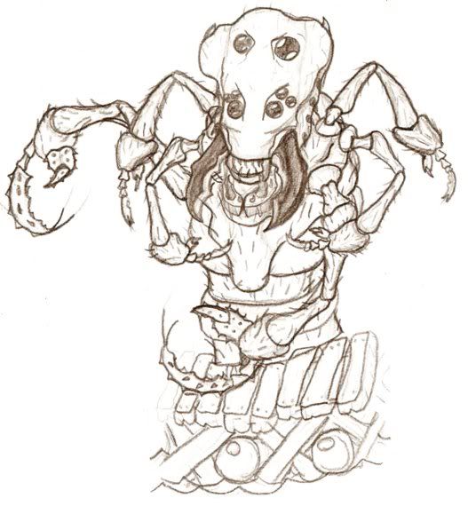
Alien pincer insect Boss
Printed From: Pixel Joint
Category: Pixel Art
Forum Name: WIP (Work In Progress)
Forum Discription: Get crits and comments on your pixel WIPs and other art too!
URL: https://pixeljoint.com/forum/forum_posts.asp?TID=6485
Printed Date: 09 June 2026 at 12:32am
Topic: Alien pincer insect Boss
Posted By: QuaziGNRLnose
Subject: Alien pincer insect Boss
Date Posted: 10 May 2008 at 12:42pm
well heres the rough power point sketch, its all i have right now, its based off one of my drawings, its gonna be animated in sections, seeing as its for a game
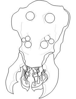 this is the actual sketch
 the barrels and bridge are just quickly drawn, so dont mind them
Plz comment, it helps me alot, im trying to find a good pallet, in the dark to medium brown area, give me colour/texture suggestions. ------------- http://www.moddb.com/games/10088/ddf-side-scrolling-shooter - Check out my SHMUP |
Replies:
Posted By: QuaziGNRLnose
Date Posted: 10 May 2008 at 12:44pm
|
I do all the line work in powerpoint, because its easier to rescale and trace everything out, also rotating is easy ------------- http://www.moddb.com/games/10088/ddf-side-scrolling-shooter - Check out my SHMUP |
Posted By: BlackDragon
Date Posted: 10 May 2008 at 1:36pm
|
Don't double post, just update your first post next time.
Looks nice so far. Will this be pixel art or not?
|
Posted By: taquito143
Date Posted: 10 May 2008 at 2:26pm
|
this isn't pixel art, you can do the line work in the ms paint, or photoshop, that's lines.. are NPA. ------------- STFU ~ |
Posted By: Aleiav
Date Posted: 10 May 2008 at 2:28pm
| I don't think she/he was claiming that this is pixel art. |
Posted By: QuaziGNRLnose
Date Posted: 10 May 2008 at 3:43pm
|
it will be pixel art, thats just for the part i will draw on top of, but it will be pure pixel art when its done
And plz use constructive critisism only, doing this in photoshop paint or power point would all be the same, i just prefer powerpoint, thats my choice, after all everyones beginning pics are drawings anyways, so whats the big problem with using powerpoint ------------- http://www.moddb.com/games/10088/ddf-side-scrolling-shooter - Check out my SHMUP |
Posted By: Setzer
Date Posted: 10 May 2008 at 3:50pm
|
Originally posted by QuaziGNRLnose After all everyones beginning pics are drawings anyways care to explain what you meant by this? Not much for me to say on the linework yet, you seem to know where you're taking it. ------------- http://sj-gfx.com"> 
|
Posted By: QuaziGNRLnose
Date Posted: 10 May 2008 at 3:55pm
|
I meant the sketches people start with are drawings, drawings are NPA but you see them in the creation of most pieces ------------- http://www.moddb.com/games/10088/ddf-side-scrolling-shooter - Check out my SHMUP |
Posted By: leel
Date Posted: 10 May 2008 at 4:01pm
|
Well that's actually not quite true. Drawings may be the first step to many pixels, but they aren't all necessarily traced. I don't think anyone has a problem with it being done in power point, we just weren't sure if you were going to pixel it in the end. And just to avoid confusion - unless you cover up the entire linework you've done so far, it won't be pixel art. It looks pretty cool so far, can't wait to see where you take it. ------------- |
Posted By: hotnikkelz
Date Posted: 10 May 2008 at 5:02pm
|
it's not pixelart cuz your drew it on powerpoint (ie program auto- AA your outlines). Regardless of whether or not you intend to paint it pixel by pixel. Noone really cares what you do with it, but just KNOW that your work won't be put on display on THIS site as a result of your outline. Acceptable work means you have to pixel and AA EVERYTHING manually |
Posted By: Aleiav
Date Posted: 10 May 2008 at 6:38pm
| Hotnikkelz, it is okay if she/he draws it and then pixels OVER it and doesn't use the outline with the machine made AA. |
Posted By: Metaru
Date Posted: 11 May 2008 at 12:05am
|
Originally posted by hotnikkelz it's not pixelart cuz your drew it on powerpoint (ie program auto- AA your outlines). Regardless of whether or not you intend to paint it pixel by pixel. Noone really cares what you do with it, but just KNOW that your work won't be put on display on THIS site as a result of your outline. Acceptable work means you have to pixel and AA EVERYTHING manually this comment went horrible wrong in the precise moment you failed at reading the first post, and started to post in autopilot mode. also -9999pts for speaking in the name of the whole site. hey Op, please ignore this and continue with your work. i want to see those lines cleaned. ------------- I ate leel's babies |
Posted By: QuaziGNRLnose
Date Posted: 11 May 2008 at 6:05am
you do realise that the aut aa just gets in my way, im using vista but i wish i still had my 98 machine which didnt do that, now i have to manually clean all the AA out of that outline:
 or else it would look like this:
  now i am going to draw over all the outline, but having AA all over it is mostcertainly a bad thing when im trying to quickly fill everthing in, then work on removing the outline itself, so next time you post a comment think about what I have to do because of the AUTO-AA
Also just because of your low skill at AAing dont think that AA is soo hard that i need a machine to do it, the only way to do AA is to understand colour blending
------------- http://www.moddb.com/games/10088/ddf-side-scrolling-shooter - Check out my SHMUP |
Posted By: Metaru
Date Posted: 11 May 2008 at 10:13am
or you could just open paint, and save the image as a monochromatic bitmap. easier, faster, and most important: cleaner. ------------- I ate leel's babies |
Posted By: QuaziGNRLnose
Date Posted: 11 May 2008 at 11:47am
|
well, yea, i have another way though. i make the fill colour in power point RGB 0,0,1 and the lines 0,0,0 then use the eraser to clean it all up, theres not enough colours between them to create a AA line, but its still annoying
I tried your way, it yeilds the same results, same amount of steps, but im sure ill find a reason to use your way, (if i accidently save some lines as a jpeg cause i have vista paint which defaults to jpeg  ) i could save it your way, so thanks, im not new to PA but new to the site, and i havnt practised in a while, tell me all the tricks you can ) i could save it your way, so thanks, im not new to PA but new to the site, and i havnt practised in a while, tell me all the tricks you can------------- http://www.moddb.com/games/10088/ddf-side-scrolling-shooter - Check out my SHMUP |
Posted By: Metaru
Date Posted: 12 May 2008 at 8:50am
|
forget about vista's paint and download XPMSpaint. ------------- I ate leel's babies |
Posted By: QuaziGNRLnose
Date Posted: 12 May 2008 at 2:24pm
well i worked on it a bit but its absolutely horrible IMO
 my colour choices were bad, and if any1 could help me out id be very gratefull my colour choices were bad, and if any1 could help me out id be very gratefullI intend it to look like this
 which uses 7 brown shades
------------- http://www.moddb.com/games/10088/ddf-side-scrolling-shooter - Check out my SHMUP |
Posted By: QuaziGNRLnose
Date Posted: 13 May 2008 at 3:49am
| would it be considered a PA on this site if i used the polygon tool in MSpaint, just to make rough outlines? |
Posted By: Aleiav
Date Posted: 13 May 2008 at 6:12am
| Don't think so. The only "tools" you can use really are the line tool and the paint bucket. |
Posted By: QuaziGNRLnose
Date Posted: 13 May 2008 at 12:31pm
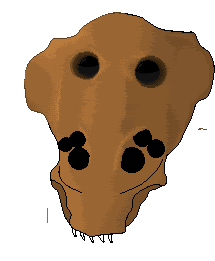
K whatever, linne tool is that same thing anyways heres my remade version, im happy with the dithering this time aroung, pay no attention to the shaded eye or anything but the upper left shading, the colours were a bit skewed by the gif also
 |
Posted By: QuaziGNRLnose
Date Posted: 15 May 2008 at 2:10pm
 give me some C&C as always (saying that always reminds me of command and conquer
|
Posted By: Shougi
Date Posted: 15 May 2008 at 2:23pm
| I think you need to bump up the shading a bit more. As of now the faces of the creature are relatively all on the same plane. eg it looks flat. I do like the the concept art though and think if you take it to completion it will look great. |
Posted By: QuaziGNRLnose
Date Posted: 15 May 2008 at 2:47pm
im working on that, i need to add more colours and add more contrast in the shading, (its pretty big so i dont think 8 shades of brown would be enough to get a smooth flow and still have alot of contrast), im not making this a low colour model so why not try that, i definately need more contrast on the darker side, but tell me if this is any better
 I realise how the curves dont flow enough, i just need a tween colour for my darkest brown and the one b4 it
as always C&C
|
Posted By: QuaziGNRLnose
Date Posted: 21 May 2008 at 3:28pm
|
C&C plz
this is an update, since i havnt made one in a whilst? wtf when do i say "whilst" is that even a word lol,
here it is, hope it seems a little more rounded than b4 shougi
  C&C plz
also im not to sure what colour darkness the line should be or if i should have a line barely/at all
[edit]
i just noticed why its lookin a tad flat, the frontmost face has no shading in it at all, well im pretty proud of it so far considering its my first piece of PA
|
Posted By: Metaru
Date Posted: 21 May 2008 at 5:55pm
|
Increase the contrast of those shades, and clean your lines before any futher work. and pixel the whole thing first, and then work on shadows. ------------- I ate leel's babies |
Posted By: QuaziGNRLnose
Date Posted: 22 May 2008 at 3:56am
| just asking, what does "pixel the whole thing first then work on shadows mean" im not to clear about what your trying to say |
Posted By: Shougi
Date Posted: 22 May 2008 at 4:50am
| He just means for you to do all the linework first before you attempt to shade it. |
Posted By: Metaru
Date Posted: 22 May 2008 at 10:27am
|
tis looks awesome in the first post trace, yet it looks terrible in your shading.
------------- I ate leel's babies |
Posted By: QuaziGNRLnose
Date Posted: 22 May 2008 at 1:01pm
|
its my first piece, im gonna redo it anyways, colours arent right at all, dont critizise it like that, i think for some1s first real piece ever its pretty good, my problem was i started to dither it too early, without finishing the colouring. I'm amzing at drawing in vector using PP, or painting in PS, but this is my first PA and i screwed up when i messed the colours up
heres a video i drew in PP for school http://ca.youtube.com/watch?v=Q5rNNkRyC0g - http://ca.youtube.com/watch?v=Q5rNNkRyC0g it was awhile back, but now plz help me get good at PA,
|
Posted By: Metaru
Date Posted: 22 May 2008 at 2:13pm
|
I managed to believe you had some experience by the way you commened in other threads. bleh. All I can say is to start working with something way more smaller, in order to grab the basics of shading and couloring. and please do not misunderstand dithering with shading. sithering has nothing to do with proper shading. in simple words: start smaller, learn the basics, and practice. all you are going to gwt with this piece is a huge frustrating ball of mess. ------------- I ate leel's babies |
Posted By: Metaru
Date Posted: 22 May 2008 at 2:15pm
|
by the way, I find funny that you claim to be amazing at drawing vectors in PS, yet you said this was traced in PowerPoint. almost a nonsense. ------------- I ate leel's babies |
Posted By: Larwick
Date Posted: 22 May 2008 at 2:31pm
|
Hey Metaru be nice.
-------------  http://larw-ck.deviantart.com"> http://larw-ck.deviantart.com">
|
Posted By: QuaziGNRLnose
Date Posted: 22 May 2008 at 2:52pm
| well actually PP is what i use for vectors. and i never said i drew vectors in PS, i use brush in PS, i have art experience, and some basic pixeling experience, but im not amazing yet, all i ever did were small pieces, and i want something big now, and FYI your work isnt too great either, considering youve been here for ages, dont insult me like that, for a 13 year old kid i think im pretty good at alot of things, i even have my own game on the net, so instead of telling me useless mean things id suggest you help me or just leave. i can tell you dont have too much experience with organics anyways, id prefer larwicks help for this, seeing as you arent helping me anymore in the first place. and just insulting me for no reason because my first piece is a little messed up, which i can tell anyways, is kinda mean, im not claiming to be the best. all i want is some help and insults wont get me anywhere. |
Posted By: QuaziGNRLnose
Date Posted: 22 May 2008 at 2:57pm
| i know it seems strange right now, that also because its missing all the other layers, which will add some depth. |
Posted By: QuaziGNRLnose
Date Posted: 22 May 2008 at 3:03pm
anyways i decided to restart and make new colour choices, because my first ones were crap, i used another pic for colour refrenceing (skull demon by Arachne b/c its in the style i wanted) and made some colour adjustments to make it suited to what i want my thing to look like and here it is, does any1 have any suggestions for any changes, b/c i think this gives the right feel,
 |
Posted By: Metaru
Date Posted: 22 May 2008 at 6:43pm
|
Originally posted by QuaziGNRLnose well actually PP is what i use for vectors. and i never said i drew vectors in PS, i use brush in PS, i have art experience, and some basic pixeling experience, but im not amazing yet, all i ever did were small pieces, and i want something big now, and FYI your work isnt too great either, considering youve been here for ages, dont insult me like that, for a 13 year old kid i think im pretty good at alot of things, i even have my own game on the net, so instead of telling me useless mean things id suggest you help me or just leave. i can tell you dont have too much experience with organics anyways, id prefer larwicks help for this, seeing as you arent helping me anymore in the first place. and just insulting me for no reason because my first piece is a little messed up, which i can tell anyways, is kinda mean, im not claiming to be the best. all i want is some help and insults wont get me anywhere. what? ------------- I ate leel's babies |
Posted By: QuaziGNRLnose
Date Posted: 22 May 2008 at 6:43pm
| huh? |
Posted By: QuaziGNRLnose
Date Posted: 23 May 2008 at 2:27pm
|
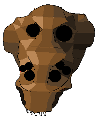
i transformed my line art into a polygonal-like surface, so that i could better understand how to make the light curve and reflect, i think it turned out pretty good, the light is coming from the top left, give me any suggestions on how to make it better
 |
Posted By: QuaziGNRLnose
Date Posted: 23 May 2008 at 3:39pm

well this is alot better than b4, its still in the beginning stages though but im happy with this, looks less "flat" this was based off that poly looking image
|
Posted By: Peach
Date Posted: 23 May 2008 at 4:36pm
|
I like it too.. gives a rough look. you can try to stick with this to see where will it lead you ;) |
Posted By: QuaziGNRLnose
Date Posted: 23 May 2008 at 5:17pm
 just an update,smoothed all the blocky edges the eraser tool made not to sure where im taking the eyes yet but ill figure it out soon, im gonna dither everything when im done, because im sure i need that textured feel, right now it looks like a stone,
|
Posted By: QuaziGNRLnose
Date Posted: 23 May 2008 at 6:24pm
update: improved everything, still needs dither and eyeballs
 |
Posted By: Poi2en
Date Posted: 24 May 2008 at 4:01am
| looks way better! |
Posted By: Shougi
Date Posted: 24 May 2008 at 5:52am
|
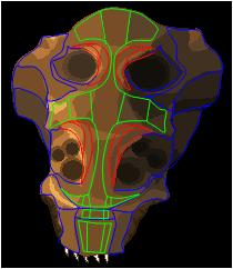
Hey QuaziGNRLnose the last edit looks much better than previous versions. I suggest however that you superimpose some contour lines on top of that current poly style shading one you have to work out some forms such as the brow ridges, cheekbones and other prominent features to help unify the shading. Right now it looks a bit too irregular and asymmetrical. crappy quick example of breaking down forms into more managable areas  Once you find the prominent features of the beasty you can use your current palette to lay down some flat shades and there will be more unity among the forms. |
Posted By: QuaziGNRLnose
Date Posted: 24 May 2008 at 6:36am
| i cant thank you enough for helping me out. im happy that im finally getting some useful help :) |
Posted By: QuaziGNRLnose
Date Posted: 24 May 2008 at 7:13am
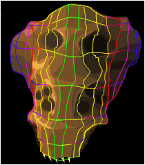
 i made those in PP, i think this is what you meant right? i used yours as a guide since you seem to know where i want to bring this piece
remember the right side is closer to the camera so its a bit larger (perspective 101) thats why it seems a little asymetric if you imagine it as a flat surface,
|
Posted By: QuaziGNRLnose
Date Posted: 24 May 2008 at 7:16am
|
LUK I 3M TH3 N00B W ]-[ 0 POST3D A UGL3Y JP3G
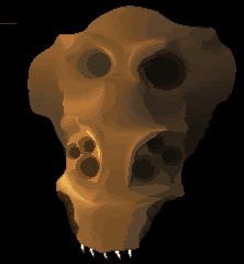
lol, i cant believe how much better my new version is, all in the colours i guess
|
Posted By: QuaziGNRLnose
Date Posted: 24 May 2008 at 9:39am
| i need more colours to dither dont i, this will look strange dithered |
Posted By: Shougi
Date Posted: 24 May 2008 at 10:49am
| Looks good now just make forms from those base shapes you found and your good to go. |
Posted By: QuaziGNRLnose
Date Posted: 24 May 2008 at 11:34am
ive done that, now im working on making it have more inbetween colours so that i can give it Metal Slug feel
 ------------- http://www.moddb.com/games/10088/ddf-side-scrolling-shooter - Check out my SHMUP |
Posted By: Metaru
Date Posted: 24 May 2008 at 11:57am
|
your shading is messing the perspective actually. the desing of the teeth suggest a 3/4 point of view, but the smaller eyes are in a frontal PoV, and the bigger ones are in a more angular 3/4. this is caused by the aligment of each part size and placement. i suggest you tu unify and define the anatomy of your character asap, or else any futher progress would be messed too. i'm not telling you to mirror it. it doesn't need to be simetrical. but your current settings make it look twisted, while it should be more like a smooth caparace, similar to the ones seen in the Zerg's Hydralisk(wich i may assume may be a source of inspiration for this desing). also, i want to point that you mentioned that you want to give this a metal slug feel. you should be aware that most metal slug sprites have their ligthsource placed at the top  ------------- I ate leel's babies |
Posted By: QuaziGNRLnose
Date Posted: 24 May 2008 at 3:31pm
| im aware of the lighting but in my game the light is coming from the right so you can see why its placed like so, and yea i noticed it looks hydralisk esc, but that was unintentional, it was actually based off a little character i made as a small child (7 yrs old) its not really supossed to be that smooth, more of a rough ridged surface, and the teeth are not done at all yet, there actually still in a concept stage, and the eyes are messed up a little i realise now, thanks for the help though im gonna fix those problems now, but u still have to look at the full line art to understand how angled this actually is, and its quite big so perspectivve is affecting it alot compared to the caracters size |
Posted By: QuaziGNRLnose
Date Posted: 24 May 2008 at 3:38pm
|
wait, would you care to quickly show me what to fix on the eyes cause i see the prob a bit but im not to sure how to fix it, like just draw red circles where the deppest point should be on my pic, cause im not to familiar with all these 3/4th angle thingys n sh*t like that, i know what you mean but im still a bit of "TH3 N00B"
------------- http://www.moddb.com/games/10088/ddf-side-scrolling-shooter - Check out my SHMUP |
Posted By: QuaziGNRLnose
Date Posted: 24 May 2008 at 4:17pm
swweeet i made a useless height map thingy
|
Posted By: Bengoshia
Date Posted: 24 May 2008 at 6:14pm
| I can't tell, is this just a kid or a troll? Seriously. |
Posted By: Metaru
Date Posted: 24 May 2008 at 9:17pm
|
neither. he is just a bit confused I believe.
------------- I ate leel's babies |
Posted By: QuaziGNRLnose
Date Posted: 26 May 2008 at 6:35pm
| well actually i am a kid, and yeah, im pretty confused because i have alot of choices i can make and i just want this to be done perfectly |
Posted By: Metaru
Date Posted: 26 May 2008 at 8:42pm
like everyone else  . . But its going to take ages since you're trying to learn the basics with a very big picture full of small technical details that require a bit more experience. not trying to discourage you in any way, but as I said a few post before, you should start with something smaller and less complex, or you'll just get messed and frustrated. ------------- I ate leel's babies |
Posted By: QuaziGNRLnose
Date Posted: 27 May 2008 at 5:38pm
i know alot of ppl are interested in SHUMP's and i wanna advertise my WIP shump DDF, so plz take a look at it :D and i know this isnt the right place but wtv http://www.moddb.com/games/10088/ddf-side-scrolling-shooter - http://www.moddb.com/games/10088/ddf-side-scrolling-shooter oh ya i added more colours to my alien thingy, making it smoother im gonna dither it all when its done
 compared to old
|
Posted By: Metaru
Date Posted: 27 May 2008 at 5:57pm
|
I believe you're using way too many colors for the skin only(34 at the moment). you need to simplify these shades if you want to aim for a 'sprite' look. and you should put this in a contex. aka, pixel the whole creature instead of shading individual parts. because you'll have to unify every element of his construction in order to make them organic and conected, and that would mean, in the worst case, that you should redo parts of what you've made already(wasting the progress you've made to the moment). ------------- I ate leel's babies |
Posted By: QuaziGNRLnose
Date Posted: 27 May 2008 at 6:16pm
|
i know its alot of colours, but the game is gonna be all high res images, i dont want it to cartoonish, i want it to look very realistic, but retain some elements that keep it from being a little too realistic, im aiming for shading similar to the santa with the tommygun if youve seen that piece
the problem with making my piece all out of one layer is that my layers are animated seperately using the games engine (for collision detection ect.), rather than being a single sprite, which means the pieces will need a layer hierachy controlled by the game engine in real time, rather than just being animated pixels, anyways im in understanding of what you mean, but i chose a carapace like structure for this reason, i wont have to make it one single smooth surface, it will be animated in chunks of body, arms, head ect for it to work, the only parts which are really butted togheter in the face are the main face plate (current piece), and the back faceplate, when i get to making the main caracter and some other bosess which arent insects ill need to do what you said
i think theres 28 colours?
anyways if worst comes to worst and i decide to have less, ill just replace the transitional shades
anyways this piece is just a test of what i can do, and how i want this to be done, ill probably end up redoing this piece again from the rough shading anyways
im going for this type of MS feel
 which uses alot of colours for its size compared to my piece
|
Posted By: leel
Date Posted: 27 May 2008 at 6:40pm
|
It's your choice as to how many colors you use in a pixel piece. But consider the following: 1. using less colors to accomplish what can be easily accomplished with unlimited colors is far more impressive and beneficial to your own growth. 2. in this particular pixel the colors you used are so close together that they just blur and dull the subject. And while that may work in some cases, I don't think it really fits this time. ------------- |
Posted By: Metaru
Date Posted: 27 May 2008 at 7:02pm
|
you might be surprised if I tell you that the whale has 18~20 colors, and yours has 34?
------------- I ate leel's babies |
Posted By: QuaziGNRLnose
Date Posted: 28 May 2008 at 3:48am
my colour ladder currently goes, 0% (lower colour): 25% : 50% : 75% : 100% (higher colour) im going to reduce it to 0% : 50% : 100%
 this should better show that, im gonna take you guys' choice on this one, it was getting to cramped for me, and i wanted it a tad less realistic.
|
Posted By: QuaziGNRLnose
Date Posted: 28 May 2008 at 3:51am
| if you consider the size of the whale though, its a diff story, my piece real big, so i tend to need more colours to get the same effect, also do you think my pallette looks right?, it seems a little strange how grey it gets, im not sure exactly how saturated some colours should or shouldnt be, and what hue they should get to |
Posted By: leel
Date Posted: 28 May 2008 at 9:46am
|
It's not all about the pixel by pixel size of the picture - but the complexity of the picture. The whale has at least 3 different color areas, while yours is all one color/textures/surface. Just cause it's bigger is no reason to add a bunch of colors. As for the colors, there's a perfect tutorial that would explain the saturation question way better than I can - now I just have to find it! ... might take a little while though. ------------- |
Posted By: QuaziGNRLnose
Date Posted: 28 May 2008 at 12:32pm
| i dont mean that size is the #1 factor, but i do mean that if i want to get the same affect but imagine the head is on the same style and scale as the whale, it would need more colours to bridge the gap, i do realise i use way too many colours, but for my colour area to look similar to the whales white colour area i will need more colours, or else it will look over dithered and too much space between shades, giving it a rocky surface, instead of kinda smooth surface |
Posted By: Metaru
Date Posted: 28 May 2008 at 9:09pm
This your current palette See it by yourself how many colors have you wasted. what your palette needs its not an automated crop of colors. what you need is to sudy-as leel said- to use a wider spectrum of colors. this is using saturation and hue for you benefic and for color echonomy(not to mention that it is more attractive and accurate than a simple gradient.  please read this and study it. its the best thing you could do for your image. ------------- I ate leel's babies |
Posted By: QuaziGNRLnose
Date Posted: 29 May 2008 at 3:41am
|
ill use Paintshop pro, HSL image divider to change the pallette a bit
also its not just a gradient, its just not dark enough IMO
|
Posted By: Aleiav
Date Posted: 29 May 2008 at 8:19am
|
You don't need a lot of colours to bridge a gap in a large image. Take this one for example: By http://pixeljoint.com/pixelart/5400.htm - lief Made with 8 colours, still realistic. |
Posted By: Garrett
Date Posted: 29 May 2008 at 12:29pm
|
Am I the only one who dont know what are those programs mentionned? Sorry I am not able to help you more than the others, but I think your alien is a bit deformed: prospectively the left "wing" should be smaller than the right one, but in your drawing it's the opposite, and is quite evident in your height map: have the red lines to be symmetrical? ------------- You'll hear your steps making no noise |
Posted By: QuaziGNRLnose
Date Posted: 29 May 2008 at 12:45pm
|
the drawing is a rough sketch, my line art doesnt have that prob
also, the red lines are skewed by perspective and are not meant to be symetrical anyways
|
Posted By: QuaziGNRLnose
Date Posted: 29 May 2008 at 12:48pm
| this image doesnt have large gaps, the wrinkles compensate for its size, making it easy to bridge without looking plain, my image is one smooth flowing surface |
Posted By: Aleiav
Date Posted: 29 May 2008 at 2:21pm
| Still, you can use dithering and other things to makeup for it. It's not as if a large image hasn't been pixelled before without using a bunch of colours. |
Posted By: QuaziGNRLnose
Date Posted: 29 May 2008 at 2:55pm
well im currently doing that, as i showed i removed the 25% and 75% gradients now and now i made up for that by adding dithered patches next 2 the 50% and 0%/100%
 this is what you meant right? i actually like this more, gives me more control over colour blending
|
Posted By: Aleiav
Date Posted: 29 May 2008 at 4:08pm
| yes, exactly. And you can use a variety of dithering styles if you want to create different looks. *thumbs up* |
Posted By: Metaru
Date Posted: 29 May 2008 at 6:48pm
 contrast ------------- I ate leel's babies |
Posted By: QuaziGNRLnose
Date Posted: 30 May 2008 at 3:55am
|
[contrast] what do you mean
|
Posted By: QuaziGNRLnose
Date Posted: 04 June 2008 at 12:53pm
 just an update
|
Posted By: QuaziGNRLnose
Date Posted: 06 June 2008 at 3:54am
| im just curious? would i add details after i dithered or before, cause i wanna add bumps to the shell, and i think after would work better |
Posted By: Metaru
Date Posted: 07 June 2008 at 12:02am
|
before. or else, if something fails you have to re-dither everything = waste of time and effort.
------------- I ate leel's babies |
Posted By: geminoid
Date Posted: 10 June 2008 at 11:56am
|
youre gonna want to work on your minor details like bumps, cracks etc. after you have your base textures finished. detailing, as with most art projects is a final step. i really need to stress how much better this would be if your kept reflected light in mind. the creatures shell does not appear to have the texture of a towel, and as such, there should be some reflected light traces on the right side of the image.... This will even make you lowlights appear to have more contrast (as there would be a highlight in direct contact with your lowlights). I think if you managed to work in some light reflection at this stage, youll have much more depth, and all around awesomeness in all future stages of this WIP. So Yeah... Youre gonna wanna work in some reflected light. Insects are usually fairly shiny, so In this case, it would be quite pronounced |
Posted By: QuaziGNRLnose
Date Posted: 12 June 2008 at 3:54am
|
care to show me what you mean? doesnt have to be anything fancy, just overlay on what i currently have.
i kinda understand what you mean, but the best way to show me whould be to actually make a rough version over what i have ------------- http://www.moddb.com/games/10088/ddf-side-scrolling-shooter - Check out my SHMUP |
Posted By: Metaru
Date Posted: 12 June 2008 at 9:27am
|
what he says is what everyone else has been saying you: don't overdither this.
------------- I ate leel's babies |
Posted By: QuaziGNRLnose
Date Posted: 12 June 2008 at 12:40pm
|
im pretty sure of the look i want, just need suggestions to help me get there ------------- http://www.moddb.com/games/10088/ddf-side-scrolling-shooter - Check out my SHMUP |
Posted By: geminoid
Date Posted: 13 June 2008 at 1:46pm
|
I dont have time to do a mockup for you right now, I have to go to work in a little while. For now Ill post something i found on a google image search as an example, and Later tonight, or tomorrow, Ill show you an example using your own piece. And Yeah, dont over-dither...but that wasnt what i was trying to say. I was trying to say in order to show depth of a light source, and in order to illustrate that the object is not floating in deep space void of matter and light noise, youre going to have to add reflective light traces. Ill edit your pic later, into this post if you dont mind http://www.digitalscores.com/3DMatrix/tutorial/apple3.jpg |
Posted By: QuaziGNRLnose
Date Posted: 15 June 2008 at 11:04am
|
test ------------- http://www.moddb.com/games/10088/ddf-side-scrolling-shooter - Check out my SHMUP |
Posted By: Blueberry_pie
Date Posted: 15 June 2008 at 12:16pm
|
Please don't post just to test your signature. Especially when said signature is a big image that contains ripped sprites. In your profile you can view your signature without having to post. |
Posted By: QuaziGNRLnose
Date Posted: 16 June 2008 at 8:30am
|
k srry, but just for the record there not ripped, i made them by resizing sprites then recompiling and editing them, anyways, theres no rule against putting something NPA in your sig ------------- http://www.moddb.com/games/10088/ddf-side-scrolling-shooter - Check out my SHMUP |
Posted By: Garrett
Date Posted: 16 June 2008 at 10:21am
|
Originally posted by QuaziGNRLnose theres no rule against putting something NPA in your sig Nobody said so, so please do not begin a discussion about rip or something like that; it is enough clear that's not completely your work. Talking again about your insect, you should try to do something on your own rather than awaiting someone doing an edit for you, you are going to gain a lot of experience, i think! ------------- You'll hear your steps making no noise |
Posted By: QuaziGNRLnose
Date Posted: 17 June 2008 at 6:35am
|
no im not waiting or anything like that, i just havnt posted any updates in a while ------------- http://www.moddb.com/games/10088/ddf-side-scrolling-shooter - Check out my SHMUP |
Posted By: QuaziGNRLnose
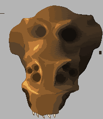
Date Posted: 24 July 2008 at 7:31am
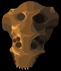
even though this post is way old cause i havnt done anything in a while, im going to update it, i think youll find it better now, but all i have to say is it looks kinda like gold, but maybe ill make a bright sun somwhere, but i hue shifted now so wtv, it looks way less flat now, but you guys decide
 the eyes are still very WIP
EDIT: i just realised it looks C64 ish, colourwise
------------- http://www.moddb.com/games/10088/ddf-side-scrolling-shooter - Check out my SHMUP |
Posted By: QuaziGNRLnose
Date Posted: 25 July 2008 at 12:40pm
|
This article has moved to pixelation after way too much lack of intrest in this forum, find it there. ------------- http://www.moddb.com/games/10088/ddf-side-scrolling-shooter - Check out my SHMUP |