| Active TopicsSearchRegisterLogin |
| WIP (Work In Progress) | |
| |
  |
| Page of 2 Next >> |
| Author | Message |
|
CELS
Commander 
Joined: 23 September 2022 Online Status: Offline Posts: 758 |
  Topic: Some kind of monster / fantasy scene Topic: Some kind of monster / fantasy scenePosted: 18 October 2011 at 7:05pm |
|
Drawing this monster here, inspired by a monster from Castlevania (at 00:40) and the Beauty & the Beast, and one of Theoden's pixel art pieces.
I'm really not sure what I want to do with this. I want to leave the face obscured, but it might be boring to just do a silhouette. Time will tell. 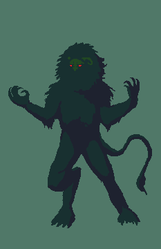 The pose is kind of a primal "rawr, I'm gonna eat you" thing at the moment. Not quite howling at the moon, but in the same vein. Edited by CELS - 29 October 2011 at 4:57am |
|
 IP Logged IP Logged |
|
|
mdog95
Commander
Joined: 14 December 2017 Online Status: Offline Posts: 150 |
Posted: 18 October 2011 at 7:08pm |
|
It looks good for a start. I recommend organizing your palette by hue, saturation, value, red, green, and blue though. It makes it easier to work with.
|
|
|
IP Logged |
|
|
CELS
Commander
Joined: 23 September 2022 Online Status: Offline Posts: 758 |
Posted: 18 October 2011 at 7:10pm |
|
Thanks. The palette is just leftovers from my gameboy piece, which I forgot to edit out, it doesn't really have anything to do with this.
|
|
|
IP Logged |
|
|
mdog95
Commander
Joined: 14 December 2017 Online Status: Offline Posts: 150 |
Posted: 18 October 2011 at 7:15pm |
|
Oh, okay.
|
|
|
IP Logged |
|
|
onek
Commander
Joined: 19 May 2009 Online Status: Offline Posts: 416 |
Posted: 19 October 2011 at 4:04am |
|
ur quite improving
i like the colors as they are... the eyes stand out nicely against the green anatomy is kinda of tho... the feet should be further apart now he doesnt seem very balanced his left arm should be foreshortened more hips and shoulder slightly angled and less straight 
|
|
|
IP Logged |
|
|
Alex Pang
Commander
Joined: 23 February 2025 Online Status: Offline Posts: 224 |
Posted: 19 October 2011 at 6:06am |
|
Good work, the only thing I don't like is the left hand it seems unfitting...
|
|
|
IP Logged |
|
|
Sahrab
Midshipman 
Joined: 12 October 2011 Online Status: Offline Posts: 52 |
Posted: 19 October 2011 at 7:35am |
|
too hairy :P i saw some place a monster like this the neck part was a bit darker with more a coat fell to it
|
|
|
IP Logged |
|
|
onek
Commander
Joined: 19 May 2009 Online Status: Offline Posts: 416 |
Posted: 19 October 2011 at 7:42am |
|
@ Sahrab
thats no critic, just a matter of taste it doesnt matter what YOU saw somewhere.. and if CELS picture looks anything like it O_O if he wants it hairy its his choice... id say make it even more hairy! :D Edited by onek - 19 October 2011 at 7:43am |
|
|
IP Logged |
|
|
Sahrab
Midshipman
Joined: 12 October 2011 Online Status: Offline Posts: 52 |
Posted: 19 October 2011 at 8:04am |
|
again you misunderstand me im just saying i saw a design with a coat like fur didnt say YOUR SUCKS MAKE THE ONE I SAW im just saying i saw this guy somewhere quote cels castlevania 40:0 :) and too hairy was supposed to be a joke hence the monster being like a werewolf and the :P
|
|
|
IP Logged |
|
|
CELS
Commander
Joined: 23 September 2022 Online Status: Offline Posts: 758 |
Posted: 19 October 2011 at 7:24pm |
|
Thanks for your comments, guys :)
Onek, your edit is as useful as always. I've tried to follow your suggestions, with a few modifications. He may be slightly out of balance still, but I wanted the pose to be dynamic and imply a sense of motion like the monster is bursting out of the shadows, rather than standing still and howling at the moon. I hope the compromise looks alright. The only thing I left untouched is the right arm, as I feel the extended arm looks more threatening. The shoulders are fairly square (i.e. we're seeing him from the front, not the side), so I figure the arm should be pointing to the side. I tried to fix the legs, the hips and the left arm. 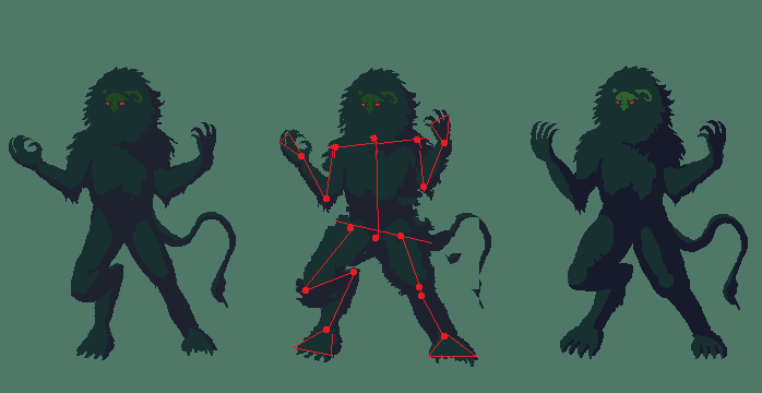 I may shrink this image to 50%, so I can do a nice background without spending weeks. My last image was so big that it got sloppy towards the end, and I lost pixel control.  Edited by CELS - 19 October 2011 at 7:24pm |
|
|
IP Logged |
|
|
onek
Commander
Joined: 19 May 2009 Online Status: Offline Posts: 416 |
Posted: 19 October 2011 at 7:31pm |
|
hooray for shrinking!
|
|
|
IP Logged |
|
|
Friend
Commander
Joined: 01 April 2015 Online Status: Offline Posts: 710 |
Posted: 19 October 2011 at 7:38pm |
|
For some reason, the face looks the awkward to me. It's like, at an improper angle compared to what angle I imagine his neck to be at.
And, just saying, you have 3 WIP's :^ ] (mwahaha) Edited by Frost Butt - 19 October 2011 at 8:02pm |
|
|
IP Logged |
|
|
CELS
Commander
Joined: 23 September 2022 Online Status: Offline Posts: 758 |
Posted: 19 October 2011 at 7:47pm |
|
"The worst"? That's an interesting way of putting it.
 I will do more work on the face, but I don't quite understand what you mean. The shoulders are square and the face is roughly in the middle, slightly to the left (as it's looking slightly to the left). How would you have me change it? At the moment, I have 3 WIPs. All my previous 7 or 8 WIP threads have resulted in gallery submissions. I think that should be alright.  |
|
|
IP Logged |
|
|
Friend
Commander
Joined: 01 April 2015 Online Status: Offline Posts: 710 |
Posted: 19 October 2011 at 8:00pm |
|
Gah I didn't mean it like that!! I dunno.. Maybe it's where it's sitting in the big ball of fur.. It's like you should be seeing much more of the right horn, and his face should be slightly to the right and down. Maybe I'm just looking at the silhouette incorrectly
K I think I know what's wrong now. You have the huge puff of fur around his face in a very round shape and symmetrical position that really suggests that his face is straight forward portrait style , but his face is drawn to be looking off to the side Edited by Frost Butt - 19 October 2011 at 8:08pm |
|
|
IP Logged |
|
|
CELS
Commander
Joined: 23 September 2022 Online Status: Offline Posts: 758 |
Posted: 19 October 2011 at 8:50pm |
|
Ah, that's what, I thought you meant. Hopefully others can voice their agreements or disagreements, because I don't quite see what you're seeing. As I see it, the face is not in a symmetrical position, it's quite a few pixels to the side already.
I may be wrong though, or there may be another problem.  WIP background: 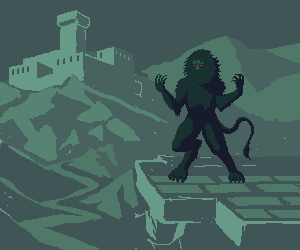 (I know the perspective is FUBAR, it's just for an idea of composition) Edited by CELS - 20 October 2011 at 4:36am |
|
|
IP Logged |
|
|
Sahrab
Midshipman
Joined: 12 October 2011 Online Status: Offline Posts: 52 |
Posted: 20 October 2011 at 4:50am |
|
got a idea maybe you well like it maybe put a flashlight ( not sure the name) the ones from prisons etc poiting towards him ? giving it nazi experemints feeling ? just an idea
|
|
|
IP Logged |
|
|
CELS
Commander
Joined: 23 September 2022 Online Status: Offline Posts: 758 |
Posted: 20 October 2011 at 6:10pm |
|
Originally posted by Sahrab got a idea maybe you well like it maybe put a flashlight ( not sure the name) the ones from prisons etc poiting towards him ? giving it nazi experemints feeling ? just an idea Thanks, but I'm going for a fantasy / medieval thing, not nazi experiments :) 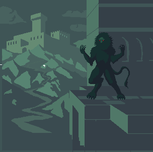 Edited by CELS - 20 October 2011 at 8:11pm |
|
|
IP Logged |
|
|
Sahrab
Midshipman
Joined: 12 October 2011 Online Status: Offline Posts: 52 |
Posted: 22 October 2011 at 4:38am |
|
bunch of lights with torches ? and one of them pointing at the beast ??
|
|
|
IP Logged |
|
|
Sahrab
Midshipman
Joined: 12 October 2011 Online Status: Offline Posts: 52 |
Posted: 22 October 2011 at 9:13am |
|
^ meant knights
|
|
|
IP Logged |
|
|
reis
Commander
Joined: 13 March 2014 Online Status: Offline Posts: 118 |
Posted: 22 October 2011 at 4:56pm |
|
Liven up monster, more colors, more detail. I know this is a technique, but to innovate.
|
|
|
IP Logged |
|
|
Alex Pang
Commander
Joined: 23 February 2025 Online Status: Offline Posts: 224 |
Posted: 23 October 2011 at 2:39am |
|
Lover the saturation on the monster, it pops out to much, it looks like hes on totally different plane(level(layer))...
|
|
|
IP Logged |
|
|
Partack
Commander
Joined: 20 October 2011 Online Status: Offline Posts: 260 |
Posted: 23 October 2011 at 3:58am |
|
Great work so far but I noticed a few things that I'd like to point out if I may.
The edit to the leg with the red dots showed the hind leg on the left going more upwards/diagonal than you have edited it to. you made the top rather flat and still looks awkward to me. kinda like, |_ Your edit / | . '/ red dot edit (if that makes sense) The beast still looks..... I don't know.. calm.. Like.. it's just standing there with its arms up for some reason. The anatomy is great but the pose is .. not so much. Perhaps you might consider flexing the beasts muscles a little more to give the arms being raised more purpose? or clenching its claws/fists to show some power or anger? the beast looks muscular which is why I suggested the flexing. Based on your background (very nice by the way - great perspective and sizing) the beast is standing on a building but its left foot is kinda... askew/awkward looking. Perhaps you might consider bending it at the heel? like a _/ and if you do that perhaps you could give it/show a back claw (imagine a chickens foot which has 3 front claws and a back claw) kinda how your beasts foot is but with a back claw. the beasts face reminds me of a yeti's which is awesome I love the bushyness. Perhaps you could give the thick bushy mane a bit more depth somehow? shadowing perhaps in strategic places? maybe suggest where the chin is with shadowing. or not. it's nice how it is really. The beast's brow could perhaps use a LITTLE more definition with a darker tone on the left side to show it protruding OUT of the bushy hole and give it depth and also maybe use that same darker tone on the inside outline of the mane to show the manes depth against the face (showing the face is INSIDE this hole of a bushy mane) or, if the face is protruding OUT of the mane then use that dark colour (or a highlight colour actually, if there is a light source hitting it) on the whole left side of the face to show it protruding OUT of the mane's hole. all this and maybe give the beast toe nails? (just an after thought.) Just throwing out ideas and brainstorming with fresh eyes =) good luck! Edited by Partack - 23 October 2011 at 4:07am |
|
|
IP Logged |
|
|
CELS
Commander
Joined: 23 September 2022 Online Status: Offline Posts: 758 |
Posted: 23 October 2011 at 5:22am |
|
Thanks for your comments, guys :)
Originally posted by Sahrab
bunch of knights with torches ? and one of them pointing at the beast ?? Thanks, but at the moment I'm really looking for things like compositional errors, anatomical errors, etc. It's always good with some input, but comments like "draw a dinosaur", "throw in a zeppelin in the sky" or "make him into a pirate" isn't what I need at the moment. My problem isn't a lack of ideas, it's the inability to carry out my ideas. Originally posted by luizfelipespr
Liven up monster, more colors, more detail. I know this is a technique, but to innovate. It's still an early WIP, so adding more colors and details is a given. Originally posted by Alex Pang Lover the saturation on the monster, it pops out to much, it looks like hes on totally different plane(level(layer))... Again, this was just an early mock-up to get a sense of composition before adding details and fixing colors. Originally posted by Partack Great work so far but I noticed a few things that I'd like to point out if I may. The edit to the leg with the red dots showed the hind leg on the left going more upwards/diagonal than you have edited it to. you made the top rather flat and still looks awkward to me. I'm not quite sure what you mean. If I draw his leg more diagonal, then his stance will be very broad. Is that better? Originally posted by Partack The beast still looks..... I don't know.. calm.. Like.. it's just standing there with its arms up for some reason. The anatomy is great but the pose is .. not so much. Perhaps you might consider flexing the beasts muscles a little more to give the arms being raised more purpose? or clenching its claws/fists to show some power or anger? the beast looks muscular which is why I suggested the flexing. I see what you mean about it being calm. It's an usual pose, I suppose, as it's clearly doing something, but it's hard to get a sense of what it is exactly. If his head was leaning back, I think it would be very clear that it was howling like a werewolf, for example. And I'm going for something similar, just without the howling. It's just showing off. Originally posted by Partack Based on your background (very nice by the way - great perspective and sizing) the beast is standing on a building but its left foot is kinda... askew/awkward looking. Perhaps you might consider bending it at the heel? and if you do that perhaps you could give it/show a back claw (imagine a chickens foot which has 3 front claws and a back claw) I see what you mean and I've tried to fix it. Of course, it doesn't really have a heel in the same sense as humans do. Its "heel" is as high up as its knee. The back claw was a good idea. The monster is clearly inspired by lions, but I don't want it to look like a lion-man. Originally posted by Partack the beasts face reminds me of a yeti's which is awesome I love the bushyness. Perhaps you could give the thick bushy mane a bit more depth somehow? shadowing perhaps in strategic places? maybe suggest where the chin is with shadowing. or not. it's nice how it is really. The beast's brow could perhaps use a LITTLE more definition with a darker tone on the left side to show it protruding OUT of the bushy hole and give it depth and also maybe use that same darker tone on the inside outline of the mane to show the manes depth against the face (showing the face is INSIDE this hole of a bushy mane) or, if the face is protruding OUT of the mane then use that dark colour (or a highlight colour actually, if there is a light source hitting it) on the whole left side of the face to show it protruding OUT of the mane's hole. How's this? 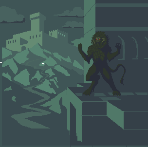 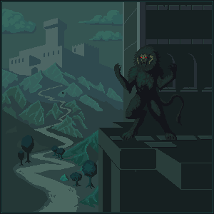 Haven't really worked out the horns yet. Will need to shade them better. Originally posted by Partack
all this and maybe give the beast toe nails? (just an after thought.) Just throwing out ideas and brainstorming with fresh eyes =) good luck! Will definitely work out details like toe nails eventually :) Thanks for your help, it's exactly the kind of feedback I need the most. Edited by CELS - 23 October 2011 at 8:32am |
|
|
IP Logged |
|
|
Friend
Commander
Joined: 01 April 2015 Online Status: Offline Posts: 710 |
Posted: 23 October 2011 at 10:03am |
|
the horns make perfect sense now. You're getting so good! I know it's very much WIP, but I think I prefer the hue to be more purple though-fits the mood a little better, and somehow makes the detail in the face and horns easier to see
 |
|
|
IP Logged |
|
|
Partack
Commander
Joined: 20 October 2011 Online Status: Offline Posts: 260 |
Posted: 23 October 2011 at 10:52am |
|
I think I've got what bothers me about the leg bend, ignore what I said before about it, I believe the bend should be lower. Looking at dogs legs gives you an idea of how it should look, the foot (if you can imagine) would be like a dogs toes and that mid-bend is actually it's ankle. So pretend you're drawing a human foot that's bent
like: | _/ and you might get what I mean.. I kinda preferred this creature with its mouth concealed in it's mane.. ok running out of time so I'll just make a quick sloppy edit and you can get what I mean. not saying you should do any of these, just saying , take a look at them, see if you like any of the ideas. 
will post back later. |
|
|
IP Logged |
|
|
Cyangmou
Midshipman
Joined: 15 December 2022 Online Status: Offline Posts: 68 |
Posted: 23 October 2011 at 12:04pm |
|
Background castle seems to be to big (destroys the depth) and out of the perspective
|
|
|
IP Logged |
|
|
CELS
Commander
Joined: 23 September 2022 Online Status: Offline Posts: 758 |
Posted: 23 October 2011 at 5:06pm |
|
Originally posted by Frost Butt the horns make perfect sense now. You're getting so good! I know it's very much WIP, but I think I prefer the hue to be more purple though-fits the mood a little better, and somehow makes the detail in the face and horns easier to see Thanks! I see what you're saying, and I agree that it creates nice contrast, but the green colours were a conscious choice because blue is more realistic. I wanted this to look more alien and mysterious, like a fairy tale. Also, I like to work with different colours and I've already done something in a blue / purple background (the tower above the clouds, don't know if you remember) Originally posted by Partack I think I've got what bothers me about the leg bend, ignore what I said before about it, I believe the bend should be lower. Looking at dogs legs gives you an idea of how it should look, the foot (if you can imagine) would be like a dogs toes and that mid-bend is actually it's ankle. So pretend you're drawing a human foot that's bent Ah, I see what you're saying now. Actually, I absolutely agree with you. The leg looks much better now. I was imitating werewolf art, you see, and they're often drawn with this silly long legs. As for the clenched fists, I think this makes it look like more of a yeti / human monster, and not so beastlike. Claws make it scarier, I think. Even if the clenched fists make the pose seem more natural. Originally posted by Partack
I kinda preferred this creature with its mouth concealed in it's mane.. Actually, I very much agree with this. I just couldn't for the life of me figure out how to leave so much of its face concealed whilst adding more depth and detail to the head and body. If you look at the reference I used from the Castlevania trailer, it's basically just a silhouette with glowing eyes and a visible brow / nose. Would it be better to just leave it a silhouette? Originally posted by Cyangmou
Background castle seems to be to big (destroys the depth) and out of the perspective Hm, you're right about the size. It really annoys me when I don't consider such obvious things. But I'm not sure about the perspective. This is the first time I've drawn a perspective drawing with vanishing points, where the walls of the buildings weren't parallel. So I did some research on drawing perspective with different angles and found this. http://www.ski.org/CWTyler_lab/CWTyler/Art%20Investigations/ART%20PDFs/TylerTwoPointHoropter.pdf (Page 3) I tried to imitate that, like this. 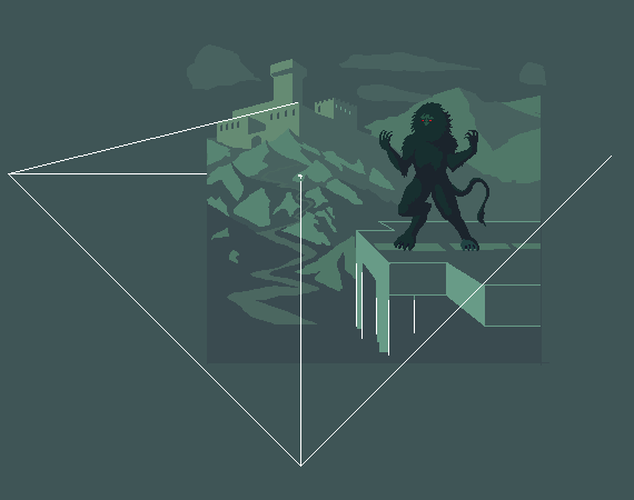 Edited by CELS - 23 October 2011 at 5:16pm |
|
|
IP Logged |
|
|
Friend
Commander
Joined: 01 April 2015 Online Status: Offline Posts: 710 |
Posted: 23 October 2011 at 5:15pm |
|
yes, duh I remember. I'm interested on what time of day the piece is meant to be in though. I'll just wait and find out. DON'T SPOIL THE SURPRISE.
 |
|
|
IP Logged |
|
|
Cyangmou
Midshipman
Joined: 15 December 2022 Online Status: Offline Posts: 68 |
Posted: 24 October 2011 at 4:53am |
|
jus of course you are right with the vanishing points, the position of them is right, but in this case you have to be consequent with your lines too. Check out some of the castles angles and especially the angle of the two square column things beneath the monster.
 The thing which is bugging about the castles size is that the tower itself seems to be bigger than a single mountain. THe small foreground trees'd fit in terms of size exactly to the castle, but the castle is further away then the trees. I'd sugest to increase the size of the trees in the foreground while decreasing the size of the castle. Furthermore it could be interesting adding perspective with more trees with always getting smaller to the castle. Also for the hills the size increasing and decreaing with the perspective would be a goold idea, also for the path. I played a bit further around with it just because I had the feeling there is something which really bugs me, e.g I changed the resolution (made it higher) and mirrored the whole thing. After the mirroring I reminded that the central perspective is leading away the watcher's eye from the monster right back to the castle (which gets now pretty important) and I think that this isn't rather good for the whole composition if you want to have the attention at the monster. The black background behind the monster decreases the readbility of it drastically, and it gets even lesser important. I think the composition of the piece has huge priority issues caused by the perspective as it is now.  left one has some of the things in it I reminded, but you won't see most of the composition issues as clear as in the right one. I guess you should really think about the composition and maybe redo all of to get the right composition. Or you could use the background with the castle as single piece (this'd work very well) and use the monster in some other illustration. Edited by Cyangmou - 24 October 2011 at 5:11am |
|
|
IP Logged |
|
|
Partack
Commander
Joined: 20 October 2011 Online Status: Offline Posts: 260 |
Posted: 24 October 2011 at 11:51am |
|
Hay what happened to this post? I couldn't see it on page 1 any more.. just a quick note, I think you're right about the claws. They're much better pointing out, I like them more today than I did yesterday. do what you feel with the face hole in the mane, I think it was great before all the shading. those creepy eyes peering out from a bushy hair ball thing.
Glad you liked the leg, good luck with the perspective. my vanishing point stuff is pretty terrible so I wouldn't have been able to point that out nor can I comment on it. hope to see this finished sometime 
|
|
|
IP Logged |
|
|
CELS
Commander
Joined: 23 September 2022 Online Status: Offline Posts: 758 |
Posted: 25 October 2011 at 1:00am |
|
Originally posted by Cyangmou
jus of course you are right with the vanishing points, the position of them is right, but in this case you have to be consequent with your lines too. Check out some of the castles angles and especially the angle of the two square column things beneath the monster. Thanks, you're quite right, although some parts were just shoddily drawn. My WIPs are a bit messy.
Originally posted by Cyangmou The thing which is bugging about the castles size is that the tower itself seems to be bigger than a single mountain. THe small foreground trees'd fit in terms of size exactly to the castle, but the castle is further away then the trees. I'd sugest to increase the size of the trees in the foreground while decreasing the size of the castle. Furthermore it could be interesting adding perspective with more trees with always getting smaller to the castle. Also for the hills the size increasing and decreaing with the perspective would be a goold idea, also for the path. I agree on all counts. :)
Originally posted by Cyangmou I played a bit further around with it just because I had the feeling there is something which really bugs me, e.g I changed the resolution (made it higher) and mirrored the whole thing. After the mirroring I reminded that the central perspective is leading away the watcher's eye from the monster right back to the castle (which gets now pretty important) and I think that this isn't rather good for the whole composition if you want to have the attention at the monster. The black background behind the monster decreases the readbility of it drastically, and it gets even lesser important. I think the composition of the piece has huge priority issues caused by the perspective as it is now. Yes, it's quite bad and suffers from the fact that I was trying to draw a background around a creature shaded in a way I don't understand. I mean, the nearest building was just there as an attempt to make sense of the near silhouette form of the monster, but it doesn't really work in terms of composition, as you say.
Originally posted by Cyangmou left one has some of the things in it I reminded, but you won't see most of the composition issues as clear as in the right one. I guess you should really think about the composition and maybe redo all of to get the right composition. Or you could use the background with the castle as single piece (this'd work very well) and use the monster in some other illustration. You're quite right. I'll do the latter. I'll try to finish the background first and then come back to the monster. Though I have no idea what kind of background is needed to make sense of the way it's shaded. It's basically a silhouette, except that the nose and brow is lit by some strange light source. I could draw it without a background, of course, but I really want to figure this out. Bah!
Originally posted by Partack Hay what happened to this post? I couldn't see it on page 1 any more.. just a quick note, I think you're right about the claws. They're much better pointing out, I like them more today than I did yesterday. do what you feel with the face hole in the mane, I think it was great before all the shading. those creepy eyes peering out from a bushy hair ball thing. Glad you liked the leg, good luck with the perspective. my vanishing point stuff is pretty terrible so I wouldn't have been able to point that out nor can I comment on it. hope to see this finished sometime Thanks for finding the thread again, I guess the forum was scrambled after some spam bot. Hopefully, I can finish the monster again soon and restore it to the original vision without trying to find a compromise that works with this background. Edited by CELS - 25 October 2011 at 3:33am |
|
|
IP Logged |
|
|
Partack
Commander
Joined: 20 October 2011 Online Status: Offline Posts: 260 |
Posted: 25 October 2011 at 1:22am |
|
Perhaps you're over thinking this, CELS. When I draw anything, I generally wanna get the lineart/general shapes of stuff done first. The shading and light comes after and even then it's just a matter of having a quick think about where the light is coming from. Pick a spot for your light source(s) and their colour, then *boom* that's all you need really.. I admire your diligence though on wanting to do this 'properly' and looking at every aspect. Were it me I'd have drawn my beast, drawn the background on a separate layer (layers still count as pixel art ;P) then based on the scene shaded and coloured and be damned to thinking too much into it.
Everyone has their own style and methods I guess.  Edited by Partack - 25 October 2011 at 1:23am |
|
|
IP Logged |
|
|
CELS
Commander
Joined: 23 September 2022 Online Status: Offline Posts: 758 |
Posted: 25 October 2011 at 9:08am |
|
Originally posted by Partack Perhaps you're over thinking this, CELS. When I draw anything, I generally wanna get the lineart/general shapes of stuff done first. The shading and light comes after and even then it's just a matter of having a quick think about where the light is coming from. Pick a spot for your light source(s) and their colour, then *boom* that's all you need really.. I admire your diligence though on wanting to do this 'properly' and looking at every aspect. Were it me I'd have drawn my beast, drawn the background on a separate layer (layers still count as pixel art ;P) then based on the scene shaded and coloured and be damned to thinking too much into it. Everyone has their own style and methods I guess. I appreciate the input. I'll try not to over think things from here on out 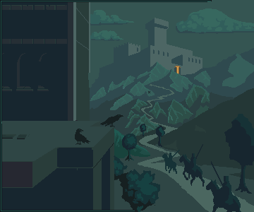 Another WIP. Note that I haven't really fixed the castle or hills yet. Edited by CELS - 25 October 2011 at 9:08am |
|
|
IP Logged |
|
|
Gecimen
Admiral 
Joined: 17 October 2021 Online Status: Online Posts: 3856 |
Posted: 25 October 2011 at 3:49pm |
|
The castle is not too big but the tower inside it is too high for that perspective.
There's a problem with the monster's hip. It's too high. Its abdomen looks just under his chest. Edited by Gecimen - 25 October 2011 at 3:49pm |
|
|
IP Logged |
|
|
Partack
Commander
Joined: 20 October 2011 Online Status: Offline Posts: 260 |
Posted: 25 October 2011 at 4:17pm |
|
love the army peoples and the crows =) castle could use a little more detail (dunno how though =<) I'm loving the choice of colours for your shading by the way. The purples and blues and greens are all coming together nicely.
'Tell you what, that one cloud up in the top right kinda bothers me.. I don't know why but it could be a little more whispy or something.. it looks like a picture/cardboard stuck ontop of your sky or something. maybe it's the dark shadow going along the bottom? maybe the clouds shape? I hate you cloud and I don't know why! 
|
|
|
IP Logged |
|
|
CELS
Commander
Joined: 23 September 2022 Online Status: Offline Posts: 758 |
Posted: 27 October 2011 at 7:28am |
|
Originally posted by Gecimen
The castle is not too big but the tower inside it is too high for that perspective. There's a problem with the monster's hip. It's too high. Its abdomen looks just under his chest. Agreed on the castle. Thanks for the comment on the monster, I will take a look at this. Originally posted by Partack love the army peoples and the crows =) castle could use a little more detail (dunno how though =<) I'm loving the choice of colours for your shading by the way. The purples and blues and greens are all coming together nicely. 'Tell you what, that one cloud up in the top right kinda bothers me.. I don't know why but it could be a little more whispy or something.. it looks like a picture/cardboard stuck ontop of your sky or something. maybe it's the dark shadow going along the bottom? maybe the clouds shape? I hate you cloud and I don't know why! Thank you! I agree on all counts. I have tried to draw the clouds in a different way. I could improve on the original design, but I think I prefer it something like this. 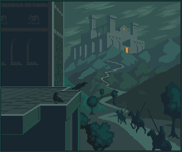 Also, this. |
|
|
IP Logged |
|
|
jalonso
Admiral
Joined: 29 November 2022 Online Status: Offline Posts: 13537 |
Posted: 27 October 2011 at 8:08am |
|
I think the clouds are too linear and follow the angle of the castle too closely. Try loose and flowy. Kinda like the bottom tree is but introducing circles and arcs into the composition. Perhaps the sky should only use gray colors and almost blend with the castle to introduce mist/fog/mystery????
Of course the castle at about 60-70% of the current size would make the mountain range more imposing and properly weighed in. |
|
|
|
|
|
IP Logged |
|
|
Gecimen
Admiral
Joined: 17 October 2021 Online Status: Online Posts: 3856 |
Posted: 27 October 2011 at 1:26pm |
|
Not defying what Jal has said but all around I like the castle/clouds/hills.
The front building looks like a modern one. Maybe lots of cracks etc. would make it look better. |
|
|
IP Logged |
|
|
CELS
Commander
Joined: 23 September 2022 Online Status: Offline Posts: 758 |
Posted: 28 October 2011 at 6:21am |
|
Originally posted by jalonso
I think the clouds are too linear and follow the angle of the castle too closely. Try loose and flowy. Kinda like the bottom tree is but introducing circles and arcs into the composition. Perhaps the sky should only use gray colors and almost blend with the castle to introduce mist/fog/mystery???? Of course the castle at about 60-70% of the current size would make the mountain range more imposing and properly weighed in. I didn't even consider the direction of the clouds, it just seemed to fit. I've tried something more loose and flowy with arcs, also tried to introduce a bit of fog. I have kept the castle rather large, for my own mysterious reasons. Same as my previous large castle pixels. Originally posted by Gecimen Not defying what Jal has said but all around I like the castle/clouds/hills. The front building looks like a modern one. Maybe lots of cracks etc. would make it look better. Well, cool to get a second opinion. Maybe if this doesn't look good, I'll try to find a compromise. I was already planning to do the front building as ruins, so stay tuned for that. (I'm just putting it off as it's going to be complicated to do rubble in perspective) 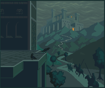 Notice the general lack of progress, except for the clouds and castle tweeks. That's because I lost a good 3 hours of work due to my laptop falling to the ground. Does grafx2 have an autosave option?  Edited by CELS - 28 October 2011 at 6:22am |
|
|
IP Logged |
|
|
jalonso
Admiral
Joined: 29 November 2022 Online Status: Offline Posts: 13537 |
Posted: 28 October 2011 at 6:37am |
|
If the castle is the size you like and wish to keep then the mountain below it needs some attention when coloring and detailing so they visually fit each other. Something between the mountain and castle seems disproportionate to me.
The sky looks better but is still on a flat 2D plane. I think a sky that adds depth will help the piece. I know its touting my own piece but check THIS sky and THIS one for pieces that have skies that add depth using very few colors. |
|
|
|
|
|
IP Logged |
|
|
Gecimen
Admiral
Joined: 17 October 2021 Online Status: Online Posts: 3856 |
Posted: 28 October 2011 at 7:40am |
|
This is an old crappy piece of mine. It might be a reference for bricks.
|
|
|
IP Logged |
|
|
CELS
Commander
Joined: 23 September 2022 Online Status: Offline Posts: 758 |
Posted: 28 October 2011 at 12:00pm |
|
Originally posted by jalonso If the castle is the size you like and wish to keep then the mountain below it needs some attention when coloring and detailing so they visually fit each other. Something between the mountain and castle seems disproportionate to me. I agree in regards to the color and detailing. Will fix that. Originally posted by jalonso The sky looks better but is still on a flat 2D plane. I think a sky that adds depth will help the piece. I know its touting my own piece but check THIS sky and THIS one for pieces that have skies that add depth using very few colors. You may not believe this, but I was actually already using those two very images as a reference. I tried the latter first, but couldn't imitate it very well, then tried to imitate the sky from the factory level. While mine isn't as pretty, I'm sure you'll see a slight resemblance. The problem is, I'm not sure how to achieve depth whilst still keeping the misty, foggy feeling. If I create too much contrast in the clouds, then the air will seem clear, right? And how can I achieve depth without creating more contrast in hue and brightness? Originally posted by Gecimen
This is an old crappy piece of mine. It might be a reference for bricks. Another one not afraid to promote his own work I'm just kidding, that's actually very helpful. I'll post later tonight with some progress.EDIT: Remind me never to pixel again without using a defined palette from beginning to end. Just spent an hour trying to rearrange my mess of a palette into something half-sensible. Also made some minor changes here and there. Will now address the bigger issues. <rolls up sleeves> 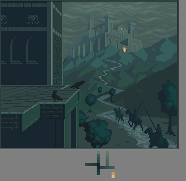 Edited by CELS - 28 October 2011 at 3:33pm |
|
|
IP Logged |
|
|
CELS
Commander
Joined: 23 September 2022 Online Status: Offline Posts: 758 |
Posted: 29 October 2011 at 4:56am |
|
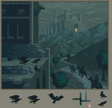
Started reworking the closest building as ruins, to increase the ominous feeling I'm trying to achieve here. I'm starting to like this now. It's got a Diablo-feeling about it. I hope I can get that across somehow.
Now to rework the hills, trees and sky. 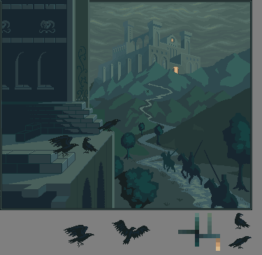 |
|
|
IP Logged |
|
|
Gecimen
Admiral
Joined: 17 October 2021 Online Status: Online Posts: 3856 |
Posted: 29 October 2011 at 9:58am |
|
The one yesterday looks in the right direction. The latest one looks
more like construction more than ruins. Can't put a hyperlink so this is how a ruined brick wall
looks like: http://en.wikipedia.org/wiki/File:St_Andrews_Cathedral_Ruins_Front.jpg
|
|
|
IP Logged |
|
|
Delicious
Rear Admiral 
Joined: 18 January 2015 Online Status: Offline Posts: 273 |
Posted: 29 October 2011 at 4:26pm |
|
I agree with Gecimen on that. However, so far this is really awesome. Make sure to do some drastic shadows on those crows and riders. Keep up the excellent work.
|
|
|
IP Logged |
|
|
CELS
Commander
Joined: 23 September 2022 Online Status: Offline Posts: 758 |
Posted: 29 October 2011 at 5:45pm |
|
Thanks for your help, guys.
I definitely see your point about the construction look. Hopefully, these new changes are a step in the right direction. Will probably need to add more rubble, moss and cracks, and also some discoloration. Will definitely be adding some dramatic shadows in time! 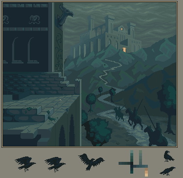 Edited by CELS - 29 October 2011 at 6:57pm |
|
|
IP Logged |
|
|
Delicious
Rear Admiral
Joined: 18 January 2015 Online Status: Offline Posts: 273 |
Posted: 30 October 2011 at 2:06am |
|
Definitely better. I feel as though the blocks at top stand out because of their outline, which makes them stand out and seem like they're just being constructed rather apart of the building as a ruin.
|
|
|
IP Logged |
|
|
CELS
Commander
Joined: 23 September 2022 Online Status: Offline Posts: 758 |
Posted: 30 October 2011 at 5:05am |
 Tried to improve a bit on that. Will continue to work on the ruins. Right now, I'm just flicking around, adding shade, shadows and details. Maybe put some more trees in. I feel that the horses' anatomy could be better, but I can't find good reference pictures to help. It's a rather unusual angle, so Google isn't of much help. If there are some other errors I've made, please don't be shy. :) Edited by CELS - 30 October 2011 at 5:08am |
|
|
IP Logged |
|
|
Qemist
Commander
Joined: 31 August 2019 Online Status: Offline Posts: 239 |
Posted: 30 October 2011 at 5:11am |
|
The perspective.. it really made it all feel weird to me when I was looking at it. :)

|
|
|
IP Logged |
|
|
Cyangmou
Midshipman
Joined: 15 December 2022 Online Status: Offline Posts: 68 |
Posted: 30 October 2011 at 5:35am |
|
@Quemist: perspective is right, we don't have use a simplified cavalier projection here, CELS works with vanishing points, it's ok.
|
|
|
IP Logged |
|
| Page of 2 Next >> |
| |
||
Forum Jump |
You cannot post new topics in this forum You cannot reply to topics in this forum You cannot delete your posts in this forum You cannot edit your posts in this forum You cannot create polls in this forum You cannot vote in polls in this forum |
|
