| Active TopicsSearchRegisterLogin |
| WIP (Work In Progress) | |
| |
  |
| Author | Message |
|
Turon
Commander 
Joined: 03 March 2016 Online Status: Offline Posts: 128 |
  Topic: Weird World WIP Topic: Weird World WIPPosted: 04 May 2015 at 4:43am |
|
Hey all its been awhile I know (computer breakdown). I decided to take a break from my main project and work on this weird surreal themed game... what I have here is a strange merge between aboveground and underwater scenery and more land based physics...
What do you think about it? how can I improve it? I need a few pointers on the leaves of that tree, I wanted The leaves of that tree to look "furry" I'm not so sure I got the desired effect... 
Current State: 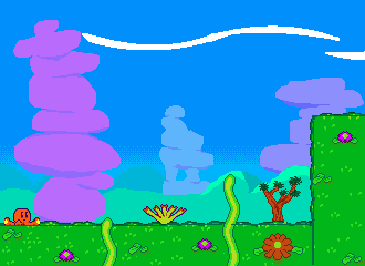 Edited by Turon - 23 June 2015 at 12:46am |
|
 IP Logged IP Logged |
|
|
Palocles
Midshipman 
Joined: 02 December 2013 Online Status: Offline Posts: 65 |
Posted: 04 May 2015 at 11:00pm |
|
It looks like a cross between side view and top view. Is it supposed to be like that?
I guess the tree kinda looks furry but when I read that I imagined a pine tree, that tree is "tufty". |
|
|
IP Logged |
|
|
Turon
Commander
Joined: 03 March 2016 Online Status: Offline Posts: 128 |
Posted: 04 May 2015 at 11:05pm |
|
Have you ever played "Kirby's Mass Attack"? The ground is supposed to be along the side so all those bits of grass and flowers are growing out of a steep incline like a "green wall".
|
|
|
IP Logged |
|
|
Limes
Commander
Joined: 15 September 2021 Online Status: Offline Posts: 683 |
Posted: 05 May 2015 at 7:29am |
|
Keep in mind that things in the background shouldn't pop as much as the foreground therefore you shouldn't use the same colors.
1 example why is the grass in the background lighter then the foreground and the purple rocks stick out to much. Edited by Limes - 05 May 2015 at 7:30am |
|
|
|
|
|
IP Logged |
|
|
Turon
Commander
Joined: 03 March 2016 Online Status: Offline Posts: 128 |
Posted: 05 May 2015 at 9:46am |
|
Do I make the foreground dark and the background light or is it the other way round?
|
|
|
IP Logged |
|
|
r1k
Commander
Joined: 01 April 2014 Online Status: Offline Posts: 336 |
Posted: 06 May 2015 at 12:14am |
|
things become closer to the sky/background color as they get further away. Depending on your scene this can mean getting darker, or lighter.
|
|
|
IP Logged |
|
|
Limes
Commander
Joined: 15 September 2021 Online Status: Offline Posts: 683 |
Posted: 06 May 2015 at 9:49am |
|
Pay attention to the desaturation on more distant objects.

|
|
|
|
|
|
IP Logged |
|
|
Turon
Commander
Joined: 03 March 2016 Online Status: Offline Posts: 128 |
Posted: 10 May 2015 at 11:17am |
|
Something more like this?
|
|
|
IP Logged |
|
|
Turon
Commander
Joined: 03 March 2016 Online Status: Offline Posts: 128 |
Posted: 11 May 2015 at 11:01am |
|
Shall I also put sections of exposed rock on the clifface to remind players it's a sidescroller?
|
|
|
IP Logged |
|
|
Damian
Commander
Joined: 24 February 2023 Location: United Kingdom Online Status: Offline Posts: 455 |
Posted: 11 May 2015 at 3:39pm |
|
Having a shadow south facing beneath objects like the flowers might help too.
|
|
|
IP Logged |
|
|
Turon
Commander
Joined: 03 March 2016 Online Status: Offline Posts: 128 |
Posted: 18 May 2015 at 11:58am |
|
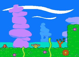
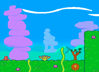
Hows this then? I've fixed the color.

|
|
|
IP Logged |
|
|
eishiya
Commander
Joined: 04 August 2022 Online Status: Offline Posts: 1109 |
Posted: 19 May 2015 at 6:00am |
|
The new desaturation is better, but everything is still too close to the foreground in colour and value. You have as much contrast in the background as in the foreground, and that's why it's hard to tell which is which.
I also think having the flowers on the side is weird. Perhaps if you showed them from the side or from 3/4, so that it looks like they're growing on an inclined surface and we're looking from the side, rather than that we're looking from above? |
|
|
IP Logged |
|
|
Turon
Commander
Joined: 03 March 2016 Online Status: Offline Posts: 128 |
Posted: 19 May 2015 at 12:05pm |
|
er... what do you mean by "3/4"? is it an angle?
Edited by Turon - 19 May 2015 at 12:06pm |
|
|
IP Logged |
|
|
Turon
Commander
Joined: 03 March 2016 Online Status: Offline Posts: 128 |
Posted: 22 May 2015 at 2:02am |
|
I must clarify what do you mean by "You have as much contrast in the background as in the foreground, and that's why it's hard to tell which is which".
|
|
|
IP Logged |
|
|
eishiya
Commander
Joined: 04 August 2022 Online Status: Offline Posts: 1109 |
Posted: 22 May 2015 at 5:39am |
|
Contrast is the difference between the colours of things (value contrast, the difference between light and dark, is the biggest issue in your case). Higher contrast makes things read more clearly, but it's distracting. So, you want less contrast in the background, so that the foreground reads clearly against it.
By 3/4 I mean the viewing angle, yes. Your flowers look like they're viewed from directly above, even though the rest of the scene is in profile/side-on view. |
|
|
IP Logged |
|
|
Turon
Commander
Joined: 03 March 2016 Online Status: Offline Posts: 128 |
Posted: 22 May 2015 at 12:30pm |
|
so your saying the background would look better with fewer colors and less contrast?
|
|
|
IP Logged |
|
|
r1k
Commander
Joined: 01 April 2014 Online Status: Offline Posts: 336 |
Posted: 22 May 2015 at 2:09pm |
|
heres a big image I made to explain everything you need to know. In the top part of the image I just sampled light and shadow colors from the foreground and background, in your image and in a photograph.
Compare the value contrast of the light and shadow colors between the foreground and background in the photo, to yours. You can easily see in the photo there is more contrast in the foreground, the shadows are much darker. As things get further away, you can basically imagine a semi-transparent layer of sky color covering things. The further away things are, the more opaque this sky layer will be, until they are so far away the sky layer is 100% opaque and you cannot see them at all. I demonstrate this in the second part of the image, by actually putting semi transparent layers of sky color of the images at 20, 40 and 60% opacity. In the third part of the image I compare the colors I sampled from the foreground on the photo earlier, with the colors sampled from the background, and a new set of colors sampled from the foreground image with a layer of 60% opacity sky over it. You can see that the colors we got just by putting that transparent layer over the foreground are pretty close to what the background colors actually are. of course, you dont have to make your background colors by strictly applying transparent layers over the foreground, you have more freedom to do what you want in art, but it should serve as a good general guideline.  Edited by r1k - 22 May 2015 at 2:37pm |
|
|
IP Logged |
|
|
AKA_Mathieu
Midshipman
Joined: 20 August 2017 Online Status: Offline Posts: 20 |
Posted: 22 May 2015 at 2:28pm |
|
Did I miss something or did you switch "foreground" and "background"in your picture?
Anyways, your explanation is really great, thks. Edit: Thank you for the review  Edited by AKA_Mathieu - 22 May 2015 at 11:13pm |
|
|
IP Logged |
|
|
r1k
Commander
Joined: 01 April 2014 Online Status: Offline Posts: 336 |
Posted: 22 May 2015 at 2:38pm |
|
oops, youre right I did, I think I flipped all the text horizontally after I put them in place. updated the image to fix it.
|
|
|
IP Logged |
|
|
Turon
Commander
Joined: 03 March 2016 Online Status: Offline Posts: 128 |
Posted: 23 May 2015 at 11:12am |
|
looks like I'm not going to get the bright effect from the background that I was looking for... I'm going to have to completely revise the background color...
|
|
|
IP Logged |
|
|
eishiya
Commander
Joined: 04 August 2022 Online Status: Offline Posts: 1109 |
Posted: 23 May 2015 at 12:00pm |
|
I agree that you should change the background colour.
It looks very unnatural being that dark. In reality, the sky doesn't tend to be so dark near the horizon due to dust, water, etc in the atmosphere, it's only that saturated overhead, where there are fewer such particles in the way. So, while the colour itself isn't necessarily unrealistic, it looks weird because humans aren't used to seeing that colour in that context, humans are used to a paler sky closer to the horizon. |
|
|
IP Logged |
|
|
Turon
Commander
Joined: 03 March 2016 Online Status: Offline Posts: 128 |
Posted: 23 May 2015 at 1:42pm |
|
So I can start by simply making the bottom of the background sky lighter and then darker coming up?
|
|
|
IP Logged |
|
|
Turon
Commander
Joined: 03 March 2016 Online Status: Offline Posts: 128 |
Posted: 24 May 2015 at 12:00pm |
|
I have been focusing on the sky/ocean/whatever and the color is lighter at the bottom and darker further up.
I'd admit that the color of the the coral thingies might suck a bit now... 
|
|
|
IP Logged |
|
|
Turon
Commander
Joined: 03 March 2016 Online Status: Offline Posts: 128 |
Posted: 26 May 2015 at 6:35am |
|
something is wrong with the sky right? I mean in the water at least it is lighter closer to the surface...
|
|
|
IP Logged |
|
|
eishiya
Commander
Joined: 04 August 2022 Online Status: Offline Posts: 1109 |
Posted: 26 May 2015 at 7:01am |
|
There's no "sky" underwater.
To be honest, since the beginnig I've been unable to tell whether this is meant to be underwater, or a sea-inspired non-underwater scene. You have what look like land plants all over the place, but the background rocks look underwater. You also have those white things that look like clouds. Underwater, you're right that the water gets darker the deeper it goes, but in a shallow area (such as around a coral reef), there isn't enough of a depth difference to make a noticeable transition. Instead, it's air bubbles and sand/dirt that create the gradient, by the same process as in the sky above the water. So, the "water" will be coloured more similar to the dirt closer to the horizon because we're seeing through more suspended particles, and closer to the sky colour directly overhead because we're seeing through fewer suspended particles. it's not about up or down, it's about how much crud is in the way. It's also not about lighter or darker, but about the colour of the crud. Edited by eishiya - 26 May 2015 at 7:06am |
|
|
IP Logged |
|
|
Turon
Commander
Joined: 03 March 2016 Online Status: Offline Posts: 128 |
Posted: 26 May 2015 at 2:03pm |
|
I guess you could say it's a sea inspired no-underwater landscape...
|
|
|
IP Logged |
|
|
Turon
Commander
Joined: 03 March 2016 Online Status: Offline Posts: 128 |
Posted: 02 June 2015 at 5:50am |
|
I've Changed the flowers a bit...

|
|
|
IP Logged |
|
|
Ottbot
Commander
Joined: 08 September 2015 Online Status: Offline Posts: 108 |
Posted: 02 June 2015 at 7:57am |
|
That subtle change on the angle of the flowers actually makes a huge difference for me
For the outline on the octopus, I'd go with something other than black, it looks a little out of place compared to the other objects in the scene. The dark purply color you used on the middle plant's outline might do? |
|
|
IP Logged |
|
|
Turon
Commander
Joined: 03 March 2016 Online Status: Offline Posts: 128 |
Posted: 02 June 2015 at 11:58am |
|
yes the Octopus.. I came up with this one gameplay concept and made a alpha of "Octopus Game", I wasn't happy with a few concepts of the design so I forgot it for awhile, But now I'm recoding the game and giving it a new and better look like what I have shown you and the Octopus you see is basically a remnant of the old project and I do plan on Making a few tweaks to the sprite of even replacing it with a new one...
Edited by Turon - 22 June 2015 at 9:24am |
|
|
IP Logged |
|
|
Turon
Commander
Joined: 03 March 2016 Online Status: Offline Posts: 128 |
Posted: 04 June 2015 at 7:09am |
|
Been playing around with the colors and I got some texture on the bark of that tree, I'm still unsure about the leaves.
I'm also not too sure on that cyan see floor, is it sand dune? or is it like rock or something?  Edited by Turon - 04 June 2015 at 7:14am |
|
|
IP Logged |
|
|
Turon
Commander
Joined: 03 March 2016 Online Status: Offline Posts: 128 |
Posted: 09 June 2015 at 2:25am |
|
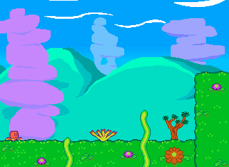
I've been playing around with the background a bit, what do you think?
|
|
|
IP Logged |
|
|
Turon
Commander
Joined: 03 March 2016 Online Status: Offline Posts: 128 |
Posted: 12 June 2015 at 3:58am |
|
do you think it'd look better if the hills were smaller?
|
|
|
IP Logged |
|
|
Turon
Commander
Joined: 03 March 2016 Online Status: Offline Posts: 128 |
Posted: 13 June 2015 at 5:33am |
|
I've made the hills smaller I'll neaten things up further shortly, but as for now what are your thoughts?
|
|
|
IP Logged |
|
|
Limes
Commander
Joined: 15 September 2021 Online Status: Offline Posts: 683 |
Posted: 13 June 2015 at 4:22pm |
|
dont detail the hills like that 2 colors are all it needs.
|
|
|
|
|
|
IP Logged |
|
|
Turon
Commander
Joined: 03 March 2016 Online Status: Offline Posts: 128 |
Posted: 14 June 2015 at 6:12am |
|
Do I get ride of the darker shade of the lighter shade or the highlight?
|
|
|
IP Logged |
|
|
Turon
Commander
Joined: 03 March 2016 Online Status: Offline Posts: 128 |
Posted: 15 June 2015 at 6:11am |
|
the reason there where 3 colors was because this was my inspiration
|
|
|
IP Logged |
|
|
Turon
Commander
Joined: 03 March 2016 Online Status: Offline Posts: 128 |
Posted: 20 June 2015 at 4:08am |
|
So you say it'll look better with 2 colors instead of 3? I don't really understand but what do you make of this?

|
|
|
IP Logged |
|
|
Turon
Commander
Joined: 03 March 2016 Online Status: Offline Posts: 128 |
Posted: 22 June 2015 at 8:03am |
|
On the contrary I think it does now look better with 2 colors. Now I think the ground lacks form I've been trying to adress this issue with questionable success...
Edited by Turon - 22 June 2015 at 8:15am |
|
|
IP Logged |
|
|
Turon
Commander
Joined: 03 March 2016 Online Status: Offline Posts: 128 |
Posted: 15 July 2015 at 4:10am |
|
will the ground look better with more rock?
|
|
|
IP Logged |
|
| |
||
Forum Jump |
You cannot post new topics in this forum You cannot reply to topics in this forum You cannot delete your posts in this forum You cannot edit your posts in this forum You cannot create polls in this forum You cannot vote in polls in this forum |
|
