| Active TopicsSearchRegisterLogin |
| WIP (Work In Progress) | |
 Topic: Fighter Character Topic: Fighter Character |
  |
| Author | Message |
|
Christopher
Commander 
Joined: 09 February 2007 Online Status: Offline Posts: 110 |
  Topic: Fighter Character Topic: Fighter CharacterPosted: 17 March 2007 at 8:02pm |
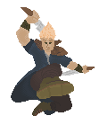 The palette basicly sucks, i've always been bad at that. Just anything to change is helpful, it has a ways to go till its done. EDIT- Just wanted to see how it lookw ith outline, so. 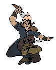 Final? 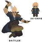 Edited by Christopher - 19 March 2007 at 12:38pm |
|
 IP Logged IP Logged |
|
|
jalonso
Admiral 
Joined: 29 November 2022 Online Status: Offline Posts: 13537 |
Posted: 18 March 2007 at 6:17am |
|
Great pose. I say shade using dramatic lighting and keep strong outlines to define the areas, maybe some simplified selout. Colors are workable.
|
|
|
|
|
|
IP Logged |
|
|
Serendor
Midshipman 
Joined: 27 February 2007 Online Status: Offline Posts: 79 |
Posted: 18 March 2007 at 3:50pm |
|
Yes, some shadows on and it would be great
the foot in the back seems to be a little tiny compared to the rest of the guy.... |
|
|
IP Logged |
|
|
leel
Commander
Joined: 29 June 2005 Online Status: Offline Posts: 3001 |
Posted: 18 March 2007 at 6:05pm |
|
just up the contrast, the colors are fine for the most part. The problem is that they all look the same.
|
|
|
IP Logged |
|
|
Christopher
Commander
Joined: 09 February 2007 Online Status: Offline Posts: 110 |
Posted: 18 March 2007 at 7:37pm |
|
Finished version, unless anyone says different.
|
|
|
IP Logged |
|
|
Aleiav
Commander
Joined: 08 April 2016 Online Status: Offline Posts: 2380 |
Posted: 18 March 2007 at 11:47pm |
|
Try upping the contrast a bit. The colors don't seem to different from eachother.
|
|
|
IP Logged |
|
|
Christopher
Commander
Joined: 09 February 2007 Online Status: Offline Posts: 110 |
Posted: 19 March 2007 at 12:41pm |
|
"Didnt gain the score needed to get into the gallery"
So...About that......... I tried to up the contrast a little bit from the beginning one.
So whats the major thing its not getting approved for? |
|
|
IP Logged |
|
|
Forge
Seaman 
Joined: 01 March 2007 Online Status: Offline Posts: 16 |
Posted: 19 March 2007 at 1:06pm |
|
For me, I think the weakest part of this piece is the head and face.
First, I think the head could be larger and wider. It looks as though his and neck are 1 cylinder.
Making the head and face wider will give you more room to detail it.
Otherwise, I think the pose is great and your proportions seem good.
Maybe some more contrast and shading.
Good job.
|
|
|
IP Logged |
|
|
Ensellitis
Commander
Joined: 19 June 2005 Online Status: Offline Posts: 10099 |
Posted: 19 March 2007 at 3:00pm |
|
many things bother me about this.
first the face... forge explains that... the next is the shading... you have highlights where you should have shadows, mainly on the arms at the sleeve |
|
|
There's a pubic hair on my keyboard. What the f**k?? I "mow the lawn" so it's not mine. Gross. |
|
|
IP Logged |
|
|
Christopher
Commander
Joined: 09 February 2007 Online Status: Offline Posts: 110 |
Posted: 19 March 2007 at 7:55pm |
|
Alright, thanks ens ill try to touch it up some tommorow.
|
|
|
IP Logged |
|
| |
||
Forum Jump |
You cannot post new topics in this forum You cannot reply to topics in this forum You cannot delete your posts in this forum You cannot edit your posts in this forum You cannot create polls in this forum You cannot vote in polls in this forum |
|
