| Active TopicsSearchRegisterLogin |
| WIP (Work In Progress) | |
| |
  |
| << Prev Page of 2 |
| Author | Message |
|
Zubb
Midshipman 
Joined: 07 October 2020 Online Status: Offline Posts: 38 |
  Posted: 06 July 2017 at 11:22am Posted: 06 July 2017 at 11:22am |
|
The space station looks great, but IMO the perspective on the spike(the one near the sphere's center) is a little off.
|
|
 IP Logged IP Logged |
|
|
PrototypeTheta
Midshipman
Joined: 03 November 2017 Online Status: Offline Posts: 39 |
Posted: 23 July 2017 at 2:57am |
|
A quick dump of stuff I've been doing (may have posted some of this before).
Player sprites: Redone the run animation (thrusters need to be re-done and hands added, but I'm happy with the overall motion) 
Dashing, damage and jumping sprites (all playing really fast for some reason)   
Enemies: A basic enemy mook. Still need to do walk cycles for this one.  
Complete with different death states depending on how you kill it.  
Projectiles/Misc effects A missile, pretty standard tbh 
Some explosion effects (conventional and antimatter)  
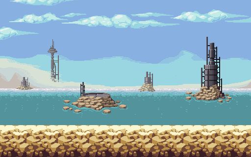
Environments: Couple of foreground elements for Mission 1 

Some more fiddling of that space station 
And finally, I wouldn't normally post anything this WIP, however it's a weird perspective that I've never tried before, and I would rather get it right first time round. Larry Niven called. He wants his ringworld back. 
Still not sure whether the landscape works (mostly the mid-ground is the problem, not used to drawing landscapes on a concave surface) and how to handle the sky. I've roughed out the atmosphere but I'm still not really sure where to go with it. 
|
|
|
IP Logged |
|
|
PrototypeTheta
Midshipman
Joined: 03 November 2017 Online Status: Offline Posts: 39 |
Posted: 26 September 2017 at 2:42pm |
|
Aerial slash attack:

Dashing attack: 
|
|
|
IP Logged |
|
|
PrototypeTheta
Midshipman
Joined: 03 November 2017 Online Status: Offline Posts: 39 |
Posted: 27 September 2017 at 2:44pm |
|
Tried to salvage old attack animation.

|
|
|
IP Logged |
|
|
PrototypeTheta
Midshipman
Joined: 03 November 2017 Online Status: Offline Posts: 39 |
Posted: 01 October 2017 at 4:22pm |
|
Mockup of another level.

|
|
|
IP Logged |
|
|
eishiya
Commander 
Joined: 04 August 2022 Online Status: Offline Posts: 1109 |
Posted: 01 October 2017 at 4:53pm |
|
I like the actual pixelling in this mockup, but I feel it has some readability issues.
I had trouble spotting the character because they blend into the background and because all the visually interesting stuff is off to the sides where the player should probably not be looking. Try to keep the non-playable areas lower-detail (or at least low-contrast) so that they're not distracting. The way you've set the floors and ceilings apart from the walls looks very nice and it's very clear. Combined with lower-contrast/simpler walls it should work very well. Lastly, I feel like the neutral background wall feels mismatched from the rest of the level. I think giving it a blue or orange hue would make it fit better with the rest of the level. Keeping the saturation low and the contrast low would help it still be clearly distinct from the midground walls. I think there's merit to a completely grey look, but I feel like that's something you should commit more fully to, e.g. an entire level that's all greyscale, save perhaps for some accent colour. |
|
|
IP Logged |
|
|
PrototypeTheta
Midshipman
Joined: 03 November 2017 Online Status: Offline Posts: 39 |
Posted: 02 October 2017 at 2:47am |
|
Funnily enough I originally had the background tinted red, just changed it afterwards as it didn't work with the foreground at all.
As for the detail on the tiles, I'm mostly using sonic tilesets as reference here (egg rocket zone to be precise) and they seem to cram even more complexity and detail into the surrounding tiles (mind you, gameplay and level design could make all the difference here). What I can do in the meantime is mute the orange highlights to stand out less: 
Still have to make the other half of the tileset (not enough here to actually make a level) so I'll try some simpler tiles and see what I can do with it in-engine. |
|
|
IP Logged |
|
|
PrototypeTheta
Midshipman
Joined: 03 November 2017 Online Status: Offline Posts: 39 |
Posted: 15 October 2017 at 9:08am |
|
Made another enemy grunt.


|
|
|
IP Logged |
|
|
PrototypeTheta
Midshipman
Joined: 03 November 2017 Online Status: Offline Posts: 39 |
Posted: 18 October 2017 at 1:11pm |
|
Working on an actual background for the laboratory level.

|
|
|
IP Logged |
|
|
PrototypeTheta
Midshipman
Joined: 03 November 2017 Online Status: Offline Posts: 39 |
Posted: 10 December 2017 at 6:12pm |
|
Took a swing at a cityscape

|
|
|
IP Logged |
|
|
Hapiel
Rear Admiral 
Joined: 30 June 2023 Online Status: Offline Posts: 3266 |
Posted: 11 December 2017 at 5:42am |
|
Oh my, this has come so far!
Some quick cc: The sprite doesn't stand out so much, it's equally dark as it's background. Also the bright horizontal lights are a bit distracting, maybe tone them down a bit. at last I'm really not a fan of the horizontal bands in the background... I know it doesn't fit with the PJ pixel art rules, but an actual gradient might be less distracting. or pick some colors which are closer to each other? |
|
|
IP Logged |
|
|
eishiya
Commander
Joined: 04 August 2022 Online Status: Offline Posts: 1109 |
Posted: 11 December 2017 at 7:38am |
|
Here is a colour edit that I think addresses the readability issue while keeping the "look":
 I put the background layers into more of a haze, darkened all the windows to orange, and used a narrower range of the purple-yellow gradient for the sky, so that it could have less contrast while still keeping the same number of bands. I think the lines in the sky work very well with the style of this, but just had too much contrast and thus stood out more than they should. |
|
|
IP Logged |
|
|
PrototypeTheta
Midshipman
Joined: 03 November 2017 Online Status: Offline Posts: 39 |
Posted: 11 December 2017 at 11:08am |
|
Alright, made a few edits. Been thinking about having a thick layer of smoke in the bottom on the far layers but I don't quite know how to do that properly.

|
|
|
IP Logged |
|
|
Hapiel
Rear Admiral
Joined: 30 June 2023 Online Status: Offline Posts: 3266 |
Posted: 11 December 2017 at 11:18am |
|
As cool as those signs may be, they again distract from the foreground (as advertisement tends to do...)
|
|
|
IP Logged |
|
|
PrototypeTheta
Midshipman
Joined: 03 November 2017 Online Status: Offline Posts: 39 |
Posted: 28 December 2017 at 10:30am |
|
Me: So I half like half the animations for this one character finished.
Inner me: Change it. (top is old version) 
|
|
|
IP Logged |
|
|
eishiya
Commander
Joined: 04 August 2022 Online Status: Offline Posts: 1109 |
Posted: 28 December 2017 at 12:24pm |
|
I like the bunny-ears, the new eye shape, and the more solid highlight on the face. However, I think the face looked more interesting and had a clearer shape in the old version. In addition, the new big portraits have banding around the "mouth" and the chin tangents with the frame.
|
|
|
IP Logged |
|
|
PrototypeTheta
Midshipman
Joined: 03 November 2017 Online Status: Offline Posts: 39 |
Posted: 30 April 2018 at 9:53am |
|
Well another year, another swing at this same old scene.
|
|
|
IP Logged |
|
| << Prev Page of 2 |
| |
||
Forum Jump |
You cannot post new topics in this forum You cannot reply to topics in this forum You cannot delete your posts in this forum You cannot edit your posts in this forum You cannot create polls in this forum You cannot vote in polls in this forum |
|
