| Active TopicsSearchRegisterLogin |
| WIP (Work In Progress) | |
| |
  |
| << Prev Page of 5 Next >> |
| Author | Message |
|
Club Beuker
Commander 
Joined: 29 January 2007 Online Status: Offline Posts: 513 |
  Posted: 08 November 2007 at 6:28am Posted: 08 November 2007 at 6:28am |
|
and he calls that a rough edit.. *sigh*
|
|
 IP Logged IP Logged |
|
|
jalonso
Admiral 
Joined: 29 November 2022 Online Status: Offline Posts: 13537 |
Posted: 11 November 2007 at 11:39am |
|
Trying something altogether different with the exocet/lawrence c+c
Ship is completely redrawn.  |
|
|
|
|
|
IP Logged |
|
|
BlackDragon
Commander
Joined: 13 May 2014 Location: United States Online Status: Offline Posts: 729 |
Posted: 11 November 2007 at 11:42am |
|
Very very nice update! It looks cleaner. It has lost some of its character in the changing of the colors though, I liked the redish boat with the colored sails better.
O yeah, the swishes in the water seem a little big. Try something more of what Lawrence did. Edited by BlackDragon - 11 November 2007 at 11:44am |
|
|
"A little pain never hurt anyone." - Blueberry_Pie
|
|
|
IP Logged |
|
|
Lawrence
Commander
Joined: 30 June 2005 Online Status: Offline Posts: 481 |
Posted: 17 November 2007 at 2:44pm |
|
How did I miss this update? This looks very good. I agree though, the ripples look too orderly and unbroken. For transparent water, you should make the vertical "walls" of the pool visible under the water. On my edit I used a dark blue (on the left corner) for that. Also, the building's reflection in the water is too straight and uniform. In my edit the lightest shade of blue is specular reflection of the sky, that's why it stops abruptly under the pier and more ambiguously near where the specular reflection of the ship's elaborate structure would be. All the other shades of blue are just shadows (cast on the bottom surface of the "pool"), the lighter of which are made by the ripples themselves and the darker one being the ship's shadow.
Also, I think the sails probably look too bright, I sort of preferred their old colours. Edited by Lawrence - 17 November 2007 at 2:45pm |
|
|
IP Logged |
|
|
jalonso
Admiral
Joined: 29 November 2022 Online Status: Offline Posts: 13537 |
Posted: 17 November 2007 at 5:12pm |
|
I kinda figured I'd leave the water for the end since I'm still messing with the layout. I'll see about toning down the sail colors or aging them.
Anyhoo, the latest :)  |
|
|
|
|
|
IP Logged |
|
|
Demon
Commander
Joined: 16 March 2005 Online Status: Offline Posts: 562 |
Posted: 17 November 2007 at 5:16pm |
|
Loving the pallet, jalonso! mhmmm!
|
|
|
"At least we killed some boredom..." - Death Note.
|
|
|
IP Logged |
|
|
jalonso
Admiral
Joined: 29 November 2022 Online Status: Offline Posts: 13537 |
Posted: 17 November 2007 at 8:30pm |
|
dude, don't be a stranger :(
 |
|
|
|
|
|
IP Logged |
|
|
Demon
Commander
Joined: 16 March 2005 Online Status: Offline Posts: 562 |
Posted: 17 November 2007 at 8:34pm |
|
Looks as though your style has changed a bit. But thats probably since its not complete?
|
|
|
"At least we killed some boredom..." - Death Note.
|
|
|
IP Logged |
|
|
Setzer
Commander
Joined: 18 December 2016 Location: United States Online Status: Offline Posts: 780 |
Posted: 17 November 2007 at 10:05pm |
|
Originally posted by jalonso I kinda figured I'd leave the water for the end since I'm still messing with the layout. I'll see about toning down the sail colors or aging them. Anyhoo, the latest :) looks like a ghost ship =o |
|

|
|
|
IP Logged |
|
|
flaber
Commander
Joined: 03 March 2005 Online Status: Offline Posts: 130 |
Posted: 17 November 2007 at 11:50pm |
|
i should make a friendly fire edit on ya
ill fire some cannonballs towards your selfesteem, and make your confidence walk the plank ;) haha, except not really.. i couldnt do that to you. but at the same time. maby ill still make an edit. ill see Edited by flaber - 18 November 2007 at 12:56am |
|
|
|
|
|
IP Logged |
|
|
MashPotato
Commander
Joined: 05 February 2007 Online Status: Offline Posts: 237 |
Posted: 18 November 2007 at 10:53am |
|
Fabulous
 I really liked your old version, but I really like this one too, so it's like 2 cool pixels for the price of one I really liked your old version, but I really like this one too, so it's like 2 cool pixels for the price of one  . .Small quibble: the palm tree (the one behind the other one) looks like it would be crashing into the building rather than being in front of the building, but that may be just because the shading is not done yet. |
|
|
IP Logged |
|
|
jalonso
Admiral
Joined: 29 November 2022 Online Status: Offline Posts: 13537 |
Posted: 18 November 2007 at 12:00pm |
|
Go for it flaber ;)
How about now Mash?  |
|
|
|
|
|
IP Logged |
|
|
MashPotato
Commander
Joined: 05 February 2007 Online Status: Offline Posts: 237 |
Posted: 18 November 2007 at 1:49pm |
|
I think the problem may be that the shading is uniform across the trunk like the other tree, so it looks like they're in the same plane. I did a quick edit to demonstrate what I mean (excuse the sloppiness
 ) ) My edit's on the right, basically it's just putting the bottom of the trunk more in shadow while the top is in the light, so it looks like it's emerging from the darkness a bit more. I messed with the highlights on the other tree a bit to try to make it look more curved and less straight, but I don't know if I was really successful or not. (btw, I only added the additional black lines to indicate what direction I'm taking the tree is heading... basically, I'm assuming that it's direction is roughly perpendicular to the other one. If it's not, you can just ignore me )Hope that makes it a bit more clear |
|
|
IP Logged |
|
|
jalonso
Admiral
Joined: 29 November 2022 Online Status: Offline Posts: 13537 |
Posted: 18 November 2007 at 2:18pm |
|
thanks :)
I completely understand. Those kind of details I generally leave for the end as I change and move stuff around a lot. This project especially so  ps: those palms are plucked from another iso of mine and may not even stay. |
|
|
|
|
|
IP Logged |
|
|
jalonso
Admiral
Joined: 29 November 2022 Online Status: Offline Posts: 13537 |
Posted: 18 November 2007 at 3:10pm |
 |
|
|
|
|
|
IP Logged |
|
|
Club Beuker
Commander
Joined: 29 January 2007 Online Status: Offline Posts: 513 |
Posted: 19 November 2007 at 1:02am |
|
Finally I see some flaws there
 Well only one.. Aren't the pirates a bit too big for the piece? Or are the houses too small for the pirates? Either way, something isn't really right there |
|
|
IP Logged |
|
|
jalonso
Admiral
Joined: 29 November 2022 Online Status: Offline Posts: 13537 |
Posted: 19 November 2007 at 5:21am |
|
Yes, the scale is incorrect. All the blocks I make for Pixeldam are out of scale. These blocks are designed for a single house. Because I like to make many buildings and have lots of scenes within the scene I purposely make the buildings slightly off scale in order to make it all fit within reason and only go for a visual scale if you will. In this block the ship itself would be 1/3 bigger to be true. The buildings had to be even smaller to make the ship appear in scale since its the focal point. The people scale is for the block to fit into the neighborhoods since that's what the people are sized there. This is in fact the challenge and fun for me and the reason I make so many Pixeldam entries : )
To be honest the building scale has bothered me from the begining. Good call btw. |
|
|
|
|
|
IP Logged |
|
|
Fdupblindkids
Seaman 
Joined: 15 November 2007 Online Status: Offline Posts: 23 |
Posted: 19 November 2007 at 5:47am |
|
That looks amazing, I wish I could do this *sad face*..in time..in time.. |
|
|
IP Logged |
|
|
JackBauer24
Commander
Joined: 23 March 2017 Online Status: Offline Posts: 113 |
Posted: 19 November 2007 at 6:43am |
|
Hey there Jalonso, The piece looks really good. One thing that sticks out for me is the bow of the ship. The figurehead should be under the bowsprit. Right now you have it over it, or next to it. Other then that, the pic looks sweet. Heres a reference to show you what I mean.
 Jack |
|
|
IP Logged |
|
|
flaber
Commander
Joined: 03 March 2005 Online Status: Offline Posts: 130 |
Posted: 20 November 2007 at 12:19am |
|
im working on a bit of textures
and shape / form for ya just so you know.. im super busy though with that school type thing. here and there i work on an edit. like 10mins at a time. haha |
|
|
|
|
|
IP Logged |
|
|
jalonso
Admiral
Joined: 29 November 2022 Online Status: Offline Posts: 13537 |
Posted: 20 November 2007 at 7:11pm |
|
No rush flaber. As you can see here I've changed stuff again.
Since Club Beuker pointed out what's been obvious to me since the beginning:  |
|
|
|
|
|
IP Logged |
|
|
jalonso
Admiral
Joined: 29 November 2022 Online Status: Offline Posts: 13537 |
Posted: 22 November 2007 at 11:09am |
 |
|
|
|
|
|
IP Logged |
|
|
Squirrelsquid
Commander
Joined: 18 July 2023 Online Status: Offline Posts: 259 |
Posted: 22 November 2007 at 12:01pm |
|
the new water looks fantastic! and the scale is (almost) on... can't wait to see this done.
|
|
|
IP Logged |
|
|
BlackDragon
Commander
Joined: 13 May 2014 Location: United States Online Status: Offline Posts: 729 |
Posted: 22 November 2007 at 12:36pm |
|
Hmmm, not sure if I like the green in the water. Also the ship should be partly under the water. It makes it look like marble, hard and flat.
|
|
|
"A little pain never hurt anyone." - Blueberry_Pie
|
|
|
IP Logged |
|
|
DJD
Seaman
Joined: 01 July 2006 Online Status: Offline Posts: 35 |
Posted: 22 November 2007 at 8:55pm |
|
That water is very very pretty, must study it for the future...
|
|
|
IP Logged |
|
|
cthulhu
Seaman
Joined: 11 November 2007 Online Status: Offline Posts: 28 |
Posted: 22 November 2007 at 11:49pm |
|
I'm sorry, you've posted this in the wrong section. You're looking for the MIP (Masterpiece in Progress) section.
All your water has been great, but I like the use of the green to get a "sand in shallow water" look to it.
|
|
|
Artist formerly known as "herbert_west"
|
|
|
IP Logged |
|
|
dropshipdvd
Seaman
Joined: 22 November 2007 Online Status: Offline Posts: 2 |
Posted: 23 November 2007 at 1:44am |
|
IP Logged |
|
|
JackBauer24
Commander
Joined: 23 March 2017 Online Status: Offline Posts: 113 |
Posted: 23 November 2007 at 2:24am |
|
Um...how does this apply to the pic in question? I for one don't see this as being in the appropriate forum.
|
|
|
IP Logged |
|
|
Club Beuker
Commander
Joined: 29 January 2007 Online Status: Offline Posts: 513 |
Posted: 23 November 2007 at 2:36am |
|
@jack: That's called spam, message is already reported and I hope will be deleted soon.
|
|
|
IP Logged |
|
|
flaber
Commander
Joined: 03 March 2005 Online Status: Offline Posts: 130 |
Posted: 23 November 2007 at 7:20am |
|
been super busy with homework and other such
did this in a few 5-10min intervals here and there. little edit to suggest some possible textures: 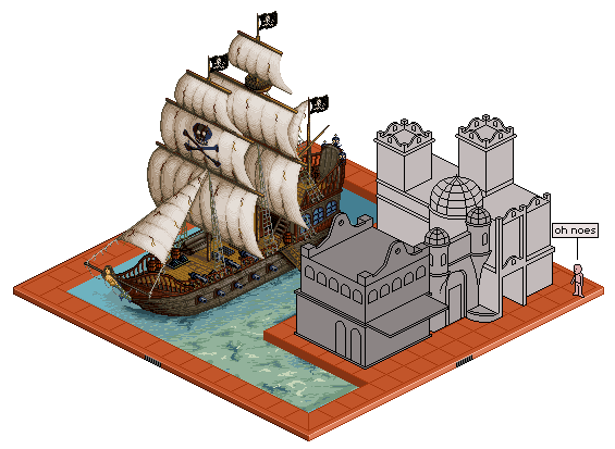 (you and your fancy transparency...) I kept for the most part, your areas of shading. I just textured. Those are a few ideas / suggestions that you could think about for giving your boat alittle bit more. I found it to look alittle like plastic. Almost like those lego pirate ships, with the hard shiny plastic. Hopefully thats a valid edit. if not then discard it. Edited by flaber - 23 November 2007 at 7:20am |
|
|
|
|
|
IP Logged |
|
|
jalonso
Admiral
Joined: 29 November 2022 Online Status: Offline Posts: 13537 |
Posted: 23 November 2007 at 7:36am |
|
Oh yes!
It did have a plastic look. The body of the ship I would have worked on some more but the sails I thought were ok as they were. I love what you did so the sails and will add texture to them, thx a million for that. transparency ??? *I missed spam action on my own thread : ( |
|
|
|
|
|
IP Logged |
|
|
flaber
Commander
Joined: 03 March 2005 Online Status: Offline Posts: 130 |
Posted: 23 November 2007 at 2:01pm |
|
not sure i got the body right for you though. that was the part i was alittle iffy on. Tried to add in the separation between the pieces of wood aswell as some nails. Since the outside of the boat is in water, it would be pretty saturated and worn, thus giving it the rough grain.
glad you liked the sails though. You had the sails shaded well, but it just seemed alittle too much like a solid object. With the definate shadows and highlights, blocked in. Where as sails are cloth material and are always changing, so i figured to try and give a lighter texture with softer highlights and shadows throughout. (dynamic dithering) The part just left of the skull and cross bones, and below (in the shadows) i did together quickly. But im sure you still get the right idea for it. The red railing on the side of the boat.. i barely even knew it was there until I sat down and started texturing. Id suggest trying to make that more prominent. You have alot of details and things going on, which is fantastic. But some of the things get lost in the confusion. So you need to then have things adjusted for slightly foreground and slightly background. Where the things in front have more highlights, and are outlined better. and the things behind have slightly less detail. Right now I found things to all be at the same colour intensities and detail intensities, causing things to get lost in the confusion and mess. Another example of this would be the nets and the ladder. So then, my biggest crit would be to bring out the red railing more. I did alittle bit, but i think it could still be brought out more. Hopefully though, that was a helpful edit, and that maby you can use something out of it. depending on how things go, maby ill make another edit for ya ;) maby ill step into your water. hehe (oh, what i meant by transparency, was that i have the nice white background...) Edited by flaber - 23 November 2007 at 2:04pm |
|
|
|
|
|
IP Logged |
|
|
jalonso
Admiral
Joined: 29 November 2022 Online Status: Offline Posts: 13537 |
Posted: 23 November 2007 at 3:58pm |
|
I love you flaber :D
All of those details will be done in the next ship update.  *thx, to the Mod that changed my topic typo. Edited by jalonso - 23 November 2007 at 4:00pm |
|
|
|
|
|
IP Logged |
|
|
Larwick
Commander
Joined: 18 July 2024 Online Status: Offline Posts: 4015 |
Posted: 23 November 2007 at 4:10pm |
|
Keep up the good work jallo! :D

|
|
 
|
|
|
IP Logged |
|
|
jalonso
Admiral
Joined: 29 November 2022 Online Status: Offline Posts: 13537 |
Posted: 23 November 2007 at 9:44pm |
 |
|
|
|
|
|
IP Logged |
|
|
Squirrelsquid
Commander
Joined: 18 July 2023 Online Status: Offline Posts: 259 |
Posted: 23 November 2007 at 10:02pm |
|
that's just lovely.. add a Treasure box under water, will you? ;)
|
|
|
IP Logged |
|
|
cthulhu
Seaman
Joined: 11 November 2007 Online Status: Offline Posts: 28 |
Posted: 23 November 2007 at 10:30pm |
|
... and the ghost of the poor soul who the pirates killed and took the treasure from...
|
|
|
Artist formerly known as "herbert_west"
|
|
|
IP Logged |
|
|
Squirrelsquid
Commander
Joined: 18 July 2023 Online Status: Offline Posts: 259 |
Posted: 23 November 2007 at 10:48pm |
|
... like Le Chuck! O.o
|
|
|
IP Logged |
|
|
flaber
Commander
Joined: 03 March 2005 Online Status: Offline Posts: 130 |
Posted: 23 November 2007 at 11:49pm |
|
since were on such a roll.
hows about we throw in a full scale kracken ;) slowly attacking the ship from the back, just so you see some tentacles here and there. :D |
|
|
|
|
|
IP Logged |
|
|
jalonso
Admiral
Joined: 29 November 2022 Online Status: Offline Posts: 13537 |
Posted: 24 November 2007 at 10:36am |
 |
|
|
|
|
|
IP Logged |
|
|
Sabata
Commander
Joined: 08 July 2007 Online Status: Offline Posts: 128 |
Posted: 24 November 2007 at 11:57am |
|
OMG Jal
this is the most precious piece for me!!! Some time
now I decided to make a project on future and it evolves a lot of ships, since
I never did ships this will be awesome to learn from. I am amazed by this
|
|
|
We fall to rise again.
|
|
|
IP Logged |
|
|
flaber
Commander
Joined: 03 March 2005 Online Status: Offline Posts: 130 |
Posted: 24 November 2007 at 1:03pm |
|
straight across from the seals is... rocks im guessing? by the store?
you have them shaded identically to the way you shaded the seals.. just in different colours. which thus makes me see them as awhole lot of dead seals piled up by the store, instead of rocks. give the rocks sharper edges, and deeper contrast between highlight and shadow. |
|
|
|
|
|
IP Logged |
|
|
jalonso
Admiral
Joined: 29 November 2022 Online Status: Offline Posts: 13537 |
Posted: 24 November 2007 at 6:16pm |
|
These rocks any better?
 |
|
|
|
|
|
IP Logged |
|
|
thedaemon
Midshipman 
Joined: 18 April 2023 Location: United States Online Status: Offline Posts: 33 |
Posted: 24 November 2007 at 6:25pm |
|
Yes much better I would say. The people to me look a few pixels to large to actually use the boat. Isometric is orthographic right? Nice and busy with life. this piece it becoming great.
|
|
|
IP Logged |
|
|
jalonso
Admiral
Joined: 29 November 2022 Online Status: Offline Posts: 13537 |
Posted: 24 November 2007 at 6:32pm |
|
Oh noes, I just remade the building to be more in scale. Are you saying I need a whole new ship

|
|
|
|
|
|
IP Logged |
|
|
flaber
Commander
Joined: 03 March 2005 Online Status: Offline Posts: 130 |
Posted: 24 November 2007 at 6:37pm |
|
:)
closer. much closer. They are good rocks. but now they are like stalagmite, rocks. hehe. but :( since they are so black now, they become a focal point... much better though than last time |
|
|
|
|
|
IP Logged |
|
|
BlackDragon
Commander
Joined: 13 May 2014 Location: United States Online Status: Offline Posts: 729 |
Posted: 24 November 2007 at 6:38pm |
|
I think it would look fine if the guy with the telescope was like 1 px smaller on all sides, its called like depth perseption or something.
Oh yes, the rocks do look too dark. Edited by BlackDragon - 24 November 2007 at 6:39pm |
|
|
"A little pain never hurt anyone." - Blueberry_Pie
|
|
|
IP Logged |
|
|
jalonso
Admiral
Joined: 29 November 2022 Online Status: Offline Posts: 13537 |
Posted: 24 November 2007 at 6:40pm |
|
Originally posted by flaber :) since they are so black now, they become a focal point... Is this a good thing? Should I go greyer? Is pointy rocks bad for this, or should I be square-ish? |
|
|
|
|
|
IP Logged |
|
|
jalonso
Admiral
Joined: 29 November 2022 Online Status: Offline Posts: 13537 |
Posted: 24 November 2007 at 6:42pm |
|
Originally posted by BlackDragon I think it would look fine if the guy with the telescope was like 1 px smaller on all sides, its called like depth perseption or something. Isometric is ALL same size by definition, can't do that. There is no depth perception in iso :/ |
|
|
|
|
|
IP Logged |
|
|
MashPotato
Commander
Joined: 05 February 2007 Online Status: Offline Posts: 237 |
Posted: 24 November 2007 at 6:52pm |
|
Jal, with all these re-workings and re-doings, I think you must be the most patient person I have ever encountered
 I think the rocks are an improvement as well, although I agree they look perhaps a little too cave-like. When I think of rocks near the sea, I think of something flatter with more edges, like these. If you prefer keeping the ones you have (which still look really good, btw), I think making them a little lighter would be nice Edited by MashPotato - 24 November 2007 at 6:52pm |
|
|
IP Logged |
|
| << Prev Page of 5 Next >> |
| |
||
Forum Jump |
You cannot post new topics in this forum You cannot reply to topics in this forum You cannot delete your posts in this forum You cannot edit your posts in this forum You cannot create polls in this forum You cannot vote in polls in this forum |
|

