Yaaaaarrgh
Printed From: Pixel Joint
Category: Pixel Art
Forum Name: WIP (Work In Progress)
Forum Discription: Get crits and comments on your pixel WIPs and other art too!
URL: https://pixeljoint.com/forum/forum_posts.asp?TID=5186
Printed Date: 10 June 2026 at 3:43am
Topic: Yaaaaarrgh
Posted By: jalonso
Subject: Yaaaaarrgh
Date Posted: 13 October 2007 at 7:42pm
|
Time for another Pixeldam city block. This hood has the worst color sidewalks and when exocet made his donkey pixel I thought maybe that palette would work. PMd him and it turns out he does not own the colors o.O First draft, color block for pirate house  ------------- |
Replies:
Posted By: greenraven
Date Posted: 13 October 2007 at 7:48pm
|
Looks pretty cool. But what's that stuff on the sidewalk, water or a shadow? Edit: Also I thing kinda stick out for me. (I'm sure you already see it, but when am I going to get a chance to spot a hole in piece of someone like you again.  ) Anyways, see that cyan building, and how the shadow falls behind it. Now look at the ship and how the shadow of the sails falls straight down. ) Anyways, see that cyan building, and how the shadow falls behind it. Now look at the ship and how the shadow of the sails falls straight down.Well that's it, I've had my moment of glory.  -------------  "pwnage comes with patience, practice and planning." ~ Jalonso "pwnage comes with patience, practice and planning." ~ Jalonso 
|
Posted By: MashPotato
Date Posted: 13 October 2007 at 7:59pm
|
I can tell this is going to be cool already (a pirate house? Nice!) Yes this comment was useless, except for encouragement purposes. Go Jalonso!  ------------- http://theindiestone.com - the INDIE STONE |
Posted By: BlackDragon
Date Posted: 14 October 2007 at 6:04am
|
Oh, there it is, one of jalonso's SUPER wip posts....
Some crits:
*Oh, BTW its 'Yargh' ------------- "A little pain never hurt anyone." - Blueberry_Pie |

Posted By: jalonso
Date Posted: 14 October 2007 at 9:17am
|
@Green, lol, they're shadows. They are unimportant atm. I only wanted to define my 'area' to stay within the Pixeldam template @Mash, maybe, pirate themed fantasy house since the ship is not to scale. @BlackDragon, this is a color blocked rough. Things, like the rails are purposely drawn in wrong colors so that I can detail the section easier. I will be using the colors on the top right for coloring. The sails are there for 'area' coverage only. I only pixel what is absolutely needed. In the latter stages details are added never at this point. I get a lot of PMs about 'how to pixel'. I make WIP threads for those who ask and they quietly follow the progress. For example I have been asked more than once about how to go about making something like a pirate ship. ------------- |
Posted By: Maarten
Date Posted: 14 October 2007 at 9:36am
| I admit Id be very interested to see the progress on one of your beautifull layered background :) |
Posted By: jalonso
Date Posted: 14 October 2007 at 8:34pm
Patriots vs. Cowboys = very little progress Game over, Pats win 
------------- |
Posted By: Club Beuker
Date Posted: 15 October 2007 at 12:29am
|
Why oh great Jalonso.. Please tell me why.. you are sooo good? It's turning out to be another pieze of great art. |
Posted By: AdrianJensen
Date Posted: 16 October 2007 at 5:27am
|
Dude, you're my hero. Pirates are important. Definitely should have a Jolly Rodger. ------------- My gallery lives here: http://www.pixeljoint.com/p/8355.htm?pg=1&sec=icons |
Posted By: Reo
Date Posted: 16 October 2007 at 11:46am
I have a feeling this is going to be epic!No crits atm.
|
Posted By: Aleiav
Date Posted: 16 October 2007 at 1:44pm
| This looks really awesome and I'm super excited about it. Pirates are really awesome. |
Posted By: jalonso
Date Posted: 16 October 2007 at 7:36pm
 ------------- |
Posted By: Shadow-gamer
Date Posted: 16 October 2007 at 7:46pm
|
You are on the verge of inspiring me to do a dock...
Simply amazing. |
Posted By: jalonso
Date Posted: 17 October 2007 at 7:13pm
 ------------- |
Posted By: BlackDragon
Date Posted: 18 October 2007 at 4:57am
|
Epic. But the boat seems to blend in a little with the flooring, add like a bridge or something to put space between the two, maybe. ------------- "A little pain never hurt anyone." - Blueberry_Pie |
Posted By: jalonso
Date Posted: 18 October 2007 at 6:49am
|
Thx Dragon. I will add a plank from the deck to the boat. I think the boat is too close to the dock too but I can't move the boat away because I'll be outside the template area (the sails). I think I have to thin out the dock and shorten the front walkway instead. urghhhh!
------------- |
Posted By: jalonso
Date Posted: 28 October 2007 at 12:02pm
 ------------- |
Posted By: jalonso
Date Posted: 28 October 2007 at 6:33pm
+2 ------------- |
Posted By: eghost
Date Posted: 28 October 2007 at 6:54pm
Awesome work Jal... 
|
Posted By: MashPotato
Date Posted: 28 October 2007 at 7:35pm
Heehee, as I look at this the Curse of Monkey Island soundtrack is playing  Just gorgeous, I'm looking for things to crit, and can't really find any... my only suggestion is that adding a fancy figurehead to the front of the ship might be cool... just 'cause you seem to love detail so much . The far railing on the stairs seems to be higher than the railing closer to us, but I think that's just me... iso perspective confuses me sometimes! ------------- http://theindiestone.com - the INDIE STONE |
Posted By: jalonso
Date Posted: 28 October 2007 at 7:46pm
|
I already have a mermaid on the front of the ship but I don't see it myself, will fix Yes the railing is funky looking but its iso correct. I will fix this by covering with pirates on the ramp. This limited exocet palette has been rough :/ ------------- |
Posted By: M.E.
Date Posted: 29 October 2007 at 12:45am
|
Hi Jalonso, Probably I'm not worthy to comment on anything you make as you clearly are much better than myself. BUT I'm doing it anyways to maybe aid you with your work the way you always help me! If only you could benefit from one pixel I made it will be worth it! WARNING: VERY SKETCHY !!!  I violated your piece with bad pixel, but I hope to show you some areas that are making the original thing hard to read. Usually the deck of a ship gets a lot of darks by all the shadows coming from the sails. I made the house at the back as light as the front hoping to lift the ship from it. Maybe you can try the pinkish color to highlight the railing instead of changing the color of the house to do the same?!?! I thought the water could be filling the harbor more. Usually a ship would not have its sails like that when it is in the harbor. But it is more dramatic this way and I like it anyhow! I would maken the stone wall end on the sidewalk of the template. My apologies if any of this isn't what you want or if you are offended by my bad pixel-sketch. As previously said I hope that just one of the idea appeals to you. Kind regards from M.E. ------------- http://www.kunststukken.nl - KunstStukken.nl M.E. Art |
Posted By: jalonso
Date Posted: 29 October 2007 at 7:52pm
|
thx M.E. (we are all equals) Mash, masthead is next  ------------- |
Posted By: M.E.
Date Posted: 29 October 2007 at 11:17pm
|
Hi Jalonso, Verry well done on the last house. The ship now comes to 'live'. The windows are now visible. Ah... that water is nice! Could maybe use a white pixel here and there along where the ship touches the water. (at the back) Great progress all in all! Best regards from M.E. ------------- http://www.kunststukken.nl - KunstStukken.nl M.E. Art |
Posted By: jalonso
Date Posted: 31 October 2007 at 7:42pm
C+C+Q ;) ------------- |
Posted By: thesalus
Date Posted: 31 October 2007 at 8:06pm
|
The sails seem to be of a rather substantial thickness, though there might not be a way to avoid it. Or it could just be me eyes. The shading on the bottom blue portion of the projection on the left-most corner of the yellow house seems rather flat to me, though I'm not sure where you can pull colours from. So it may be a moot point. (And what is the brick construct in the bottom corner?) But looking good so far. |
Posted By: jalonso
Date Posted: 31 October 2007 at 8:12pm
|
Originally posted by thesalus The sails seem to be of a rather substantial thickness, though there might not be a way to avoid it. Or it could just be me eyes. You are right. I can fix that most obvious flaw, thx. Originally posted by thesalus The shading on the bottom blue portion of the projection on the left-most corner of the yellow house seems rather flat to me, though I'm not sure where you can pull colours from. So it may be a moot point. Don't get it? You mean the dome?(not finished) Originally posted by thesalus (And what is the brick construct in the bottom corner?) waaaaa  Originally posted by thesalus But looking good so far.  ------------- |
Posted By: Hatch
Date Posted: 31 October 2007 at 8:13pm
|
The area where the flag, the green building, and the... things on the rear railing meet is a bit confusing to my simple mind. And while I'm looking at the green building, the brown on it looks pretty scrappy (I know the actual building is supposed to look scrappy; I mean the pixeling looks scrappy)
Also, the water doesn't instantly read as water to me. When I first look at the piece (and it's entirely possible I'm the only one who could be quite so dense) I think, "ah, a building made of a pirate ship" and then it slowly becomes clear that it actually IS a pirate ship in dock. Not really sure what could be done about it. I personally preferred your last iteration as far as the water goes; I feel it reads much better. Lastly, I'm very, VERY unsure about this, so much so that I hesitate to bring it up, but are the two smaller domes on the rightmost building out of perspective? ------------- |
Posted By: jalonso
Date Posted: 31 October 2007 at 8:31pm
|
Originally posted by Hatch The area where the flag, the green building, and the... things on the rear railing meet is a bit confusing to my simple mind. And while I'm looking at the green building, the brown on it looks pretty scrappy (I know the actual building is supposed to look scrappy; I mean the pixeling looks scrappy) I agree, with this limited palette I can't get the right colors. Once I add the pirates on the deck maybe it will solve itself. This area is currently ignored as I really hate it. I might even re-do the whole rear of the ship. Originally posted by Hatch Also, the water doesn't instantly read as water to me. When I first look at the piece (and it's entirely possible I'm the only one who could be quite so dense) I think, "ah, a building made of a pirate ship" and then it slowly becomes clear that it actually IS a pirate ship in dock. Not really sure what could be done about it. I personally preferred your last iteration as far as the water goes; I feel it reads much better. Well, I started off as a single 'house' that looks like a pirate village so if this is what you see I'm happy. The reason the water is simplified is to add the characters and other stuff without confusing myself. Originally posted by Hatch Lastly, I'm very, VERY unsure about this, so much so that I hesitate to bring it up, but are the two smaller domes on the rightmost building out of perspective? Yes they are. I noticed this when I added the new dome. Actually the perspective is correct but the top of the dome is off center (easy fix). ------------- |
Posted By: greenraven
Date Posted: 31 October 2007 at 8:51pm
|
Originally posted by jalonso Originally posted by thesalus (And what is the brick construct in the bottom corner?) waaaaa I think he means the underground entrance. ------------- "pwnage comes with patience, practice and planning." ~ Jalonso
|
Posted By: thesalus
Date Posted: 31 October 2007 at 9:23pm
 Something like this. Yeah, where does the entrance go? |
Posted By: jalonso
Date Posted: 02 November 2007 at 7:56pm
I'm looking for the details now, beyond the obvious parrot, treasure, booze, skeleton,etc. ------------- |
Posted By: Dutrho
Date Posted: 03 November 2007 at 8:08am
|
wenches perhaps?
------------- Mmmm.. Thats good placebo! |
Posted By: BlackDragon
Date Posted: 03 November 2007 at 8:13am
|
Alligator in the water ------------- "A little pain never hurt anyone." - Blueberry_Pie |

Posted By: Squirrelsquid
Date Posted: 03 November 2007 at 10:45am
|
nice work, I do think that the highlights on the sails are a bit harsh. this way it looks like it's all glossy ------------- vote for squirrels crates! |
Posted By: jalonso
Date Posted: 03 November 2007 at 12:31pm
Woke up in a different mood ------------- |
Posted By: greenraven
Date Posted: 03 November 2007 at 12:40pm
Ooooh.... ahhhhh....  But shouldn't there also be a flag on top of the crows nest? ------------- "pwnage comes with patience, practice and planning." ~ Jalonso
|
Posted By: jalonso
Date Posted: 03 November 2007 at 1:16pm
|
Yes, there should be a flag there. The Pixeldam template however does not give me room to add one so I placed it in the back. I'm thinking of starting from scratch and re-pixelling everything to be extra clean and sharp : / ------------- |
Posted By: BlackDragon
Date Posted: 03 November 2007 at 2:10pm
|
As much as I FREAKING ADORE this peice, I have to agree with you. Some places just don't look right. ------------- "A little pain never hurt anyone." - Blueberry_Pie |
Posted By: greenraven
Date Posted: 03 November 2007 at 4:54pm
It's your call. Good luck with it. 
------------- "pwnage comes with patience, practice and planning." ~ Jalonso
|
Posted By: Lawrence
Date Posted: 03 November 2007 at 7:39pm
| This looks great, I don't think you should start from scratch. My biggest crit is that the part of the water which is reflecting the sky is darker than that reflecting the boat and buildings. I think it should probably be the other way round like in http://www.flickr.com/photos/brotherwolf/204202019/ - this . |
Posted By: Monkey 'o Doom
Date Posted: 03 November 2007 at 7:42pm
|
I dunno, I think it would be cooler if the buildings were changed to geive the piece a night ambience but not just another one of those blue-tinted night pieces. Show night with luminosity, not hue. Just throwing something out there. ------------- http://pixelmonkey.ensellitis.com"> 
RPG is numberwang. |
Posted By: jalonso
Date Posted: 03 November 2007 at 7:52pm
|
Damm, Lawrence that so obviously wrong. I fail :( MoD, Pixeldam is all daytime ligthing. The hood this is going in is particularly saturated and bright, the streets are light grey to boot. Maybe when I lighten the water it will be less nighttime looking. *I am never, ever using someone else's palette again  ------------- |
Posted By: jalonso
Date Posted: 07 November 2007 at 5:00pm
|
I really felt something has been wrong here and couldn't quite picture it. I asked exocet what he thought as it relates to colors and he had this to say: Hi, I had a look at your picture. It's really nicely drawn but indeed the colours don't really work. It feels too dark for what I believe is supposed to be a day time scene in the Caribeans. Generally I would use more saturated colours for the whole scene. Having mostly light colours and a few very dark patches for what's in shadows could work well as well, like those very sunny days when everything seems too bright. The water could do with being much lighter and blue, as it's reflecting the sky. Also the reflections in the water look too much like they're reflecting flames. They should be less contrasted and less saturated. The sails of the ship should use a pure white as the brighter colour and be less contrasted because they are probably slightly translucent. I've done a quick and dirty test for the sails and the water:  Hope this helps, as I said the pic is cool but the colours don't really fit at the moment! My thought to him: I do agree with your take. I was trying so hard to make it work with your Battersea palette which I think is awesome. I have never used someone else's colors and a challenge it has been. That has been the challenge for me on this pixel. Now that you feel the palette does not work for this project I will have to reconsider what is more important, the pixel or the challenge : / Thanks for your input, jal  ------------- |
Posted By: Acherhar
Date Posted: 07 November 2007 at 6:16pm
| But jal, was it supposed to be a day time scene in your eyes? If not, then you really have nothing to worry about, as it's amazing the way it is. |
Posted By: jalonso
Date Posted: 07 November 2007 at 6:27pm
|
Well I was trying to make a daytime scene using a strict palette. The colors are just not right for this scene tho. I think that adjusting the colors to better fit may solve it and is worth the attempt. If anything I could just backtrack. ------------- |
Posted By: Acherhar
Date Posted: 07 November 2007 at 6:33pm
| It looked like daytime to me though... I thought you did a fantastic job of using such a limited and dark(ish) set of colors to create something like that. |
Posted By: MashPotato
Date Posted: 07 November 2007 at 7:06pm
|
Exocet's colours were for a sunrise/sunset scene (or so it appears to me), and if you're going for full daylight, there's nothing wrong with adjusting the colours to suit that. In this case, the light should set the colours, not the other way round I think you accomplished your challenge of using a strict palette; now it's time to accomplish what you think is the best pixel ------------- http://theindiestone.com - the INDIE STONE |
Posted By: greenraven
Date Posted: 07 November 2007 at 8:59pm
|
When you look at these side by side, yours looks more of a night time/ some dark cave scene, while exocet's looks more of a clear day time/ out on the open seas scene. To be honest I like exocet's version a lil better. If you're going to stick with your colors then maybe you could turn it into a cave, kinda like Cervantes' stage from Soul Calibur. If you're going to go with exocet's colors you could make it out in the middle of the ocean/some island. I dunno, those are just my thoughts. ------------- "pwnage comes with patience, practice and planning." ~ Jalonso
|
Posted By: Lawrence
Date Posted: 08 November 2007 at 5:46am
|
Actually I now think that since the water wouldn't be so deep and dark,
refraction would be more noticeable and reflections would only be
subtle, like in Mario sunshine, http://www.hangsim.com/vs/help/water4.jpg - this or http://hem.bredband.net/zaptronic/pool-5.jpg - this Here's a rough edit of what I mean-  |
Posted By: Club Beuker
Date Posted: 08 November 2007 at 6:28am
| and he calls that a rough edit.. *sigh* |
Posted By: jalonso
Date Posted: 11 November 2007 at 11:39am
|
Trying something altogether different with the exocet/lawrence c+c Ship is completely redrawn.  ------------- |
Posted By: BlackDragon
Date Posted: 11 November 2007 at 11:42am
|
Very very nice update! It looks cleaner. It has lost some of its character in the changing of the colors though, I liked the redish boat with the colored sails better.
O yeah, the swishes in the water seem a little big. Try something more of what Lawrence did. ------------- "A little pain never hurt anyone." - Blueberry_Pie |
Posted By: Lawrence
Date Posted: 17 November 2007 at 2:44pm
|
How did I miss this update? This looks very good. I agree though, the ripples look too orderly and unbroken. For transparent water, you should make the vertical "walls" of the pool visible under the water. On my edit I used a dark blue (on the left corner) for that. Also, the building's reflection in the water is too straight and uniform. In my edit the lightest shade of blue is specular reflection of the sky, that's why it stops abruptly under the pier and more ambiguously near where the specular reflection of the ship's elaborate structure would be. All the other shades of blue are just shadows (cast on the bottom surface of the "pool"), the lighter of which are made by the ripples themselves and the darker one being the ship's shadow. Also, I think the sails probably look too bright, I sort of preferred their old colours. |
Posted By: jalonso
Date Posted: 17 November 2007 at 5:12pm
|
I kinda figured I'd leave the water for the end since I'm still messing with the layout. I'll see about toning down the sail colors or aging them. Anyhoo, the latest :)  ------------- |
Posted By: Demon
Date Posted: 17 November 2007 at 5:16pm
|
Loving the pallet, jalonso! mhmmm! ------------- "At least we killed some boredom..." - Death Note. |
Posted By: jalonso
Date Posted: 17 November 2007 at 8:30pm
dude, don't be a stranger :( ------------- |
Posted By: Demon
Date Posted: 17 November 2007 at 8:34pm
|
Looks as though your style has changed a bit. But thats probably since its not complete?
------------- "At least we killed some boredom..." - Death Note. |
Posted By: Setzer
Date Posted: 17 November 2007 at 10:05pm
|
Originally posted by jalonso I kinda figured I'd leave the water for the end since I'm still messing with the layout. I'll see about toning down the sail colors or aging them. Anyhoo, the latest :) looks like a ghost ship =o ------------- http://sj-gfx.com"> 
|
Posted By: flaber
Date Posted: 17 November 2007 at 11:50pm
|
i should make a friendly fire edit on ya ill fire some cannonballs towards your selfesteem, and make your confidence walk the plank ;) haha, except not really.. i couldnt do that to you. but at the same time. maby ill still make an edit. ill see ------------- |
Posted By: MashPotato
Date Posted: 18 November 2007 at 10:53am
|
Fabulous I really liked your old version, but I really like this one too, so it's like 2 cool pixels for the price of one . Small quibble: the palm tree (the one behind the other one) looks like it would be crashing into the building rather than being in front of the building, but that may be just because the shading is not done yet. ------------- http://theindiestone.com - the INDIE STONE |
Posted By: jalonso
Date Posted: 18 November 2007 at 12:00pm
|
Go for it flaber ;) How about now Mash?  ------------- |
Posted By: MashPotato
Date Posted: 18 November 2007 at 1:49pm
I think the problem may be that the shading is uniform across the trunk like the other tree, so it looks like they're in the same plane. I did a quick edit to demonstrate what I mean (excuse the sloppiness ) My edit's on the right, basically it's just putting the bottom of the trunk more in shadow while the top is in the light, so it looks like it's emerging from the darkness a bit more. I messed with the highlights on the other tree a bit to try to make it look more curved and less straight, but I don't know if I was really successful or not. (btw, I only added the additional black lines to indicate what direction I'm taking the tree is heading... basically, I'm assuming that it's direction is roughly perpendicular to the other one. If it's not, you can just ignore me )Hope that makes it a bit more clear ------------- http://theindiestone.com - the INDIE STONE |
Posted By: jalonso
Date Posted: 18 November 2007 at 2:18pm
|
thanks :) I completely understand. Those kind of details I generally leave for the end as I change and move stuff around a lot. This project especially so ps: those palms are plucked from another iso of mine and may not even stay. ------------- |
Posted By: jalonso
Date Posted: 18 November 2007 at 3:10pm
 ------------- |
Posted By: Club Beuker
Date Posted: 19 November 2007 at 1:02am
Finally I see some flaws there  Well only one.. Aren't the pirates a bit too big for the piece? Or are the houses too small for the pirates? Either way, something isn't really right there |
Posted By: jalonso
Date Posted: 19 November 2007 at 5:21am
|
Yes, the scale is incorrect. All the blocks I make for Pixeldam are out of scale. These blocks are designed for a single house. Because I like to make many buildings and have lots of scenes within the scene I purposely make the buildings slightly off scale in order to make it all fit within reason and only go for a visual scale if you will. In this block the ship itself would be 1/3 bigger to be true. The buildings had to be even smaller to make the ship appear in scale since its the focal point. The people scale is for the block to fit into the neighborhoods since that's what the people are sized there. This is in fact the challenge and fun for me and the reason I make so many Pixeldam entries : ) To be honest the building scale has bothered me from the begining. Good call btw. ------------- |
Posted By: Fdupblindkids
Date Posted: 19 November 2007 at 5:47am
|
That looks amazing, I wish I could do this *sad face*..in time..in time.. |

Posted By: JackBauer24
Date Posted: 19 November 2007 at 6:43am
Hey there Jalonso, The piece looks really good. One thing that sticks out for me is the bow of the ship. The figurehead should be under the bowsprit. Right now you have it over it, or next to it. Other then that, the pic looks sweet. Heres a reference to show you what I mean. Jack |
Posted By: flaber
Date Posted: 20 November 2007 at 12:19am
|
im working on a bit of textures and shape / form for ya just so you know.. im super busy though with that school type thing. here and there i work on an edit. like 10mins at a time. haha ------------- |
Posted By: jalonso
Date Posted: 20 November 2007 at 7:11pm
|
No rush flaber. As you can see here I've changed stuff again. Since Club Beuker pointed out what's been obvious to me since the beginning:  ------------- |
Posted By: jalonso
Date Posted: 22 November 2007 at 11:09am
 ------------- |
Posted By: Squirrelsquid
Date Posted: 22 November 2007 at 12:01pm
|
the new water looks fantastic! and the scale is (almost) on... can't wait to see this done.
------------- vote for squirrels crates! |
Posted By: BlackDragon
Date Posted: 22 November 2007 at 12:36pm
|
Hmmm, not sure if I like the green in the water. Also the ship should be partly under the water. It makes it look like marble, hard and flat. ------------- "A little pain never hurt anyone." - Blueberry_Pie |
Posted By: DJD
Date Posted: 22 November 2007 at 8:55pm
| That water is very very pretty, must study it for the future... |
Posted By: cthulhu
Date Posted: 22 November 2007 at 11:49pm
|
I'm sorry, you've posted this in the wrong section. You're looking for the MIP (Masterpiece in Progress) section. All your water has been great, but I like the use of the green to get a "sand in shallow water" look to it.
------------- Artist formerly known as "herbert_west" |
Posted By: dropshipdvd
Date Posted: 23 November 2007 at 1:44am
|
Spam removed. Move along, people. mailto:hw925shop@hotmail.com - ------------- |
Posted By: JackBauer24
Date Posted: 23 November 2007 at 2:24am
| Um...how does this apply to the pic in question? I for one don't see this as being in the appropriate forum. |
Posted By: Club Beuker
Date Posted: 23 November 2007 at 2:36am
| @jack: That's called spam, message is already reported and I hope will be deleted soon. |
Posted By: flaber
Date Posted: 23 November 2007 at 7:20am
|
been super busy with homework and other such did this in a few 5-10min intervals here and there. little edit to suggest some possible textures: 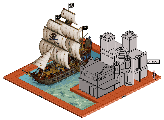 (you and your fancy transparency...) I kept for the most part, your areas of shading. I just textured. Those are a few ideas / suggestions that you could think about for giving your boat alittle bit more. I found it to look alittle like plastic. Almost like those lego pirate ships, with the hard shiny plastic. Hopefully thats a valid edit. if not then discard it. ------------- |
Posted By: jalonso
Date Posted: 23 November 2007 at 7:36am
|
Oh yes! It did have a plastic look. The body of the ship I would have worked on some more but the sails I thought were ok as they were. I love what you did so the sails and will add texture to them, thx a million for that. transparency ??? *I missed spam action on my own thread : ( ------------- |
Posted By: flaber
Date Posted: 23 November 2007 at 2:01pm
|
not sure i got the body right for you though. that was the part i was alittle iffy on. Tried to add in the separation between the pieces of wood aswell as some nails. Since the outside of the boat is in water, it would be pretty saturated and worn, thus giving it the rough grain. glad you liked the sails though. You had the sails shaded well, but it just seemed alittle too much like a solid object. With the definate shadows and highlights, blocked in. Where as sails are cloth material and are always changing, so i figured to try and give a lighter texture with softer highlights and shadows throughout. (dynamic dithering) The part just left of the skull and cross bones, and below (in the shadows) i did together quickly. But im sure you still get the right idea for it. The red railing on the side of the boat.. i barely even knew it was there until I sat down and started texturing. Id suggest trying to make that more prominent. You have alot of details and things going on, which is fantastic. But some of the things get lost in the confusion. So you need to then have things adjusted for slightly foreground and slightly background. Where the things in front have more highlights, and are outlined better. and the things behind have slightly less detail. Right now I found things to all be at the same colour intensities and detail intensities, causing things to get lost in the confusion and mess. Another example of this would be the nets and the ladder. So then, my biggest crit would be to bring out the red railing more. I did alittle bit, but i think it could still be brought out more. Hopefully though, that was a helpful edit, and that maby you can use something out of it. depending on how things go, maby ill make another edit for ya ;) maby ill step into your water. hehe (oh, what i meant by transparency, was that i have the nice white background...) ------------- |
Posted By: jalonso
Date Posted: 23 November 2007 at 3:58pm
|
I love you flaber :D All of those details will be done in the next ship update.  *thx, to the Mod that changed my topic typo. ------------- |
Posted By: Larwick
Date Posted: 23 November 2007 at 4:10pm
Keep up the good work jallo! :D
-------------  http://larw-ck.deviantart.com"> http://larw-ck.deviantart.com">
|
Posted By: jalonso
Date Posted: 23 November 2007 at 9:44pm
 ------------- |
Posted By: Squirrelsquid
Date Posted: 23 November 2007 at 10:02pm
|
that's just lovely.. add a Treasure box under water, will you? ;)
------------- vote for squirrels crates! |
Posted By: cthulhu
Date Posted: 23 November 2007 at 10:30pm
|
... and the ghost of the poor soul who the pirates killed and took the treasure from...
------------- Artist formerly known as "herbert_west" |
Posted By: Squirrelsquid
Date Posted: 23 November 2007 at 10:48pm
|
... like Le Chuck! O.o
------------- vote for squirrels crates! |
Posted By: flaber
Date Posted: 23 November 2007 at 11:49pm
|
since were on such a roll. hows about we throw in a full scale kracken ;) slowly attacking the ship from the back, just so you see some tentacles here and there. :D ------------- |
Posted By: jalonso
Date Posted: 24 November 2007 at 10:36am
 ------------- |
Posted By: Sabata
Date Posted: 24 November 2007 at 11:57am
|
OMG Jal
this is the most precious piece for me!!! Some time
now I decided to make a project on future and it evolves a lot of ships, since
I never did ships this will be awesome to learn from. I am amazed by this
------------- We fall to rise again. |
Posted By: flaber
Date Posted: 24 November 2007 at 1:03pm
|
straight across from the seals is... rocks im guessing? by the store? you have them shaded identically to the way you shaded the seals.. just in different colours. which thus makes me see them as awhole lot of dead seals piled up by the store, instead of rocks. give the rocks sharper edges, and deeper contrast between highlight and shadow. ------------- |
Posted By: jalonso
Date Posted: 24 November 2007 at 6:16pm
These rocks any better? ------------- |
Posted By: thedaemon
Date Posted: 24 November 2007 at 6:25pm
| Yes much better I would say. The people to me look a few pixels to large to actually use the boat. Isometric is orthographic right? Nice and busy with life. this piece it becoming great. |
Posted By: jalonso
Date Posted: 24 November 2007 at 6:32pm
|
Oh noes, I just remade the building to be more in scale. Are you saying I need a whole new ship
------------- |
Posted By: flaber
Date Posted: 24 November 2007 at 6:37pm
|
:) closer. much closer. They are good rocks. but now they are like stalagmite, rocks. hehe. but :( since they are so black now, they become a focal point... much better though than last time ------------- |
Posted By: BlackDragon
Date Posted: 24 November 2007 at 6:38pm
|
I think it would look fine if the guy with the telescope was like 1 px smaller on all sides, its called like depth perseption or something.
Oh yes, the rocks do look too dark. ------------- "A little pain never hurt anyone." - Blueberry_Pie |
Posted By: jalonso
Date Posted: 24 November 2007 at 6:40pm
|
Originally posted by flaber :) since they are so black now, they become a focal point... Is this a good thing? Should I go greyer? Is pointy rocks bad for this, or should I be square-ish? ------------- |
Posted By: jalonso
Date Posted: 24 November 2007 at 6:42pm
|
Originally posted by BlackDragon I think it would look fine if the guy with the telescope was like 1 px smaller on all sides, its called like depth perseption or something. Isometric is ALL same size by definition, can't do that. There is no depth perception in iso :/ ------------- |
Posted By: MashPotato
Date Posted: 24 November 2007 at 6:52pm
Jal, with all these re-workings and re-doings, I think you must be the most patient person I have ever encountered  I think the rocks are an improvement as well, although I agree they look perhaps a little too cave-like. When I think of rocks near the sea, I think of something flatter with more edges, like http://www.cavinguk.co.uk/holidays/HeroesOfTelemark2006/normal/ShoreRocks.jpg - these. If you prefer keeping the ones you have (which still look really good, btw), I think making them a little lighter would be nice ------------- http://theindiestone.com - the INDIE STONE |