| Active TopicsSearchRegisterLogin |
| WIP (Work In Progress) | |
| |
  |
| << Prev Page of 2 |
| Author | Message |
|
cure
Commander 
Joined: 23 March 2022 Online Status: Offline Posts: 2859 |
  Posted: 13 July 2009 at 1:32pm Posted: 13 July 2009 at 1:32pm |
|
your palette is extremely saturated right now, especially the orange
building. desaturate the oranges. where is your lightsource? And unless
this building is on an alien planet where 8 suns light the sky, then
yes, you need shadows. the tree needs work (a ball and a stick?),
google images of trees. the last three tiles of the sidewalk are a
different length than the rest. the door is off center. why don't the
bushes wrap around both sides of the building? dithering the grass
creates one color at 1x, so all it accomplished was looking like one
color but taking two to do it. try a real grass texture. the stiff,
inorganic lines of the vines bother me a little, and i think details
like vines should be saved for later on in the piece. not sure what's
going on with the grey area where the grass meets the pavement.
Edited by ThereIsNoCure - 13 July 2009 at 1:57pm |
|
 IP Logged IP Logged |
|
|
wenruto
Commander
Joined: 19 January 2021 Location: United States Online Status: Offline Posts: 115 |
Posted: 12 August 2009 at 5:15pm |
|
I was having trouble with my PC (troubleshooting) so since it's kinda fix now i want to finish that piece i am working on so can you guys help me with my grass tile because mine aint good here's what it looks like
 the shadow will be next |
|
|
Earn free stuff by searching like Google

|
|
|
IP Logged |
|
|
Manupix
Commander
Joined: 07 May 2026 Online Status: Offline Posts: 771 |
Posted: 13 August 2009 at 4:05am |
|
This has certainly come a long way! But there are still a number of issues, and grass is not so important at the moment. Grass tends to be boring anyway, I'm sure you'll find more interesting stuff to put in all that empty space. Your little grass tile is not bad by the way, it has volume.
Speaking of empty space, I think it would look far better on a much smaller, but controlled, ground patch. Parking lots and grass, well, that's boring unless you fill them with stuff. There are still important shape, color and light issues. The central part of the building is not symmetrical: the door and windows are shifted to the left. Because the right aisle is hiding a bit of the central wall, what you see as the middle of this wall is not the middle! Also, why are there only 3 rows of windows? There is room for one more at the top. But a more interesting possibility would be to reduce the height of that central part, by 1 story. That would make the bldg more interesting. The horiz space between windows changes randomly (15, 16 or 17 pxs), it's enough to give an uneasy feeling. I don't like so much that there are the same n° and spacing of windows on the narrower right side. Get them closer? have 5x4 on the front sides? Make the aisles square? Windows and door are completely flat: give them some depth. Windows are also very small, but this might be the architects choice ;-) The railing is still not good, far too uneven, and I think it was better in a light color. First, you should check the low roof wall it is supposed to be set on. It is itself far from uniform. Then put the railing posts along the middle of this wall, not at the edge, and space them regularly. You have to calculate the interval before, to make sure it comes OK at the angles! There might be some detail on that roof too. Your former boxes were not very good, too big, but think of smaller ones, with a technical look: elevator shelter, as well as chimneys, pipes, air con, tv. The building would look better if it was not exactly on the grounds corner. The hedges would look better if they were a little apart from the building. And check the hedge corners, you have problems keeping corners iso. Vines are a distraction. The outside grounds wall has no thickness. The alleyway has a problem. I guess it is tiled with square tiles, but since the alley is sideways, the short lines should not follow the 2x1 iso persp. Try 3x1 or 4x1. Lamp posts: one is inside, one is outside. Shading/color: There's not enough contrast between the lit and unlit sides; also make sure to shift saturation and hue on the darker sides, not just lightness. If the central part is deliberately of a different color, make it really different! Think architect! No pure greys, please... Why not make the outside wall bricks? Why are the inner sides out the outside wall darker than the outer sides, regardless of light? Grass and hedges are much too green. And, if you want to give real depth and light: things cast shadows. Choose a direction light comes from (left side, 45° is an easy one to start with), and put these shadows in. On the walls, roof, ground, hedges. Keep going! |
|
|
IP Logged |
|
|
minipuck
Commander
Joined: 23 August 2008 Online Status: Offline Posts: 185 |
Posted: 13 August 2009 at 6:15am |
|
i'd fix the driveway/walking path to the door.
 |
|

please click it, otherwise it will die, and it seems special. |
|
|
IP Logged |
|
|
wenruto
Commander
Joined: 19 January 2021 Location: United States Online Status: Offline Posts: 115 |
Posted: 21 August 2009 at 6:31pm |
|
Thank you guys for taking your time to help me TNHX
|
|
|
Earn free stuff by searching like Google
|
|
|
IP Logged |
|
|
wenruto
Commander
Joined: 19 January 2021 Location: United States Online Status: Offline Posts: 115 |
Posted: 21 October 2009 at 5:48pm |
|
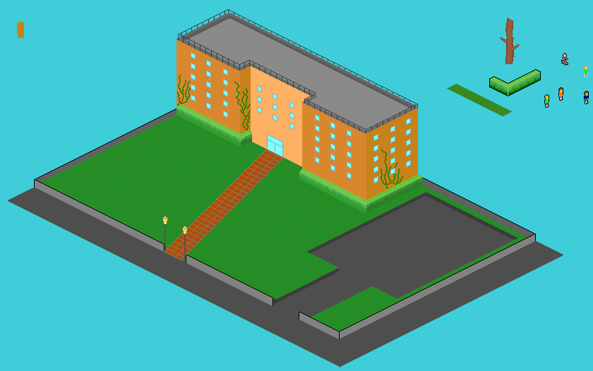
I've done some work but i was waiting for my soccer season to close to finish it and since i am new to those kind of techniques i dunno if i am doin the right thing here and i really appreciate you comments and there are still stuff to do especially the shadows ;( i have to work on so this is where i am so far =)
|
|
|
Earn free stuff by searching like Google
|
|
|
IP Logged |
|
|
wenruto
Commander
Joined: 19 January 2021 Location: United States Online Status: Offline Posts: 115 |
Posted: 17 November 2009 at 7:05pm |
|
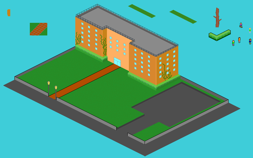
CAN ANYONE HELP ME WIT MY SHADOWS PLEASE???
 |
|
|
Earn free stuff by searching like Google
|
|
|
IP Logged |
|
|
Club Beuker
Commander
Joined: 29 January 2007 Online Status: Offline Posts: 513 |
Posted: 18 November 2009 at 2:06am |
|
Your shadows look weird because your shading is off.
How can the middle part off the left side of the building be lighter than the same side of the "wings". The shadow of the building suggests that the light comes from the back (top in the pic) while the shading of your windows suggests it comes from no direction at all. The shadnig on the building suggests your light comes from the bottom left. Make up your mind here! I'll try to make a quick edit for you that shows how you should properly shade. |
|
|
Without me, it's just aweso
|
|
|
IP Logged |
|
|
Club Beuker
Commander
Joined: 29 January 2007 Online Status: Offline Posts: 513 |
Posted: 18 November 2009 at 2:24am |
|
Very very quick n dirty edit:
 btw I counted 52 colors Edited by Club Beuker - 18 November 2009 at 2:30am |
|
|
Without me, it's just aweso
|
|
|
IP Logged |
|
|
Walrus
Midshipman 
Joined: 22 December 2007 Online Status: Offline Posts: 58 |
Posted: 18 November 2009 at 7:06am |
|
there is a perspective problem i found in the right corner of the bush-wall.
i dont know what caused the problem or how to solve it though. 
|
|
|
IP Logged |
|
|
Hatch
Admiral 
Joined: 05 August 2015 Online Status: Offline Posts: 1387 |
Posted: 18 November 2009 at 7:31am |
|
(left, right, back, and front in this post is relative to someone standing in front of the building, facing the road)
Don't go crazy with the dithering like that. Just use solid, flat shades. You've drawn your shadows as if they're being cast by completely flat structures, like billboards. If your light is coming from back-right, the shadows would be cast not just in front, but to the left as well. Currently it's like only your front faces are casting shadows. I would suggest making your light source coming from completely straight-on behind. You can follow the iso lines and your life will be much easier. Lastly, the hedge to the immediate right of the door is out of perspective. You need to learn to be more precise and careful. I don't know much about iso, but I do know you need to develop a bit of fussy nitpickiness about the SCIENCE behind it in order to be good at it. EDIT2: Actually, no, you'll need to lower the bottom of the hedge there and where it wraps around the bldg, I believe. I think this will also fix the perspective problem I pointed out above. Edited by Hatch - 18 November 2009 at 7:33am |
|
|
IP Logged |
|
|
wenruto
Commander
Joined: 19 January 2021 Location: United States Online Status: Offline Posts: 115 |
Posted: 11 December 2009 at 3:21pm |
|
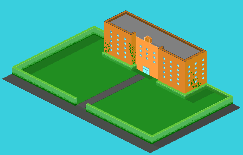
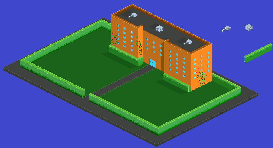
I Fix The Hedges and other stuff to do on the right side
 |
|
|
Earn free stuff by searching like Google
|
|
|
IP Logged |
|
| << Prev Page of 2 |
| |
||
Forum Jump |
You cannot post new topics in this forum You cannot reply to topics in this forum You cannot delete your posts in this forum You cannot edit your posts in this forum You cannot create polls in this forum You cannot vote in polls in this forum |
|
