| Active TopicsSearchRegisterLogin |
| Collaborations/Challenges | |
 Topic: 13 Color Comp( Topic: 13 Color Comp( |
  |
| << Prev Page of 4 Next >> |
| Author | Message |
|
a3um
Commander 
Joined: 25 June 2022 Location: Russian Federation Online Status: Offline Posts: 244 |
 Posted: 22 August 2013 at 2:32am Posted: 22 August 2013 at 2:32am |
|
Gonna put a wip here:)

update: le palette 
 Edited by a3um - 25 August 2013 at 6:35am |
|
 IP Logged IP Logged |
|
|
Gecimen
Admiral 
Joined: 17 October 2021 Online Status: Offline Posts: 3868 |
Posted: 22 August 2013 at 3:30am |
|
Updated everything except not-finished ones.
@byroz; I must say while in your piece it might look cool, I'd post the 2nd palette as an alternative and not replacement. |
|
|
IP Logged |
|
|
DawnBringer
Commander
Joined: 11 August 2024 Online Status: Offline Posts: 568 |
Posted: 22 August 2013 at 7:47am |
|
Edit: How do I remove the black from the palette list?
In the GrafX2 palette-editor: Copy your darkest color to the first & last unused index and [Spread] them. OR if you're working on an image using your palette (only!); select the darkest color and [Zap unused]. I'm gonna look into adding some option to the script that makes this easier. Edited by DawnBringer - 22 August 2013 at 8:26am |
|
|
IP Logged |
|
|
P0int
Midshipman 
Joined: 20 April 2022 Online Status: Offline Posts: 26 |
Posted: 22 August 2013 at 1:24pm |
|
I'm not sure what to do with my palette now. I suppose I should make a piece with it to see how well it works in use.
@Friend: Thanks. Is there any particular characteristic you like about my palette or just personal preference? @DawnBringer: Thank you! Do you have any quick observations you could share about my color choices? |
|
|
IP Logged |
|
|
DawnBringer
Commander
Joined: 11 August 2024 Online Status: Offline Posts: 568 |
Posted: 22 August 2013 at 2:09pm |
|
@P0int: Yeah, your dark-blue and brown have the same brightness; you can't afford to waste potential shades, esp. in the sparse dark region. Maybe make the brown about 12-14 brighter. The bright-red is too close to the orange (and the upper register is dominated by green & yellow) it could be about 16 brighter. You could also separate the medium-blue from the green a bit by making it a snippet darker (unless you have an intention for them to be close, ofcoz).
|
|
|
IP Logged |
|
|
jalonso
Admiral
Joined: 29 November 2022 Online Status: Offline Posts: 13537 |
Posted: 22 August 2013 at 2:21pm |
|
Everyone is doing such a great job with their palettes this time around.
|
|
|
|
|
|
IP Logged |
|
|
Peyton
Midshipman
Joined: 16 January 2018 Online Status: Offline Posts: 47 |
Posted: 22 August 2013 at 4:13pm |
|
I have decided to compile all of the pixel art done in my palette here, so it can be easy to see :p
And some made by my friend MmmOctopie 
|
|
|
IP Logged |
|
|
P0int
Midshipman
Joined: 20 April 2022 Online Status: Offline Posts: 26 |
Posted: 23 August 2013 at 4:27pm |
|
@DawnBringer: Thank you for pointing out the importance of having a broad and diverse value range. That was a dynamic I was not incorporating in my color choices. I see it as very valuable while working with a limited palette.
|
|
|
IP Logged |
|
|
Ashkin
Seaman 
Joined: 06 May 2012 Online Status: Offline Posts: 35 |
Posted: 24 August 2013 at 7:56pm |
|
I think I'll call this done for now. Need more stuff to demonstrate it, but I guess that can wait.
  |
|
|
IP Logged |
|
|
DawnBringer
Commander
Joined: 11 August 2024 Online Status: Offline Posts: 568 |
Posted: 24 August 2013 at 10:08pm |
|
@Ashkin: Your two greens line up in brightness with the greys (esp. the bright ones)- that's a terrible waste of brightness values (which is priority #1). Easiest tweak is probably to brighten the dark-grey a bit and darken the bright-green some. The yellow could be a little brighter. There's a big step from the black to the next darkest color, and the dark-red is not much darker than the red; so a suggestion would be to darken both dark-blue and dark-red a tad.
Other than that it's quite a nice palette, you've got a good alternation of hues along the brightness line. |
|
|
IP Logged |
|
|
Ashkin
Seaman
Joined: 06 May 2012 Online Status: Offline Posts: 35 |
Posted: 24 August 2013 at 11:14pm |
|
Thanks for the great feedback, Dawnbringer, here's the updated palette/mockup:
  Doing this exercise has made me think: What's the best way to choose colors? RGB or HSV? I've been using RGB for a while now, and I've never really thought of HSV, but maybe it would help me develop a better understanding of the relationships between colors. Edited by Ashkin - 24 August 2013 at 11:14pm |
|
|
IP Logged |
|
|
a3um
Commander
Joined: 25 June 2022 Location: Russian Federation Online Status: Offline Posts: 244 |
Posted: 25 August 2013 at 7:36am |
|
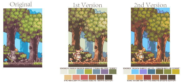
finished palette and inner body wip which I don't plan to finish:(


|
|
|
IP Logged |
|
|
DawnBringer
Commander
Joined: 11 August 2024 Online Status: Offline Posts: 568 |
Posted: 25 August 2013 at 4:46pm |
|
@a3um: Nice work. Though, making brown & bright-green 7-8 brighter might balance the brightness ramp even better ;)
|
|
|
IP Logged |
|
|
imnumberfour
Midshipman
Joined: 24 June 2021 Online Status: Offline Posts: 63 |
Posted: 26 August 2013 at 4:26am |
|
This is new to me
 |
|
|
IP Logged |
|
|
P0int
Midshipman
Joined: 20 April 2022 Online Status: Offline Posts: 26 |
Posted: 26 August 2013 at 9:46am |
|
Here are my developments on the palette. Not Quite Finished
Please, C&C.     Edited by P0int - 27 August 2013 at 8:23am |
|
|
IP Logged |
|
|
keeling00
Midshipman
Joined: 29 April 2007 Online Status: Offline Posts: 62 |
Posted: 27 August 2013 at 6:06am |
|
Maybe on next collaborations the pallete could be done in a more collaborative way.
1-Select the max amount of collours the pallete will have. Lets say 20, it need to be at least 3. 2-Instead of sending their palletes, users send just 2 colours. 3-judges vote on the stuff users send. 5-The pallete have now 2 colours. 6-People select the third colour that will be on the pallete,making sure it works with the previously selected colours. 7-Judges vote on the best one. 8-Continue doing this thing until you select 20 colours. 9-Pallete is done. Edited by keeling00 - 29 August 2013 at 5:21am |
|
|
IP Logged |
|
|
jalonso
Admiral
Joined: 29 November 2022 Online Status: Offline Posts: 13537 |
Posted: 27 August 2013 at 7:32am |
|
@keeling00, the whole idea behind palette comps is for pixelartists to learn how to create and develop limited palettes and understand better how colors interact for better pixels. Having collab palettes is not likely to accomplish that, imo.
To 'judge' any individual color is far too subjective. A complete palette is easier because the interaction of colors can be judged. |
|
|
|
|
|
IP Logged |
|
|
keeling00
Midshipman
Joined: 29 April 2007 Online Status: Offline Posts: 62 |
Posted: 27 August 2013 at 9:38am |
|
Originally posted by jalonso @keeling00, the whole idea behind palette comps is for pixelartists to learn how to create and develop limited palettes and understand better how colors interact for better pixels. Having collab palettes is not likely to accomplish that, imo. To 'judge' any individual color is far too subjective. A complete palette is easier because the interaction of colors can be judged. On my idea, users would need to vote what colour they want on pallete based on the previous colours that won, because they will be together on a pallete. Also judges would not judge the individual colours alone, they would judge the colours people post based on how they fit with the colours that won and are sure to be on the pallete. |
|
|
IP Logged |
|
|
Mrmo Tarius
Commander
Joined: 12 February 2022 Online Status: Offline Posts: 367 |
Posted: 28 August 2013 at 12:33pm |
|
I was working on yet another tiny tileset thing, so I thought I'd try and fit everything into 13 colors :P
I used DB's Grafx2 palette tools to try and understand how the colors "get along" :) Dunno if it's well-made enough to actually submit it, but at least it works nice with the tileset mockup :) 
*edit* made things more purple 'cause I miss purple :P The base inspiration was the Incredible Machine 2 palette, not that it has anything to do with it anymore :D Edited by Mrmo Tarius - 28 August 2013 at 4:58pm |
|
|
IP Logged |
|
|
DawnBringer
Commander
Joined: 11 August 2024 Online Status: Offline Posts: 568 |
Posted: 29 August 2013 at 12:05am |
|
@Mrmo: To be honest, the palette is somewhat flawed - but you're so good, the mock-up looks great anyways! ;) You demonstrate that a "partitioned" palette can work well with selective/specialized use (as here)... but it may suffer in general use.
Most noticeable you have big gaps in brightness and clumping in other areas. The red ramp could also be reviewed. In your palette I found a good example of some of the mechanics one should identify, and possibly adjust, when optimizing a palette (but as stated this is just an isolated example that ignores the relationship with the remaining colors. Always take the entire palette into consideration when making changes!) 
Along the brightness... ...If possible; zigzag Greens & Blues, so greens may interpolate blues and vice-versa. It also provides more Turquoise mixes. (But in a Turquoise-based palette one would probably line up greens & blues instead!) ...Alternate hues (ex: r,g,b,r,g,b...) for uniform ramps and better colormix & neutralization potential. If colors have the same brightness they should optimally be complementary (blue-yellow,green-purple etc.) or at least provide some other useful colormix. Edited by DawnBringer - 29 August 2013 at 12:38am |
|
|
IP Logged |
|
|
Mrmo Tarius
Commander
Joined: 12 February 2022 Online Status: Offline Posts: 367 |
Posted: 29 August 2013 at 2:05am |
|
I... had no idea about the greys via dihtering complementaries O_o
Thank you for the analysis and advice! I'll see if I can make some rational adjustments :) |
|
|
IP Logged |
|
|
Gecimen
Admiral
Joined: 17 October 2021 Online Status: Offline Posts: 3868 |
Posted: 29 August 2013 at 3:18am |
|
@Mrmo & DB; I tried and tend to think Mrmo's palette is more usable than many in a new piece (trying it on an existing piece doesn't work well). Don't know how but the fact that it covers most highly saturated areas allow it to work more diversely than low-sat palettes.
The only things I would change would be: * the colors having (almost) the same hue such as 2 greens, 2 browns, 2 purple-greys, for an even more diverse use. * the 2 mid colors that have almost the same brightness (purplegrey, orangebrown). * the darkgreen to a little more neutralizer tone against dark blue. That's just my 2 cents. |
|
|
IP Logged |
|
|
jeremy
Rear Admiral 
Joined: 25 November 2024 Location: New Zealand Online Status: Offline Posts: 1704 |
Posted: 29 August 2013 at 4:19am |
|
Originally posted by Mrmo Tarius I... had no idea about the greys via dihtering complementaries O_o Watch out everyone, Mrmo's discovered a whole new way of colour mixing ;) Edited by Jeremy - 29 August 2013 at 4:19am |
|
|
IP Logged |
|
|
Mrmo Tarius
Commander
Joined: 12 February 2022 Online Status: Offline Posts: 367 |
Posted: 29 August 2013 at 4:38am |
|
I really really try to avoid dihtering if at any way possible tho, so yeah :D
Edited by Mrmo Tarius - 29 August 2013 at 4:38am |
|
|
IP Logged |
|
|
keeling00
Midshipman
Joined: 29 April 2007 Online Status: Offline Posts: 62 |
Posted: 29 August 2013 at 6:44am |
 Another pallete I made for the contest. Edited by keeling00 - 29 August 2013 at 6:45am |
|
|
IP Logged |
|
|
P0int
Midshipman
Joined: 20 April 2022 Online Status: Offline Posts: 26 |
Posted: 29 August 2013 at 7:43am |
|
I would like some further critique on my color choices. I like the mood of the palette but there is still something off about it.
Also I am at a loss for good examples of the palette in use. I'm not sure how well this thing works in actual application and I feel I'm not quite an experienced enough pixeler to demonstrate my vision any mastery. Any help would be appreciated. I have learned quite a lot about color relations with this practice. |
|
|
IP Logged |
|
|
crozier
Commander
Joined: 08 May 2023 Online Status: Offline Posts: 190 |
Posted: 29 August 2013 at 8:29am |
|
K, p0int, first thing I see is the orange is over saturated. It feels like it absorbs all of the colors in the dithering color combo test. In relation to the other colors, the second darkest blue could be a few shades darker. I think that may unify your pallet a little more. Your darker colors could be a little more different, too. Make one or two a few shades darker and lighter. Might add a little variety. At least on my phone's screen, the 4 dark colors look kind of similar. This is most noticeable in that upmost graphic table in your earlier post.
|
|
|
IP Logged |
|
|
Mrmo Tarius
Commander
Joined: 12 February 2022 Online Status: Offline Posts: 367 |
Posted: 29 August 2013 at 9:34am |
|
Awright, so I made a not-so-slight tweak from:

to: 
I tried to produce a few complementaries and even out some ramps (mainly red one). The orange is now kinda dull, tho :/ Edited by Mrmo Tarius - 29 August 2013 at 1:18pm |
|
|
IP Logged |
|
|
DawnBringer
Commander
Joined: 11 August 2024 Online Status: Offline Posts: 568 |
Posted: 29 August 2013 at 4:47pm |
|
Def. improvement here! But there's still things that could be optimized:
* Indeed, the orange is drab, and since it's so close to the gray, why not give it some life. * There's a brightness gap in the middle, and the blue is now quite similar too the grey, why not make the blue a little darker. * For a little more drastic possibility: The two darkest colors are both red/purple, which means there's no choice or variance...every image will have to have a red dark region. I don't want to influence the palette too much, but if it was up to me...I'd extend the red ramp and make dark-blue and green darker to get the alternating sequence red-blue-red-green-red... (rather than red-red-blue-red-green...)  Edited by DawnBringer - 29 August 2013 at 4:49pm |
|
|
IP Logged |
|
|
Mrmo Tarius
Commander
Joined: 12 February 2022 Online Status: Offline Posts: 367 |
Posted: 30 August 2013 at 12:58am |
|
Okay, so, I tried to balance things a bit. Made the middle red a bit more purple, and tried to space brightness more evenly.
I discovered that the HSL mode is much more useful than the RGB mode when balancing the colorspace thing :D 
Maybe "black" is a bit too much on the green side? |
|
|
IP Logged |
|
|
DawnBringer
Commander
Joined: 11 August 2024 Online Status: Offline Posts: 568 |
Posted: 30 August 2013 at 2:40am |
|
@Mrmo: Think that looks pretty good; well balanced, but it also has a distinct character.
|
|
|
IP Logged |
|
|
Mrmo Tarius
Commander
Joined: 12 February 2022 Online Status: Offline Posts: 367 |
Posted: 30 August 2013 at 3:17am |
|
Eh, now that it's balanced and all that, it kind of looks like a certain other palette...
Here's the pretty-much final version: 
*edit* while I was in the mood, I adapted a simple, random duotone palette I made and used earlier (basically just a grayscale ramp hueshifted to blueish and reddish tones) into this: 
v2:  Edited by Mrmo Tarius - 30 August 2013 at 10:44am |
|
|
IP Logged |
|
|
CakeDrake
Commander
Joined: 16 February 2018 Online Status: Offline Posts: 85 |
Posted: 31 August 2013 at 4:31am |
|
I tried to add a gray to the palette, I don't know if it will fit in. I think I would have to brighten the gray and green, and change the "dirty yellow" to a light brown/gray maybe, because then it would be a waste.

 just a quick try. just a quick try.
|
|
|
IP Logged |
|
|
Hapiel
Rear Admiral
Joined: 30 June 2023 Online Status: Offline Posts: 3266 |
Posted: 31 August 2013 at 11:13am |
|
Here is my palette, I worked hard to optimize it!
 Will it match the theme of the collab? Hopefully it will be something like: Carnival Rollercoaster tycoon Loony tune land Rainbow River Candy land Flower Power Or something else bright and colorful. But just in case it will be something like Yellow desert Green jungle Silver Sci-fi remember that it might just look more interesting with 13 strong saturated colors ;) Hapiel |
|
|
IP Logged |
|
|
DawnBringer
Commander
Joined: 11 August 2024 Online Status: Offline Posts: 568 |
Posted: 31 August 2013 at 1:03pm |
|
@Hapiel: Looking pretty good. Making a small & functional high-saturation palette doesn't come easy (as it spans a larger volume of colorspace), still this one looks very promising. But...
...I'll say it for the 3d and last time; the dark-dark-dark-blue is a TOTAL waste, it's almost black and in the bright and cheerful context you're hoping for it would blend completely with the black...your palette is coherent and balanced except for this illogical eyesore - make it at least 20 brighter - and gain a useful shade of blue. |
|
|
IP Logged |
|
|
jalonso
Admiral
Joined: 29 November 2022 Online Status: Offline Posts: 13537 |
Posted: 31 August 2013 at 3:23pm |
|
ooooh, Ringmaster whips the clown >.<
|
|
|
|
|
|
IP Logged |
|
|
CakeDrake
Commander
Joined: 16 February 2018 Online Status: Offline Posts: 85 |
Posted: 31 August 2013 at 4:26pm |
|
I've worked more on it:
 
from what I can see I might have to make the brown more saturated. edit: progress 
  Edited by CakeDrake - 01 September 2013 at 8:57am |
|
|
IP Logged |
|
|
Pukahuna
Seaman
Joined: 18 November 2018 Online Status: Offline Posts: 38 |
Posted: 31 August 2013 at 8:56pm |

 Edited by Pukahuna - 02 September 2013 at 4:28pm |
|
|
IP Logged |
|
|
imnumberfour
Midshipman
Joined: 24 June 2021 Online Status: Offline Posts: 63 |
Posted: 01 September 2013 at 12:26pm |
|
Would someone be kind enough to generate some of those graphs for me?
I'm on my computer with next to no programs on it; Edited by imnumberfour - 01 September 2013 at 12:26pm |
|
|
IP Logged |
|
|
DawnBringer
Commander
Joined: 11 August 2024 Online Status: Offline Posts: 568 |
Posted: 01 September 2013 at 7:23pm |
|
@Mrmo: I like the first one with a bit of yellow. As long as the secret theme doesn't include too much vegetation... :D
@CakeDrake: Looking pretty good there. @Pukahuna: You got a clump of 4 colors in the lower-middle register (red,brown,green,purple); they all have about the same brightness, green & purple are complementary so those are ok, but red/brown are very similar. My suggestion is to make the red a little darker and the brown a bit brighter (so you have a nice ramp of all the brown/red/orange colors). Your two brightest colors are very similar and since the darkest color (after black) is quite bright - you could just darken all the colors between white and black about 10 or so. @im#4: Here! You got some issues with brightness-gaps and other areas with similar colors. A possible tweak is to make middle green,blue and grey a bit darker, and green a little darker still - relative the grey. 
|
|
|
IP Logged |
|
|
Pukahuna
Seaman
Joined: 18 November 2018 Online Status: Offline Posts: 38 |
Posted: 02 September 2013 at 4:32pm |
|
Thanks for the tips Dawnbringer :D I made some edits and put in my previous post, it looks better?
|
|
|
IP Logged |
|
|
Erstus
Seaman
Joined: 24 March 2012 Online Status: Offline Posts: 31 |
Posted: 02 September 2013 at 6:18pm |
|
Finished Palette:

Analysis chart: 
Test pixelling: 
|
|
|
IP Logged |
|
|
cirpons
Seaman
Joined: 01 June 2019 Online Status: Offline Posts: 14 |
Posted: 02 September 2013 at 8:35pm |
 Crits appreciated. Edited by cirpons - 02 September 2013 at 8:35pm |
|
|
IP Logged |
|
|
Friend
Commander
Joined: 01 April 2015 Online Status: Offline Posts: 710 |
Posted: 03 September 2013 at 8:36am |
|
Cirpons, the purple seems to dominate the palette
Ok, I would like my 2nd submission (Friend II) to be deleted. I dislike it. I also would like my 3rd submission (Friend III) to be replaced with this, because I made tweaks to it.  Dawnbringer, what kind of input would you have for a specialized palette such as the mine above? Edited by Friend - 03 September 2013 at 9:14am |
|
|
IP Logged |
|
|
DawnBringer
Commander
Joined: 11 August 2024 Online Status: Offline Posts: 568 |
Posted: 03 September 2013 at 10:03am |
|
@Friend: Looking good except for that strong red; it's just too saturated and glaring compared to the rest of the colors.
|
|
|
IP Logged |
|
|
Friend
Commander
Joined: 01 April 2015 Online Status: Offline Posts: 710 |
Posted: 03 September 2013 at 11:43am |
|
Originally posted by DawnBringer @Friend: Looking good except for that strong red; it's just too saturated and glaring compared to the rest of the colors. Which is the point of the palette  |
|
|
IP Logged |
|
|
[thUg]
Seaman
Joined: 12 November 2021 Online Status: Offline Posts: 22 |
Posted: 03 September 2013 at 8:09pm |
|
Hi, long time I haven't post something on PJ but keep reading news. I've made those 10 palettes 3 weeks ago when I saw this and forgot to post
them, I think I'm just in time
           Edited by [thUg] - 03 September 2013 at 8:10pm |
|
|
IP Logged |
|
|
crozier
Commander
Joined: 08 May 2023 Online Status: Offline Posts: 190 |
Posted: 03 September 2013 at 11:36pm |
|
Welp, here's mine.
edit- Not current! aaaand a few examples/tests/random doodles 
edit- Not current! Edited by crozier - 04 September 2013 at 2:59pm |
|
|
IP Logged |
|
|
Nyno
Seaman
Joined: 10 January 2016 Online Status: Offline Posts: 21 |
Posted: 04 September 2013 at 1:32am |
|
My entry:
 I was aiming for a palette that focused on tertiary colors (greens/purples/browns) where the colors wouldn't have too much contrast with one another, so I kept the saturation low. |
|
|
IP Logged |
|
|
jalonso
Admiral
Joined: 29 November 2022 Online Status: Offline Posts: 13537 |
Posted: 04 September 2013 at 8:07am |
|
Damm [thUg]...you never disappoint me with your color choices.
|
|
|
|
|
|
IP Logged |
|
| << Prev Page of 4 Next >> |
| |
||
Forum Jump |
You cannot post new topics in this forum You cannot reply to topics in this forum You cannot delete your posts in this forum You cannot edit your posts in this forum You cannot create polls in this forum You cannot vote in polls in this forum |
|
