| Active TopicsSearchRegisterLogin |
| WIP (Work In Progress) | |
| |
  |
| << Prev Page of 5 Next >> |
| Author | Message |
|
jalonso
Admiral 
Joined: 29 November 2022 Online Status: Offline Posts: 13537 |
  Posted: 02 December 2007 at 7:31pm Posted: 02 December 2007 at 7:31pm |
|
:p
These are all the pixels that are affected if I change the colors of the sails at this stage. And 3 of them are from the template base which mean they can't be changed. I'd hate to add colors now.  Edited by jalonso - 02 December 2007 at 7:32pm |
|
|
|
|
 IP Logged IP Logged |
|
|
flaber
Commander 
Joined: 03 March 2005 Online Status: Offline Posts: 130 |
Posted: 02 December 2007 at 7:54pm |
|
oh, well thats not too bad ;)
hehe. it was just a suggestion. But like i said, you could take the sails in either direction, either lighter or darker. WHAT you could do, though, since these colours are used SOO much throughout the rest of the picture... is... Well, first off, obviously leave the mandatory colours from the template. Then go through, and pick 1 or 2 prominant colours for each section. ex: 1 or 2 colours that are a light tan for the sails. 1 or 2 colours that are a yellow for your building. etc. Ideally, you want these to be at different sat and lum values. Instead, of just sliding hue. That way, you can use these colours in each pallete. Then depending on how many colours you are left with, go into neutrals. Neutral browns, neutral yellows... all the neutrals of the actual colours you have. (low saturation). Now each of these neutrals holds a hint of a colour, but at the same time you are able to mix them and cross them wherever without huge contrast like you have. Now that you have your restricted template colours, your base colours, and a few neutral colours.. it becomes a game of ratios and proportions. A game of fooling the eye, into making it see what you want it to. Your neutrals will be your saving grace. If you use the slight hints of colour you want, with more of the base colour, and then finish shading with the neutrals you will get the colour you want. I had an experiment i did awhile ago - that if you could colour something using non of the appropriate colours. I believe i made wood out of blue, purple, green, yellow, and possibly alittle orange. There were no tans, or browns, yet in the ratios and combinations it was as if you blended the colours much like you blend paints. By say, taking pure red, pure yellow, if you were to dither 50% of each, you would see an orange colour, despite you not even using orange. Since we arnt using pure colours, the neutrals help to aid in the 'mixing' and sat/lum change. hopefully im not just rambling, but rather making alittle bit of sense. Right now, you have alot of prominant main colours. Like for the buildings - they scream, I AM PINK, I AM YELLOW. the boat screams I AM BROWN. this is because of so many colours that are precisly dedicated to their cause. If you could interchange say your dark browns on the boat for the shadows on the buildings, and then the lightest pinks and yellows for the lightest shades on the sails.. you would be able to save yourself some colours. you must hate me by now. |
|
|
|
|
|
IP Logged |
|
|
jalonso
Admiral
Joined: 29 November 2022 Online Status: Offline Posts: 13537 |
Posted: 02 December 2007 at 7:59pm |
|
Originally posted by flaber ...if you were to dither 50% of each...  Originally posted by flaber you must hate me by now.  |
|
|
|
|
|
IP Logged |
|
|
flaber
Commander
Joined: 03 March 2005 Online Status: Offline Posts: 130 |
Posted: 02 December 2007 at 8:00pm |
|
Originally posted by jalonso Originally posted by flaber ...if you were to dither 50% of each... i know.. i know.. it was just an example. i would never actually suggest such a horrendous technique. it was to make a point! haha |
|
|
|
|
|
IP Logged |
|
|
Club Beuker
Commander
Joined: 29 January 2007 Online Status: Offline Posts: 513 |
Posted: 03 December 2007 at 12:56am |
|
Ok can someone write a small application that will fav this piece for me even when I'm not sitting behind my computer?
For extra points: also make the app place a comment saying "first" there That would make me happy... P.S. Where's the voodoo priest?????  |
|
|
Without me, it's just aweso
|
|
|
IP Logged |
|
|
jalonso
Admiral
Joined: 29 November 2022 Online Status: Offline Posts: 13537 |
Posted: 03 December 2007 at 6:52am |
|
Originally posted by Club Beuker ...Where's the voodoo priest????? ...He's busy writing applications in the pink tower. |
|
|
|
|
|
IP Logged |
|
|
Doomcreator0
Commander
Joined: 12 March 2017 Online Status: Offline Posts: 187 |
Posted: 03 December 2007 at 3:23pm |
|
I personally don't like dithering in this piece. It looks nicer smoothed out like this. Give yourself a break Jalonso. You deserve one.

|
|

|
|
|
IP Logged |
|
|
flaber
Commander
Joined: 03 March 2005 Online Status: Offline Posts: 130 |
Posted: 03 December 2007 at 3:45pm |
|
nope.
no breaks. keep givin err :) |
|
|
|
|
|
IP Logged |
|
|
jalonso
Admiral
Joined: 29 November 2022 Online Status: Offline Posts: 13537 |
Posted: 08 December 2007 at 3:38pm |
|
recoloring the ship 9.9
 |
|
|
|
|
|
IP Logged |
|
|
Squirrelsquid
Commander
Joined: 18 July 2023 Online Status: Offline Posts: 259 |
Posted: 08 December 2007 at 3:41pm |
|
I just looove, the new sails. can't wait till you finished the wood.
I'm missing a pirate with a parrot... and monkey! every pirate crew needs a crazy monkey |
|
|
IP Logged |
|
|
Skaka
Commander
Joined: 31 October 2007 Online Status: Offline Posts: 183 |
Posted: 08 December 2007 at 4:15pm |
|
I like the new sails but I think you've cursed yourself trough this piece :P
|
|
|
Ars longa, vita brevis.
|
|
|
IP Logged |
|
|
flaber
Commander
Joined: 03 March 2005 Online Status: Offline Posts: 130 |
Posted: 08 December 2007 at 4:52pm |
|
much nicer.
still planning to texture them though? instead of lump sums of colour right? much smoother! but.. did you make new colours, or use from existing pallete. if you edited the existing pallete i will be plenty much pleased :) |
|
|
|
|
|
IP Logged |
|
|
jalonso
Admiral
Joined: 29 November 2022 Online Status: Offline Posts: 13537 |
Posted: 08 December 2007 at 7:55pm |
|
This now has 2 less colors and some palette revisions have been made.
I have also desaturated the shadow side of the buildings as suggested earlier. Cleaned the sidewalk a little so the Captain and parrot show up. Sadly, the monkey is still kicking college guy butts but will be back soon. Remade all the ropes and moved some things around too. Boat wood planks and sail details for later.  |
|
|
|
|
|
IP Logged |
|
|
leel
Commander
Joined: 29 June 2005 Online Status: Offline Posts: 3001 |
Posted: 08 December 2007 at 9:42pm |
|
those are nice sails, really.. there's a cool effect going there, but does anyone else find them insanely distracting? They're just SO cool that i cant keep my eyes on anything else for more than a split second.. i mean.. theres like pink coming from the blue.. PINK WHOA.
Anywho.. my 2 cents: you earned some serious respect points by going back to square one as much as you did. Was a nice reminder that art is actually hard work. Too often people just spit something out and if it doesn't work just call it a 'practice' and try something different next time. I did that on like every project this semester. +500 points P.S. I'm sure the sails won't stand out so much when you add the nice texture. Good luck  Edited by leel - 08 December 2007 at 9:43pm |
|
|
IP Logged |
|
|
flaber
Commander
Joined: 03 March 2005 Online Status: Offline Posts: 130 |
Posted: 09 December 2007 at 12:46am |
|
nice. starting to come along.
i can almost call this 'pixelart' now ;) mind if i make a suggestion? what a question.. i know you mind :D it just irks you. thus why i do it. since your main change / focus was colour change. im going to comment on colour change alone. the sails are much improved with their smoothness between each colour. Thats very nice change. But, now you have them nearly blue? You seem to keep chaning your mind about what colour you want your sails to be. Blue or brown. Hows about, for the sake of the crit, lets say we want tan sails. why? because as leel said, they are super distracting and a main focal point now that they are blue. If you make them a tan then it becomes more uniform and whole with the entire picture. But then, we want a tan, without it being such a solid tan colour that it too looks off and funny. So hows about we actually think about the material we are colouring. this is a white/tan piece of cloth. Which means it will reflect most colours, and is probably dirty. Therefore, it does not mean that only browns and tans and whites will be reflected to develop that colour in our eyes. It will reflect most colours, but in different ratios, as to still give the appearance of brown: 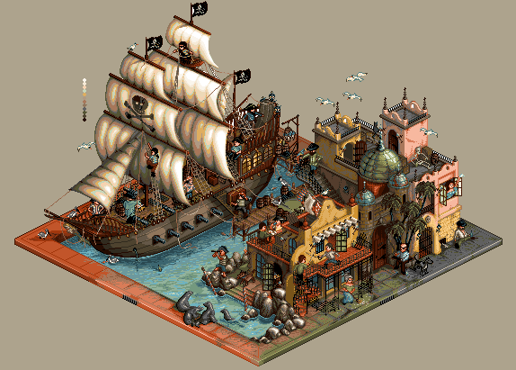 There are reds, tans, browns, greens, blues, greys, and pinks all mixed into there. Yet for the most part it still maintains a tan-ish colour. As you blend and mix you can refine this further by defining your ratios that much stronger. your sails now, focus heavily on blues, soley for the shadows, and the light neutrals for the highlights. Mix it up abit. this is now almost stepping into what i call 'double pallete blending' its an interesting concept, and could be applied to the whole piece, if so chosen. The buildings are a nice update too. the darker shadows on the one side are good. my only crit for them, is to make sure there is a prominant difference between straight on, top, and side light source. The front and side are good. But its the top that varies in inconsistancy. Sometimes you have it really light, sometimes you have it darker. try to make sure you have 3 separate planes, recieving different amount of light. you have it pretty well on par. Just hear and there, on a few places could be fixed up, to give it that even further dramatic effect. oh.. i always forget to mention. the water. it should be shallow (like it is) close to the buildings. But then your going to need a huge shelf / drop off. In order for the boat to be there. Those cant sail into very shallow waters, or well, dont normally. So perhaps deepen around the boat? hope some of these new comments may be useful. [EDIT / NOTE] I dont feel like looking back and trying to see where this could fit in... but... the colours i changed in the sale, to illustrate that example were chosen from your colours already. I did not change or create anything myself. I only replaced with colours that were already existant somewhere else in the picture Edited by flaber - 09 December 2007 at 12:56am |
|
|
|
|
|
IP Logged |
|
|
jalonso
Admiral
Joined: 29 November 2022 Online Status: Offline Posts: 13537 |
Posted: 09 December 2007 at 6:36am |
|
@flaber, All points well made and taken to heart, you rock!
The top lighting is inconsistent and have the illusion of difference in luminosity because the are all shadowed in. The colors are the same exact shades, cut me some slack, meanie :'( To explain my rationale for the blue on the sails. I thought that since canvas sails are not an opaque material and white in color the would pick up the reflection from below thus blueing the shadows whereas the sun and environment would pick the red/yellows for the highlights. Besides exocet's palette (now gone entirely) the only other item from the beginning of this project was the lighting on the sails. I am fighting myself to keep this intact because real/unreal or good/bad it 'did it' for me on and as evidenced by the length of this thread, still does. Perhaps for my description, once added to the gallery, I'll say its my first pixelart  @leel, lol at insanely distracting |
|
|
|
|
|
IP Logged |
|
|
Hapiel
Rear Admiral 
Joined: 30 June 2023 Online Status: Offline Posts: 3266 |
Posted: 09 December 2007 at 6:49am |
|
Originally posted by leel those are nice sails, really.. there's a cool effect going there, but does anyone else find them insanely distracting? They're just SO cool that i cant keep my eyes on anything else for more than a split second.. i mean.. theres like pink coming from the blue.. PINK WHOA. Wow you are right! I tried, and I cant study the buildings anymore now with these sails! even when I zoom in it remains hard! thats why I like flabers version much more..  |
|
|
IP Logged |
|
|
jalonso
Admiral
Joined: 29 November 2022 Online Status: Offline Posts: 13537 |
Posted: 09 December 2007 at 10:32am |
|
XD
So I have brought the colors down from 45 to 31 (might add a mellow green too). All are new colors except the Pixeldam colors. I know it looks harsh atm. I will of course have to recolor the rougher areas using my new palette. Looks much better to me right now.  Edited by jalonso - 09 December 2007 at 10:49am |
|
|
|
|
|
IP Logged |
|
|
Reo
Rear Admiral
Joined: 18 January 2026 Online Status: Offline Posts: 679 |
Posted: 09 December 2007 at 10:45am |
|
I love the new colors!

|
|
|
IP Logged |
|
|
greenraven
Commander
Joined: 08 September 2016 Online Status: Offline Posts: 2598 |
Posted: 09 December 2007 at 10:50am |
|
Yeah it looks a little gritty at the moment. Good luck with the recolors.
|
|
 "pwnage comes with patience, practice and planning." ~ Jalonso "pwnage comes with patience, practice and planning." ~ Jalonso 
|
|
|
IP Logged |
|
|
flaber
Commander
Joined: 03 March 2005 Online Status: Offline Posts: 130 |
Posted: 09 December 2007 at 12:16pm |
|
oh wow.
why such a radical change now in colours? or are you trying to drop colour count? hmmm.. im going to wait for you to re-colour those rough areas, so I can get a better idea of what your going for. it does seem very dark, and alittle washed out. Its not bad, just much different than what you were working with before (warmer colours). So, lets see how you can get this going. im no meanie >_< im just the pain in your side that wont go away For the tops of buildings then, since they are same colours... mix/blend in darker colours with it. since what you have for the tops, is the darker colour/texture of the fronts its hard to differentiate. Then your side is much much darker. So if you took the lightest tone from that, and mixed it with the darkest tone from the front, and scattered/blended/dithered in some mannerism, as to give an obvious different plane. I never said anything about the lighting on the sails. It was the colours. The actual shading and such, is fine. True, it would pick up the colour from the ocean, as blue. But, its surrounded by plenty of other colours too. The actual ship itself would have a huge influence on light bouncing onto it. As would the buildings. So thats then where cold and warm colours come in. The shadows, would be influenced by the huge ocean giving them a slight blue tint (hence slight, meaning not every shadow shade needs to be blue). The highlights/warmer colours would be influenced by light coming from the ship and building. Giving more random crazier colours sort of like my edit, where it looks 'polluted'. Its recieving light from everywhere, and since its a light coloured fabric it would reflect most. Thats where perhaps looking further into double pallete blending might become of use. With how youv started, the side of your ship would be a good candidate for it aswell. if you really want.. you could probably google some pirate ships just to see somehting similar as to what i was telling you. 'your precision of pixel placement, the love you put into each and every pixel' is really starting to surprise me jal :). hahaha |
|
|
|
|
|
IP Logged |
|
|
jalonso
Admiral
Joined: 29 November 2022 Online Status: Offline Posts: 13537 |
Posted: 09 December 2007 at 1:10pm |
|
Originally posted by flaber 'your precision of pixel placement, the love you put into each and every pixel' is really starting to surprise me jal :). hahaha I've heard this before somewhere  *I always try to use the least amount of colors possible. Its a PA pet-peeve. |
|
|
|
|
|
IP Logged |
|
|
greenraven
Commander
Joined: 08 September 2016 Online Status: Offline Posts: 2598 |
Posted: 09 December 2007 at 1:14pm |
|
Originally posted by jalonso *I always try to use the least amount of colors possible. Its a PA pet-peeve. Sounds like a challenge to me. Redo this piece with just 2 colors.  |
|
|
"pwnage comes with patience, practice and planning." ~ Jalonso
|
|
|
IP Logged |
|
|
jalonso
Admiral
Joined: 29 November 2022 Online Status: Offline Posts: 13537 |
Posted: 09 December 2007 at 1:17pm |
|
My bad, I meant least amount colors to make it appear as I'd like not just less colors for the sake of less colors.
|
|
|
|
|
|
IP Logged |
|
|
Hapiel
Rear Admiral
Joined: 30 June 2023 Online Status: Offline Posts: 3266 |
Posted: 09 December 2007 at 1:24pm |
|
Huge improvement! However I think that the ship is too dark, and the green area's on the ship are really terrible.. you need to remove/replace those! The rest of the colors are less warm, not my favourite but surely alot better! |
|
|
IP Logged |
|
|
jalonso
Admiral
Joined: 29 November 2022 Online Status: Offline Posts: 13537 |
Posted: 09 December 2007 at 1:48pm |
|
Back to the beginning but completely knowing what I'm doing now XD
 |
|
|
|
|
|
IP Logged |
|
|
BlackDragon
Commander
Joined: 13 May 2014 Location: United States Online Status: Offline Posts: 729 |
Posted: 09 December 2007 at 2:05pm |
|
I do hope you're not keeping those rocks the way they are... they look a lot like metal.
Anyways, nice update.
|
|
|
"A little pain never hurt anyone." - Blueberry_Pie
|
|
|
IP Logged |
|
|
greenraven
Commander
Joined: 08 September 2016 Online Status: Offline Posts: 2598 |
Posted: 09 December 2007 at 3:15pm |
|
Your patience and dedication is an inspiration to us all bug man. Keep at it.

|
|
|
"pwnage comes with patience, practice and planning." ~ Jalonso
|
|
|
IP Logged |
|
|
jalonso
Admiral
Joined: 29 November 2022 Online Status: Offline Posts: 13537 |
Posted: 09 December 2007 at 4:18pm |
 |
|
|
|
|
|
IP Logged |
|
|
surt
Commander
Joined: 30 December 2015 Online Status: Offline Posts: 413 |
Posted: 09 December 2007 at 4:24pm |
|
New shading on building looks much more naturalistic and hence nicer.
Rocks still look like metal though. The white highlight is to blame there methinks. |
|

|
|
|
IP Logged |
|
|
greenraven
Commander
Joined: 08 September 2016 Online Status: Offline Posts: 2598 |
Posted: 09 December 2007 at 4:26pm |
|
Actually it doesn't look like metal to me, but rather like coal. O_o
|
|
|
"pwnage comes with patience, practice and planning." ~ Jalonso
|
|
|
IP Logged |
|
|
flaber
Commander
Joined: 03 March 2005 Online Status: Offline Posts: 130 |
Posted: 09 December 2007 at 4:59pm |
|
Originally posted by jalonso Originally posted by flaber 'your precision of pixel placement, the love you put into each and every pixel' is really starting to surprise me jal :). hahaha I've heard this before somewhere ehh, seemed suitable.. alittle out of context, but it works here:) heh, maby i should stop giving you crits and comments. this is like your 30th redo. although now, now that you have an idea of what you want. with crossing palletes, double pallete blending, and texturing techniques (and NO 50% dither) it should be a nice improvement. I shall wait and see! [suggestion] since your right down to basics. Dont even worry about blending, texturing, or mixing anything right now. Lay your flat colours. Just like its important to have a solid lineart, with defined details, and a good understanding of what the image is working solid colours into the perfect spot is the next important step. Dont combine it will blending and texturing. All textures and blends are, are a manipulation of the flat colours you layed out. They add that extra kick of flavour. so technically, you could make a piece look fairly decent solely on flat colours. so perhaps refine that, and it is easier to edit and fix flat colours, then reworking dynamic dithering Edited by flaber - 09 December 2007 at 5:02pm |
|
|
|
|
|
IP Logged |
|
|
ceddo
Commander
Joined: 01 June 2020 Online Status: Offline Posts: 466 |
Posted: 10 December 2007 at 9:09am |
|
Totally digging the new color theme of blue/yellow! One thing that's bugging(lol) me is how clean the roof near the rocks looks. I think you could add some dark under the highlights to make the form of each tile more obvious, and even put some grime coming from the building. Also think behind the building should be darker.
|
|
|
IP Logged |
|
|
flaber
Commander
Joined: 03 March 2005 Online Status: Offline Posts: 130 |
Posted: 10 December 2007 at 3:27pm |
|
its always easy to add grime, and dirt, and texture
defining proper lights, and shade shapes/quantities is the hard part. it be best to let him work clean right now, and then grime and texture after his shades are defined properly |
|
|
|
|
|
IP Logged |
|
|
loopyash
Seaman 
Joined: 06 December 2007 Online Status: Offline Posts: 2 |
Posted: 11 December 2007 at 9:39am |
|
How do I post my pixel art? |
|
|
IP Logged |
|
|
greenraven
Commander
Joined: 08 September 2016 Online Status: Offline Posts: 2598 |
Posted: 11 December 2007 at 10:04am |
|
For starters don't invade other people's topics.
Just create . And then  . .Or for the gallery just submit. edit: Ok that isn't funny.
 Edited by greenraven - 11 December 2007 at 10:11am |
|
|
"pwnage comes with patience, practice and planning." ~ Jalonso
|
|
|
IP Logged |
|
|
Vertigo-Zero
Midshipman 
Joined: 14 July 2018 Online Status: Offline Posts: 59 |
Posted: 15 December 2007 at 2:43am |
|
Think you did an amazing job, only because you used so much colours on the sails they look pillow-shaded... mayb less contrast
|
|
|
IP Logged |
|
|
Skaka
Commander
Joined: 31 October 2007 Online Status: Offline Posts: 183 |
Posted: 15 December 2007 at 11:48am |
|
Pillow shaded my nads, it's clear where the lightsource is (top left).
|
|
|
Ars longa, vita brevis.
|
|
|
IP Logged |
|
|
Platnium
Commander
Joined: 27 June 2007 Online Status: Offline Posts: 319 |
Posted: 15 December 2007 at 12:15pm |
|
Actually the light source looks like it is coming from the top right,look at the building.
|
|

|
|
|
IP Logged |
|
|
Skaka
Commander
Joined: 31 October 2007 Online Status: Offline Posts: 183 |
Posted: 15 December 2007 at 12:31pm |
|
Yeah my mistake, don't know left from right haha XD
|
|
|
Ars longa, vita brevis.
|
|
|
IP Logged |
|
|
jalonso
Admiral
Joined: 29 November 2022 Online Status: Offline Posts: 13537 |
Posted: 15 December 2007 at 9:46pm |
|
*looks side to side*
 Ship still in progress. New buildings, moved around loads of stuff. New colors. Edited by jalonso - 15 December 2007 at 9:47pm |
|
|
|
|
|
IP Logged |
|
|
zi-double
Commander
Joined: 05 October 2021 Online Status: Offline Posts: 277 |
Posted: 16 December 2007 at 6:53am |
|
for me front upper part of left building on the wall is too clear without details ... maybe need some ornaments
else look fantastic and I can't comment, but like edition and works like this inspire me too much :) cheers on the deck hehehe |
|
|
IP Logged |
|
|
jalonso
Admiral
Joined: 29 November 2022 Online Status: Offline Posts: 13537 |
Posted: 16 December 2007 at 1:08pm |
 |
|
|
|
|
|
IP Logged |
|
|
Setzer
Commander
Joined: 18 December 2016 Location: United States Online Status: Offline Posts: 780 |
Posted: 16 December 2007 at 1:41pm |
|
your attempt at texture have given the sails more of a "really bad quality filter" look than fabric =(
 take another look at that one, might help? They just look really fuzzy atm and... almost jpeg D= take another look at that one, might help? They just look really fuzzy atm and... almost jpeg D=
|
|

|
|
|
IP Logged |
|
|
theguy
Commander
Joined: 03 November 2023 Online Status: Offline Posts: 417 |
Posted: 16 December 2007 at 2:14pm |
|
@greenraven: actually loopy ash posted here already submitted it to the gallery then PMed me and and asked and I told him so he didnt already know and hes not a spammer also this is the first forum hes ever been on I know because hes a friend of mine from school
|
|
|
IP Logged |
|
|
flaber
Commander
Joined: 03 March 2005 Online Status: Offline Posts: 130 |
Posted: 16 December 2007 at 10:33pm |
|
Originally posted by jalonso Eek... JAL!! what have we been talking about this whole time? and then.. you go and texture 'across the grain' If your sails are vertical.. the shading is up and down.. and the flow of the object is up and down... should you texture not follw the same path/ you are texturings 'across the grain' of the object. It is a vertical object... Think of it like colouring with pencil crayons, would you use small side to side strokes to fill in the sial, or large sweeping strokes to follow the form and curve of the object up and down. colours arnt bad though |
|
|
|
|
|
IP Logged |
|
|
Skaka
Commander
Joined: 31 October 2007 Online Status: Offline Posts: 183 |
Posted: 17 December 2007 at 2:33am |
|
Simply do this"
Take a linen bedsheet and put it in your window and stand on the opposite end of the room. How much texture do you see then? I think you would see even less at a great distance to the point where a pixel is too big :P |
|
|
Ars longa, vita brevis.
|
|
|
IP Logged |
|
|
jalonso
Admiral
Joined: 29 November 2022 Online Status: Offline Posts: 13537 |
Posted: 17 December 2007 at 5:43am |
|
I know its lame. I was trying stuff and learning and thought I'd show it for the hell of it.
I would have sent this back to myself if submitted to the gallery, btw.  E: This is exactly what this project has been  spartan_1117's siggy spartan_1117's siggyEdited by jalonso - 17 December 2007 at 5:58am |
|
|
|
|
|
IP Logged |
|
|
jalonso
Admiral
Joined: 29 November 2022 Online Status: Offline Posts: 13537 |
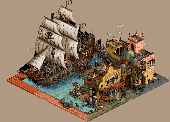
Posted: 22 December 2007 at 12:18pm |
|
Another attempt
 |
|
|
|
|
|
IP Logged |
|
|
greenraven
Commander
Joined: 08 September 2016 Online Status: Offline Posts: 2598 |
Posted: 22 December 2007 at 2:03pm |
|
Ye gods you've started this thing over so many times it's not even funny. I'll just keep the small nitpicks to myself.
This looks great. |
|
|
"pwnage comes with patience, practice and planning." ~ Jalonso
|
|
|
IP Logged |
|
| << Prev Page of 5 Next >> |
| |
||
Forum Jump |
You cannot post new topics in this forum You cannot reply to topics in this forum You cannot delete your posts in this forum You cannot edit your posts in this forum You cannot create polls in this forum You cannot vote in polls in this forum |
|

