| Active TopicsSearchRegisterLogin |
| Collaborations/Challenges | |
| |
  |
| Page of 2 Next >> |
| Author | Message |
|
administrator
Admiral 
Joined: 03 March 2005 Online Status: Offline Posts: 0 |
  Topic: CHALLENGE 7/18/2011: Rainbow Cheapskate Topic: CHALLENGE 7/18/2011: Rainbow CheapskatePosted: 18 July 2011 at 12:00am |
CHALLENGE: Rainbow CheapskateUse only four colours to create an image featuring a rainbow. CHALLENGE RULES
CHALLENGE JUDGING
CHALLENGE PRIZES/GOODIES
CHALLENGE VOTINGVote now for your favorite pixelart in this week's challenge!CHALLENGE AWARDSThe Rainbow Cheapskate pixel art challenge is complete and we have three new champions. This week's challenge awards go to the following pieces:Thanks so much to all who took the time to vote and participate in the challenge! |
|
 IP Logged IP Logged |
|
|
Smilecythe
Seaman 
Joined: 22 November 2019 Online Status: Offline Posts: 24 |
Posted: 18 July 2011 at 2:58am |
|
Interesting challenge.

|
|
|
IP Logged |
|
|
pixer
Midshipman 
Joined: 15 February 2009 Online Status: Offline Posts: 45 |
Posted: 18 July 2011 at 4:18am |
|
there is my wip =')
 progress:  FINISHED !  Edited by pixer - 18 July 2011 at 5:47am |
|
|
IP Logged |
|
|
Mirm
Seaman
Joined: 23 October 2018 Online Status: Offline Posts: 1 |
Posted: 18 July 2011 at 5:49am |
|
My wip
 Upd  Edited by Mirm - 18 July 2011 at 7:35am |
|
|
IP Logged |
|
|
Chrispy
Seaman
Joined: 28 October 2016 Online Status: Offline Posts: 17 |
Posted: 18 July 2011 at 10:55am |
|
WIP
 Finished  Reference I plan on throwing a real rainbow somewhere in there. Edited by Chrispy - 18 July 2011 at 12:43pm |
|
|
IP Logged |
|
|
PainForge
Seaman
Joined: 07 July 2011 Online Status: Offline Posts: 3 |
Posted: 18 July 2011 at 12:23pm |
|
does shading count as a color [ie. if i use a lighter shade of red to add realism in my shading.] ?
|
|
|
IP Logged |
|
|
Chrispy
Seaman
Joined: 28 October 2016 Online Status: Offline Posts: 17 |
Posted: 18 July 2011 at 12:23pm |
|
Originally posted by PainForge Yes
does shading count as a color [ie. if i use a lighter shade of red to add realism in my shading.] ? |
|
|
IP Logged |
|
|
MacNcheese
Seaman
Joined: 13 July 2011 Online Status: Offline Posts: 36 |
Posted: 18 July 2011 at 1:18pm |
|
WIP
 |
|
|
IP Logged |
|
|
Chrispy
Seaman
Joined: 28 October 2016 Online Status: Offline Posts: 17 |
Posted: 18 July 2011 at 1:39pm |
|
This has GOTTA be rainbowy enough
 Edited by Chrispy - 18 July 2011 at 2:58pm |
|
|
IP Logged |
|
|
MacNcheese
Seaman
Joined: 13 July 2011 Online Status: Offline Posts: 36 |
Posted: 18 July 2011 at 3:27pm |
 I think I'm finished, might add some detail in the background, shadows or so... |
|
|
IP Logged |
|
|
Rebolation?
Seaman
Joined: 23 January 2011 Online Status: Offline Posts: 36 |
Posted: 18 July 2011 at 3:44pm |
|
My wip in black and white

|
|
|
IP Logged |
|
|
cure
Commander 
Joined: 23 March 2022 Online Status: Offline Posts: 2859 |
Posted: 18 July 2011 at 4:07pm |
|
the rainbow has disappeared entirely, leaving this an image of a vomiting unicorn.
|
|
|
IP Logged |
|
|
Life Dairy
Seaman
Joined: 06 May 2011 Online Status: Offline Posts: 8 |
Posted: 18 July 2011 at 4:28pm |
|
@chrispy
It kinda reminds me of a pro war poster Edited by Life Dairy - 18 July 2011 at 4:52pm |
|
|
IP Logged |
|
|
MacNcheese
Seaman
Joined: 13 July 2011 Online Status: Offline Posts: 36 |
Posted: 18 July 2011 at 5:15pm |
|
Originally posted by cure the rainbow has disappeared entirely, leaving this an image of a vomiting unicorn. You're absolutely right, i hope I've fixed it now:  Added clouds, which i know doesn't make sense whatsoever, but I hope it fits.. |
|
|
IP Logged |
|
|
Jinn
Rear Admiral 
Joined: 27 February 2026 Online Status: Offline Posts: 191 |
Posted: 18 July 2011 at 6:43pm |
|
Almost done. Not sure if I'll join tho.
 |
|
|
IP Logged |
|
|
skamocore
Admiral
Joined: 07 April 2021 Online Status: Offline Posts: 3866 |
Posted: 18 July 2011 at 6:54pm |
|
@Jinn - Great use of four colours. Regardless of whether you choose to enter or not, that's already one of my favourite things I've seen from you.
Why not try making the colours a bit more golden, though? |
|
|
IP Logged |
|
|
Jinn
Rear Admiral
Joined: 27 February 2026 Online Status: Offline Posts: 191 |
Posted: 18 July 2011 at 7:10pm |
 I've already played with these colors...  But I still thinking the original is the best. What would you suggest? Edited by Jinn - 18 July 2011 at 7:11pm |
|
|
IP Logged |
|
|
skamocore
Admiral
Joined: 07 April 2021 Online Status: Offline Posts: 3866 |
Posted: 18 July 2011 at 7:16pm |
|
Something along the lines of the third one - except, I would go with more of an orange colour instead of a red.
|
|
|
IP Logged |
|
|
Triumverent
Seaman
Joined: 12 July 2011 Online Status: Offline Posts: 6 |
Posted: 18 July 2011 at 7:27pm |
|
Sure! Join in! This is good stuff
|
|
|
IP Logged |
|
|
Jinn
Rear Admiral
Joined: 27 February 2026 Online Status: Offline Posts: 191 |
Posted: 18 July 2011 at 7:32pm |
|
I don't know...
I'm not a big fan of this blank space, but I don't know what I can do fix it. [edit] Some idea..  Edited by Jinn - 18 July 2011 at 7:55pm |
|
|
IP Logged |
|
|
Mrmo Tarius
Commander
Joined: 12 February 2022 Online Status: Offline Posts: 367 |
Posted: 19 July 2011 at 2:48am |
|
Jinn, I am amazed.
Here's something I'm working on: *updaet'd* 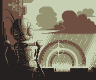 Edited by Mrmo Tarius - 19 July 2011 at 4:00am |
|
|
IP Logged |
|
|
skamocore
Admiral
Joined: 07 April 2021 Online Status: Offline Posts: 3866 |
Posted: 19 July 2011 at 2:51am |
|
@Jinn - Negative space is your friend :o maybe move him a little more to the right?
|
|
|
IP Logged |
|
|
eghost
Midshipman
Joined: 19 June 2018 Location: United States Online Status: Offline Posts: 99 |
Posted: 19 July 2011 at 6:24am |
|
WIP:

Decided to go with a muted CMYK palette for this...Seems to be workin...:) |
|
|
IP Logged |
|
|
MacNcheese
Seaman
Joined: 13 July 2011 Online Status: Offline Posts: 36 |
Posted: 19 July 2011 at 6:41am |
 Playing around with the palette... |
|
|
IP Logged |
|
|
skeddles
Commander
Joined: 08 April 2021 Online Status: Offline Posts: 636 |
Posted: 19 July 2011 at 6:45am |
|
Originally posted by Jinn
I don't know... I'm not a big fan of this blank space, but I don't know what I can do fix it. [edit] Some idea.. I'd mix the 3rd and 4th palettes, the 4rd looks good, just needs to be brighter. |
|
|
|
|
|
IP Logged |
|
|
Jinn
Rear Admiral
Joined: 27 February 2026 Online Status: Offline Posts: 191 |
Posted: 19 July 2011 at 9:35am |
|
Thanks, skamocore! It's a bit more for right, now.
And I changed the palette, what do you think? A or B?  Edited by Jinn - 19 July 2011 at 9:37am |
|
|
IP Logged |
|
|
HCGamer
Commander
Joined: 12 March 2010 Location: United States Online Status: Offline Posts: 114 |
Posted: 19 July 2011 at 10:29am |
|
Originally posted by Mirm
My wip Upd
I love this, but I don't understand. Isn't there a 4 color limit? Or are you going to reduce it later? |
|
|
This is not a sig, look away now. Go on, get.
|
|
|
IP Logged |
|
|
JoNaH
Seaman
Joined: 17 June 2011 Online Status: Offline Posts: 13 |
Posted: 19 July 2011 at 11:19am |
|
Originally posted by HCGamer
Originally posted by Mirm
My wip Upd
I love this, but I don't understand. Isn't there a 4 color limit? Or are you going to reduce it later? It is only four colors. Red, blue, yellow, and white. I think it looks really good. Most likely getting a vote from me. |
|
|
IP Logged |
|
|
eghost
Midshipman
Joined: 19 June 2018 Location: United States Online Status: Offline Posts: 99 |
Posted: 19 July 2011 at 1:23pm |
|
WIP:
Finished?: 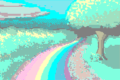
Feel like I did ok, for being a bit rusty... |
|
|
IP Logged |
|
|
MacNcheese
Seaman
Joined: 13 July 2011 Online Status: Offline Posts: 36 |
Posted: 19 July 2011 at 2:43pm |
|
Latest:

Decided to step up my game.. 
I know I'm using Mrmo Tarius palette, but it's only temporary. @eghost, brilliant use of colors, you already have my vote :) Edit: Worked on it a bit: 
Edit 2: 
Starting to take shape ^^ Edited by MacNcheese - 20 July 2011 at 10:57am |
|
|
IP Logged |
|
|
eghost
Midshipman
Joined: 19 June 2018 Location: United States Online Status: Offline Posts: 99 |
Posted: 19 July 2011 at 3:10pm |
|
Mac: Thanks, been a while since I've pixeled anything:) Nice base, btw looking forward to seeing the palette.
Jinn: Great piece...I'd probably go with palette A if it were me... |
|
|
IP Logged |
|
|
Mrmo Tarius
Commander
Joined: 12 February 2022 Online Status: Offline Posts: 367 |
Posted: 19 July 2011 at 3:26pm |
|
Anyone and everyone is welcome to use that palette of mine :D
Not exactly awe-inspiring, though, and I might go and change it a bit. |
|
|
IP Logged |
|
|
Life Dairy
Seaman
Joined: 06 May 2011 Online Status: Offline Posts: 8 |
Posted: 19 July 2011 at 6:27pm |
|
@ Mrmo Tarius
Perhaps you can make it a kinda maroon to show a rusting robot? |
|
|
IP Logged |
|
|
Mrmo Tarius
Commander
Joined: 12 February 2022 Online Status: Offline Posts: 367 |
Posted: 20 July 2011 at 12:44am |
|
Updaet tiem :)

I'm not sure if this update is for the better or the worse ;P Edited by Mrmo Tarius - 20 July 2011 at 12:45am |
|
|
IP Logged |
|
|
skamocore
Admiral
Joined: 07 April 2021 Online Status: Offline Posts: 3866 |
Posted: 20 July 2011 at 1:11am |
|
Better.
|
|
|
IP Logged |
|
|
Imagician
Midshipman
Joined: 04 July 2023 Online Status: Offline Posts: 78 |
Posted: 20 July 2011 at 5:27am |
|
Really like that one, nice style. Only thing is, this whole Leprechaun-thing is irish foklore, right? So maybe a Pound-symbol (£) instead of $ would be more fitting ;)
P.S.: The front foot somehow bothers me, think it's because it's turned towards the inside (towards viewer) too much. |
|
|
IP Logged |
|
|
eghost
Midshipman
Joined: 19 June 2018 Location: United States Online Status: Offline Posts: 99 |
Posted: 20 July 2011 at 6:17am |
|
Mrmo: The update looks good :) You might want to try hue shifting the lightest grey just a bit more towards the cooler end of the spectrum, and possibly desaturating the red a bit...
|
|
|
IP Logged |
|
|
Imagician
Midshipman
Joined: 04 July 2023 Online Status: Offline Posts: 78 |
Posted: 20 July 2011 at 8:07am |
|
[post deleted by Imagician because of unintentional double post (fell free to remove completely ;)]
Edited by Imagician - 20 July 2011 at 9:13am |
|
|
IP Logged |
|
|
jalonso
Admiral
Joined: 29 November 2022 Online Status: Offline Posts: 13537 |
Posted: 20 July 2011 at 8:33am |
|
OT- @Imagician, Nice to see you around Mr. lil'dude :)
|
|
|
|
|
|
IP Logged |
|
|
Imagician
Midshipman
Joined: 04 July 2023 Online Status: Offline Posts: 78 |
Posted: 20 July 2011 at 9:12am |
|
Sorry twice:
Multipost: PJ webserver was'nt responding to me for like hours. Will try to delete my posts if possible (if not, some admin may feel free to do so :)) And: Not sure if it's visible what piece I was referring to (I was clicking the corresponding Reply-button though). I meant Jinn's Leprechaun ;) @ Jalonso: Thanks for the hello :) I come around every now and then, mainly for looking, sometimes for commenting, but not much time for contributing something these days, alas ;) Edited by Imagician - 20 July 2011 at 9:14am |
|
|
IP Logged |
|
|
Jinn
Rear Admiral
Joined: 27 February 2026 Online Status: Offline Posts: 191 |
Posted: 20 July 2011 at 9:44am |
|
Is it an improvement?
 New Old I don't know about the foot, but I like $ better ;P Edited by Jinn - 20 July 2011 at 9:51am |
|
|
IP Logged |
|
|
eghost
Midshipman
Joined: 19 June 2018 Location: United States Online Status: Offline Posts: 99 |
Posted: 20 July 2011 at 9:49am |
|
Jinn: It looks good, but I think a bit more of the bridge of the foot should be showing now... For the one one the left I mean...And I agree, the $ on the gold just agrees with me... :)
Edited by eghost - 20 July 2011 at 9:50am |
|
|
IP Logged |
|
|
Imagician
Midshipman
Joined: 04 July 2023 Online Status: Offline Posts: 78 |
Posted: 20 July 2011 at 10:35am |
|
I think it would look better if you would decrease the size of the Pound-symbol a bit, so that it has some "space to breathe".
Furthermore, you could play a bit more with the thickness of the line of the character (it's a typography thing, can't find the English term right now). It could be thinner on top, right after the "drop" you have at the upper right end. The overall difference anyway is, that you made the pound a little bolder and slightly more "organic" than the quite geometrical Dollar sign you did first. Maybe that's why it looks a little uncomfortable at first. Generally I'd agree that dollars symbolize money or something similar, but in this case I'd really go for the Pound and would consider Dollar some kind of goof. Just my opinion ;) Edited by Imagician - 20 July 2011 at 10:51am |
|
|
IP Logged |
|
|
Imagician
Midshipman
Joined: 04 July 2023 Online Status: Offline Posts: 78 |
Posted: 20 July 2011 at 10:41am |
|
Ah, overlooked the foot ;) I don't think it's really a improvement, but that's maybe because the style does look a bit less "dashing"... what I like better about the old foot: big first toe (this one looks small and flattened on top), and the overall shape of the foot, indicated by the shading, it looked more elaborate and comical (especially due to the "ball of the foot" that was more visible here).
Edited by Imagician - 20 July 2011 at 10:42am |
|
|
IP Logged |
|
|
Jinn
Rear Admiral
Joined: 27 February 2026 Online Status: Offline Posts: 191 |
Posted: 20 July 2011 at 10:59am |
|
Well, I don't know how to fix then... I'd apreciatte an edit if you have time.
Oh, and thanks! :) Edited by Jinn - 20 July 2011 at 11:02am |
|
|
IP Logged |
|
|
DawnBringer
Commander
Joined: 11 August 2024 Online Status: Offline Posts: 568 |
Posted: 20 July 2011 at 11:57am |
|
Nice image, but why so drab?
 |
|
|
IP Logged |
|
|
artistictiger
Midshipman
Joined: 28 May 2009 Online Status: Offline Posts: 46 |
Posted: 20 July 2011 at 1:28pm |
|
Haven't uploaded in a while lol, so decided to check out the challenges..starting to fall in love with the color restrictions...
Anyway..WIP  WIP2  Updated..  Edited by artistictiger - 20 July 2011 at 5:07pm |
|
|
IP Logged |
|
|
ellie-is
Commander
Joined: 12 September 2021 Online Status: Offline Posts: 706 |
Posted: 20 July 2011 at 2:07pm |
|
That's very nice, and I love the water, but your rainbow doesn't look like a rainbow at all. I think it needs to be much wider.
Jinn, great stuff so far, keep working! Mrmo, same. I love Dawn's palette edit, especially the second one. |
|
|
IP Logged |
|
|
shampoop
Commander
Joined: 12 January 2015 Online Status: Offline Posts: 202 |
Posted: 20 July 2011 at 2:36pm |
|
I am struggling with the colors for this wip.

 Edited by shampoop - 20 July 2011 at 3:01pm |
|
|
IP Logged |
|
|
Imagician
Midshipman
Joined: 04 July 2023 Online Status: Offline Posts: 78 |
Posted: 20 July 2011 at 2:39pm |
 Did a little more than you asked for, guess I got carried away ;). Could have go on for longer (not implying that there's so much to "fix", maybe just "subjective" or stylistic decisions). Also included a version where only the differences are marked, dont't know if it's of any help :D. I also edited the aft foot a bit (it's not yet lifted as in your version, but only at the point of pushing away, still touching the ground, so that there's more action-deformation in it), but I'm not really satisfied yet still right there. Anyway, ran out of time for now ;) Don't know if my edit is of any help to you (as I said, I think most things are more or less a subjective decision, there's mostly no "right" or "wrong", or rather more than just one "right" in painting, depending on what you want to express/convey). Enough with the ranting for now ;) |
|
|
IP Logged |
|
| Page of 2 Next >> |
| |
||
Forum Jump |
You cannot post new topics in this forum You cannot reply to topics in this forum You cannot delete your posts in this forum You cannot edit your posts in this forum You cannot create polls in this forum You cannot vote in polls in this forum |
|
