CHALLENGE 7/18/2011: Rainbow Cheapskate
Printed From: Pixel Joint
Category: Pixel Art
Forum Name: Collaborations/Challenges
Forum Discription: Submit pixel art project ideas/templates or contribute to an existing pixel art collaboration.
URL: https://pixeljoint.com/forum/forum_posts.asp?TID=12525
Printed Date: 05 April 2026 at 10:06pm
Topic: CHALLENGE 7/18/2011: Rainbow Cheapskate
Posted By: administrator
Subject: CHALLENGE 7/18/2011: Rainbow Cheapskate
Date Posted: 18 July 2011 at 12:00am
Replies:
Posted By: Smilecythe
Date Posted: 18 July 2011 at 2:58am
|
Interesting challenge. |
Posted By: pixer
Date Posted: 18 July 2011 at 4:18am
there is my wip =') progress:  FINISHED !  |
Posted By: Mirm
Date Posted: 18 July 2011 at 5:49am
My wip Upd  |
Posted By: Chrispy
Date Posted: 18 July 2011 at 10:55am
WIP Finished  http://s2.postimage.org/uiy7ztg0y/129016612677.jpg - Reference I plan on throwing a real rainbow somewhere in there. |
Posted By: PainForge
Date Posted: 18 July 2011 at 12:23pm
| does shading count as a color [ie. if i use a lighter shade of red to add realism in my shading.] ? |
Posted By: Chrispy
Date Posted: 18 July 2011 at 12:23pm
|
Originally posted by PainForge Yes
does shading count as a color [ie. if i use a lighter shade of red to add realism in my shading.] ? |
Posted By: MacNcheese
Date Posted: 18 July 2011 at 1:18pm
WIP |
Posted By: Chrispy
Date Posted: 18 July 2011 at 1:39pm
This has GOTTA be rainbowy enough |
Posted By: MacNcheese
Date Posted: 18 July 2011 at 3:27pm
 I think I'm finished, might add some detail in the background, shadows or so... |
Posted By: Rebolation?
Date Posted: 18 July 2011 at 3:44pm
My wip in black and white

|
Posted By: cure
Date Posted: 18 July 2011 at 4:07pm
| the rainbow has disappeared entirely, leaving this an image of a vomiting unicorn. |
Posted By: Life Dairy
Date Posted: 18 July 2011 at 4:28pm
|
@chrispy It kinda reminds me of a pro war poster |
Posted By: MacNcheese
Date Posted: 18 July 2011 at 5:15pm
|
Originally posted by cure the rainbow has disappeared entirely, leaving this an image of a vomiting unicorn. You're absolutely right, i hope I've fixed it now:  Added clouds, which i know doesn't make sense whatsoever, but I hope it fits.. |
Posted By: Jinn
Date Posted: 18 July 2011 at 6:43pm
Almost done. Not sure if I'll join tho. |
Posted By: skamocore
Date Posted: 18 July 2011 at 6:54pm
|
@Jinn - Great use of four colours. Regardless of whether you choose to enter or not, that's already one of my favourite things I've seen from you. Why not try making the colours a bit more golden, though? ------------- |
Posted By: Jinn
Date Posted: 18 July 2011 at 7:10pm
 I've already played with these colors...  But I still thinking the original is the best. What would you suggest? |
Posted By: skamocore
Date Posted: 18 July 2011 at 7:16pm
|
Something along the lines of the third one - except, I would go with more of an orange colour instead of a red.
------------- |
Posted By: Triumverent
Date Posted: 18 July 2011 at 7:27pm
| Sure! Join in! This is good stuff |
Posted By: Jinn
Date Posted: 18 July 2011 at 7:32pm
|
I don't know... I'm not a big fan of this blank space, but I don't know what I can do fix it. [edit] Some idea..  |
Posted By: Mrmo Tarius
Date Posted: 19 July 2011 at 2:48am
|
Jinn, I am amazed.
Here's something I'm working on: *updaet'd* 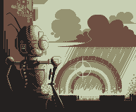
|
Posted By: skamocore
Date Posted: 19 July 2011 at 2:51am
|
@Jinn - Negative space is your friend :o maybe move him a little more to the right? ------------- |
Posted By: eghost
Date Posted: 19 July 2011 at 6:24am
WIP:

Decided to go with a muted CMYK palette for this...Seems to be workin...:) |
Posted By: MacNcheese
Date Posted: 19 July 2011 at 6:41am
 Playing around with the palette... |
Posted By: skeddles
Date Posted: 19 July 2011 at 6:45am
|
Originally posted by Jinn
I don't know... I'm not a big fan of this blank space, but I don't know what I can do fix it. [edit] Some idea..  I'd mix the 3rd and 4th palettes, the 4rd looks good, just needs to be brighter. ------------- |
Posted By: Jinn
Date Posted: 19 July 2011 at 9:35am
|
Thanks, member_profile.asp?PF=10332&FID=1 - skamocore ! It's a bit more for right, now. And I changed the palette, what do you think? A or B?  |
Posted By: HCGamer
Date Posted: 19 July 2011 at 10:29am
|
Originally posted by Mirm
My wip  Upd Upd
I love this, but I don't understand. Isn't there a 4 color limit? Or are you going to reduce it later? ------------- This is not a sig, look away now. Go on, get. |
Posted By: JoNaH
Date Posted: 19 July 2011 at 11:19am
|
Originally posted by HCGamer
Originally posted by Mirm
My wip  Upd Upd
I love this, but I don't understand. Isn't there a 4 color limit? Or are you going to reduce it later? It is only four colors. Red, blue, yellow, and white. I think it looks really good. Most likely getting a vote from me. |
Posted By: eghost
Date Posted: 19 July 2011 at 1:23pm
WIP:

Finished?: 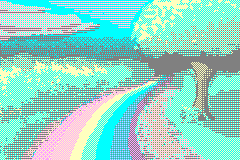
Feel like I did ok, for being a bit rusty... |
Posted By: MacNcheese
Date Posted: 19 July 2011 at 2:43pm
Latest:

Decided to step up my game.. 
I know I'm using Mrmo Tarius palette, but it's only temporary. @eghost, brilliant use of colors, you already have my vote :) Edit: Worked on it a bit: 
Edit 2: 
Starting to take shape ^^ |
Posted By: eghost
Date Posted: 19 July 2011 at 3:10pm
|
Mac: Thanks, been a while since I've pixeled anything:) Nice base, btw looking forward to seeing the palette.
Jinn: Great piece...I'd probably go with palette A if it were me... |
Posted By: Mrmo Tarius
Date Posted: 19 July 2011 at 3:26pm
|
Anyone and everyone is welcome to use that palette of mine :D
Not exactly awe-inspiring, though, and I might go and change it a bit. |
Posted By: Life Dairy
Date Posted: 19 July 2011 at 6:27pm
|
@ Mrmo Tarius Perhaps you can make it a kinda maroon to show a rusting robot? |
Posted By: Mrmo Tarius
Date Posted: 20 July 2011 at 12:44am
Updaet tiem :)

I'm not sure if this update is for the better or the worse ;P |
Posted By: skamocore
Date Posted: 20 July 2011 at 1:11am
|
Better.
------------- |
Posted By: Imagician
Date Posted: 20 July 2011 at 5:27am
|
Really like that one, nice style. Only thing is, this whole Leprechaun-thing is irish foklore, right? So maybe a Pound-symbol ( http://en.wikipedia.org/wiki/Pound_sign - £ ) instead of $ would be more fitting ;) P.S.: The front foot somehow bothers me, think it's because it's turned towards the inside (towards viewer) too much. |
Posted By: eghost
Date Posted: 20 July 2011 at 6:17am
| Mrmo: The update looks good :) You might want to try hue shifting the lightest grey just a bit more towards the cooler end of the spectrum, and possibly desaturating the red a bit... |
Posted By: Imagician
Date Posted: 20 July 2011 at 8:07am
|
[post deleted by Imagician because of unintentional double post (fell free to remove completely ;)] |
Posted By: jalonso
Date Posted: 20 July 2011 at 8:33am
|
OT- @Imagician, Nice to see you around Mr. lil'dude :) ------------- |
Posted By: Imagician
Date Posted: 20 July 2011 at 9:12am
|
Sorry twice: Multipost: PJ webserver was'nt responding to me for like hours. Will try to delete my posts if possible (if not, some admin may feel free to do so :)) And: Not sure if it's visible what piece I was referring to (I was clicking the corresponding Reply-button though). I meant Jinn's Leprechaun ;) @ Jalonso: Thanks for the hello :) I come around every now and then, mainly for looking, sometimes for commenting, but not much time for contributing something these days, alas ;) |
Posted By: Jinn
Date Posted: 20 July 2011 at 9:44am
Is it an improvement? New Old I don't know about the foot, but I like $ better ;P |
Posted By: eghost
Date Posted: 20 July 2011 at 9:49am
| Jinn: It looks good, but I think a bit more of the bridge of the foot should be showing now... For the one one the left I mean...And I agree, the $ on the gold just agrees with me... :) |
Posted By: Imagician
Date Posted: 20 July 2011 at 10:35am
|
I think it would look better if you would decrease the size of the Pound-symbol a bit, so that it has some "space to breathe". Furthermore, you could play a bit more with the thickness of the line of the character (it's a typography thing, can't find the English term right now). It could be thinner on top, right after the "drop" you have at the upper right end. The overall difference anyway is, that you made the pound a little bolder and slightly more "organic" than the quite geometrical Dollar sign you did first. Maybe that's why it looks a little uncomfortable at first. Generally I'd agree that dollars symbolize money or something similar, but in this case I'd really go for the Pound and would consider Dollar some kind of goof. Just my opinion ;) |
Posted By: Imagician
Date Posted: 20 July 2011 at 10:41am
|
Ah, overlooked the foot ;) I don't think it's really a improvement, but that's maybe because the style does look a bit less "dashing"... what I like better about the old foot: big first toe (this one looks small and flattened on top), and the overall shape of the foot, indicated by the shading, it looked more elaborate and comical (especially due to the "ball of the foot" that was more visible here). |
Posted By: Jinn
Date Posted: 20 July 2011 at 10:59am
|
Well, I don't know how to fix then... I'd apreciatte an edit if you have time. Oh, and thanks! :) |
Posted By: DawnBringer
Date Posted: 20 July 2011 at 11:57am
Nice image, but why so drab? |
Posted By: artistictiger
Date Posted: 20 July 2011 at 1:28pm
|
Haven't uploaded in a while lol, so decided to check out the challenges..starting to fall in love with the color restrictions... Anyway..WIP  WIP2  Updated..  |
Posted By: ellie-is
Date Posted: 20 July 2011 at 2:07pm
|
That's very nice, and I love the water, but your rainbow doesn't look like a rainbow at all. I think it needs to be much wider.
Jinn, great stuff so far, keep working! Mrmo, same. I love Dawn's palette edit, especially the second one. |
Posted By: shampoop
Date Posted: 20 July 2011 at 2:36pm
I am struggling with the colors for this wip.


|
Posted By: Imagician
Date Posted: 20 July 2011 at 2:39pm
 Did a little more than you asked for, guess I got carried away ;). Could have go on for longer (not implying that there's so much to "fix", maybe just "subjective" or stylistic decisions). Also included a version where only the differences are marked, dont't know if it's of any help :D. I also edited the aft foot a bit (it's not yet lifted as in your version, but only at the point of pushing away, still touching the ground, so that there's more action-deformation in it), but I'm not really satisfied yet still right there. Anyway, ran out of time for now ;) Don't know if my edit is of any help to you (as I said, I think most things are more or less a subjective decision, there's mostly no "right" or "wrong", or rather more than just one "right" in painting, depending on what you want to express/convey). Enough with the ranting for now ;) |
Posted By: artistictiger
Date Posted: 20 July 2011 at 3:20pm
|
Thanks, i was going to do a more realistic rainbow, but decided to let my imagination run a little wild lol, rainbow roads, rainbow rivers.. Hmmm i might change it though, maybe more wider and better, It'll fit/blend with the whole scene if its more like a real rainbow. |
Posted By: Imagician
Date Posted: 20 July 2011 at 3:37pm
 Just couldn't let the aft foot alone 0:) I think it was the shading that bothered me; now I like it better. I also took out the freedom to see how some cracks would add to the pot and I thought the hat could take some shadow from the pot as well. I understand I have probably gone a little further than I would maybe like someone do something to my art, so sorry If you feel I i meddled with your piece too much ;). Just wanted to see how it looks (I'm not even sure the cracks are better, maybe they are to tiny/detailed for the style of the picture). That should be it for now, looking forward for your comments (I guess :D) |
Posted By: MacNcheese
Date Posted: 20 July 2011 at 6:54pm

Playing around with the palette :) |
Posted By: Jinn
Date Posted: 20 July 2011 at 7:42pm
|
Sorry to disappoint you guys, but I'm going back with the 1st palette cuz I'm not quite happy with the current one.... Also, I love what you did on his left foot, Imagician! So I'm following your idea. But I'll keep his right foot the way it was, with some little tweaks. And I like the way you rendered the symbol with some "bevel light". So I'm following it too! Thanks a lot, pal! ^^  |
Posted By: eghost
Date Posted: 20 July 2011 at 7:48pm
| @Mac: Very nice...:) Good texturing throughout, though the petals at the top of the flower get a bit confusing... |
Posted By: PixelPocket
Date Posted: 20 July 2011 at 11:00pm
Here is a WIP i just whipped up when I saw the topic name. Now I realize how much I hate colour restrictions D: |
Posted By: Mrmo Tarius
Date Posted: 21 July 2011 at 1:53am
|
Made some edits to my pic, namely, removed the dark area on the left completely. Will have to look into the proposed palettes, thanks for the advice! :D
*edit* here's a color combo that I find kinda pleasing, and it is also not very drab: 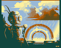
|
Posted By: Imagician
Date Posted: 21 July 2011 at 2:29am
|
Glad I could help :). Anyway, about the Pound-symbol. I really wouldn't use the dollar sign, for two good reasons. Not only I would consider the dollar sign out of place for reasons of context and culture (like using it on an Aztec or Arabic treasure chest or in a Roman picture), I would also think of using the Pound sign as a real funny joke, _exactly because_ there's normally a dollar sign. Imagine for instance drawing a graphic novel and there's some greedy guy in it who is chinese. And in some certain point in the story he sees the opportunity to make money, and then, ka-ching, Yen-signs (¥) pop in his eyes instead of dollars! I wouldn't simply consider this fitting, but instead a really funny twist on / adaption of the usual "cliché". See, the thing is to take tropes and symbols etc., and then to match them to your context. But then again, that's just my opinion ;) |
Posted By: jeremy
Date Posted: 21 July 2011 at 3:08am
|
(Ireland uses the Euro) |
Posted By: Mrmo Tarius
Date Posted: 21 July 2011 at 4:34am
Here's a weird game-like concept. Space for the gui reserved on the right! :)
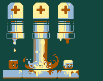
|
Posted By: onek
Date Posted: 21 July 2011 at 4:42am
|
the crosses remind me too much of the Red Cross sign ... looks hospital-ish now
otherwise nice |
Posted By: Mrmo Tarius
Date Posted: 21 July 2011 at 4:48am
|
Oh, they are the placeholders for the controller commands you'd need to press :)
They've arrows on them now ;) *edit* something like this: 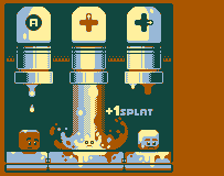
|
Posted By: Imagician
Date Posted: 21 July 2011 at 4:57am
|
Yeah.. ehm, Ireland has the Euro... right, I knew that, of course But, before that, they had the Irish Pound: http://en.wikipedia.org/wiki/Irish_pound - http://en.wikipedia.org/wiki/Irish_pound So I'd suggest to stick to the classic currency... Anyway, have you seen any Leprechauns exchanging their Pounds to Euros back in '99? (hope I got this figure right at least |
Posted By: Jinn
Date Posted: 21 July 2011 at 9:15am
Then, since theres no point for $, what about a Clover instead? It's the leprechaun's symbol after all! I do like the Pound symbol. But I'm afraid people don't link it to money. I wouldn't. |
Posted By: eghost
Date Posted: 21 July 2011 at 9:29am
|
@Mrmo: Interesting palette edit on your original, but I want to play the mockup now...:P
@PixelPocket: (EDIT: Sorry 'bout that) Try desaturating the red some, and changing the black to a dark, desaturated purple...Otherwise looks interesting... @Jinn: Clover looks great! Nothing more too add... I see +1 vote in your future... |
Posted By: PixelPocket
Date Posted: 21 July 2011 at 9:46am
|
Yeah the clover looks amazing, and very fitting. And even so, using the Pound sign, OR even the dollar sign would be slightly inaccurate anyways, right? Since the leprechaun has a pot of GOLD not and specific currency, right? So basically the clover is the perfect symbol in my opinion. It's also more visually appealing then the others. |
Posted By: Imagician
Date Posted: 21 July 2011 at 11:22am
|
Very good idea about the clover. But: Shouldn't it be four-leaved, symbolizing luck? ;) |
Posted By: Imagician
Date Posted: 21 July 2011 at 11:27am
|
Add. Info: Just looked up http://en.wikipedia.org/wiki/Shamrock - http://en.wikipedia.org/wiki/Shamrock , this seems to be three leaved by definition, being a symbol for Ireland. Nevertheless, the wiki article on Clover says, four leaves are a symbol for luck. When I look up 'irish clover' on Google Images, I get three and four leaves as well. Searching for 'irish shamrock' gives mixed results, too, with seemingly a prevalence of three leaves, though. |
Posted By: Jinn
Date Posted: 21 July 2011 at 11:43am
I think I got a good reason to go for three leaves.  |
Posted By: PixelPocket
Date Posted: 21 July 2011 at 12:22pm
 I did two more, and I'm not even sure what to go with anymore.  Also I played with the palette of the other one more. I tried one more desaturated one with the purple-ish background instead of black. I also did a happy-go lucky candy rainbow one. -.-   |
Posted By: artistictiger
Date Posted: 22 July 2011 at 2:58pm
Updated! Hmmm.Would be kind of nice animated...May give it a try..If i feel up to it lol |
Posted By: ekobor
Date Posted: 23 July 2011 at 10:51am
|
Originally posted by Imagician
Add. Info: Just looked up http://en.wikipedia.org/wiki/Shamrock - http://en.wikipedia.org/wiki/Shamrock , this seems to be three leaved by definition, being a symbol for Ireland. Nevertheless, the wiki article on Clover says, four leaves are a symbol for luck.When I look up 'irish clover' on Google Images, I get three and four leaves as well. Searching for 'irish shamrock' gives mixed results, too, with seemingly a prevalence of three leaves, though. The Shamrock is three leafed (leaved?), and is the symbol for Ireland and Leprechauns by right of history and lore. The four leaf clover is (necessarily) four-leafed, and is a symbol for luck, but not particularly Irish or Leprechaun-y. (It comes in handy sometimes to have an Irish Pa) |
Posted By: onek
Date Posted: 23 July 2011 at 1:41pm
|
Four-leaf clover
The four-leaf clover is often confused with the shamrock. While the four-leaf clover is a symbol of good luck, the three-leafed shamrock is mainly an Irish Christian symbol of the Holy Trinity and has a different significance.[5] |
Posted By: cure
Date Posted: 23 July 2011 at 3:08pm
|
According to Irish legend, the druids in Ireland looked at the shamrock
as a sacred plant because its leaves formed a triad. Three was a
mystical number in the Celtic religion.Then St Patrick, who was thought to be born in Wales, used the shamrock
in the 5th century to teach people about Christianity as he travelled
around Ireland. He told people that each of the three leaves illustrated the Father, the Son and the Holy Spirit of the Holy Trinity. Old Irish manuscripts make no reference to this in connection with St Patrick, so this is likely to be pure mythology. In the 19th century it became a symbol of rebellion
against the English and began to be strongly associated with Irish
identity. Apparently anyone wearing it risked death by hanging. - - - - In 1620, Sir John
Melton wrote: "If a man walking in the fields find any four-leaved grass, he shall in a small while after find some good thing." tl;dr 4-leaf clovers have connotations of luck, shamrocks have connotations of Ireland. Leprechauns have connotations of luck and Ireland. |