| Active TopicsSearchRegisterLogin |
| Collaborations/Challenges | |
| |
  |
| Page of 2 Next >> |
| Author | Message |
|
administrator
Admiral 
Joined: 03 March 2005 Online Status: Offline Posts: 0 |
  Topic: CHALLENGE 4/28/2014: The New Bomber Topic: CHALLENGE 4/28/2014: The New BomberPosted: 28 April 2014 at 12:01am |
CHALLENGE: The New BomberChallenge winner, atpalicis, wants you to redesign the classic NES Mega Man sprite: The sprite must be all your own work - no editing existing sprites. Have a look at this thread over at Pixelation for some inspiration. CHALLENGE RULES
CHALLENGE JUDGING
CHALLENGE PRIZES/GOODIES
CHALLENGE VOTINGVote now for your favorite pixelart in this week's challenge!CHALLENGE AWARDSThe The New Bomber pixel art challenge is complete and we have three new champions. This week's challenge awards go to the following pieces:megasapiens by 7even Thanks so much to all who took the time to vote and participate in the challenge! MegaMiniMan by Buch Mega manly by pavanz MangaMango by EdJr mm by felchqueen
|
|
 IP Logged IP Logged |
|
|
Eggy
Commander 
Joined: 01 October 2020 Online Status: Offline Posts: 354 |
Posted: 28 April 2014 at 3:51am |
 Done at school, planning on animating it, inspired by the Megaman Derp image meme.
|
|
|
IP Logged |
|
|
Nevercreature
Commander
Joined: 04 July 2022 Online Status: Offline Posts: 164 |
Posted: 28 April 2014 at 4:57am |
|
I can see massive entries...
|
|
|
IP Logged |
|
|
bagz
Seaman 
Joined: 30 May 2014 Online Status: Offline Posts: 1 |
Posted: 28 April 2014 at 7:50am |
|
Current WIP. I'll try to animate it.

|
|
|
IP Logged |
|
|
deadpixelteam
Seaman
Joined: 14 December 2014 Online Status: Offline Posts: 10 |
Posted: 28 April 2014 at 8:30am |
|
Here's my wip, scaled x 2 :
There is a lot of things to be changed but, I'm getting there... |
|
|
IP Logged |
|
|
PurpleTentacle
Seaman
Joined: 13 April 2014 Online Status: Offline Posts: 3 |
Posted: 28 April 2014 at 10:31am |
|
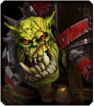
Hi guys, I'm trying to make the pixel version of what's probably the worst Megaman ever seen (the one on the cover of the first NES game).  Critics and comments are more than welcome ;) |
|
|
IP Logged |
|
|
DatMuffinMan
Commander
Joined: 03 April 2023 Online Status: Offline Posts: 150 |
Posted: 28 April 2014 at 12:20pm |
|
I was going for a kind of pompous look, like one of those buff guys that puff their chest out and have really stubby legs. I plan on animating him to walk and maybe shoot, but I'm struggling with readability on frame 1 :(

edit - for now, making the limbs black seems to help a bit. Might redo the whole tihng, since I made lots of things too thin/small   Edited by DatMuffinMan - 28 April 2014 at 1:07pm |
|
|
IP Logged |
|
|
CakeDrake
Commander
Joined: 16 February 2018 Online Status: Offline Posts: 85 |
Posted: 28 April 2014 at 1:04pm |
|
here is my kind of silly sprite :P

|
|
|
IP Logged |
|
|
inphy
Commander
Joined: 24 June 2014 Online Status: Offline Posts: 116 |
Posted: 28 April 2014 at 1:45pm |
 u fokken wot m8 Just thought that would've been a fun redesign, not going to enter this. :) |
|
|
IP Logged |
|
|
Karric
Seaman
Joined: 28 April 2014 Online Status: Offline Posts: 1 |
Posted: 28 April 2014 at 2:25pm |
|
I'm kinda new to spriting, done a thing here and there. This is my submission:
 I've always hated that he doesn't look like a robot, and the odd proportions, so I fixed that. The white marks would change to the color of his mode; I'm too lazy to animate. Edited by Karric - 28 April 2014 at 2:40pm |
|
|
IP Logged |
|
|
sgtcrispy
Seaman
Joined: 28 May 2012 Online Status: Offline Posts: 17 |
Posted: 28 April 2014 at 2:28pm |
|
One of the practice doodles that I like. 2x'd
edit: better(?) face 
Edited by sgtcrispy - 28 April 2014 at 2:33pm |
|
|
IP Logged |
|
|
Damian
Commander
Joined: 24 February 2023 Location: United Kingdom Online Status: Offline Posts: 455 |
Posted: 28 April 2014 at 3:02pm |
|
Getting in on the fun :)

CakeDrake, loving those colours! Edited by Damian - 28 April 2014 at 3:04pm |
|
|
IP Logged |
|
|
skittle
Commander
Joined: 20 July 2021 Online Status: Offline Posts: 350 |
Posted: 28 April 2014 at 3:56pm |
|
These are all fantastic!
|
|
|
IP Logged |
|
|
SharpKing
Seaman
Joined: 30 March 2014 Online Status: Offline Posts: 17 |
Posted: 28 April 2014 at 5:14pm |
|
Here is my current attempt :)
 -> -> 
After my first attempt I was very much not happy. Then I got inspired by all of the great work the rest of you did! I tried not to copy anyone's work too closely. :] Edited by SharpKing - 30 April 2014 at 4:48pm |
|
|
IP Logged |
|
|
DeathByChris
Seaman
Joined: 26 July 2025 Online Status: Offline Posts: 3 |
Posted: 28 April 2014 at 8:05pm |

I'll give this a try. This is just a quickie will probably end up redoing it. |
|
|
IP Logged |
|
|
JoCh
Seaman
Joined: 12 October 2009 Online Status: Offline Posts: 10 |
Posted: 29 April 2014 at 12:15am |
|
WIP for Mega Wooo !
   Edited by JoCh - 29 April 2014 at 11:48pm |
|
|
IP Logged |
|
|
Mrmo Tarius
Commander
Joined: 12 February 2022 Online Status: Offline Posts: 367 |
Posted: 29 April 2014 at 12:51am |
|
Well, my MechaMan is a very loose reinterpretation so I don't know if I'll submit it but it was a nice practice I guess.

*edit* ok, I'm spending more time on this than I thought I would...  Edited by Mrmo Tarius - 29 April 2014 at 4:02am |
|
|
IP Logged |
|
|
CELS
Commander
Joined: 23 September 2022 Online Status: Offline Posts: 758 |
Posted: 29 April 2014 at 3:29am |
|
So much great stuff!
I'm really hoping someone will break the cuteness mold and do a nitty, gritty Megaman. Like a cross between Flashback and Abuse. @PurpleTentacle: Very interesting choice. I think you may have to get rid of some of the yellow details, on such a tiny sprite such as this. Getting rid of some details will make it easier for you to improve readability. Unless someone is comparing this side by side with the original, some of the yellow details won't make sense. Edited by CELS - 29 April 2014 at 3:37am |
|
|
IP Logged |
|
|
PabloGalaviz
Seaman
Joined: 26 April 2022 Online Status: Offline Posts: 7 |
Posted: 29 April 2014 at 4:22am |
|
My WIP, I'm not happy with the animation of the cannon. Suggestions?

|
|
|
IP Logged |
|
|
deadpixelteam
Seaman
Joined: 14 December 2014 Online Status: Offline Posts: 10 |
Posted: 29 April 2014 at 5:33am |
|
Really nice takes on megaman so far... Here's my final:
Edited by deadpixelteam - 29 April 2014 at 7:40am |
|
|
IP Logged |
|
|
PurpleTentacle
Seaman
Joined: 13 April 2014 Online Status: Offline Posts: 3 |
Posted: 29 April 2014 at 10:51am |
|
Hi guys, I'm pretty new to pixel art and I couldn't help but notice that most of you use an outline to provide some definition to your sprites. I've just tried to do the same with mine... but I have mixed feelings: the readability has definitely improved, but the sprite has somehow lost something. What do you think? @Karric: Just love the design/proportions. @Mrmo Tarius: Awesome metal shading, love the 2-colored illumination. @Cels: Many thanks, man. As you may have seen I've followed your advice ;)
|
|
|
IP Logged |
|
|
Hapiel
Rear Admiral 
Joined: 30 June 2023 Online Status: Offline Posts: 3266 |
Posted: 29 April 2014 at 2:37pm |
|
So megaman is supposed to be a robot created by Dr. Light, right?
Well I don't believe any of that, he totally does not look like a robot to me! More like a kid. A kid in a leotard with a gun arm. But leotards are totally not useful for superheroes, and neither is it practical to make a superhero out of a kid instead of an adult. I figured it all out: Dr Light is the father of this obese kid (hence the name MEGA), and build a nice virtual reality system for his son so he can pretend to be a superhero (and hopefully moving around enough to loose some weight!). The real life suit matches the in-game outfit...  |
|
|
IP Logged |
|
|
pthiers
Seaman
Joined: 29 April 2014 Online Status: Offline Posts: 7 |
Posted: 29 April 2014 at 3:30pm |
|
can we do more than one entry?
this is my first thought 
and a little larger: 
I also recorded the process =] Anyone want to see? Edited by pthiers - 29 April 2014 at 3:45pm |
|
|
IP Logged |
|
|
Hapiel
Rear Admiral
Joined: 30 June 2023 Online Status: Offline Posts: 3266 |
Posted: 29 April 2014 at 3:56pm |
|
As many entries as you like.
Yes, if you speed it up so that the whole thing does not take more than 5 min I'd be interested to watch the process! |
|
|
IP Logged |
|
|
PabloGalaviz
Seaman
Joined: 26 April 2022 Online Status: Offline Posts: 7 |
Posted: 29 April 2014 at 3:59pm |
|
Nice... I want to see! Thanks.
|
|
|
IP Logged |
|
|
CyanideKoolaid
Seaman
Joined: 26 April 2014 Online Status: Offline Posts: 10 |
Posted: 29 April 2014 at 5:07pm |
 A quick try. A bit bulkier and with giant shoulder guards.... because... duh! Edited by CyanideKoolaid - 29 April 2014 at 5:08pm |
|
|
IP Logged |
|
|
pthiers
Seaman
Joined: 29 April 2014 Online Status: Offline Posts: 7 |
Posted: 29 April 2014 at 5:48pm |
|
@Hapiel and @PabloGalaviz
Behold the timelapse! 4:15 of megaman music and pixelart. I hope you enjoy it! Took me a while to figure out how to edit the video Pthiers' New Bomber Timelapse Edited by pthiers - 29 April 2014 at 5:58pm |
|
|
IP Logged |
|
|
LameCakes
Seaman
Joined: 22 February 2014 Online Status: Offline Posts: 8 |
Posted: 29 April 2014 at 8:33pm |

Trying to work on something with a little bit of realism...it's my first time doing anything this small, so comment and criticism is greatly appreciated! :) Edit: Round 2 of megaman sprite  Edited by LameCakes - 30 April 2014 at 11:13am |
|
|
IP Logged |
|
|
LameCakes
Seaman
Joined: 22 February 2014 Online Status: Offline Posts: 8 |
Posted: 29 April 2014 at 8:36pm |
|
@PabloGalaviz
maybe as it shoots it can get brighter at the center of the cannon? it also looks a bit weird coming out perfectly aligned to the left. Just my two cents. Edited by LameCakes - 29 April 2014 at 8:37pm |
|
|
IP Logged |
|
|
mrbut
Seaman
Joined: 01 February 2014 Online Status: Offline Posts: 2 |
Posted: 29 April 2014 at 10:43pm |
|
I'm still new in pixel art, so please comment and criticism about it.I appriciate about it :D
 Edited by mrbut - 29 April 2014 at 10:44pm |
|
|
IP Logged |
|
|
CELS
Commander
Joined: 23 September 2022 Online Status: Offline Posts: 758 |
Posted: 30 April 2014 at 12:01am |
|
Originally posted by LameCakes
Trying to work on something with a little bit of realism...it's my first time doing anything this small, so comment and criticism is greatly appreciated! :) Great to see someone take a more realistic approach. Hopefully, more people will follow your lead. Although, to be fair, your pose is very superhero comic-esque. Not a bad thing though. I'm a novice when it comes to this sort of stuff, but the major issue in my opinion is readability. Try to divide the character into separate, big shapes and use simple shading. Forget about complex stuff and details, and eliminate as much noise as possible. Forget about trying to divide the shoulder into different deltoid muscles, for example. I'm assuming you're using some sort of comic book as a reference (please include a link, if you are), and they tend to over-emphasize every muscle on every limb, but that doesn't work at this size. I made an edit here, trying to improve readability and reduce noise. I also got rid of one colour which seemed unnecessary to me, and tweaked the remaining colours a little bit. I barely change the shape of your sprite at all, because I'm not very good with anatomy. Maybe someone else can help with that. It looks pretty good to me. But I did make some changes, such as his left hand, right leg and right shoulderpad. (I see now that I fumbled up his left bicep-area, but... oh well) 
Edited by CELS - 30 April 2014 at 12:02am |
|
|
IP Logged |
|
|
a3um
Commander
Joined: 25 June 2022 Location: Russian Federation Online Status: Offline Posts: 244 |
Posted: 30 April 2014 at 12:30am |
|
SO HANSOM! I wonder if I can use the bigger version as a preview image
 Edited by a3um - 30 April 2014 at 12:30am |
|
|
IP Logged |
|
|
CELS
Commander
Joined: 23 September 2022 Online Status: Offline Posts: 758 |
Posted: 30 April 2014 at 12:36am |
|
Originally posted by a3um
SO HANSOM! I wonder if I can use the bigger version as a preview image Dat bulge. 
|
|
|
IP Logged |
|
|
Mandrill
Rear Admiral
Joined: 10 April 2021 Online Status: Offline Posts: 469 |
Posted: 30 April 2014 at 3:11am |
|
"Bigga iz bedda!"
 |
|
|
IP Logged |
|
|
JohnnySix
Seaman
Joined: 30 April 2014 Online Status: Offline Posts: 3 |
Posted: 30 April 2014 at 3:46am |
|
This was too fun to pass up. Saw this checking out a link from polycount.
Small : 
Large: 
Palette :  Edited by JohnnySix - 30 April 2014 at 3:50am |
|
|
IP Logged |
|
|
poet
Seaman
Joined: 10 April 2014 Online Status: Offline Posts: 1 |
Posted: 30 April 2014 at 6:09am |
|
Well, I made Mega Dog:

What do you think? |
|
|
IP Logged |
|
|
LameCakes
Seaman
Joined: 22 February 2014 Online Status: Offline Posts: 8 |
Posted: 30 April 2014 at 6:56am |
|
Originally posted by CELS
Great to see someone take a more realistic approach. Hopefully, more people will follow your lead. Although, to be fair, your pose is very superhero comic-esque. Not a bad thing though. I'm a novice when it comes to this sort of stuff, but the major issue in my opinion is readability. Try to divide the character into separate, big shapes and use simple shading. Forget about complex stuff and details, and eliminate as much noise as possible. Forget about trying to divide the shoulder into different deltoid muscles, for example. I'm assuming you're using some sort of comic book as a reference (please include a link, if you are), and they tend to over-emphasize every muscle on every limb, but that doesn't work at this size. I made an edit here, trying to improve readability and reduce noise. I also got rid of one colour which seemed unnecessary to me, and tweaked the remaining colours a little bit. I barely change the shape of your sprite at all, because I'm not very good with anatomy. Maybe someone else can help with that. It looks pretty good to me. But I did make some changes, such as his left hand, right leg and right shoulderpad. (I see now that I fumbled up his left bicep-area, but... oh well)
Wow thanks for the advice! I totally get what you mean (pictures make everything so much clearer). I'll work on making everything pop a bit more.....although I'd really love it if it were possible to make out the different parts of his suit -.- Is that something I shouldn't put too much effort into with a sprite this small? It seems like the big challenge is readability. And you're right! I've been looking at some of the spiderman swinging poses as inspiration. I wanted to try something different/dynamic than all the megan man poses I've seen :P |
|
|
IP Logged |
|
|
Hapiel
Rear Admiral
Joined: 30 June 2023 Online Status: Offline Posts: 3266 |
Posted: 30 April 2014 at 7:04am |
|
Woah, after seeing so many awesome entries I needed to have a better one too!
It is fun to pixel something again V1:  But during the animation I figured I could do better:  Critique welcome |
|
|
IP Logged |
|
|
pthiers
Seaman
Joined: 29 April 2014 Online Status: Offline Posts: 7 |
Posted: 30 April 2014 at 7:55am |
|
Update:

and zoomed in 
the bad news is that the specs tool is saying these gifs have 100% transparency as ONLY color. HALP! Anybody know how to fix this? Edited by pthiers - 30 April 2014 at 7:56am |
|
|
IP Logged |
|
|
Cheetah
Midshipman 
Joined: 20 March 2009 Online Status: Offline Posts: 48 |
Posted: 30 April 2014 at 8:34am |
|
Originally posted by pthiers
Update:
and zoomed in
the bad news is that the specs tool is saying these gifs have 100% transparency as ONLY color. HALP! Anybody know how to fix this? I loved the video, you should do more with additional animations. I like the new final stance, but I think I liked the bolder and simpler colors better. |
|
|
IP Logged |
|
|
CyanideKoolaid
Seaman
Joined: 26 April 2014 Online Status: Offline Posts: 10 |
Posted: 30 April 2014 at 8:35am |
|
For fun.... if Megaman had been made by Technos...

|
|
|
IP Logged |
|
|
CELS
Commander
Joined: 23 September 2022 Online Status: Offline Posts: 758 |
Posted: 30 April 2014 at 8:35am |
|
I'm glad you did a more detailed version, pthiers. But is it just me, or did you kind of decrease the white flash effect? I thought it was more visible before. Maybe it's just because of the bright forum background.
|
|
|
IP Logged |
|
|
pthiers
Seaman
Joined: 29 April 2014 Online Status: Offline Posts: 7 |
Posted: 30 April 2014 at 8:46am |
|
kinda both: Since I ran out of colors, I needed to change my darkest colour to a dark blue so I could use in the metal parts. It was previously a darker brown-ish that I was using it on one frame only, to make a greater contrast at the opening.
But in this thread the bright background is doing most damage. |
|
|
IP Logged |
|
|
pthiers
Seaman
Joined: 29 April 2014 Online Status: Offline Posts: 7 |
Posted: 30 April 2014 at 8:57am |
|
Thanks Cheetah!
I liked that way too on my gray background, but when I uploaded to my gallery with transparency it wasn't as good. I couldn't shake the feeling that was halfway done. I was going to leave it though, but CELS' comment reinforced my insecurity. Also, I woke up earlier than usual today, so I thought I might try to do some shading. At the end, I liked the result better, but the previous state is quite good and fast to animate if I can control the background at all times! And as for the videos, I'll keep recording my pixelarts! It was a fun experiment =] Edited by pthiers - 30 April 2014 at 9:00am |
|
|
IP Logged |
|
|
Hapiel
Rear Admiral
Joined: 30 June 2023 Online Status: Offline Posts: 3266 |
Posted: 30 April 2014 at 3:15pm |
|
How often can I get myself to edit tiny details on this?....
 > > Edited by Hapiel - 30 April 2014 at 3:27pm |
|
|
IP Logged |
|
|
pthiers
Seaman
Joined: 29 April 2014 Online Status: Offline Posts: 7 |
Posted: 30 April 2014 at 3:20pm |
|
I update mine a little bit. Anyone knows if there's a problem if the small image is larger than the detail image? They are exactly the same, only the display one is bigger than the detail, since this last one fits 32x32
|
|
|
IP Logged |
|
|
SharpKing
Seaman
Joined: 30 March 2014 Online Status: Offline Posts: 17 |
Posted: 30 April 2014 at 4:49pm |
|
Update to mine above...super different look now lol!
|
|
|
IP Logged |
|
|
Hapiel
Rear Admiral
Joined: 30 June 2023 Online Status: Offline Posts: 3266 |
Posted: 30 April 2014 at 6:20pm |
|
Megaman has come a loooong way...
|
|
|
IP Logged |
|
|
DeathByChris
Seaman
Joined: 26 July 2025 Online Status: Offline Posts: 3 |
Posted: 30 April 2014 at 7:31pm |
|
meh not, I'm just not feelin it.
maybe another try later this week. 
 Edited by DeathByChris - 30 April 2014 at 7:34pm |
|
|
IP Logged |
|
|
sgtcrispy
Seaman
Joined: 28 May 2012 Online Status: Offline Posts: 17 |
Posted: 30 April 2014 at 8:06pm |
|
wip. 2x for the eyeballs. sms colors.

|
|
|
IP Logged |
|
| Page of 2 Next >> |
| |
||
Forum Jump |
You cannot post new topics in this forum You cannot reply to topics in this forum You cannot delete your posts in this forum You cannot edit your posts in this forum You cannot create polls in this forum You cannot vote in polls in this forum |
|
