| Active TopicsSearchRegisterLogin |
| WIP (Work In Progress) | |
| |
  |
| Author | Message |
|
Sabata
Commander 
Joined: 08 July 2007 Online Status: Offline Posts: 128 |
  Topic: Mockup (WIP) Topic: Mockup (WIP)Posted: 17 February 2008 at 11:44am |
|
Early stages
of a mockup
c & c And any
help on that tree?
|
|
|
We fall to rise again.
|
|
 IP Logged IP Logged |
|
|
Inventrix
Midshipman 
Joined: 01 January 2008 Online Status: Offline Posts: 77 |
Posted: 17 February 2008 at 11:53am |
|
Make some leaves coming in front of the branches/trunk, also. At the moment it looks like it's leaning heavily away from the viewer, and I suspect that isn't what you intended.
|
|
|
IP Logged |
|
|
Sabata
Commander
Joined: 08 July 2007 Online Status: Offline Posts: 128 |
Posted: 18 February 2008 at 9:55am |
|
=/ yea.....
How's the overall shading idea? first time doing a tree...... 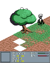 |
|
|
We fall to rise again.
|
|
|
IP Logged |
|
|
littlesapphire
Midshipman
Joined: 14 January 2008 Online Status: Offline Posts: 83 |
Posted: 18 February 2008 at 11:25am |
|
Overall shading looks pretty good. You should put some texture on the trunk for bark, but otherwise looks like it's coming along ok. I agree with Kira, though. The tree looks like it's really leaning way out there. I can' decide if it's the right-most root that's sticking way out, or if it's because the tree trunk is tilted so much. But the edit really helped it feel less tilted.
I really like the grass texture, but there's something about the colors that don't sit right with me. I'm thinking it's way too blue. I've yellowed it a bit for you to look at :3  |
|
|
IP Logged |
|
|
Sabata
Commander
Joined: 08 July 2007 Online Status: Offline Posts: 128 |
Posted: 20 February 2008 at 2:51pm |
|
Thanks, I
think I finally finished my tree, here is a pic whit my actual colors and one
whit a 30 % yellow
looks like the yellow one looks better right?  original  yellow |
|
|
We fall to rise again.
|
|
|
IP Logged |
|
|
BlackDragon
Commander
Joined: 13 May 2014 Location: United States Online Status: Offline Posts: 729 |
Posted: 20 February 2008 at 3:13pm |
|
Yes, but typically one would use yellow in the highlights, and greens and blues in the shade. To create a simple hueshift.
|
|
|
IP Logged |
|
|
Sabata
Commander
Joined: 08 July 2007 Online Status: Offline Posts: 128 |
Posted: 01 March 2008 at 4:32pm |
|
Been
working on this after a short break (or maybe not so short =)) Last time
grass was bothering me, it had a very messy look for me so I redid it from
scratch here is the result
PS: I am
still to rework the UI Edited by Sabata - 01 March 2008 at 4:33pm |
|
|
We fall to rise again.
|
|
|
IP Logged |
|
|
BlackDragon
Commander
Joined: 13 May 2014 Location: United States Online Status: Offline Posts: 729 |
Posted: 01 March 2008 at 5:14pm |
|
Hm, I liked the old grass better.
And the new colors are better. Edited by BlackDragon - 01 March 2008 at 5:17pm |
|
|
IP Logged |
|
|
Acherhar
Commander
Joined: 13 September 2021 Location: United States Online Status: Offline Posts: 179 |
Posted: 01 March 2008 at 5:17pm |
|
I like the new colors a lot, much better than the yellowed, overused kind. As for the grass, I like the new version too, except it looks more like small plants than grass.
|
|
|
|
|
|
IP Logged |
|
|
jalonso
Admiral 
Joined: 29 November 2022 Online Status: Offline Posts: 13537 |
Posted: 02 March 2008 at 6:22am |
|
Very nice updates. Your palette control/color conservation skills have really improved :)
|
|
|
|
|
|
IP Logged |
|
| |
||
Forum Jump |
You cannot post new topics in this forum You cannot reply to topics in this forum You cannot delete your posts in this forum You cannot edit your posts in this forum You cannot create polls in this forum You cannot vote in polls in this forum |
|

