Mockup (WIP)
Printed From: Pixel Joint
Category: Pixel Art
Forum Name: WIP (Work In Progress)
Forum Discription: Get crits and comments on your pixel WIPs and other art too!
URL: https://pixeljoint.com/forum/forum_posts.asp?TID=6043
Printed Date: 22 April 2026 at 7:03pm
Topic: Mockup (WIP)
Posted By: Sabata
Subject: Mockup (WIP)
Date Posted: 17 February 2008 at 11:44am
|
Early stages
of a mockup
c & c And any
help on that tree?
------------- We fall to rise again. |
Replies:
Posted By: Inventrix
Date Posted: 17 February 2008 at 11:53am
| Make some leaves coming in front of the branches/trunk, also. At the moment it looks like it's leaning heavily away from the viewer, and I suspect that isn't what you intended. |
Posted By: Sabata
Date Posted: 18 February 2008 at 9:55am
|
=/ yea..... How's the overall shading idea? first time doing a tree...... 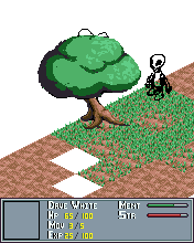 ------------- We fall to rise again. |
Posted By: littlesapphire
Date Posted: 18 February 2008 at 11:25am
|
Overall shading looks pretty good. You should put some texture on the trunk for bark, but otherwise looks like it's coming along ok. I agree with Kira, though. The tree looks like it's really leaning way out there. I can' decide if it's the right-most root that's sticking way out, or if it's because the tree trunk is tilted so much. But the edit really helped it feel less tilted. I really like the grass texture, but there's something about the colors that don't sit right with me. I'm thinking it's way too blue. I've yellowed it a bit for you to look at :3  |
Posted By: Sabata
Date Posted: 20 February 2008 at 2:51pm
|
Thanks, I
think I finally finished my tree, here is a pic whit my actual colors and one
whit a 30 % yellow
looks like the yellow one looks better right?  original  yellow ------------- We fall to rise again. |
Posted By: BlackDragon
Date Posted: 20 February 2008 at 3:13pm
| Yes, but typically one would use yellow in the highlights, and greens and blues in the shade. To create a simple hueshift. |
Posted By: Sabata
Date Posted: 01 March 2008 at 4:32pm
|
Been
working on this after a short break (or maybe not so short =)) Last time
grass was bothering me, it had a very messy look for me so I redid it from
scratch here is the result
PS: I am
still to rework the UI ------------- We fall to rise again. |

Posted By: BlackDragon
Date Posted: 01 March 2008 at 5:14pm
|
Hm, I liked the old grass better.
And the new colors are better.
|
Posted By: Acherhar
Date Posted: 01 March 2008 at 5:17pm
|
I like the new colors a lot, much better than the yellowed, overused kind. As for the grass, I like the new version too, except it looks more like small plants than grass. ------------- |
Posted By: jalonso
Date Posted: 02 March 2008 at 6:22am
|
Very nice updates. Your palette control/color conservation skills have really improved :)
------------- |