| Active TopicsSearchRegisterLogin |
| WIP (Work In Progress) | |
 Topic: Tiny House - First Pixel Art Topic: Tiny House - First Pixel Art |
  |
| Author | Message |
|
Zeebo
Seaman 
Joined: 01 August 2008 Location: Netherlands Online Status: Offline Posts: 4 |
  Topic: Tiny House - First Pixel Art Topic: Tiny House - First Pixel ArtPosted: 01 August 2008 at 11:42am |
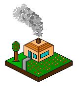 Hello. This is my first art of a little house. Made a lot of building but none of them were worth to upload. So I thought lets try this out. Its simple I know but I am a beginner in pixel arts. Rate and Comment please. |
|
|
~ Zeeb0 - Pixel Art ~
|
|
 IP Logged IP Logged |
|
|
DrunkBurger
Midshipman 
Joined: 23 July 2008 Location: Netherlands Online Status: Offline Posts: 66 |
Posted: 01 August 2008 at 12:14pm |
|
You need to tone down the colors. There too bright.
It needs more shadow too. The tree looks weird too  Dont go yell at me now because i dont really like it. I am a beginner too. The avatar im using is my first work EVER. It really needs more work. But i think you can accomplish great things if you work more  Edited by DrunkBurger - 01 August 2008 at 12:21pm |
|
|
~Mo Money Mo Bitches~
|
|
|
IP Logged |
|
|
Zeebo
Seaman
Joined: 01 August 2008 Location: Netherlands Online Status: Offline Posts: 4 |
Posted: 02 August 2008 at 4:30am |
|
Thanks for you comment, and yeah I don't know realy good on how to make a goodlooking tree, its the basics and I am trying to make shine in windows better, cant realy get a good thing shadows for the house and combine them with the window shine. I need to learn much more..
|
|
|
~ Zeeb0 - Pixel Art ~
|
|
|
IP Logged |
|
|
Ameki
Seaman
Joined: 23 July 2008 Online Status: Offline Posts: 27 |
Posted: 02 August 2008 at 4:34am |
|
The doorknob looks like it's a little low, maybe take it up one or two pixels.
|
|
|
IP Logged |
|
|
Blu
Commander 
Joined: 23 January 2008 Online Status: Offline Posts: 208 |
Posted: 02 August 2008 at 11:22am |
|
It looks like you used the spray paint can in Paint for the smoke (though I'm not sure). I don't ... think that's allowed, and it looks a bit fake, anyway. :/
Is the roof supposed to look peeked or flat? Lower your color count, k? The sidewalk kind of looks like it's sinking. ^^; You don't really need to shade it, either. Try to make the tree's leaves more than just a circle. Get rid of the black outline underneath the trunk of the tree. Sorry if I sound cruel. That's not what I'm going for. Good luck! |
|
|
Gremlins rule the world; you just don't know it yet.
|
|
|
IP Logged |
|
|
pipe
Commander
Joined: 11 August 2008 Location: Croatia Online Status: Offline Posts: 110 |
Posted: 17 August 2008 at 7:13am |
|
why is left side of that grass yard brighter than right also i would get rid of those black outlines
|
|
|
IP Logged |
|
|
chanfan
Seaman
Joined: 07 April 2006 Online Status: Offline Posts: 22 |
Posted: 17 August 2008 at 6:18pm |
|
Hehe this reminds me of when I was new to pixelart. I think my first work looked something like this! Keep going! Look at lots of references to get ideas of how to improve! When doing isometric art I think eboy.com is a great place for inspiration!
|
|
|
IP Logged |
|
|
bren0098
Seaman
Joined: 04 February 2008 Online Status: Offline Posts: 24 |
Posted: 20 August 2008 at 8:18am |
|
Maybe try raising the roof a little. The tree trunk looks too big for the leafy part, so maybe make that a little bigger or the trunk a little smaller. Also, why is the grass brighter on one side than the other?
 I'm not an expert or anything btw, just throwing in my $0.02. :D
|
|
|
IP Logged |
|
| |
||
Forum Jump |
You cannot post new topics in this forum You cannot reply to topics in this forum You cannot delete your posts in this forum You cannot edit your posts in this forum You cannot create polls in this forum You cannot vote in polls in this forum |
|
