Tiny House - First Pixel Art
Printed From: Pixel Joint
Category: Pixel Art
Forum Name: WIP (Work In Progress)
Forum Discription: Get crits and comments on your pixel WIPs and other art too!
URL: https://pixeljoint.com/forum/forum_posts.asp?TID=6876
Printed Date: 09 September 2025 at 9:20am
Topic: Tiny House - First Pixel Art
Posted By: Zeebo
Subject: Tiny House - First Pixel Art
Date Posted: 01 August 2008 at 11:42am
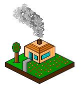 Hello. This is my first art of a little house. Made a lot of building but none of them were worth to upload. So I thought lets try this out. Its simple I know but I am a beginner in pixel arts. Rate and Comment please. ------------- ~ Zeeb0 - Pixel Art ~ |
Replies:
Posted By: DrunkBurger
Date Posted: 01 August 2008 at 12:14pm
|
You need to tone down the colors. There too bright. It needs more shadow too. The tree looks weird too  Dont go yell at me now because i dont really like it. I am a beginner too. The avatar im using is my first work EVER. It really needs more work. But i think you can accomplish great things if you work more  ------------- ~Mo Money Mo Bitches~ |
Posted By: Zeebo
Date Posted: 02 August 2008 at 4:30am
|
Thanks for you comment, and yeah I don't know realy good on how to make a goodlooking tree, its the basics and I am trying to make shine in windows better, cant realy get a good thing shadows for the house and combine them with the window shine. I need to learn much more..
------------- ~ Zeeb0 - Pixel Art ~ |
Posted By: Ameki
Date Posted: 02 August 2008 at 4:34am
| The doorknob looks like it's a little low, maybe take it up one or two pixels. |
Posted By: Blu
Date Posted: 02 August 2008 at 11:22am
|
It looks like you used the spray paint can in Paint for the smoke (though I'm not sure). I don't ... think that's allowed, and it looks a bit fake, anyway. :/ Is the roof supposed to look peeked or flat? Lower your color count, k? The sidewalk kind of looks like it's sinking. ^^; You don't really need to shade it, either. Try to make the tree's leaves more than just a circle. Get rid of the black outline underneath the trunk of the tree. Sorry if I sound cruel. That's not what I'm going for. Good luck! ------------- Gremlins rule the world; you just don't know it yet. |
Posted By: pipe
Date Posted: 17 August 2008 at 7:13am
| why is left side of that grass yard brighter than right also i would get rid of those black outlines |
Posted By: chanfan
Date Posted: 17 August 2008 at 6:18pm
| Hehe this reminds me of when I was new to pixelart. I think my first work looked something like this! Keep going! Look at lots of references to get ideas of how to improve! When doing isometric art I think eboy.com is a great place for inspiration! |
Posted By: bren0098
Date Posted: 20 August 2008 at 8:18am
|
Maybe try raising the roof a little. The tree trunk looks too big for the leafy part, so maybe make that a little bigger or the trunk a little smaller. Also, why is the grass brighter on one side than the other?
 I'm not an expert or anything btw, just throwing in my $0.02. :D
|