Mario Street Fight
Printed From: Pixel Joint
Category: Pixel Art
Forum Name: WIP (Work In Progress)
Forum Discription: Get crits and comments on your pixel WIPs and other art too!
URL: https://pixeljoint.com/forum/forum_posts.asp?TID=10416
Printed Date: 12 June 2026 at 12:47pm
Topic: Mario Street Fight
Posted By: RollerKingdom
Subject: Mario Street Fight
Date Posted: 27 May 2010 at 6:53am
Okay so I guess here I go... I've been thinking of trying to create a mock up based on mario with a mixture a bit of street fight.. Basically it would be a screen of when both fighters start, mario would be with his arms crossed and a confident expression and his opponent waluigi would have an evil smile but not sure of his pose yet.. First Ill work on Mario (which will prob take a while :)) so im wide open for critics and so on...
|
Replies:
Posted By: wenruto
Date Posted: 27 May 2010 at 12:54pm
|
It Would Be cool If mario Had Thosee Powers (abilities) and Cool Suits like In the video Games like Ice,fire,flying etc.. and waluigi With His Ummh Whatever He does .. i Dunno Just sayin =)cool so far like the idea though ------------- Earn free stuff by searching like Google http://swagbucks.com/refer/wendy"> 
|
Posted By: Ninja Crow
Date Posted: 27 May 2010 at 1:08pm
|
What kind of style are you going for? If there was a scale where zero was "game Mario" (cartoon) and five was realistic (Mortal Kombat movie) then where on that scale do you want it to fall?
I would say that, yes, even something close to the zero end of the realism scale should be informed by good references (sorry!). Here are some pictures that may help show what I mean: http://www.ripten.com/wp-content/uploads/2008/04/ehondawiifit.jpg http://johnlarroquetteproject.com/wordpress/wp-content/uploads/2007/02/honda.jpg http://www.walyou.com/img/street-fighter-character-art.jpg The first shows some great proportions for a fat-but-fit guy (it also just happens to be a Street Fighter character...). The second shows an excellent crossed-arm pose (just download and flip before use...). And the third is just to illustrate an extreme example of style so that you can more easily recognise it in the previous two pictures. What I mean by that is that even though Honda is made of many shapes (circles, tubes, barrels, etc.) the artist was going for an overall, hit-you-on-first-glance shape that unifies the image into a single, striking whole. In other words, these really pop when you see them, because every element works toward the same, final effect: BANG!. Do you recognise the "bang" in each image? (hint: in the first, it is an "A", with a lot of visual force on the leg on our left, as well as having the spread of his upper body (the bar of the A) from elbow to elbow, which practically forces the center of this image right off the page. In the second, it is an arc, which starts from his face, and follows the curve of the chest and belly, down toward feet which we can't see, but we can feel because of the arc, and even though there are crossed arms jutting out from this line, they only serve to reinforce the power of this curve, rather than to break it. And in the third image, the focus is the head, with everything hanging down symmetrically from there, and because of the deceptively casual pose, combined with the confrontational costume design (he's dressed like a tough guy) it creates the juxtaposition of loose (all his body hangs) with power (his costume and his body create a visual "bulge") to generate the feel of "challenge" (great for fighter characters) for an overall burst of eye-catching interest.) So if you compare these with your pose, you might notice that you need to find a way to generate this "bang" and add some more dynamism, as you were able to do in your previous http://www.pixeljoint.com/pixelart/49574.htm - Avatar vs. Naruto image (notice the lines of dynamic power you gave the characters!). This image will have that, too, once you fix the issues with the crossed arms (notice how the arms are too long for this size of body, and create a "caved-in" chest feeling, which is not compatible with the confident, outwardly-curved thrust of the pose I assume you are going for, as exampled in the second ref of Honda), and give a more dynamic and natural spread to his feet - as exampled in the first ref (you'll notice how Honda's weight is perfectly and confidently centered between his feet, which is why your Mario looks like he needs to shift his right leg to our left, so that his weight won't be mostly over that one leg - which leads to an unbalanced feeling for this type of pose). You also need more "volume" in the head above his eyeline. Sorry for so much, but I hope it helps! Here's a summary of the points:
(p.s., if you can make a sketch with an improved pose, please do so and post it - I'd love to see it.) ------------- 
!Strange Atoll - The Amazing Wilbot Game Project! |
Posted By: RollerKingdom
Date Posted: 27 May 2010 at 1:26pm
|
@wenruto: thanks, I will prob add like a costume floating somewhere as to represent a bit of the game and that he can get it and wear it.. @NC: Thanks for the time explaining this, I would give more of a 3, not too realistic but also not too vague (boring, etc) I will deff. work on a sketch and post it, and also work around the pixel sketch after the real life one.. then you can analyze both :) I will look forward to get working on it soon so sketched the pose.. what do you think?  and I would say i made his legs a bit short because i want him to be fat and not that tall.. pixel:  so i started shading and coloring mario, Im really happy of how his face came out :D  |
Posted By: Ninja Crow
Date Posted: 28 May 2010 at 10:54am
|
Wow, that's a great sketch, Roller, and a much more dynamic pose!
Some things you might want to be aware of: the lighter blue arm (as seen in the new sprite) is not long enough. I can see the bicep bulge in the sketch, and it is shown in the sprite as the bulb that sticks off above the elbow, but there is not much of a shoulder above that to speak of. Since the arm isn't long enough, the elbow is too short. You'll notice in the http://johnlarroquetteproject.com/wordpress/wp-content/uploads/2007/02/honda.jpg - ref that if you were to draw a line across the top of the shoulders, and then one from elbow tip to elbow tip, the two lines would be roughly parallel, but in your sketch they are actually diagonals that ascend/descend in opposite directions. I also think that (in the sketch), while the position of the leg on our left is better, the leg still needs to be shifted slightly more to the left to center his weight. That said, this is only so you can more critically evaluate your drawing (for the benefit of future drawings) since in the sprite it seems to look all right. For your sprite, I really like your hat and moustache! I do feel, though, that:
(p.s. sorry to be so wordy, but I'm getting really invested in this great piece, and I'm really being inspired to think about it a lot!) -------------
!Strange Atoll - The Amazing Wilbot Game Project! |
Posted By: RollerKingdom
Date Posted: 29 May 2010 at 9:53pm
Im not sure if I was able succeeding on most of what you criticized but I gave it a try, im actually really stunned of how it's coming out.. never thought i would be able to give my own try doing mario.. |
Posted By: Ninja Crow
Date Posted: 30 May 2010 at 1:04pm
|
Great update, Roller!
Is that a belly button? I have a hard time believing you could see it through a layer of denim, but lol! I still think the elbow on our left is too short (should be covering more of the wrist) but the shading is great, and the new face is terrific! -------------
!Strange Atoll - The Amazing Wilbot Game Project! |
Posted By: RollerKingdom
Date Posted: 30 May 2010 at 4:42pm
|
Thank you, yea i was trying to put a belly button but gotta agree on that, I will prob remove it.. and ill make his elbow covering more the wrist, thanks.. edit: so i went over some of the stuff you said and finished shading it.. im actually surprised of how great it came out.. but once again I would like to hear your thoughts, and go over what is needed or else if the sign is given I shall move on to waluigi.  |
Posted By: StepDragon
Date Posted: 31 May 2010 at 10:31am
|
what's holding in his belly? a belt? there's no visual indication. to my knowlege, with overalls you wouldn't see a line like that...
overalls are made from denim, which has threading and tufting from the seams. you have enough resolution to incorporate them. 
crotch seems a little akward, can't go into more detail than that. front leg seems much bigger than the far one. (even for distance compensation, its half the size, compaired to the arms, which are nearly identical. stance seems a little too wide, probably because of the difference in leg thicknesses. for the muscularness you've given to him, his shoulders shure seem small... and his cheek seems puffy, as if its been hit already, maybe remove some of the shine? or at least tone it down... But for the most part i think you got it down. i can definately tell its mario. |
Posted By: RollerKingdom
Date Posted: 31 May 2010 at 10:57am
|
Thank you, I've ticked around some of the points you mentioned.. im not sure if it looks better or anything but this is some of the stuff worked Made the leg a little less bigger Gave him a bit more of shoulder worked around his belly worked around his crotch  Now for his cheek I like the lightning on it because i want him to have a bit of puffy cheek p.s: i kinda liked the dark line under his belly.. it gave a bit of volume so here's the edit but with the line under his belly..  |
Posted By: Ninja Crow
Date Posted: 31 May 2010 at 12:14pm
|
It's looking really good, Roller - you've made quite a few improvements.
I would say that having a shadow under the belly does look better, but since having an excuse for it is important, maybe we can get suggestions from everybody, such as "his guts look like that naturally, now, since he wears belted pants all the rest of the time", or "he's wearing belted pants under the protective overalls", and so on. I think it's an important enough detail that you may be able to get away with fudging the reality. Do you think it's possible to put the denim seams on his overalls? Maybe make an alternate test version with the dotted lines and post it to see what everybody thinks. I especially would like to see some cuffs that almost cover the entire insteps of the shoes. I'm afraid I'm a bit of a symmetry freak, and I would like the leg on our left to have the same area lit as on the leg on our right (the upper thigh). The lighting on that leg on our right should probably first be raised, and have the midtone light (not the lightest highlight) be stretched down into more of an oval, if possible, before making them match. I would also like to see some lighting on the rightmost shoe - perhaps a spot specular could even benefit both (I'm a big fan of those, so disregard if they're not your own taste!). Don't see anything else that jumps out at me - you've got it going great so far! -------------
!Strange Atoll - The Amazing Wilbot Game Project! |
Posted By: RollerKingdom
Date Posted: 31 May 2010 at 12:46pm
okay so i added the denim seams and WOW i've got to say it looks A LOT BETTER, more detailed :) im so happy with it!!!!! |
Posted By: ellie-is
Date Posted: 31 May 2010 at 1:10pm
|
Looks much better indeed, but I think you can still add more detail to the seams and stuff. Face still seems to need some work, mostly just more definition. I'm doing a quick edit of it right now, will post in a second.
EDIT: 
Just to give you an idea of what I think you should do. |
Posted By: jalonso
Date Posted: 31 May 2010 at 1:24pm
|
Such a vast improvement...but... Should his belly hang a little more, like covering the belt area a little? Also the cheeks are hanging low. Maybe the moustache can be exagerated a little more and help define the cheeks and define the nose better? ------------- |
Posted By: RollerKingdom
Date Posted: 31 May 2010 at 1:54pm
|
Thank you Lucas and Jal so i worked around it a bit and yea it does look much better Jal, I increased and curved his mustache a bit and i also like it much better that way..  |
Posted By: jalonso
Date Posted: 31 May 2010 at 4:51pm
dunno, if I'm entirely correct in my lines here but I now see that my problem wasn't really how the belly hangs over the belt but that the arm that shows the glove is not quite right in angle (glove position is ok.) ------------- |
Posted By: RollerKingdom
Date Posted: 31 May 2010 at 7:45pm
|
Thanks Jal, I guess that what it was missing as well.. worked a bit around it and how did it come out?  p.s: I have a feeling if the rest of the work come out great as it's going so far it has a chance to be my best work and hopefully with the highest # of favs  |
Posted By: StepDragon
Date Posted: 01 June 2010 at 12:28am
| IMO, the new belly is too big.maybe reduce it by 2 or less pixels on the right. just to make it a little more balanced. |
Posted By: RollerKingdom
Date Posted: 01 June 2010 at 7:37am
|
Thanks StepDragon, I will see about that later.. i like the idea of him having this fat belly :P anyways now to the second 25% of the project I would say.. time to work on his opponent Waluigi, based on some pictures of waluigi I could say he is an evil character but silly so this is the pose im going for but i kno there are a lot of anatomy prob. already ;(  It was supposedly based upon this |
Posted By: StepDragon
Date Posted: 01 June 2010 at 9:05am
|
This is gonna be the last time i bring it up [don't want to be a troll!]
I'm not saying Mario is too fat. I'm saying he's too fat for your style choice. you went with a more realistic vs toony approach, because you're looking for a street fighter style. i just don't think the belly is realistic enough for the style. you're choice. as for waluigi. i'm no expert on anatomy, so here's what i can tell you. waluigi is TALL.. how tall? without his legs, he would be as tall as mario.. http://www.mariowiki.com/images/thumb/d/dc/MarioBrosVsWarioBros.jpg/783px-MarioBrosVsWarioBros.jpg - ref IRL, he would probably have different anatomy structure than most other people (which is why i'm trying to get this post in here) i would use somebody like http://www.oneinchpunch.net/wordpress/wp-content/uploads/2007/07/worlds-tallest-man.jpg - this as a reference. also keep in mind that although thin, waluigi has amazing muscles. his arms and knees are always bent (which is why you can't tell he's twice as tall as mario) ooh, and something i noticed as i was writing this post, you're blot-out of waluigi, his right arm (on our left), the upper arm is too short. it should be abbout even with the lower arm. like i said, for waluigi, i would make him, maybe 10 px taller, and draw him with bent legs, to emphasize his Incredible height. Cheers. |
Posted By: RollerKingdom
Date Posted: 01 June 2010 at 9:35am
|
thanks for the points of view.. Although I don't want to make him like twice as mario height, I think it would look odd for the game.. I am though going to increase his legs a bit more because they look short atm.. but yea I will be tweaking around with his pose before going to detailing |
Posted By: StepDragon
Date Posted: 01 June 2010 at 12:01pm
I drew this up for you to illustrate what i'm talking about (i'm just making sure my suggestion was clear)

(first pic is the original) (second is him with the lankyer limbs) (third is the same as the second, but with a new more waluigi-like pose) as you can see, i wasn't saying to make the picture taller (not by much anyways), but by increasing the length of his limbs and torso, you can both make him look taller, and give him a more waluigi-esque stance. I hope this helps! |
Posted By: Ninja Crow
Date Posted: 01 June 2010 at 12:31pm
|
When you first mentioned having Waluigi, I thought immediately that he could be the Dhalsim of your mockup, so I agree with where StepDragon's third pose is going (it also looks well proportioned and balanced to me).
If you want jal's bigger belly for Mario, it looks wrong with the lower arms, since the belly would hold them up (he couldn't keep them in that position without straining against the top of his belly). Also, you lost a bit of the "shoulders back" confidence of the pose (the arms just look droopy, now) - so my personal request is to ask you to return to the arms you had (sorry jal) which also had more aesthetic shapes, especially in the definition of the leftmost tricep area (but obviously go with what you like best - my use of droopy vs. confident was in no way meant to unduly influence you  ). I was willing to say that foreshortening could make up for any worries that the arms weren't long enough. ). I was willing to say that foreshortening could make up for any worries that the arms weren't long enough.
(Sorry if that's more opinion than helpfulness!) -------------
!Strange Atoll - The Amazing Wilbot Game Project! |
Posted By: ellie-is
Date Posted: 01 June 2010 at 3:12pm
|
Originally posted by StepDragon
'm saying he's too fat for your style choice. you went with a more realistic vs toony approach, because you're looking for a street fighter style. 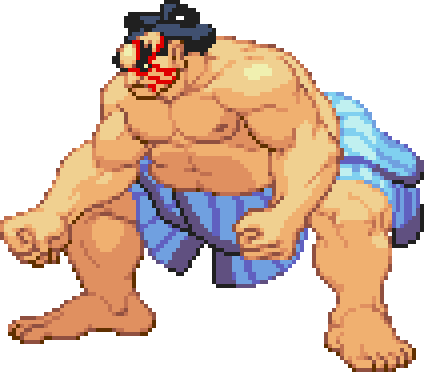
He's fat and on a street fighter game. 
|
Posted By: StepDragon
Date Posted: 01 June 2010 at 3:48pm
|
Originally posted by lucas_irineu
He's fat and on a street fighter game. 
He's a little too fat, don'cha think? ANYWAYS, fooling aside. Yes you're example is fat, and in a fighting game, but he is not disproportionate. look at him (yours not mine) as an example. with him, he has VERY broad shoulders, and a wide leg stance, but even so, his torso is intact and held. in the case of Mario, his belly looks more like somebody who had been an alcoholic for MANY years and has a beer belly which without his shirt on would hang down to his knees (which I've seen before, its not pretty) i realize i'm exaggerating a little bit, but the concept is still there. however, thank you for allowing me to explain myself in more detail. @RollerKingdom Please keep in mind, no matter how much I may emphasize a point, Ultimately it is YOUR art. and I respect that. You are free to take or leave any advice I may present. I don't mind if you don't agree with my views. In the end, Its Your art, Your the boss! |
Posted By: ellie-is
Date Posted: 01 June 2010 at 4:04pm
|
Yeah, I know, I just thought it would be fun to post that pic. :P
Here's another bonus pic. 
|
Posted By: RollerKingdom
Date Posted: 01 June 2010 at 7:19pm
|
thank you guys, now im confused on which marios pose to choose >_< I actually liked Jals pose a lot because his arms are resting on his belly but still with a confident pose... @stepdragon: OO I love the third pose.. Ill work a bit around to make it almost alike and post it after, thanks for the help! |
Posted By: Ninja Crow
Date Posted: 02 June 2010 at 12:00pm
|
You're right about jalonso's pose - don't know why I didn't see it before O.o
I'd say, go with your...gut...on this one >.< -------------
!Strange Atoll - The Amazing Wilbot Game Project! |
Posted By: RollerKingdom
Date Posted: 03 June 2010 at 8:24am
|
SO since I've been working lately it got a bit hard to keep working on it but I will move slowly and steady.. Based upon Steps pose I recreated it to be more "waluigi" and started on it I did his face so far.. can it be recognized as waluigi?  I've noticed that Ill have to make his pupils to our left side so he can look at mario |
Posted By: jalonso
Date Posted: 03 June 2010 at 9:05am
|
Waluigi is plump and meaty you have to retain those qualities. His face, as is, looks too lean and chiseled.
------------- |
Posted By: StepDragon
Date Posted: 03 June 2010 at 9:06am
|
Just my opinion, but i think his head could be a little bigger.
(here's why, in toony waluigi, his head is HUGE. and even some massively tall guys have larger heads than normal. not by much, but noticeably.) i'm sure you have a good ref, so i'm not gonna bother posting one. Good luck! |
Posted By: StepDragon
Date Posted: 03 June 2010 at 9:10am
|
ok, just saw jalonso's post, and i disagree. waluigi is reletivaly slim compared to the other mario characters. if you combine that with his height, and then throw in a heaping pile of reality. you're gonna get a thinner guy.
I would say keep him thin, for the same reason that you didn't make mario 4 ft. tall. (1.2 meters for all the metric ppl out thar) EDIT: sorry for double posting |
Posted By: RollerKingdom
Date Posted: 03 June 2010 at 9:46am
| Thank you guys, I hope you also understand that im giving the characters a bit of my style.. i do not except it to be completely 100% identical to the original one but have most of the parts recognizable. |
Posted By: jalonso
Date Posted: 03 June 2010 at 10:49am
|
Originally posted by StepDragon ... i disagree. waluigi is reletivaly slim...  Senility suxxorz Senility suxxorz------------- |
Posted By: Ninja Crow
Date Posted: 03 June 2010 at 11:11am
|
Terrific Waluigi face, and I agree about the pupils.
I recommend pixelling the head without the hand in the way (you don't have to refine the parts you know will be covered), and I think the hat is a little too small or lacking in shape (perhaps increase the bill, and give more volume to the part that leans out over his face?). And definitely keep your own style whenever you can! -------------
!Strange Atoll - The Amazing Wilbot Game Project! |
Posted By: RollerKingdom
Date Posted: 03 June 2010 at 11:52am
|
yea thanks Ninja, Ill give more volume and increased his hat and pixel the rest of the face without the hand.. I hope to post some more updates later Edit: So i start doing some part of him..  and it gave me the idea of maybe putting his hand behind his head.. should I? or just do it over his face? |
Posted By: kenpokis
Date Posted: 03 June 2010 at 4:10pm
|
Extend the bill of the hat more, and maybe for his arm have it at a slightly higher angle in a karate chop position. ------------- !Strange Atoll - The Amazing Wilbot Game Project! |
Posted By: RollerKingdom
Date Posted: 03 June 2010 at 7:48pm
|
i see what you mean about the hat, fixing that and about the arm ill see it after okay im not sure if the shading is good so far.. and OOPS forgot about his pointy shoes, ill be adding them soon but yea let me know about his body before i got to AA and refining the jaggy lines of it..  |
Posted By: Buddy90
Date Posted: 03 June 2010 at 8:58pm
|
ugh, the crotch again....>.< Anyway, I would work on the hips and legs alot more. The orientation suggests that he is facing backwards, but the rest of the body doesnt. It seems like he's twisting his body too much. Maybe try to make the leg that touches the floor straight, instead of bent. Not to mention, that looks like a really uncomfortable position to stand in. Usually that means somethings off. Also, the bill of the hat needs to be extended. The part of the part that goes over the face.  ------------- http://ps3trophycard.com/profile/vilocon"> 
|
Posted By: StepDragon
Date Posted: 04 June 2010 at 1:00am
|
Originally posted by Buddy90
Maybe try to make the leg that touches the floor straight, instead of bent. Not to mention, that looks like a really uncomfortable position to stand in. i wouldn't be defending the position if i hadn't suggested it myself. anyways i'm gonna make this simple (of course its roller's final decision, but here's why i wouldn't worry too much about his pose: 
its just how he is. anyways as for critique, his right leg (our left) is too thin at the knee. i know it was in my mock up, but i didn't bother with anatomy too much when suggesting it. i agree the crotch needs some work. i would also bring down his shirt a little bit. he seems to have a little too much denim on him. if you look at the ref i posted above, roughly half his torso has shirt, but yours only has maybe 1/4. don't know if its the hand or what but somehow you added a bulge to the hat that shouldn't be there (while expanding the bill?) waluigi is using a few less colors than mario, (which is good), but it makes him look more cell shaded -ish, than mario. i would edit one or the other to have a more uniform style. you mentioned the shoes... but don't forget the denim! other than that, its looking really good. Good job, keep up the good work. and as always, I hope this helps! |
Posted By: RollerKingdom
Date Posted: 04 June 2010 at 3:46am
|
I will work on these tips soon.. about the "less color" subject I think it will even out when denim is added.. |
Posted By: RollerKingdom
Date Posted: 04 June 2010 at 11:08am
|
Okay so here are the 2 sprites refined beside each other.. of course the outline areas will only be AA when they are plugged into a background.  |
Posted By: jalonso
Date Posted: 04 June 2010 at 9:29pm
|
I don't like the arm behind Waluigi's head being such a straight line and just disappearing back there... ...the 2 sprites overall are at a stage that you might want to go ahead and start the BG and see what details, changes, and edits the characters will need later on in the process. Ya noes? Don't quite know where your BG ideas are headed but maybe check the slideshow of scenes from the movie, might inspire. http://www.imdb.com/title/tt0108255/ - http://www.imdb.com/title/tt0108255/ ------------- |
Posted By: Ninja Crow
Date Posted: 04 June 2010 at 10:52pm
|
The hat has a funny bulge, like the old finger in the pocket for a gun trick.
Also, the bill looks more like a hat band. It needs a bit more substance, and some shine, as can be seen in the reference that StepDragon showed. I can't see any reason that his hand would be behind his head, unless you wanted to go with a really old fashioned taunt I think I've seen in Disney cartoons, in which the palm is held behind the head, with the fingers visible and held straight up (if seen in motion, the hand would be wagging in a taunting fashion, as if patting the top of the head). Anybody know what this is called, or if it's considered offensive now? (Oh, and his visible thumb is too short.) Is he going to have highlight colours? Mario has a nice orangish one to go with the red - might I suggest making it as pink as possible to complement the purple (and the purple already there might be a good highlight for the overalls)? And finally, I can't really tell from reference pictures what kind of shoes he's supposed to be wearing - maybe Persian slippers? - but I think they look a little too much like socks, even so, and should probably have a bit of a shine. Sorry if that sounds like a lot - I think the picture is looking great so far! -------------
!Strange Atoll - The Amazing Wilbot Game Project! |
Posted By: RollerKingdom
Date Posted: 05 June 2010 at 7:50am
|
Ill fix some of the stuff possible for now.. and as for the background i want to make it in a dark scene so the characters maybe stands out more?? also i want to add some mario characteristics to it but with diff style.  Like those mountains, the tube, plants.. Also here's a more update on waluigi, looks better  ? ? |
Posted By: Ninja Crow
Date Posted: 05 June 2010 at 12:20pm
|
Looks fine, actually, except that maybe all his fingers (including thumbs) are a bit too short, and he needs to be moved a little closer to the right edge, to balance against Mario.
I'd also love to see a "rough-in" of your background plan, even if it's just coloured shapes. (p.s., I also just noticed he has no shoulder on our right, just a concave indent - can you put a little meat into this area?) -------------
!Strange Atoll - The Amazing Wilbot Game Project! |
Posted By: Pragz
Date Posted: 05 June 2010 at 1:11pm
|
I just wanted to say I think it's great how well you take criticism and suggestions. In all your threads you're quick to respond with edits following the ideas of other members and because of that I see you're getting much, much better. It's great to see an artist like you! :) And on that note, I think his arm looks better this way, but it should still be behind his head. That way a little hand is showing in the background, it's not too linear, and adds more depth. :) ------------- Hello - I'm new here. :) |
Posted By: RollerKingdom
Date Posted: 05 June 2010 at 6:08pm
|
Originally posted by Ninja Crow Looks fine, actually, except that maybe all his fingers (including thumbs) are a bit too short, and he needs to be moved a little closer to the right edge, to balance against Mario. I'd also love to see a "rough-in" of your background plan, even if it's just coloured shapes. (p.s., I also just noticed he has no shoulder on our right, just a concave indent - can you put a little meat into this area?) Thanks, hmm what do you mean by moving him a bit more to the right edge? and yea i was also thinking of creating a rough idea for the background soon.. and sure ill work a bit more on his left shoulder. Originally posted by Pragz I just wanted to say I think it's great how well you take criticism and suggestions. In all your threads you're quick to respond with edits following the ideas of other members and because of that I see you're getting much, much better. It's great to see an artist like you! :) And on that note, I think his arm looks better this way, but it should still be behind his head. That way a little hand is showing in the background, it's not too linear, and adds more depth. :) Thanks, I shall give that a try and thank you so much for noticing it :) I do my best to take in everything since what's the point of say " Oh it's good the way it is" when you are not getting any improvement from that at all. |
Posted By: StepDragon
Date Posted: 06 June 2010 at 10:10am
| On waluigi, if you have the hand behind his head, the 'L' is totally unreadable. i know you don't have the pixel space to outline it, but maybe try to make it darker (almost orange), from a distance it shall be more readable. even if its not the 'correct' color. |
Posted By: RollerKingdom
Date Posted: 07 June 2010 at 8:21am
|
Sorry for the slow updating here but i just had my graduation and party this weekend, any who here are some small updates.. put waluigis hand behind his hat..  and did a rough sketch of the bkg >_>  The purple thing are supposed to be the tubes, on the back they are supposed to be mario mountains and mario clouds.. the black things are supposed to be the different type of rocks you can hit along the game, yellow, with a question mark and etc.. ill prob. add some type of foliage along constructing it. |
Posted By: .Vinno
Date Posted: 07 June 2010 at 11:49am
| Looks great so far! Dislike the coulours of the bg, but I think you'll be able to fix that;) |
Posted By: RollerKingdom
Date Posted: 07 June 2010 at 11:55am
| the background is just a rough sketch using random colors :) it's basically on that stage where I turn myself into a little kid and play around paint with it :P |
Posted By: StepDragon
Date Posted: 07 June 2010 at 1:06pm
|
I like it, except for one thing, the warp pipe in the middle. here's why. when all is said and done, Mario and Waluigi are basically staring each other down, but there's a big pipe in the way (or so it seems).
not to mention i think the pipe is disproportionately big. i do have a suggestion for you though. since this is like a street fight (style i know but still), in a lot of street fight games there's like a brick wall, some cars, etc. because its on a street! (derp).. anyways here's my point, you can use the dungeon bricks from Mario games, (or thwomps) to construct a wall. if you do this, i would only suggest using it on 1/3 of the street, behind Waluigi. I think it will add symbolism as well. on Waluigi's side, the wall represents isolation from the good/real/true world. yet for mario's side, HE IS THE WALL, the protector, the stern image to balance the picture... just think about it... Cheers! |
Posted By: RollerKingdom
Date Posted: 07 June 2010 at 1:59pm
|
can you post ref. pictures of objetcs and things (including the wall) from the game that I can relate to it? *sigh.. constructing backgroung/scenes are the hardest part imo :P |
Posted By: StepDragon
Date Posted: 07 June 2010 at 3:36pm
|
http://3.bp.blogspot.com/_nxaUL3DfPag/Sc_p4Uck0uI/AAAAAAAAABs/JIbf2cbHrNA/s320/1-4.png - castle walls, for brick
http://themushroomkingdom.net/images/bugs/smb_w4-2_warptrick_5.gif - underground brick/ warp pipes http://selectstartgames.files.wordpress.com/2009/07/snes_super_mario_world_2jpg.jpeg - another wall idea http://www.flishfun.com/photos/albums/userpics/10001/emrocamariolanddesktop.jpg - just cuz i want to That's all for now, i'll make a mock up later. (its dinner time here) but i don't work tonight, so i'll be here all night on and off. hope this helps! |
Posted By: RollerKingdom
Date Posted: 07 June 2010 at 7:31pm
|
just cuz i want to" I've seen that before, itz amazing haha but thanks for the images |
Posted By: RollerKingdom
Date Posted: 09 June 2010 at 9:37am
So i worked on a sketch for another bkg, it's basically supposed to be under a dungeon or something like that, with a lava pond, castle/dungeon walls, torches, monster plant and etc.. |
Posted By: StepDragon
Date Posted: 09 June 2010 at 9:55am
|
You should talk to The B.O.B. He's got this really cool pirahna plant style, which would go great with your piece. I think you should ask him if you can do a similar style (asking is always a good idea)
Here's the link: http://www.pixeljoint.com/pixelart/10658.htm - Pirahna Plant |
Posted By: jalonso
Date Posted: 09 June 2010 at 11:10am
|
I think that you need to keep the original concept of SMW meets Street Fighter in a more visual way. Your BG concepts are leaning to an entirely pure perspective and real 'world' imagery. This I think defeats the concept and idea entirely. I think the better way to have your concept read better is to treat the BG as 2 separate entities. The foreground (which matches the characters in realism but is a kinda forced perspective but realistically drawn. The second is a 'curtain' behind it (it can be toony, realistic, super realistic, artistic, w/e). Notice I made this drawing using a tile so that the viewer reads it right away. This is what Street Fighter scenes are made of...this is further emphasised by using separate palettes for each of the 2 entities. Foreground 80% of characters and curtain at 60% in lum and hue.  ------------- |
Posted By: RollerKingdom
Date Posted: 09 June 2010 at 11:48am
|
You basically spoke another language right there >_< confused.. ughhh I should of done the bkg first hahah it's getting to hard now to figure out what to do for it.. |
Posted By: jalonso
Date Posted: 09 June 2010 at 12:04pm
Check out this SF screen. Notice the front is a 'platform' where the fighting action takes place. This is the wood and that thing that slopes at an angle. In gameplay this moves with the action and is a 'unit'. Notice how its just a little lighter in hue and especially luminesence from the sprites, like 80-90% Everything else, the pagoda, water and fence is the 'curtain' behind that with lum and hue a bit ligther/softer. It moves on its own. All SF action is always on a bridge/plaza/sidewalk, etc. Most importantly notice that the artist drew the 2 layers and the sprites using the same style and realism which is why it looks like a 'complete scene'. I think you need to consider this highly for the original idea to work. * comment is probably stated poorly  **my image before this one shows the same thing from 2 angles. ------------- |
Posted By: Ninja Crow
Date Posted: 09 June 2010 at 1:22pm
Oh man, I left the first page of your thread open in my browser, and didn't realise it had switched over to page 2! 
Jalonso's description of the Street Fighter staging is excellent, and Mario is the perfect game to match to that concept, since the strip of ground that you run along in all the games can be thought of as the stage, with an obvious scrolling background behind. Your first concept drawing (or your second one) ought to be easily adapted to this idea, as in http://www.smashbros.com/en_us/stages/images/stage03/stage03_070612a-l.jpg - these http://www.yoshiart.com/images/wp/yoshis-island3.jpg - four http://www.mariomayhem.com/reference/smb3_transform/smas-smb3_title.png - Mario http://www.hajuu.com/pics/124.jpg - images . I would say that in your first background sketch, the horizon line is the top of the lime green area, and it should be brought down closer to the floor. I also agree with StepDragon that the main purple warp pipe is a little intrusive, but it makes a great focus piece (like a coffee table book) so I would suggest making it not overlap your green area in the front (the "stage") and making it look like it is located closer to the mountains (on the plains between the stage and the mountains) than the stage. I hope that's a simple enough modification of what you already have. If it inspires any ideas, can you post a new sketch with the new perspective, so it can be further refined? Thanks! -------------
!Strange Atoll - The Amazing Wilbot Game Project! |
Posted By: RollerKingdom
Date Posted: 09 June 2010 at 7:09pm
| Thank you both, I will def. study it and make the new sketch based upon on it :) also im done with graduation now and with a kitchen i was painting with my dad, so hopefully i have more time now to work on this |
Posted By: RollerKingdom
Date Posted: 10 June 2010 at 5:45am
|
okay so based upon the explanation and things i understood i redid it.. the first layer on the bkg it's supposed to be a castle wall with a plant going around of the detailed part of it.. then on the background we have mario mountains, ocean, and another castle.. Of course I plan to add more details along the wall like the broken brick i did and hopefully some cracks and etc.. also i placed mario and waluigi with the word just for the fun of it :P  |
Posted By: jalonso
Date Posted: 10 June 2010 at 7:50am
I think you got the idea.  I might be smart to first work on the foreground platform before getting into the BG BG. If you are making a screen that will include GUI elements you need to plan for that too. Traditionally its on the top of the screen but if you decide its going on the bottom then you'll want to move the platform up so you have space for it. Plan ahead. ------------- |
Posted By: RollerKingdom
Date Posted: 10 June 2010 at 9:11am
| Thanks Jal, I will work on the ground first and yes I plan to include the GUI elements on the top |
Posted By: Ninja Crow
Date Posted: 10 June 2010 at 12:12pm
|
Wow, that's looking terrific!
It looks like your horizon line is a little low, though. -------------
!Strange Atoll - The Amazing Wilbot Game Project! |
Posted By: kenpokis
Date Posted: 10 June 2010 at 4:38pm
|
I think a sunset type palette for the background would work nicely. Kinda like fighting at dusk. idk just a thought.
------------- !Strange Atoll - The Amazing Wilbot Game Project! |
Posted By: RollerKingdom
Date Posted: 12 June 2010 at 6:19pm
|
ugh I need help SO freaking bad with the ground :( I suck at doing textures and come up with ideas for ground.. I tried this out but it's just EWWWWWWWWWWW  |
Posted By: RollerKingdom
Date Posted: 15 June 2010 at 7:41am
|
a sketch using bold colors and very rough.. idk if I will ever be able to manage this mock up into a successful result but oh well..  |
Posted By: dpixel
Date Posted: 15 June 2010 at 10:02am
|
I know you can do this Roller. That Mario came out awesome. Just feel the shapes you're trying to create and take your time. EDIT: Also, you're background may be too big. Take a look at the Street Fighter screen above and notice how big the characters are compared to the background. Some common resolutions for games like that are: 320x200 and 320x240. Just a thought. ------------- |
Posted By: Ninja Crow
Date Posted: 15 June 2010 at 6:31pm
|
Wow, that is a fantastic update and improvement on your first version! Keep it up!
I love the weight things have now, and the organic feel of roughness to everything - like a master artist spashing a canvas with bold strokes of colour. The higher horizon line is a great improvement, and the sparkles on the water look very cool. I like the colours for your sky, just remember to put the lighting on the clouds on the bottom, since the sun is below them. Try making the base of your ivy column stick down onto the floor a bit, so that it looks more round. And you might want to make the floor stones a bit larger so that they don't drive you crazy (unless you're already fine with them!). To wrap up - terrific job, this is going really well, and is going to rock! -------------
!Strange Atoll - The Amazing Wilbot Game Project! |
Posted By: RollerKingdom
Date Posted: 15 June 2010 at 6:40pm
|
Thank you guys, and thanks for the great tips Ninja, Ill keep working on it.. should I decrease the canvas size a bit then? |