EOCENE PREDATOR ATTACK
Printed From: Pixel Joint
Category: Pixel Art
Forum Name: WIP (Work In Progress)
Forum Discription: Get crits and comments on your pixel WIPs and other art too!
URL: https://pixeljoint.com/forum/forum_posts.asp?TID=13758
Printed Date: 09 June 2026 at 3:46am
Topic: EOCENE PREDATOR ATTACK
Posted By: skeddles
Subject: EOCENE PREDATOR ATTACK
Date Posted: 25 January 2012 at 9:20am
 Two extinct animals, the http://images.google.com/search?q=leptictidium&tbm=isch - Leptictidium and the http://images.google.com/search?q=andrewsarchus&tbm=isch - Andrewsarchus , who lived in the http://en.wikipedia.org/wiki/Eocene - Eocene Epoch . I've compared their heights at the top, one block being one foot, and hope that I correctly portrayed that. I would like to get help on perspective and anatomy mostly (colors too, but not yet). The dark green will be ferns, the light green will be bushes and the yellow-green will be grass (with some other plants thrown in). I hope to add some trees, but the one I drew first would be on top of the andrewsarchus (who is now on top of it), so I'll have to find a new place for it. ------------- |
Replies:
Posted By: jalonso
Date Posted: 25 January 2012 at 11:04am
|
Maybe the angle is off. 3/4 top-down right?
------------- |
Posted By: skeddles
Date Posted: 25 January 2012 at 11:08am
|
Originally posted by jalonso Maybe the angle is off. 3/4 top-down right? somewhere around that, does andrewsarchus look wrong? here's a newer version, not necessarily fixed, I think the butt looked the most off, the head prolly needs some tweaking.  I started with a skeleton like thing, but I guess it was too sideview  any perspective tips? EDIT: Update  ------------- |
Posted By: slym
Date Posted: 28 January 2012 at 11:51am
| The pose on the predator needs to be in action! |
Posted By: Cyangmou
Date Posted: 29 January 2012 at 4:25pm
|
it's a predator, so think about the story of the picture. The position of the animals isn't rather good for the "hunt" scenario. You should also think a bit about how you create the environment to tell the story. Just a quickie to give you something you can think of  |
Posted By: jeremy
Date Posted: 29 January 2012 at 4:55pm
|
A quick check of wiki says Leptictidium was 6' at the shoulder to Andrewsarchus's ~20cm. I also don't think they ever would have met, 'cos Lepictidium hang at the coast and [probably] ate shellfish, whereas Andrewsarchus was in the forest. Why not replace Leptictidium with a Terrorbird of some kind? I'm fairly sure I even saw that on Walking with Beasts :L And yeah, ^dynamism. |
Posted By: skeddles
Date Posted: 29 January 2012 at 8:10pm
|
Originally posted by Cyangmou
it's a predator, so think about the story of the picture. The position of the animals isn't rather good for the "hunt" scenario. You should also think a bit about how you create the environment to tell the story. Just a quickie to give you something you can think of -image- Guh, that's awesome, I never would have even been able to get to that stage though. I'm really just trying to work on a certain style, which is usually an overhead gamelike style. Honestly, the hardest part for me is the drawing, if I just took what you've done I could turn it into a pretty nice piece, but just drawing things in perspective (or even getting the idea to) just doesn't come easily to me. Plus I have a hard time with anatomy, so drawing a pose like this is hard, nevermind something crazy and cool. Also, I wasn't really intending a hunt, more like the big ones just walkin' through, and everything else getting the f out his way. Originally posted by Jeremy A quick check of wiki says Leptictidium was 6' at the shoulder to Andrewsarchus's ~20cm. I also don't think they ever would have met, 'cos Lepictidium hang at the coast and [probably] ate shellfish, whereas Andrewsarchus was in the forest. Why not replace Leptictidium with a Terrorbird of some kind? I'm fairly sure I even saw that on Walking with Beasts :L And yeah, ^dynamism. Damnit, I read the length as the height, you're right, they're even smaller than I thought. And as far as them meeting, it's not like I'm really going for realism, I just made sure they were same era, and they're also two of my favorites. Don't worry, I'm sure I'll do a terror bird some day, I'm obsessed with this stuff. (Walking with beasts is awesome) I dunno, should I really start over? I wanted and rpg view like scene including extinct animals, but was that where I went wrong? ------------- |
Posted By: jeremy
Date Posted: 29 January 2012 at 9:48pm
|
Subject matter is cool, I was (mostly) joking about them never meeting. I'm doing a prehistoric mockup atm too, spent the past hour looking at dead things on Wikipedia :D. Why not do something different stylistically? It's rad that you want to develop your style but you don't want your gallery to look too same-ish. A palette switch up could help in that regard too, I don't envision Eocene woodland to be so bright and happy looking. |
Posted By: skeddles
Date Posted: 29 January 2012 at 10:50pm
|
Okay, I'm gonna do a more dynamic fight scene, terror bird(8ft) rider with an andrewsarchus(6ft) vs an enteleont (probably not much of a fight, but I don't like em). yeah I'm just throwing realism out the window. I think I want to do a side view for now I cant wait to see your piece though jeremy, glad I'm not the only one who sees their awesomeness =]  roughly 1 block = 1 foot? and I want to work on my style, but create something more interesting than ponds. I'm sick of not knowing what style I like, and I always admire people whose galleries are consistent, so I'm going to start doing that, and I've chose a style. edit: Andrewsarchus may be too big, he might get hit with an arrow. might just leave him out and make it terrorbird vs hell pig  though h wouldn't stand a chance with just arrows... pet smilodon maybe? ------------- |
Posted By: skeddles
Date Posted: 31 January 2012 at 8:46am
|
http://big-game.web.infoseek.co.jp/Pleistocene/Daeodon/Daeodon2.jpg - ref for the boar I think I'm gonna try to fit this into the weekly challenge, so here's the size, and I've added some colors, as well as the enteledont, not sure if he gives enough of a charging feel though  or would smaller characters work bettter? which would look better when done  EDIT: think I'll use the smaller ones I worked on a tree for the background  ------------- |
Posted By: skeddles
Date Posted: 31 January 2012 at 5:44pm
 tried the tree again, think it worked out better this time, even though it looks less detailed, I also tried leaves but failed, I might have to just do them in shadow edit--------- worked on palette/composition  edit-------- worked on the bird a bit, now the hunters arm positions look really bad too, I always have trouble with action looking poses for people  ------------- |
Posted By: dpixel
Date Posted: 01 February 2012 at 9:53am
|
An arrow would line up close with the eye. Rough edit: 
------------- |
Posted By: PixelSnader
Date Posted: 01 February 2012 at 7:08pm
|
Why are you restricting yourself to rather strict perspectives for this piece, rather than a point-of-view like Cyangmou suggested? If it's because you're afraid you can't do it - if you don't try you never will. ------------- ▄▄█ ▄▄█ ▄█▄ ▄█▄ |
Posted By: skeddles
Date Posted: 01 February 2012 at 8:19pm
|
Originally posted by snader Why are you restricting yourself to rather strict perspectives for this piece, rather than a point-of-view like Cyangmou suggested? If it's because you're afraid you can't do it - if you don't try you never will. I want to start being more of a spriter and less of a pixel artist (I know that sounds dumb), which is why I want to do it in either 3/4 or sidescroller. ------------- |
Posted By: jeremy
Date Posted: 01 February 2012 at 8:49pm
| Consider thickening+shortening the terrorbird's legs, also makes the opponent feel more dangerous (sizewise). |
Posted By: skeddles
Date Posted: 02 February 2012 at 2:01pm
 worked on fighters stance, hopefully a little better, though he's too fat and muscley now, and I just know I'm going to fail hard with the face and here's some more background work  pretend the green is bushes and that the grey is rocks ------------- |
Posted By: dpixel
Date Posted: 02 February 2012 at 2:23pm
|
Originally posted by skeddles and I just know I'm going to fail hard with the face No you're not. You'll do just fine. ------------- |
Posted By: skeddles
Date Posted: 03 February 2012 at 9:22am
had most of this guy done, then computer turned off   I'm really uncreative when it comes to clothing... edit------  edit------  not sure what to do with leg/clothes shading ------------- |
Posted By: skeddles
Date Posted: 03 February 2012 at 6:03pm
 not sure If I should do him furry, or muscely, or somewhere in between. also not sure if I'll need more colors, I only have 4 for such a big sprite. does anything look wonky/bad? ------------- |
Posted By: dpixel
Date Posted: 03 February 2012 at 6:18pm
|
It seems to have a really big neck for a small head. Maybe the body needs to be a tad longer too. The proportions seem a bit off. I can't put my finger on it though. Also the shaded colors should be darker considering how dark the foreground trees are. It seems to pop unrealistically. ------------- |
Posted By: Trick17
Date Posted: 03 February 2012 at 6:34pm
I disagree, I think the anatomy is quite good, just the pose could be more dynamic. Maybe like this:  |
Posted By: skeddles
Date Posted: 03 February 2012 at 6:35pm
|
Originally posted by dpixel It seems to have a really big neck for a small head. Maybe the body needs to be a tad longer too. The proportions seem a bit off. I can't put my finger on it though. Also the shaded colors should be darker considering how dark the foreground trees are. It seems to pop unrealistically. I'll be sure to add some darker colors when I begin shading, I think the bird shows that I get darker when I shade. I was basing my shape heavily off http://big-game.web.infoseek.co.jp/Pleistocene/Daeodon/Daeodon2.jpg - this picture , which I love. I can already see that I connected the jaw different, which probably is making his head seem smaller. I worked on the bird a little, finally figured out what to do with the legs  edit: didn't even see your post, will look at pose shortly ------------- |
Posted By: skeddles
Date Posted: 03 February 2012 at 7:00pm
 this look more actiony? found some boar runnin pix   ------------- |
Posted By: dpixel
Date Posted: 03 February 2012 at 7:04pm
|
@Super17 - I looks more pig/boar-like which wouldn't have quite the dynamics of a dog. I'm thinking it would be quite bumbly. It reminds me of a cross between a boar and hyena. @Skeddles - Beefing up the jaw would work. Also maybe move the front shoulder forward up a tad, accorded to your reference. And make that shoulder bigger too. Looking good though. ------------- |
Posted By: skeddles
Date Posted: 03 February 2012 at 7:10pm
|
Originally posted by dpixel @Super17 - I looks more pig/boar-like which wouldn't have quite the dynamics of a dog. I'm thinking it would be quite bumbly. It reminds me of a cross between a boar and hyena. @Skeddles - Beefing up the jaw would work. Also maybe move the front shoulder forward up a tad, accorded to your reference. And make that shoulder bigger too. Looking good though. Yeah, boar/hyena is just what I was thinking, maybe a little buffalo too.  edit--------- threw the bird in for fun, remember that there will be rocks and bushes and it wont just be solid darkness  edit----- last one for today  ------------- |
Posted By: Trick17
Date Posted: 03 February 2012 at 8:54pm
|
The anatomy of a boar and dog is very similar, so I think it's fine. Looks better now. |
Posted By: Rayovatron
Date Posted: 04 February 2012 at 1:41pm
|
I think it would great if the head of the bird was a little down with the beak open like his was screaming.
like this: 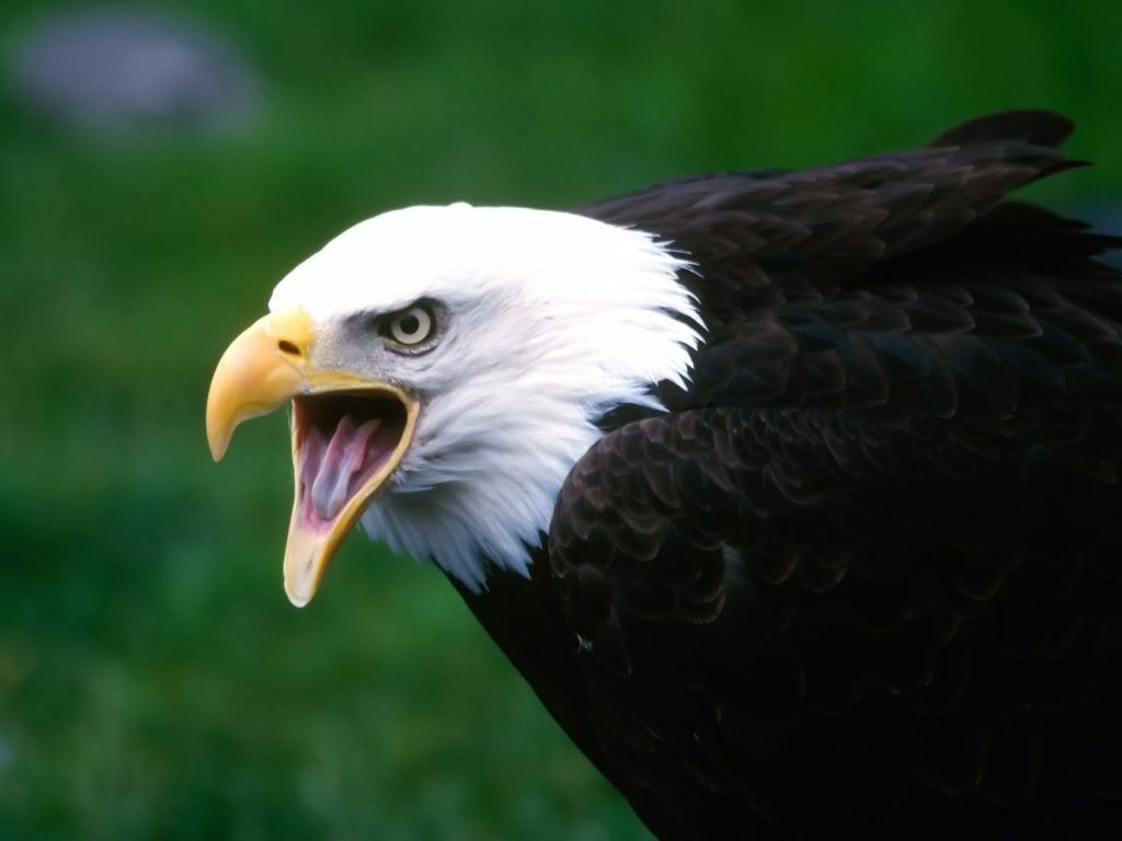
|
Posted By: skeddles
Date Posted: 20 February 2012 at 8:03am
 so I got sick and couldn't finish in time for the challenge, but I'm still gonna finish it the eagles face is what I meant for the bird, but now I see it sucked, so I opened it more. having trouble with the guy... ------------- |
Posted By: jalonso
Date Posted: 20 February 2012 at 8:18am
|
Good pixelwork...but...the bow seems rather small and somewhat lame and the bird legs are not elegant and don't seem to be in the right proportion somehow. Maybe the belly is too thin too...something about where the body meets the legs and the legs is just off. In birds like emus and ostriches that depend on land speed instead of flight the thighs need to generate power while the talons need to be light on the ground. ------------- |
Posted By: skeddles
Date Posted: 20 February 2012 at 8:50am
|
Originally posted by jalonso Good pixelwork...but...the bow seems rather small and somewhat lame and the bird legs are not elegant and don't seem to be in the right proportion somehow. Maybe the belly is too thin too...something about where the body meets the legs and the legs is just off. In birds like emus and ostriches that depend on land speed instead of flight the thighs need to generate power while the talons need to be light on the ground. I worked on the legs a little, as well as tried to attach them to the body better, will keep going, and I lengthened bow but it still looks lame  EDIT: better bow:  EDIT 2: working on the pig now, details are easy for me, positioning and shapes are hard...  ------------- |
Posted By: jalonso
Date Posted: 20 February 2012 at 10:33am
|
Originally posted by skeddles I worked on the legs a little, as well as tried to attach them to the body better, will keep going, and I lengthened bow but it still looks lame Think more T-Rex legs. Very muscle-y thighs and spindly legs with the proper size/proportion thigh to belly attachment. ------------- |
Posted By: skeddles
Date Posted: 20 February 2012 at 10:51am
|
Originally posted by jalonso Originally posted by skeddles I worked on the legs a little, as well as tried to attach them to the body better, will keep going, and I lengthened bow but it still looks lame Think more T-Rex legs. Very muscle-y thighs and spindly legs with the proper size/proportion thigh to belly attachment. by thighs do you mean the top of the yellow part or above that? for some reason I imagine birds having no muscles in their legs, even though they obviously must.. ------------- |
Posted By: skeddles
Date Posted: 28 February 2012 at 12:19pm
 EDIT:  EDIT 2: brighter colors better or worse?  ------------- |
Posted By: jeremy
Date Posted: 28 February 2012 at 10:18pm
|
Loving the colours. You could try making the bird's feet ~twice as large as they are now, land birds (especially runners) tend to have them I think. |
Posted By: fay
Date Posted: 29 February 2012 at 10:31am
|
Hi, I'm not sure if it's to late but I would like to give some advice on posing the bore. Try staggering the limbs a bit more and it will give more dynamic movement of the charging bore. This image has the bore with one front arm streched out while the other is following up. The back hind leg is more curled and about to come forth while the hind leg in front is about to leave the ground it's stretched a bit further.  This pose has the front arm in the back streched a bit further than the other to show it's reaching more fiercely while the other arm stays slightly bent.  hope that is helpful. |
Posted By: skeddles
Date Posted: 05 March 2012 at 2:54pm
|
@Jeremy, I will work on that when I do the bird next, the toes do look a bit small @fay, thanks, I will try to do that, luckily I've worked the least on the feet and for what I've been doing  working on the trees, adding branches and whatnot. I hope I can fit some vines in. and then here I added one more color to the ramp, because I felt it was too flat  I kind of want to even add one more, in between the brightest and second brightest. but I don't know if I will. I also hope to add bushes and rocks... ------------- |
Posted By: skeddles
Date Posted: 12 March 2012 at 12:03pm
adding more foliage to the first background layer
------------- |
Posted By: 42and19
Date Posted: 12 March 2012 at 12:15pm
|
This has progressed nicely. I like the background and sprites over all.
Two suggestions though. First, the plant growth on the ground seems to start and stop suddenly. if you want to keep that as a stand alone hedge then the left and right sides should trail off a tad, or have branches and leaves jutting out at an angle to break up the hard vertical line Second, your characters do not seem to fit into the scene. The background is rather dark and the foreground is light. They kind of look like stickers. You need to incorporate them better by either making then darker or adding another background layer that would represent the floor they are standing on that is brighter than the other background layers. Maybe something that implies sunlight breaking through at that point. |
Posted By: skeddles
Date Posted: 12 March 2012 at 12:29pm
|
Originally posted by 42and19 This has progressed nicely. I like the background and sprites over all. Two suggestions though. First, the plant growth on the ground seems to start and stop suddenly. if you want to keep that as a stand alone hedge then the left and right sides should trail off a tad, or have branches and leaves jutting out at an angle to break up the hard vertical line Second, your characters do not seem to fit into the scene. The background is rather dark and the foreground is light. They kind of look like stickers. You need to incorporate them better by either making then darker or adding another background layer that would represent the floor they are standing on that is brighter than the other background layers. Maybe something that implies sunlight breaking through at that point. don't worry, I'm not done with bushes but you're right about the characters, will work on that. edit:  edit2:  edit3:  ------------- |
Posted By: Partack
Date Posted: 12 March 2012 at 3:28pm
|
holy crap, i just looked through this thread for the first time, it's really impressive how far this piece has come since you started =D
individually each item looks gorgeous. the bird, the man, the background and the boar. but put together, you've got lighting issues. they're in a dark environment but the boar and the bird+man are lit up as if they were in an open field. you might want to start thinking about lighting your characters more dramatically now that you know where they are in the 'world' also, the right leg of the bird seems to merge with the body instead of look like it's behind it. i feel you might need to define the underside of the bird a little more . perhaps a darker outline or deeper shading. Good luck, this looks great! |
Posted By: skeddles
Date Posted: 12 March 2012 at 4:10pm
|
Originally posted by Partack holy crap, i just looked through this thread for the first time, it's really impressive how far this piece has come since you started =D individually each item looks gorgeous. the bird, the man, the background and the boar. but put together, you've got lighting issues. they're in a dark environment but the boar and the bird+man are lit up as if they were in an open field. you might want to start thinking about lighting your characters more dramatically now that you know where they are in the 'world' also, the right leg of the bird seems to merge with the body instead of look like it's behind it. i feel you might need to define the underside of the bird a little more . perhaps a darker outline or deeper shading. Good luck, this looks great! yeah, I pretty much agree with you, but I have no clue how to go about lighting the characters correctly. I will work on the birds leg though ------------- |
Posted By: echocharliepapa
Date Posted: 12 March 2012 at 4:24pm
| the boar's tail looks a little thin, too, might want to flesh that out. partack is right, though, the evolution of this piece from start to finish is amazing, looks fantastic ! |
Posted By: skeddles
Date Posted: 13 March 2012 at 8:48am
|
Still working on the background, as you can see I went crazy with vines. Still gotta do the ground. And a couple foreground pieces. Then I can work on the characters. 
------------- |
Posted By: skeddles
Date Posted: 13 March 2012 at 11:33am
 so indigo gave me some advice and I followed it as best I could, and here's what I did with the tree:  not sure if things would be better or worse this way. ------------- |
Posted By: Partack
Date Posted: 13 March 2012 at 4:19pm
|
I've been studying your picture for a few minutes now and I think the biggest problem I'm having with it is the dark outline around the boar. I think the dark outline is what's separating it from the scene and making it stand out. try giving it some brown outlines instead that blend in with the boar and see if that helps.
also, I just shoved a brownish black with some transparency and multiply layer ontop of the boar. I think the colours could be a tiny few shades darker, In theory my mind says yes, but in practice it doesn't make all that much difference. so the outlines must be what my subconscious is yelling at me for. as for your tree, I don't know if I like the new one. It seems more tree texture-y but it's not as defined as your other trees texture. perhaps it needs a little refining instead of leaving it 'brush-stroke- y' ? (that's a real professional term right there! =P) Good luck |
Posted By: Trick17
Date Posted: 14 March 2012 at 7:36am
|
Looks great so far, especially with the vines, bushes and branches. I think the new tree also looks good, but it's too rough and plain, reminds me of stone at this state. And have to agree with Partack, the black outline looks distracting now, I guess you don't need it anymore. |
Posted By: skeddles
Date Posted: 15 March 2012 at 10:57am
 texture on tree? how does it look? ------------- |
Posted By: Rayovatron
Date Posted: 15 March 2012 at 11:04am
How does it look? It looks awesome! 
|
Posted By: skeddles
Date Posted: 15 March 2012 at 11:36am
 trying other colors on the pig, and took out the outline, don't think it totally worked more colors  edit: bird colors  edit: style?  bird with outline bird with outlineor  bird without edit: slight outline?  edit: reworking the boar, I might want to go with a more muscular and less hairy version, but I don't think my anatomy skills are good enough for it to look good...  ------------- |