Valley of kings
Printed From: Pixel Joint
Category: Pixel Art
Forum Name: WIP (Work In Progress)
Forum Discription: Get crits and comments on your pixel WIPs and other art too!
URL: https://pixeljoint.com/forum/forum_posts.asp?TID=14581
Printed Date: 09 June 2026 at 12:54am
Topic: Valley of kings
Posted By: philippejugnet
Subject: Valley of kings
Date Posted: 23 June 2012 at 6:06pm
 Check the updates down there. |
Replies:
Posted By: Friend
Date Posted: 23 June 2012 at 7:29pm
|
Refreshing. This is a good chance to form good foundations for your piece before you get detail and pixel perfect crazy. It may also be a good chance to do a piece with a more encompassing palette instead of a single hue that dominates the whole piece. I'd like to see some reds and blues here too, but that's just me. The planet or sun on the right looks pretty cool- the light adds nice punctuation. Perhaps make it a bit brighter down the road after you've added detail to keep this punctuation. Also, it is a bit hard for people to give good critique when you just give the image. It helps to voice your concerns for the current state and where you want to take it. |
Posted By: philippejugnet
Date Posted: 23 June 2012 at 8:32pm
|
Thanks, but I think the art must speak for itself! if it isn't its a problem on compositon ^^. Small update, turned music on, yeah it helps.  |
Posted By: AirStyle
Date Posted: 23 June 2012 at 9:13pm
| It's not that FrostButt's questioning your composition, it's that we can't tell where it's going. While you're still "composing" your piece, it's not going to look entirely like the final copy. Therefore, we can't see the vision you've set for this piece. If you want us to help you, you have to let us in on your big picture before we can help compose your piece. When you're done, the piece will speak for itself. |
Posted By: imnumberfour
Date Posted: 24 June 2012 at 3:05am
 Had a bit of a play. Meh.  |
Posted By: philippejugnet
Date Posted: 24 June 2012 at 11:49am
|
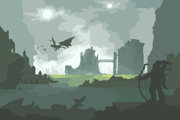
Here guys: Thanks all!  So, I kinda dreamed about this scene, that's why I am doing it. http://www.youtube.com/watch?v=9wxrB41PMhw - Fits with this song |
Posted By: Friend
Date Posted: 24 June 2012 at 12:19pm
|
Fantastic edit. May want to be careful about the interaction between dragons, the people, and what the people are actually doing/motivating them. What I mean is right now you just have people gazing off into the horizon, which totally makes sense without the dragons. But add in something as spectacular as a herd of dragons, and the context is a bit weirder. Maybe having the people look awestruck somehow? or perhaps hiding or keeping stealthy? Or, if the dragons are friendly. have the people beckoning to them or something? Just throwing ideas of context- something your pieces are not always the best at. |
Posted By: Night
Date Posted: 24 June 2012 at 1:07pm
|
The perspective of the closest city/building thing fails, and you might as well want to throw some reflection in the piece to make the water and the piece it self look better.
Here's a rough edit: 
|
Posted By: AngelOTG
Date Posted: 24 June 2012 at 2:06pm
| I don't like the full-foliage trees growing out of the mountains, they don't really match the theme of the piece at all. |
Posted By: philippejugnet
Date Posted: 24 June 2012 at 5:32pm
|
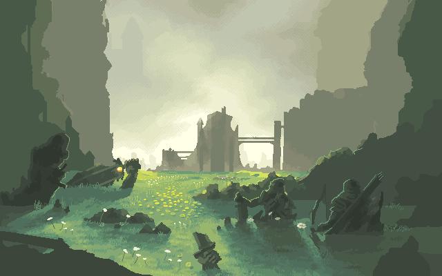
@Night - Okay, it's not water, it's grass. Heh, so I have to change it. Those are just statues like the MOAIS, they are not underwater. @Angel - I don't know about that, I don't see anything wrong with it, but I will experiment something different. |
Posted By: philippejugnet
Date Posted: 24 June 2012 at 6:51pm
Maybe this looks better: |
Posted By: AngelOTG
Date Posted: 24 June 2012 at 7:02pm
| Oh, I thought it was water too. Like some green mucky toxic water with people wading through them, which is why the trees didn't fit. But now they make sense. :) |
Posted By: a3um
Date Posted: 24 June 2012 at 7:45pm
| Don't crop it. |
Posted By: philippejugnet
Date Posted: 24 June 2012 at 8:25pm
|
Originally posted by a3um Don't crop it.  |
Posted By: Night
Date Posted: 25 June 2012 at 2:42am
|
Oh wow, I didn't have a clue that it was grass. :P
Well, I see you're doing dramatic shadows to this, so perhaps you'd like to make them a little bit more dynamic, and also, to make it look more like grass, I think you should add moss on some of the statues, rock and perhaps the buildings as well, and also add more of the long grass on the ground. Here's another (very) rough edit: 
|
Posted By: philippejugnet
Date Posted: 25 June 2012 at 1:18pm
Thanks Night <3 |
Posted By: philippejugnet
Date Posted: 26 June 2012 at 1:11pm
+ Dithering:

|
Posted By: Friend
Date Posted: 26 June 2012 at 1:46pm
|
I still don't think your dithering ever fits the style of your pieces. Just add another color or color mix more. somewhat off topic: I also thought the greenish blue was a murky water at first, and I thought it made the piece very interesting and brought the viewer to an interesting place. Somewhat saddened it's grass :p kutgw |
Posted By: philippejugnet
Date Posted: 26 June 2012 at 4:48pm
I will do both versions then 
|
Posted By: philippejugnet
Date Posted: 26 June 2012 at 6:17pm
|
Posted By: philippejugnet
Date Posted: 26 June 2012 at 6:30pm
Color update:
|
Posted By: ||||
Date Posted: 27 June 2012 at 2:47pm
|
Nice colors and sky.. I'm glad to see you take another approach! Those colors with dithering look really good and give it a nice misty effect. But why the heck are they submerged into what looks like short grass on a plain!? That's just bizarre in a bad way. |
Posted By: philippejugnet
Date Posted: 27 June 2012 at 2:55pm
 here update thanks |||| here update thanks ||||
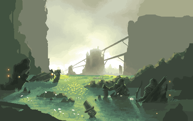
http://3.bp.blogspot.com/_p__ylaaSK5o/TAFPnNEz7LI/AAAAAAAAVuc/fSoy-G5UiXQ/s1600/MoaisIslaDePascua04.jpg - It's not strange =/ <- My idea was like: Once they made a valley with lots of statues, one statue for each king... Then time passed and the earth covered them all, leaving just ruins. |
Posted By: Friend
Date Posted: 27 June 2012 at 3:06pm
| Yeah, but the Easter Island heads aren't really buried in the ground...Are they? More importantly, they are HUGE and HEAVY. And your statues look human size. Work on making your statues appear huge and much larger than life, which gives the feeling that it is so sturdy it'll never move, not like yours look like they are ready to tip over easily. Maybe add tiny sized humans walking through the valley? |
Posted By: philippejugnet
Date Posted: 27 June 2012 at 3:23pm
|
http://www.conservativecommune.com/wp-content/uploads/2011/10/easter-island-statue-excavation.jpg - Maybe they are and nobody knows :D
Ok, I think I will just make them bigger. |
Posted By: ||||
Date Posted: 27 June 2012 at 3:57pm
|
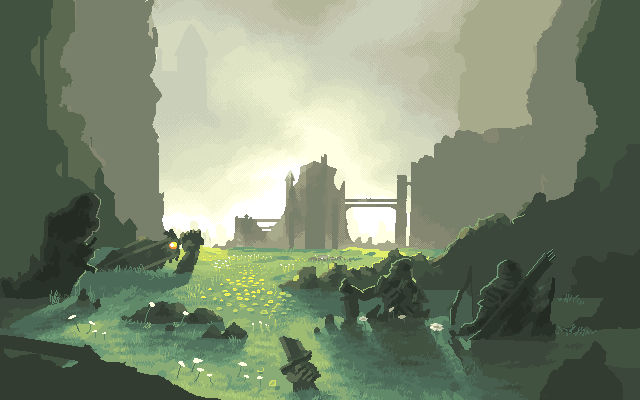
Oh I see.. it just comes of as if they weren't monolithic statues in ruins at all. I thought it was one guy buried almost fully as if in quicksand and the others too sinking, but carrying on through a marshland. I was confused by that because of the flowers though. It makes more sense now indeed; but maybe have the statues less submerged and more crumbled with rocky debris to show the mass. Another positive thing.. I like the shadow in the foreground a lot! EDIT: I just realized a second after posting that maybe the perspective of the shadows is a bit too severe on one side:  The one on the right being a suggested approximate angle |
Posted By: philippejugnet
Date Posted: 27 June 2012 at 4:34pm
| Thanks |||| for real, thankyou! =D |
Posted By: Friend
Date Posted: 28 June 2012 at 8:12am
Also, I noticed your piece may have a very basic compositional fault. Take a look at this, and compare it to your tower centered in the middle of the picture and decide for yourself. 

|
Posted By: imnumberfour
Date Posted: 28 June 2012 at 8:20am
| Perhaps, instead of increasing the size of the statues, you could have vines/moss growing on them and make then look at tad more beaten up? |
Posted By: philippejugnet
Date Posted: 28 June 2012 at 11:12am
Thanks guys and thank you so much frostbutt!
|||| working on te shades 
|
Posted By: nivek
Date Posted: 28 June 2012 at 7:14pm
|
The castle(whatever it is) thing looks a bit small in this scene compared to the things around the border. I'm sure you're not focused on it yet but that's just what I think.
Who knows, maybe you'll add more detail later |
Posted By: philippejugnet
Date Posted: 29 June 2012 at 9:48am
| well, its far away on the horizon... |
Posted By: Gamamoto
Date Posted: 05 July 2012 at 9:18am
|
Will ther be moss on those statues ? Because if they were burried in the ground for centuries I think that moss would've grown on them (just thinking). Else really nice stuff ! |
Posted By: Inarma
Date Posted: 08 July 2012 at 12:58am
| I think it'd be an interesting move to make the mountain to the right that is connected to the castle into a castle itself. I think it'd give the scene a sense of being vast and make a good focal point that would lead you from the right along to the left. I'd also make the rock formation that obscures this new castle a little smaller to make this new focal point stand out. Just a thought :) |
Posted By: Pookaball
Date Posted: 08 July 2012 at 8:14pm
|
It's... Awesome!
I wish I could do the same, but I think it's all about learning and practising. |
Posted By: philippejugnet
Date Posted: 30 July 2012 at 8:43am
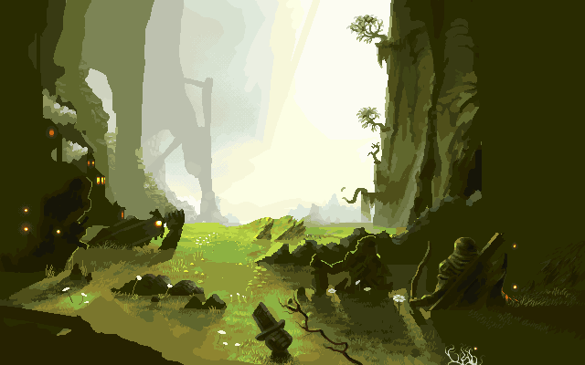
Thanks guys, here, update. It looks like something done by fool but it was coincidence, if there's a problem in than I will post ref.
|
Posted By: Yuran
Date Posted: 30 July 2012 at 4:11pm
|
It is a pity I would love to see the beautiful clear water on the foreground ...
And on the left is not a walking castle by Hayao miadzaki? : D I really like your sketches, the only thing that confuses me is the statue of an archer on the right, he is too similar to a live person. Maybe it is positioned at a different angle (a more difficult foreshorten) Жаль, мне очень хотелось бы видеть красивую прозрачную водичку на переднем фоне... А с лева не ходячий замок Хаяо миадзаки? :D Мне очень нравятся твои зарисовки, единственное что смущает меня это статуя лучника с права, он слишком похож на живого человека. Может его стоит расположить под другим углом (более сложный ракурс) |
Posted By: Yuran
Date Posted: 30 July 2012 at 4:28pm
And the only thing that I want to say critical - it is too early to do small details - it distracts you from the overall composition and the painting of those little details takes much time.

И единственное что я хочу сказать критичного - пока рано заниматься маленькими деталями - это отвлекает тебя от общей композиции и на рисование этих маленьких деталей уходит много времени. |
Posted By: philippejugnet
Date Posted: 31 July 2012 at 8:33am
|
priviet yuran! kak dela? spaciba =) ya iyublyu isskustvo Miazaki! ~paca~ |
Posted By: Juniorps
Date Posted: 31 July 2012 at 5:34pm
| Me lembra muito shadow of the colossus , só faltou o cavalo agro |
Posted By: philippejugnet
Date Posted: 02 August 2012 at 8:51am
hah!

|
Posted By: LachieD
Date Posted: 02 August 2012 at 1:40pm
| Wow! Great work. I kinda thought I would miss the castle and the bridges, but this setup gives the scene a more solitary/isolated feel. Wonderful details all over the place. |
Posted By: Yuran
Date Posted: 02 August 2012 at 4:20pm
So what? 
Mountain as a mountain,  nothing special, nothing special, very similar to the stone, very similar to the stone, so much cracked stone walls, so much cracked stone walls, lovingly ironed a small brush ... lovingly ironed a small brush ... 
I like it straight and want to touch their toes. Cool!   
I'm joking way  
I, too, so I like to do when work is not half done, to make some part of almost complete - pleasing to the eye and inspiring to do more. 
А что? Гора как гора, ничего особенного, очень похожа на камень, такие большие растрескавшиеся каменные стены, любовно выглаженные маленькой кисточкой... мне прям нравится и хочется потрогать их пальцами. Круто! :DDD я шучу так )) А я тоже так люблю делать, когда работа ещё и на половину не сделана, какой-нибудь участок сделать почти завершённым - радует глаз и вдохновляет на большее. |
Posted By: cure
Date Posted: 02 August 2012 at 7:36pm
|
during this WIP thread the artwork has gotten much more refined in terms of detail, but has lost all of the atmosphere of the original. the truncated forms of the statues are also distracting, a bit too even in how the meet the ground. the pool of water was more interesting than grass, even if it is more derivative of the Elk piece this is inspired by. the narrative of the original is also gone. it was once a heroic bowman looking at a fearsome dragon with ruins in between, but now it's just some half-statues in a field. The composition of the original was well-balanced, with the focal points of the narrative balancing each other. The current composition is sort of cluttered along the bottom. That being said, the parts that are refined are looking good, I would just keep in mind composition and the narrative, and don't get lost in refining until you know how you want to move forward. |
Posted By: Yuran
Date Posted: 03 August 2012 at 10:48am
|
Thank you, Cure, I also sometimes lose the original idea, when I do big work. This advice to shake on my own mustache :)
Спасибо, Куре, Я тоже иногда теряю первоначальную идею, когда делаю болоьшую работу. Этот совет мотаю себе на ус |
Posted By: Friend
Date Posted: 03 August 2012 at 12:06pm
| Again, I admire your ambition, courage and confidence, but perhaps you should learn to master a more traditional pixel art canvas size before doing a size that is more or less completely out of expected size for a pixel art scene. Perhaps even less than 1/4 of this size would fit this very well and the size restrictions would probably coerce you to have sharper and better arranged pixels. Don't abandon the unique advantages of this medium in a courageous attempt |
Posted By: H|F
Date Posted: 03 August 2012 at 12:43pm
| Keep going and don't change the size, this will be wonderful when it is finished! |
Posted By: philippejugnet
Date Posted: 09 August 2012 at 11:23am
|
Thankyou guys, I still don't like some stuff so I will probably be changing it.
THANK YOU SO MUCH! 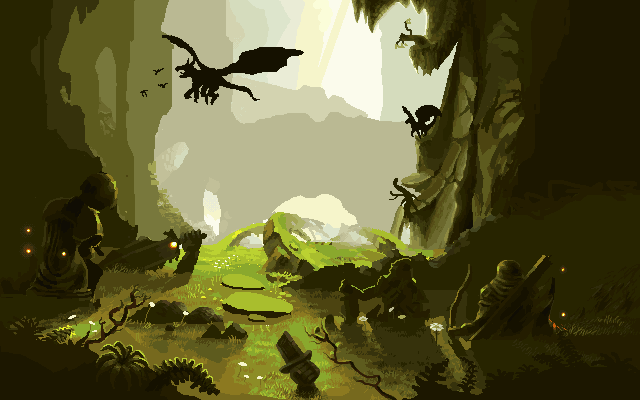
|
Posted By: philippejugnet
Date Posted: 09 August 2012 at 12:26pm
:)
|
Posted By: Yuran
Date Posted: 09 August 2012 at 1:49pm
|
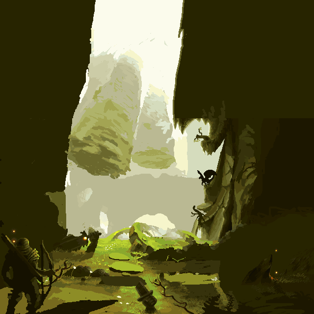
Oh, floating mountains, there is something like in the movie "Avatar"
:) О, парящие горы, есть что то похожее в фильме "аватар" |