Falling
Printed From: Pixel Joint
Category: Pixel Art
Forum Name: WIP (Work In Progress)
Forum Discription: Get crits and comments on your pixel WIPs and other art too!
URL: https://pixeljoint.com/forum/forum_posts.asp?TID=14887
Printed Date: 10 June 2026 at 2:51am
Topic: Falling
Posted By: Noburo
Subject: Falling
Date Posted: 09 August 2012 at 9:47pm
Before moving forward with details, I'd love some critique on the proportions, perspective, body positioning, etc.

|
Replies:
Posted By: Yuran
Date Posted: 10 August 2012 at 1:15pm
| It seems everything is fine, the main draw her face with true test perspective |
Posted By: Whisper Heart
Date Posted: 10 August 2012 at 1:19pm
| the second hand will be? |
Posted By: DoctorRheet
Date Posted: 10 August 2012 at 3:42pm
| Perspective of the shorts looks a little off. Not too badly, you could probably keep it as it is and it'd look fine. |
Posted By: Noburo
Date Posted: 10 August 2012 at 6:43pm
Update:

I also noticed the perspective of the shorts being somewhat off, and made a few modifications. |
Posted By: Ashkin
Date Posted: 10 August 2012 at 6:58pm
| It's probably too late to fix this, but who falls with their limbs pointing down? Wouldn't the limbs be dragged upwards? |
Posted By: Noburo
Date Posted: 10 August 2012 at 10:29pm
Final update before bed:

@Ashkin - It's more intended as a rearward rotation in her descent, which would account for the angle of her legs, but not her arms however. I will work on that tomorrow. |
Posted By: Yuran
Date Posted: 11 August 2012 at 2:35am
|
Wind blowing from the bottom, then her should seek up jacket just like her hair.
And try to paint her hair is operating with large planes, now her hair looks like a tree branch or beam whose tail is. Ветер дует с низу, значит её куртка должна стремиться вверх так же как и её волосы. И попробуй рисовать её волосы оперируя большими плоскостями, сейчас её волосы выглядят как ветки дерева или пучок чьих то хвостов. |
Posted By: Yuran
Date Posted: 11 August 2012 at 3:19am
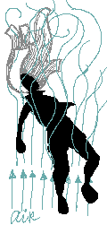
You must consider the air flow - Turbulence Учитывай потоки воздуха - турбулентность |
Posted By: Noburo
Date Posted: 12 August 2012 at 8:19pm
Updated the hair and jacket as you suggested, while trying to maintain the stylization of the hair I was already working on. I also updated the positioning of her left arm.

|
Posted By: Yuran
Date Posted: 12 August 2012 at 8:29pm
|
The left hand is long, make it shorter on the length of the palm.
I still do not like the jacket - it spoils all composition, try to direct it to the side far hand |
Posted By: Noburo
Date Posted: 12 August 2012 at 9:16pm
A couple quick edits to the jacket. Obviously both could use some tweaking reworking, but I wanted to get some input before moving forward. I also updated the left arm as well.

|
Posted By: Noburo
Date Posted: 15 August 2012 at 7:07pm
Update:

|
Posted By: H|F
Date Posted: 16 August 2012 at 3:05pm
|
imo, arms seem cartoony/short (this may be due to it being wip) The legs seem that way as well but I wasn't sure if they are bend backward so you can ignore that part if so. 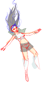 just some redlines imo. The hair looks fine but I had to draw some to see the shape =P
|
Posted By: Noburo
Date Posted: 16 August 2012 at 9:08pm
|
Thanks for the edit. I was also thinking that the arms were too short but hadn't had a chance to update them yet. In regards to the legs, they were originally intended to be facing backward, but I haven't been happy with the way they currently look. I will likely end up playing off of your edit.
Update: 
|
Posted By: H|F
Date Posted: 16 August 2012 at 11:12pm
| Glad that it helps =) |
Posted By: ZacRay
Date Posted: 17 August 2012 at 9:00am
| I agree that the pose doesn't look "falling" enough, looks more like she is laying with her back being supported. Her legs should be up, arms bent up at the elbows, or something like that. |
Posted By: uint
Date Posted: 18 August 2012 at 10:09am
| I guess with a background with clouds and far from the ground it will look more falling. |
Posted By: LachieD
Date Posted: 18 August 2012 at 2:27pm
| Love how this is developing. Keep it up! |
Posted By: Noburo
Date Posted: 18 August 2012 at 11:52pm
Here is a little bit of an update. Her feet seem to be a bit small, but I've been staring at it for so long it's hard to say for sure.

|
Posted By: Noburo
Date Posted: 21 August 2012 at 9:30pm
Almost finished now. I'll be adding some final details to it tomorrow and submitting it to the gallery. Any additional CC?

|
Posted By: H|F
Date Posted: 22 August 2012 at 1:36am
I realize now that it wasn't the shape of her legs but her pose that is kind of bothering me, sorry it's so late but....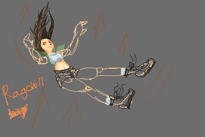 |
Posted By: RileyFiery
Date Posted: 22 August 2012 at 2:29am
|
Maybe putting a ledge below her feet would help with the original pose and having the hair flow at a 45degree angle towards the top right. Then you could bring back the original hand that was reaching out towards something to grab on to. Even if you don't change the hand back, a ledge would really help clear it up. Since the beginning of the thread, I always looked at her as if she was starting to fall off a building by some unknown force. |
Posted By: Noburo
Date Posted: 22 August 2012 at 12:25pm
|
Riley is correct in that it was intended somewhat as falling of a ledge, and still in a backward rotation, but if it doesn't seem like it flows very well as a standalone piece, than it may be grounds to rework the pose. I've already started playing with my next piece, so my interest has slightly shifted towards it, but I don't want to cheap out on this one if it still has work to be done. Additional thoughts would be appreciated.
Edit: Taking a break to work on this. 
|
Posted By: Noburo
Date Posted: 04 September 2012 at 8:59pm

Haven't been able to pixel for a little while due to having loaded Windows 8 on my PC. Anyways, I threw together a quick bg for perspective. I'll be updating the hair soon as well. Background seems small in scale imo, any thoughts? |
Posted By: -
Date Posted: 05 September 2012 at 10:43am
|
Maybe add some more details for the river.
|
Posted By: Noburo
Date Posted: 05 September 2012 at 11:12am
| The background is nowhere near completed yet. It is currently just in place to have a static image to line up the perspective of the character. Once the overall structure of the piece is complete, I plan to finish the background. |
Posted By: Kopaka
Date Posted: 05 September 2012 at 10:50pm
|
With the falling image, its looking really well composed with the setting and placement. Although I will say that the character herself her right hand is looking really weird. I can kind of see the direction you wanted to go with, but with the highlighted thumb and pointer finger its more clear to me that you wanted her hand to point straight out rather than turned backwards where those fingers seem to indicate. It also doesn't seem natural for something falling to twist their hand all the way in that direction, considering her left hand is naturally sitting the way it is. You also seem to have some banding with her shirt and its a little jarring to look at because of it. Since the lighting source (judging by how everything else is shaded) seems to be coming on top of her, her shirt shouldn't look like that. Just out of curiosity, have you considered making her shirt loose rather than have it skin tight? It might make for some interesting shapes. The other character you started to work on, the bald man, his waist is way too thin. Make that bigger and then put the hand holding the scythe out more, or move the elbow away from the body, because it looks really awkward. |
Posted By: Noburo
Date Posted: 15 September 2012 at 7:25pm
|
My busy schedule has taken priority over pixeling, but now I've got a free weekend with time on my hands.
Thanks for the suggestions, Kopaka, I' completely agree with your points and have taken them into consideration with my most recent update. Unless you or anyone else sees anyn major flaws, I plan on cleaning up some of the pixels on the character, adding detail,(to the jacket in particular) and changing focus towards the background. 
|
Posted By: crozier
Date Posted: 15 September 2012 at 7:56pm
| Looks like your characters should get some sun ;p They are looking a little pale (especially the dude). |
Posted By: Noburo
Date Posted: 25 September 2012 at 9:27pm
Progress update. I've been paying with the palette of the cliff, but can't seem to get it right. Anyways, I'll post updates as they come. Suggestions are welcome.

|
Posted By: cure
Date Posted: 27 September 2012 at 10:02pm
| She lacks a cranium, and has a rather prominent jaw. The figure in general feels very flat, make sure to follow your light source carefully. |
Posted By: Noburo
Date Posted: 03 October 2012 at 9:34pm
You sir, are absolutely right. Here is the first pass on correcting the shading, I'll continue cleaning it up.

|
Posted By: Noburo
Date Posted: 23 October 2012 at 11:19pm
This project is turning into something a bit larger than I initially expected. Progress moving forward is slow going, but I still plan on working on it whenever I have the chance. As always, further CC is always welcome.

|
Posted By: cure
Date Posted: 23 October 2012 at 11:36pm
| She's still lacking 90% of her skull. The feet bother me a little too, their position reads like she's standing instead of falling, I'd unlock the ankles and let them flow with the legs a bit more. Even if she's just jumped, the feet should still be extended. The background is kinda confusing, tough to tell what's the cliff ledge and what's far below. You might consider using atmospheric perspective (which would be intensified by the mist from the waterfall) to correct this. Bringing the foreground forward with bright highlights would help a lot too, iI believe it being so dark is a big part of the problem. The arms look too small, especially the one on our left. The figure itself still reads as very flat to me, particularly the torso. Think of it like a box, and differentiate the side of the torso from the front. |
Posted By: Noburo
Date Posted: 28 October 2012 at 10:49pm
Enlarged skull size, unlocked ankles, background image cleanup, and torso depth. Minor arm size increase, but much more work will be done in the future. I'll also continue work on trying to add torso depth, as well as details on shoes. I've also added some stripies to the socks, as well as I am playing with adding a green tint to the water, though I am not completely sure if it lends much to the piece. Still obviously a work in progress, but I'm getting there step by step. Thanks again to everyone for their input thus far!

|
Posted By: Korban
Date Posted: 29 October 2012 at 7:57am
| Great composition imo :) |
Posted By: CookieCrumbles
Date Posted: 29 October 2012 at 11:51am
| I still think the arms are too small, especially the left one. I'm liking the green tint you're adding in water. It's come really far from the original. ;) |
Posted By: cure
Date Posted: 29 October 2012 at 12:29pm
anatomy and contrast still need heavy work |
Posted By: Noburo
Date Posted: 05 November 2012 at 11:05am
|
Thanks for the edit! Here is an update based on your suggestions.
Character: Added contrast, worked on legs, shorts, shirt, jacket and face. Going to redo arms, works on hair and boots, as well as continue working on legs. Backgrounds: No updates yet, but I do plan to work off of your edit as I move forward. 
Edit: Also, while playing with the colors, I've ended up with a few extra colors that I will be cleaning up. |
Posted By: cure
Date Posted: 05 November 2012 at 2:25pm
| Figure looks better so far, be careful about working on pure white though, it can throw off your colors. Something like a 50% grey is less likely to affect your color choices. |
Posted By: Noburo
Date Posted: 14 November 2012 at 9:24pm
Still have a ways to go, but I'm a bit worried that the background is too busy and takes away from the character.

|
Posted By: Noburo
Date Posted: 01 December 2012 at 9:35pm
I'm nearing completion on the character, but still have a bit of grunt work to do with the water and grass. I'm having some difficulties with the waterfall, but plan on looking up some references.

|
Posted By: Noburo
Date Posted: 16 March 2013 at 5:41pm
|
*phew!* Took 3 1/2 months for this update, and of course I'm still not happy with the way the grass has turned out. All of the blades of grass just seem to blend together and don't stand out. Anyone know of a good pixel art piece I can reference? :/
Aside from the grass, I've been slowly working through adding details to the water, as well as trying to come up with "artistic choices" to cut out some of the monotonous labor. 
|
Posted By: Noburo
Date Posted: 23 March 2013 at 2:11pm
|
Redid the hair, removed pillar going into the water because the perspective seemed a bit off, and a rough edit to the grass to split the it into groups to better focus on adding detail. This will probably be the last edit I post until completion, as there won't be any major composition changes.
|
Posted By: Noburo
Date Posted: 24 April 2013 at 7:11pm
So close to finishing I can taste it! Though, I just can't seem to stop adding to it.

|
Posted By: Hapiel
Date Posted: 24 April 2013 at 7:27pm
|
Stop adding! I preferred the previous one!
------------- |
Posted By: Noburo
Date Posted: 24 April 2013 at 8:19pm
Ok well this is the last thing I'm adding then! It's totally an improvement.

|