Fighter Angel challenge thing - 2014(!) updates
Printed From: Pixel Joint
Category: Pixel Art
Forum Name: WIP (Work In Progress)
Forum Discription: Get crits and comments on your pixel WIPs and other art too!
URL: https://pixeljoint.com/forum/forum_posts.asp?TID=15072
Printed Date: 01 June 2026 at 9:25pm
Topic: Fighter Angel challenge thing - 2014(!) updates
Posted By: Zeratanus
Subject: Fighter Angel challenge thing - 2014(!) updates
Date Posted: 11 September 2012 at 2:20pm
|
I've been posting this in the challenge thread, but I'd really love some feedback, since there's such a long time before deadline, and I want to make this look pretty nice.
The animation is still very WIP, think i'll have to add a new frame for the headwings when she's on her last "going up" frame at least. Anyway, let me know what you think. Any critiques are totally cool and welcome! "Idle" Animation  > >  > >  > >  > >  > >  > > 
> 
Block Animation  > >  > >  > > 
Block + Attack Animation 
>  > >  > > 
Full Animation:  > > 
Unused 
edit: Full animation loop is now done, but it's got quite a bit of fixing and spicing up to go! edit2: Aside from shadows, this is now at a "submittable" state, I think. But dont let that stop you from giving me advice to improve it! 09/06: Submitted to the gallery for the challenge - http://www.pixeljoint.com/pixelart/72979.htm# - http://www.pixeljoint.com/pixelart/72979.htm# - but feel free to keep picking at it! Wont be updating the gallery version while the contest is going but I'm all for making this even better 
Started working on the continued animation: (also this edit completely messed up the formatting of this post! think its all fixed now...) WIP Poses: 
2013  > > > > > > > >
Attack Only  > >
EDIT: I stopped updating this post for being just TOO MANY GIFS. The comp I often post from can barely handle it! So just read along in the comments for the latest. Its got more context for why changes are made anyway! |
Replies:
Posted By: Yuran
Date Posted: 12 September 2012 at 9:15am
| You have a great character, I like it. Animation a bit harsh - too strong attraction to the land, I'd like more flowing. |
Posted By: Zeratanus
Date Posted: 12 September 2012 at 10:59am
|
Thank you, and yeah, I've been fighting with how much vertical movement to give it from the start. Im pretty happy with how it is now, but I'll test out other timing in photoshop.
With more feedback from the challenge topic - head-wings now go up higher, shadow has more depth, and I added movement to the skirt. Also started a block and throw animation, for the fun of it.
|
Posted By: Zeratanus
Date Posted: 12 September 2012 at 2:09pm
|
First go at the block animation :)
|
Posted By: Noburo
Date Posted: 13 September 2012 at 6:41am
The wings on the idle animation stand out to me as being very weak, as the upward motion seems to have more power behind it. The way you can fix this is to add some rearward bend in the wings during the downward animation, as illustrated below.
In regards to the block animation, while I'm no head-wing expert, any time us regular humans exert the force needed to attack/block, you will tense up and push your entire body behind it, and in this case, I would imagine the use the head-wings would be pushing down for the additional force behind the block. That being said, it looks like by the shape of the body, it is more intended as a block from an unexpected blow. If this is the case, not as much of the previous statement would apply. Also, just to clarify, is that a cape she is wearing, or are those more wings? |
Posted By: Zeratanus
Date Posted: 13 September 2012 at 7:01am
|
Thanks for the reference! I'll see what I can do to improve it :)
as for the block, I'm mostly just going for something kinda cute, but the unexpected-ness was more the plan. I originally planned on adding her looking surprised right before the block, but I haven't been able to implement it well yet. Ill keep that wing-push in mind though. Might change it later Also, the back is another set of wings. I should probably add the 2nd one in the block animation. It would likely be visible and would make that clearer. here's what I've got so far (Before I saw your post) - not much added except something for her to block, which is very WIP itself
edit: First pass at editing the flap
edit 2: new attack frame
She'll be magicing the spear back into existence and shooting it. Q: So why carry the spear in the first place? A: Because she would throw it, but I just dont have the canvas size to do that without cutting it off, which would look terrible :| |
Posted By: Zeratanus
Date Posted: 13 September 2012 at 1:01pm
|
*sigh* it's getting there! I hope I have enough time to make the attack animation before deadline. |
Posted By: Yuran
Date Posted: 13 September 2012 at 1:18pm

You have an amazing speed of creating this works. So I tried a little bit to smooth your animation angel. |
Posted By: Zeratanus
Date Posted: 13 September 2012 at 2:22pm
 yeah, when I do work on something, I tend to really work on it! yeah, when I do work on something, I tend to really work on it!
I'm not sure which version I prefer. I like the weight of my original, but yours looks more floaty and probably more angelic... I'll definitely think about it. Thanks :) And ugh, this whole attack animation thing is getting to me. Block stage is finished, but the attack stage is really causing me problems. The attack itself is totally WIP, just felt like getting a general idea of how many more frames I need. And I think im done working on it for today... try to hit it fresh tomorrow!
|
Posted By: DawnBringer
Date Posted: 13 September 2012 at 4:43pm
| I like the colors and the character, but that halo is a banded, ugly mess! |
Posted By: Yuran
Date Posted: 14 September 2012 at 8:47am
|
Give advice before you completed the attack animation. Angel in the attack feet are in a position as if she takes a hit, but should be the opposite.
When she does blow then all her body should be pointing upwards to the forward of the attacking arm as if she jumped through the gulf |
Posted By: Zeratanus
Date Posted: 14 September 2012 at 11:08pm
|
@Dawnbringer - is the new one in this animation better? (huzzah for having the halo on its own layer, and easily editable for all frames!) @Yuran - yes, the attack animation was looking very poor. So I've completely changed my mind on what I'm doing! Now she falls to the ground, because I find it cute, and because she's not flapping to keep her up anymore. Now the attack will take place on the ground instead of trying to find some way to make it take place in a fall, or without the bunch of extra frames to reposition her. (Attack animation itself is still very WIP. hoping to get on this hardcore tomorrow and finish it up before Sunday...) edit: just noticed she's clearly not landing as far down as the shadows are. ill be editing the shadows position later I suppose! edit2: Added a frame into the floating animation (1 more than before, 1 less than Yuran's edit), and changed the halo |
Posted By: eclep
Date Posted: 15 September 2012 at 7:44am
|
Please finish it in time, I will totally vote for for this!
I made a little edit on the floating animation : 
I just changed the height of the angel on each frame (that is why the halo looks a little weird), because I think it looked like she was going up before her wing even flapped down. |
Posted By: Zeratanus
Date Posted: 15 September 2012 at 2:03pm
|
Good point, Eclep! I've adjusted my animation file, but wont bother to upload it yet again lol. Thanks! Okay, getting the attack animation in place... realized I missed the back wings so Ill have to tack those back on! The fly up is still obviously not done. Not entirely happy with the attack animation, but I think.. the end is in sight... I'm honestly ready for this to be done lol. |
Posted By: AirStyle
Date Posted: 15 September 2012 at 2:11pm
|
The attack seems lack-luster. Maybe some recoil to the arm spear shot would look better.
BTW, why aren't you using the over-sized spear for attacking :P ? |
Posted By: jalonso
Date Posted: 15 September 2012 at 2:31pm
|
I think taking just one (any) concentrating on that one and entering the challenge is a smarter and efficient way to meet a goal. However, I think you should carry on the thread after the week ends and really work on these. They are so lovely and you'll learn a lot from everyone and everyone will learn a lot from you in the process. ------------- |
Posted By: Zeratanus
Date Posted: 15 September 2012 at 3:06pm
|
@AirStyle: Recoil eh? That would add some needed "Umf" to it! I think I'll have time to keep messing with it, so I'll give it a try! As for the spear, it was longer before, but it took so many frames for it to get out it made the attack even more dull than it is now. @Jalonso: I was considering dropping the attack part entirely, but it just felt lopsided, seeing her get knocked down over and over again! I'm sure it'll be able to be a lot better than I'll be able to get it by tomorrow though, so I've got no problem continuing this until I totally run out of steam! In the meantime though I'm going to see if I cant at least finish what I've started. And thanks for the kind words! Here's the first -almost- looped animation. It's still missing some frames of her returning to the original pose and reforming the spear, and the attack hasn't been edited yet, but it's nice to at least see it nearing a full loop. edit: okay. Now it is "done", having all its animation in place (aside from shadows). Now all that's left is shadows, and fixing up the lackluster bits! |
Posted By: Buddy90
Date Posted: 15 September 2012 at 5:15pm
|
Try making the spear animation fast, it doesn't really look like she's throwing it at this speed. And this sprite is absolutely adorable.
------------- http://ps3trophycard.com/profile/vilocon"> 
|
Posted By: Zeratanus
Date Posted: 15 September 2012 at 10:19pm
|
Okay everyone, how's this? Sped it up, added recoil, added all sorts of other frames, including an extra one for the "getting up" part. As it is now (aside from lack of shadows still) I could feel decent about submitting it. But totally keep on with the critiques! Still have another day and I hope I'll have the energy to keep working on it afterwards too! edit: okay, submitting this thing (with shadows!) to the gallery now for the Challenge. But feel free to keep picking at it! - http://www.pixeljoint.com/pixelart/72979.htm# - http://www.pixeljoint.com/pixelart/72979.htm# |
Posted By: jalonso
Date Posted: 17 September 2012 at 7:01am
|
Progress is real good and you got a vote from me for this week's challenge. I would nitpick the halo in all versions in that it currently feels a bit thick and heavy. Not that its awful but something lighter, smaller, thinner, floatier would add to the sprite's heavenly nature...me thinks. ------------- |
Posted By: Zeratanus
Date Posted: 19 September 2012 at 10:51am
|
Thanks Jal
Seems I have a lot to consider with the Halo. On that note, I'm going to paste DawnBringer's comment onto here to make sure I dont forget it: Since you posted the image I'll continue the halo issue here instead of the forum.
It's better but still not good. There's still some banding and it's not quite circular. And It's often an important aspect of a sprite to make it work with different backgrounds, meaning that you will have to be very restrictive and selective with outer AA (something I've been practicing & exploring myself recently). Typically, any sprite that works well with all backgrounds often become a better looking sprite in general. Here's an edit to demonstrate this: (your original in the left column) 
|
Posted By: Cheetah
Date Posted: 19 September 2012 at 11:14am
| That looks like great advice from DawnBringer. I would also comment that the throw animation is the weakest piece. It definitely needs to be faster, maybe not motion blurred but at least shorter time for the frames. |
Posted By: Zeratanus
Date Posted: 01 October 2012 at 8:25am
|
Playing with what exactly to do with this now. Thinking of instead of replacing the existing attack animation, I'll add in a second attack, after she realizes the first one wasn't all that great~
Some poses I've been playing with:
|
Posted By: Buddy90
Date Posted: 01 October 2012 at 7:39pm
|
Now you just to give her a name and backstory :) This character is super adorable, you should take it beyond the realm of a simple challenge entry. ------------- http://ps3trophycard.com/profile/vilocon">
|
Posted By: Zeratanus
Date Posted: 15 January 2013 at 8:33am
|
AAAAND I'm back to it! (and thanks Buddy90! :) )
No drastic changes yet, and I'm scaling back my original plans, unless I really get into this again. New halo, thanks to DawnBringer, and a few extra frames added in before the attack, which are still WIP (needs a few more between frames, and the frames that are there aren't fully done (wings need to move and such). Instead of majorly changing the attack, I'm thinking of just adding these new frames and then edit her hair during the attack to be flowing around, instead of static.
|
Posted By: coloringsquared
Date Posted: 15 January 2013 at 9:19am
|
This awesome. My only comment would be preferential, I would rather see the spear taken off of the back instead of disappearing.
Your block animation is amazing. I think she starts getting pushed back too early from the blast. She should get hit and forced back, it looks like she moves before she is hit. However, the way she blocks is super cute and gives her personality. |
Posted By: Zeratanus
Date Posted: 15 January 2013 at 9:47am
|
Thanks! And yeah, the whole spear thing could of probably been done in a much more interesting way, but at this point that would be a near total overhaul of the animation x)
I did a quick test based on what you said, and I think I've figured it out. She wasn't actually moving backwards before the blast hit, but she was drawing the shield back towards her, which makes it look like she is. I just nudged that frame a few pixels to the right and I think it gets rid of that without causing any problems with the rest of it
|
Posted By: Zeratanus
Date Posted: 16 January 2013 at 8:11am
|
Updated with some more frames for the hand clench. I don't know why, but I just love pixeling little hands. Its just really satisfying for some reason.
edit: Few but, IMO, important frame updates. Her shield no longer bounces back up with her entirely during her bump, and as she stands up she has to correct her posture as she goes a bit (1 pixel) too far. Also edited the throw animation to match what I'll be editing later. >
|
Posted By: Zeratanus
Date Posted: 21 January 2013 at 8:23am
|
Haven't worked on it a ton more, but I got some of the other new poses from a few posts back worked into it. Which of course means I'll have to add in all sorts of new frames to make it move smoothly, but for now it's a jumpy mess~
|
Posted By: Zeratanus
Date Posted: 22 January 2013 at 8:24am
|
Stripped the animation down to just the attack frames so I can focus on them. Added more transition frames to the first part of the attack. still lack them on the second part (end/recoil). Other parts still look odd to me which I'll work on, like the movement of the shield as she prepares to attack.
Seriously though, if anyone wants to leave any feedback feel free ;P. I've got no problem finishing this on my own, but I know I'm not seeing everything that could be improved! :P edit: glad I stripped it down. Now i see that she weirdly blips to the left when I didn't mean for her to. Wee more editing! |
Posted By: shampoop
Date Posted: 22 January 2013 at 9:21am
|
First off, the work you are putting into this is paying off because it looks great. I enlarged it and watched your latest update for a while thinking of what to say and my only crit is the halo is way too distracting. I would maybe limit how far off the head it travels or add some motion blur. Although the motion blur might be hard to add at this point because it isn't used anywhere else and might just look weird. Any plans of making a walk cycle or anything? |
Posted By: Zeratanus
Date Posted: 22 January 2013 at 1:03pm
|
Thanks Shampoop! :D
I'll definitely keep the halo thing in mind. I've toned it down a bit, but I think it'll be less distracting when I've finished the other effects I'm planning on putting in, like her hair whipping forward and such (assuming that actually ends up looking good lol). I'll also probably draw a few new frames for it too, as having it stationary while her body's turning so far is weird looking. As for any animations beyond this one, I guess it depends on how much steam I have left after this is over lol. I've been focusing on this little loop for so long, I really want to make it as good as I can get it before I start something else with this character. And for my update: More frames! Smoother frames! (Fast frames! slooow frames! Even frames from around the world!) *has seen the "Lots and Lots of Trains/Planes commercial way too many times*. Hair still isn't doing any whipping, and the little wing blip i added during the fist clench looks WAY too spazzy right now, but I'm not entirely sure what I want to do with it right now. Just that having it sit still looks boring. Edit: oh yeah, and now she gets pushed back by the attack, and not just because I'm doofus who didn't realize it! old -> new ->
|
Posted By: Zeratanus
Date Posted: 17 September 2013 at 9:10am
|
Raaaaah RISE FROM THE GRAVE, TOPIC OF MY CREATION!
Yup, still haven't forgotten about this. Because i WILL finish this EVENTUALLY Added hair and wing motion to the attack, still no attack itself. BUT ITS SOMETHING @_@ Old -> New  -> ->
|
Posted By: jalonso
Date Posted: 17 September 2013 at 9:36am
|
You are doing such a great job on this!
I still find the halo too 'heavy' and has from the start. I find it distracting:/ ------------- |
Posted By: Zeratanus
Date Posted: 18 September 2013 at 8:41am
|
Thanks Jal :D
And do you mean the halo looks heavy or moves in too heavy a fashion? Either way, I stripped out its darker colors and I think I like it more now. (not happy with the brownish in it though. might strip that out too) Added in the spear to the attack. Only mildly different from the old version (takes longer to appear, shoots faster, kicks little bits of energy out of the ball). But between the new animation for the girl and this I think it has a lot more impact than the original. As usual, any critiques are more than welcome :) 
|
Posted By: jalonso
Date Posted: 18 September 2013 at 9:45am
|
I mean heavy in that its too thick a ring and if you visually weigh it against the shield they seem equal, ya noes. Seems to me a halo should read as light and airy. ------------- |
Posted By: Zeratanus
Date Posted: 18 September 2013 at 11:22am
|
Hm, yeah I get what you mean. Okay, I shrunkified the halo a lot, so it's smaller and hopefully less thick looking. placement in the animations hasn't changed at all though so its a tad jumpier. did actually animate it having a tilt as it reaches its furthest point though.
Also added 1 new frame right before the spear fires to give it less of an immediate kick back which bugged me. Also noticed that when the hand was fully extended her hair blipped behind her wing, so that's fixed now too. Yay for derping on the details~ old vs new ->
|
Posted By: shampoop
Date Posted: 18 September 2013 at 11:44am
The next attack should be using the halo as a weapon  |
Posted By: jalonso
Date Posted: 18 September 2013 at 12:46pm
|
Halo as weapon is a great idea.
I feel badly now for nitpicking but while I like the halo a bit smaller I meant the original size but 'thinner'. Kinda like the gold edge of the shield but maybe 1px thicker than that. ------------- |
Posted By: Zeratanus
Date Posted: 19 September 2013 at 9:06am
|
No worries Jal, nitpicking is what this is all about at this point! But I'm afraid I'm not totally sure what you mean then, could you clarify, or show me an example?
And attacking with the halo would be interesting, but it'd either need an entirely new set of animations or a complete revamping of the second half of the attack (Probably could maker her throw it with the first half of the animation intact), but at this point I think I want to get this improved loop done, then I'll see about spending more time on going further with it! (or, hell, maybe another loop altogether. That'd probably be way less of a hassle...) |
Posted By: jalonso
Date Posted: 19 September 2013 at 9:29am

I purposely went thin and 'wrong' as not to sway you, k. Just showing thinner and lighter. ps: Halo weapon can be boomerrang-ish ------------- |
Posted By: serrival
Date Posted: 20 September 2013 at 8:52pm
|
I'd like to say, I love this work and you've done a great job with your animation! There is one thing which bothers me as I watch your beautiful angel - the transition between the 4th and 5th frames of her floating is slightly jarring compared to the smoothness of the rest of the animation. Perhaps it is because her wings are too pulled down or because the wing distance between frames 4 and 5 are too great? Either way, I hope you can find some time to continue perfecting your marvelous work! |
Posted By: Zeratanus
Date Posted: 23 September 2013 at 2:12pm
|
Thanks Jal! Totally get it now!
And you're too kind, Serrival! But you're -RIGHT- it's totally jarring! NEW 10 frame version of the float loop! Also took some time to redo the hair more like Jal's edit, cuz it was way too busy (also might redo the wings and such too, later). No halo for the moment. 
-edit- seeing a few things bugging me with the new hair too. Heh. Whelp, next update...- |
Posted By: serrival
Date Posted: 23 September 2013 at 5:43pm
| Beautiful! Looking forward to her next update! |
Posted By: Zeratanus
Date Posted: 24 September 2013 at 7:32am
|
~Oh it's the sprite that doesnt eeeeend, it just goes on and on my friiieeeend!~
Edits on: Hair now swishes forward. WEE! Shield now looks less curved with new shading, slightly reworked cross thing Feet have more frames of movement Subtle (hopefully?) bounce to the chest, since every other damned thing is moving Redid the shading on the bottom part of her outfit to be less busy, changed its animation slightly New halo. Not totally happy with it, might try it with the darker colors of Jal's edit Old -> New -> 
|
Posted By: Zeratanus
Date Posted: 25 September 2013 at 8:36am
|
Got the block animation redone. Major changes from the last post is a redone spear head and halo, which I like a bit more now. Dozens of other minor edits, but nothing worth noting individually.
Next step is the work in the new attack animation (and redo the hair and shield on all those frames too~) If you see any problems with the frames so far let me know! 
|
Posted By: AlcopopStar
Date Posted: 25 September 2013 at 8:58am
| I just wanted to pipe in and say I love this. great progress. |
Posted By: 2blackbar
Date Posted: 25 September 2013 at 5:11pm
|
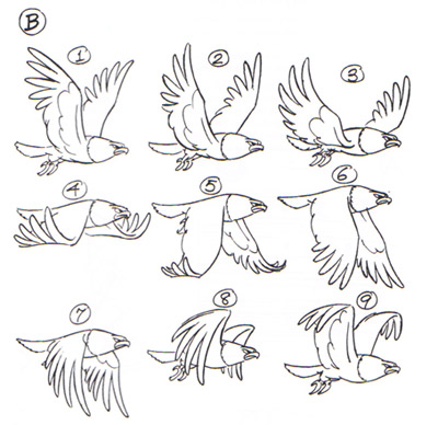
I would bend the wings a bit more when they move down, theyre too straight in the mid-way, its too fast, should be straight on the bottom. --- Got inspired to make my own sprite in similar theme and test wings myself so maybe that would help to show what i mean but previous pic with bird was also very good help.   |
Posted By: Zeratanus
Date Posted: 26 September 2013 at 8:34am
|
Geezum this animation has too many frames! So much to fix! And noticed in the new attack animation that when she throws her arm forward her back foot blips! How could something so wonky still be in this animation!? lol oh boy...
Wont post the current progress yet, want to at least get the attack redone and then have the jump back into the air as the last bit. @2blackbar - I'm a bit confused: your explanation sounds like you think the flap downward should bend more, but your animation only bends as the wings move up. Either way, looking at it it does seem like the upward movement of the wings should be pulled closer to the body, so I tried that out: old -> New ->
|
Posted By: 2blackbar
Date Posted: 26 September 2013 at 1:28pm
|
Wings down movement should lift character up kinda like they really do in real life.Now your character lifts up when wings lift up which is opposite to real life. In my example wings are bent a bit like this even if it isnt that visible and they go down under angle like this / not like this -- ,  its better visible on right wing than on bigger left one , that frame in red circle is important so wings are bent up a little bit, in your animation they look too straight for too long during middle of the down movement for my taste and theyre all the time bent upwards tiny bit in area near the head , i would bend them down near the head when they go down , anyway you did fantastic work and thanks to you i was inspired to make my own animation :) Maybe its best to split shield, head and body into layers and move them a bit differently to get most motion but its up to you.I know its very nitpicky but thats what im looking for when im animating also now you fixed them and bent them down when moving up but i think you should bend them closer to head or at least exactly in the middle... anyway there are different types of wings but i think the ones that are longer from the middle to sides look best, like here http://www2.ups.edu/biology/museum/BLOYwingUWBM36365.jpg. its better visible on right wing than on bigger left one , that frame in red circle is important so wings are bent up a little bit, in your animation they look too straight for too long during middle of the down movement for my taste and theyre all the time bent upwards tiny bit in area near the head , i would bend them down near the head when they go down , anyway you did fantastic work and thanks to you i was inspired to make my own animation :) Maybe its best to split shield, head and body into layers and move them a bit differently to get most motion but its up to you.I know its very nitpicky but thats what im looking for when im animating also now you fixed them and bent them down when moving up but i think you should bend them closer to head or at least exactly in the middle... anyway there are different types of wings but i think the ones that are longer from the middle to sides look best, like here http://www2.ups.edu/biology/museum/BLOYwingUWBM36365.jpg. |
Posted By: serrival
Date Posted: 26 September 2013 at 1:52pm
| Hmm, I personally like the old wing animation, looks smoother...;__; |
Posted By: Zeratanus
Date Posted: 26 September 2013 at 1:58pm
|
I see what you mean about them pointing up too long where it connects to the head. Not seeing what you mean about the bend. I'll keep staring at it though. Maybe it'll look right once I correct the head connect part and wont look so straight to you? Definitely not seeing a major difference in yours though, sorry! I'll mess with the wing bend as it pulls up more though. As for wing shape, her head has those funny Captain America type wings, while her back ones should be more like what you linked to (actually, need to change them to that in a few frames. Crud. Thanks for getting me to notice that!)
As for the lift movement, she does lift when then wings beat down. or, more specifically, she stops falling as she beats her wings, gains a little lift from it that she rides as her wings pull up, and then immediately begins to fall again. Your angel is very light and airy; I wanted a very heavy feel - that shield and spear weigh more than she's physically designed to fly with, so she beats her wings quickly and with enough force to keep in the air. The new frames HAVE changed the timing on this a bit though, I'll keep that in mind and see if I should change it a bit. Might look more correct if I have her start to move up one frame sooner now. @Serrival - woah page 2! I'll keep working on the changed frames and see if the new animation can get smoother after the changes I'm planning :) but after noticing it, her wings do need to fold as they go upward, or they'd be hitting the same amount of wind resistance and pushing her back downward. |
Posted By: Zeratanus
Date Posted: 30 September 2013 at 8:09am
|
Lets see if this is any smoother. Where the wings connect to the head should look right now, and redid some frames, including the bend while pulling them back up.
Also redid the halo a little since it looked like butt on a dark background. Semi-related news: I stupidly edited and saved after reducing the animation to the 10 frame loop. All the edited sprites are still fine, but now I have to redo all the timing and positioning. Urf. Old->New->(Edit: and new timing tweaks) -> -> ->
|
Posted By: Yuran
Date Posted: 30 September 2013 at 5:58pm
|
Hi, I want to improve your animation, but I'm too lazy to do it illustrative manner :)
I want to say that her hand must move first in front of, and then her leg. But here they move in parallel.  => => 
And besides her back should tilt a bit in front at the time of the throw (or badly because it depends on the strength of her cast) For example like this: she is too straight back, because of this strike seems weak. 
|
Posted By: Zeratanus
Date Posted: 07 January 2014 at 9:24am
|
I'm almost disappointed that it hasn't been a full year since my last update lol. I need to get this finished.
Finally took the time to get all the frames back into one file. from the attack onwards still need a lot of cleaning up on its shapes and such, and the jump up at the end is just kinda thrown back together. 
Yuran - I agree that your stick animation looks a lot more like a spear-throwing animation, but she's not actually physically throwing the spear. I could of incorporated that earlier maybe, but at this point I'm less willing to redo half the animation lol. As for the other example, that one was done with the idea of it being a platformer type game, so the slashes were made to be quick and not change the player's hitbox, but I agree that that too could be made to have more power behind it |
Posted By: neofotistou
Date Posted: 07 January 2014 at 6:10pm
Posted By: neofotistou
Date Posted: 07 January 2014 at 6:13pm
|
What an amazing character! Some fantastic keyframes and animations here!! One thing that bothers me with the spear throw is its lack of energy. I just did some acting in front of a mirror, and found out that I'd use my waist twist my whole torso when throwing. Feel free to ignore my super-sloppy edit! Also, when you animate the halo, you could just make it a filled yellow disk. It's not only less distracting, it shows a trail. A halo would leave the same trail as car headlights on a camera with an open diaphragm: it moves too fast to capture. Also, try to keep in mind that if you take a single point of interest (e.g. elbow, knee, etc) and keep track of it throughout the animation, its trajectory should be a pleasing curve. If it isn't, then the animation is going to look jerky. Just my two cents, fantastic work! before -> after  |
Posted By: Zeratanus
Date Posted: 07 January 2014 at 6:25pm
Oh goodness! Looks like I'll be retooling it after all, because I love that too much to be happy with what I have now! 
|
Posted By: jalonso
Date Posted: 08 January 2014 at 8:09am
|
This is one of those threads I just love seeing updates on. Its almost a tutorial for all. ------------- |
Posted By: Zeratanus
Date Posted: 08 January 2014 at 1:30pm
|
I'm both endlessly frustrated by the never ending edits to this and greatly enjoying learning and improving everything!
But someday I will call this finished. I owe that much to everyone who's been helping me out here!
Speaking of: New version. Man it hurts to cut frames out of this thing but I think it's for the best. Changes: Shield now tilts when blocking the blast, so its less stiff Major frame cuts when getting up. Now she looks at her hand immediately and attacks, rather than staring off for a few moments Beginnings of the edit for the new attack, including having her lean forward more, now that this is a more energetic motion. The entire 'getting blown back' part is still in but will have to be scrapped, as it makes no sense with the new attack. old->new 
(i'm thinking of ending the attack with her losing her balance and falling over, cuz it would be cute, but I'm not set on that yet) |
Posted By: Zeratanus
Date Posted: 09 January 2014 at 12:10pm
|
aaand down she goes~
Blocking out the new animation 
edit: urf. just noticed the head wings blip right as she goes for the new attack. Figures I'd miss something while cutting out frames. edit edit: AAAND in those wind up to attack frames i noticed I lost some revisions I had done. Had to revert to a previous save when i botched up editing a frame real bad, guess I hadn't saved as recent as I thought. Nothing significant though. AND I'LL EDIT AGAIN since it wasnt that long since I posted the last one. After watching her spin around over and over I felt like she didn't express enough in the rest of the animation. No emoooootion! So now she blows a raspberry and reacts to the attack before its on screen 
|
Posted By: Zeratanus
Date Posted: 10 January 2014 at 6:10am
Jumped on it for a bit early this morning. Got the full loop going now, though the getting up animation definitely needs more frames~

|
Posted By: BottleGnomes
Date Posted: 10 January 2014 at 6:32am
|
Are the ears supposed to stay rigid like that when she falls? Also, I think there might be one or two extra frames in the throwing animation - it seems quite slow to me. I'd recommend at least seeing what it looks like if you take one out. Otherwise, this animation is really cute! |
Posted By: Zeratanus
Date Posted: 13 January 2014 at 8:48am
|
Yeaaah now that there's more fluid animation in other parts the stiffer parts are becoming very obvious. No huge change here, but they do move more so its less rigid. Took out a frame of the attack too. Might look a little too fast for me, but it definitely looks like it has the force to spin her around now.
Also added a few more sketchy frames to the getting up pose. Not a ton of progress, but its getting there. 
|
Posted By: neofotistou
Date Posted: 13 January 2014 at 10:18am
|
The attack does look more energetic! You can push it a bit more if you like, especially the anticipation. Exaggeration is a weapon, and you're good at using it! It really paid off that you took a frame out! You don't want to fall in love with your frames, treat them as sketches until you're sure the movement is right. You're already doing this. The tumble is fantastic and adorable. I usually hate "moe" moments (where an otherwise super-powerful female character is clumsy or silly just to invoke straight male viewers to feel protective of her, even though she's stronger than they are) but this one is appropriate I think. Watch out for how much larger she becomes in the sketchy frames when she's on the floor and getting up. It's easy to get carried away when animating frame-by-frame and note pose by pose. It pays off however, because the animation is smooth and interesting. |
Posted By: Velrio
Date Posted: 13 January 2014 at 2:06pm
| Thanks for making this, Zeratanus. It's inspiring as all heck. |
Posted By: Zeratanus
Date Posted: 16 January 2014 at 2:20pm
|
@Neofotistou: Thanks! And I know what you mean about the frames. It's just hard to take something that was a finished product that I wanted to further refine and get it over with and then decide to throw out half of it . I noticed with the last frame of the getting up pose how much bigger she was becoming, so yeah I'm gonna be watching out for that. Darn me.
@Velrio - thanks! I'm glad this thread can inspire other folks, cuz it's sure been inspiring for me! Here's the latest version. I haven't had much time to work on it, so nothing huge yet. Changes: Spear now drops as it vanishes, and starts vanishing one frame later. This fits in better with her quickly ducking under her shield, and then looking at her hand noticing that the spear is gone. slight changes and an additional frame to the wind up to the attack few of the frames of the fall are now not sketchy crud. 
|
Posted By: Zeratanus
Date Posted: 28 January 2014 at 8:28am
You spin me right round baby right round like a record baby right round round round~

slow going but at least this isnt the months long breaks I've had in the past lol |
Posted By: Zeratanus
Date Posted: 30 January 2014 at 8:19am
|
I CAN TASTE THE GOLD AT THE END OF THE RAINBOW!
Only a few more totally new frames to get done and the loop will be back to the tweaking phase. Interesting side note: this is gif #46 or so that I've made for this WIP. Not certain all of them were uploaded, but geeze that is a lot of versions!

|
Posted By: Zeratanus
Date Posted: 26 February 2014 at 10:34am
|
Two more new frames... and only two more until I'm done with the brand new frames and can get back to tweaking everything~
This would of been done a long time ago, but twice now, once for each frame, the program crashed and lost all of my progress even though I was certain I had saved. File might be getting too big for this junky computer to handle. 
|
Posted By: jalonso
Date Posted: 27 February 2014 at 6:35am
|
Looking great, especially the getting up off the floor which has just the right amount of weight. ------------- |
Posted By: Zeratanus
Date Posted: 28 February 2014 at 11:33am
|
MUAHAHAHAHA! ITS FINALLY A FULL LOOP AGAIN! NOT DONE BUT NO MORE SKETCHY FRAMES!
Thanks Jal! I'm not really certain the getting up frames are the best yet though. Definitely could use some tweaking, so I made a version of just her falling on her face over and over so I can stare at it. As always, If anyone sees anything i could tweak don't hesitate to let me know! 

(also just noticed the entire set of frames between the brand new ones and her being back in the air are still uncleaned :( not particularly noticeable but I'll have to get them fixed. Haven't worked on this for this long to skimp on details lol) |
Posted By: Yuran
Date Posted: 11 March 2014 at 6:09am
|
I love this charming warrior. Could not resist and plotted cool moment    |
Posted By: skittle
Date Posted: 11 March 2014 at 11:53am
|
@Yuran
Nice fanart ;D @Zeratanus Golly, you've been working on this for awhile. So much dedication O_O |