Jaguar Spirit
Printed From: Pixel Joint
Category: Pixel Art
Forum Name: WIP (Work In Progress)
Forum Discription: Get crits and comments on your pixel WIPs and other art too!
URL: https://pixeljoint.com/forum/forum_posts.asp?TID=26735
Printed Date: 13 June 2026 at 1:15pm
Topic: Jaguar Spirit
Posted By: pavanz
Subject: Jaguar Spirit
Date Posted: 03 October 2019 at 5:49pm
|
Hey guys! It's been long since the last time I showed up.
I'm trying to emulate the good ol' SNES JRPGs boss vibes for this sprite. I'm using only a monocromatic ramp right now, but I plan to add more color later. 
|
Replies:
Posted By: Greycloak
Date Posted: 04 October 2019 at 11:20am
|
Seems to be turning out quite well. The only thing I might suggest is putting a defined dark border around objects such as the necklace and maybe the claws as well. E.g.
 |
Posted By: pavanz
Date Posted: 23 October 2019 at 5:17pm
|
Thanks for the input! You're right. I still need to test the sprite on some noisy backgrounds, but a dark outline will be essential for readability.
Here's some progress 
|
Posted By: pavanz
Date Posted: 24 October 2019 at 2:27pm
Update

|
Posted By: Greycloak
Date Posted: 25 October 2019 at 9:34am
|
Looking really good. One thing I might point out is that the pattern on his foreground leg looks a bit odd, almost as if he has scales instead of fur. Also, your current spot patterns make it look more like a cheetah than a jaguar. The dots on a jaguar's head are small and clumped together, and on their torso the dots expand into a circle of dots (sometimes with dots inside the circle), and then the circle of dots on the hind-legs and tail become larger with no middle dot. Though of course a picture of a jaguar is much better than trying to explain their pattern. 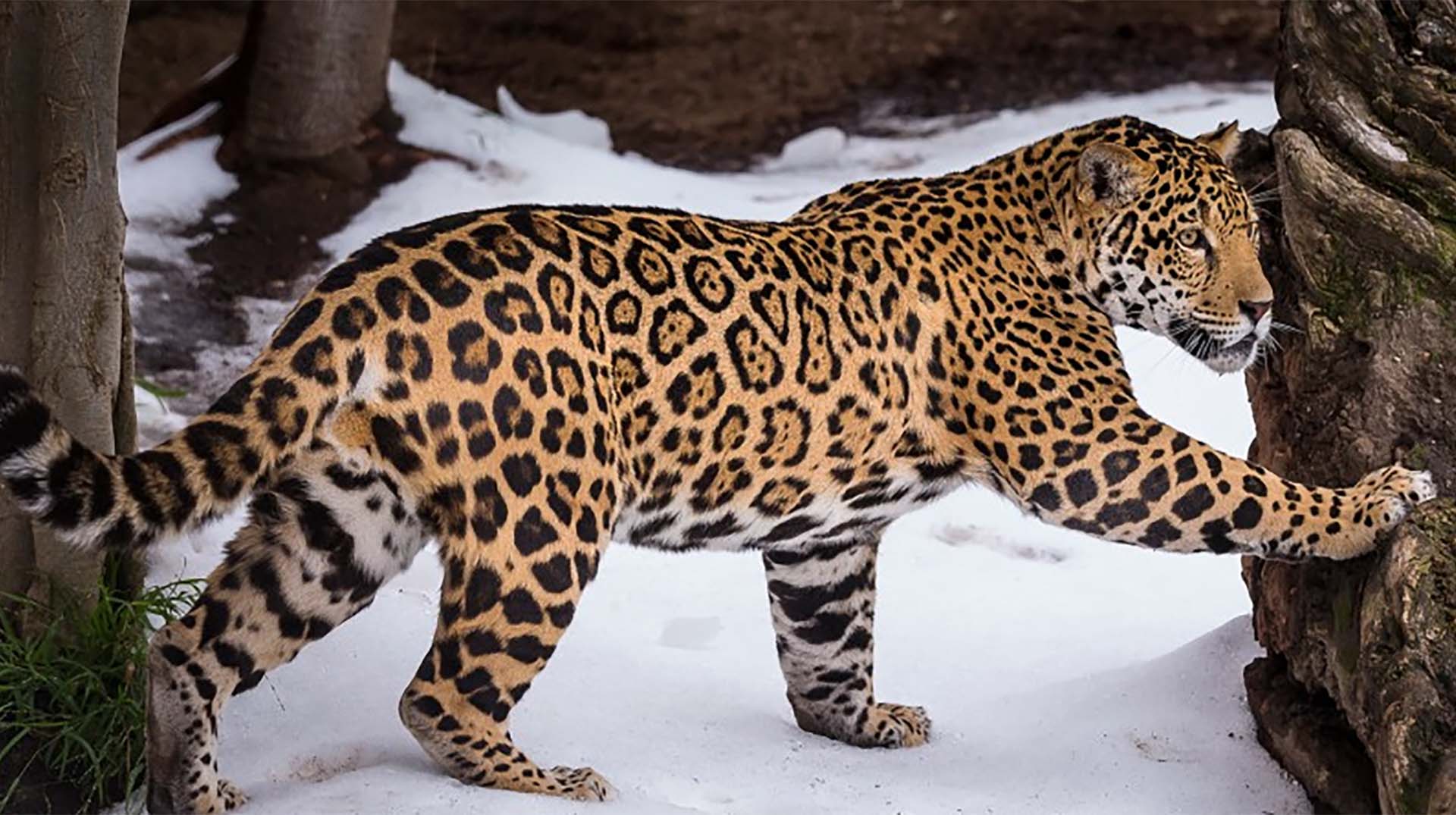 |
Posted By: pavanz
Date Posted: 25 October 2019 at 8:29pm
|
Thanks! The pattern in the legs is different on pourpose: I'm trying to replicate an indigenous graphism on it (I'm not satisfied with the result yet, still working on it).
The issue on the spots is spot on (ha!), I will try to work on the pattern some more. |
Posted By: pavanz
Date Posted: 27 October 2019 at 9:08am
Updated the spots and inverted the "tattoo", so it becomes more readable

|
Posted By: Greycloak
Date Posted: 27 October 2019 at 3:01pm
| Very nice. I can't think of anything else to critique on it. |