First Attempt at Isometric
Printed From: Pixel Joint
Category: Pixel Art
Forum Name: WIP (Work In Progress)
Forum Discription: Get crits and comments on your pixel WIPs and other art too!
URL: https://pixeljoint.com/forum/forum_posts.asp?TID=3444
Printed Date: 21 July 2026 at 9:34am
Topic: First Attempt at Isometric
Posted By: Saint Minor
Subject: First Attempt at Isometric
Date Posted: 02 December 2006 at 2:36pm
|
Well here is my first attempt at iso: Let me here thoughts and tips! Also the beach i have only just started that is why it seems empty  |
Replies:
Posted By: Skull
Date Posted: 02 December 2006 at 2:43pm
|
JPG = No No. Seems fine to me, but some parts, like the beach don't appear to be pixel art at all. ------------- |
Posted By: Saint Minor
Date Posted: 02 December 2006 at 3:11pm
|
edited: now PNG Also i cant find an effective way to get what i want without blurring the beach etc. any adice with this? |
Posted By: Cryssy
Date Posted: 02 December 2006 at 3:36pm
|
I have a suggestion for the beach, try dithering or color fade and use some green to blend the blue and yellow. Dithering around the land areas to blend them...but I am no iso artist so maybe I should be quiet
------------- 
|
Posted By: skeddles
Date Posted: 02 December 2006 at 3:53pm
| what program do you use? i suggest you use paint. |
Posted By: Saint Minor
Date Posted: 02 December 2006 at 5:00pm
| i use photoshop i create my work the same way as i could in paint though |
Posted By: Souly
Date Posted: 02 December 2006 at 5:14pm
|
Well the beach isn't pixel art. I suggest you fix that right away. ------------- 
I am the jesus of PJ. |
Posted By: jalonso
Date Posted: 02 December 2006 at 5:56pm
|
Crissy is correct use dithering to create the blend. One thing you really should make a desicion on is. Will it all be outlined in black or nothing will be. The mix looks poor. ------------- |
Posted By: Toonses
Date Posted: 02 December 2006 at 6:22pm
|
some things that could be fixed:
consistancy in the picture, things vary in size a LOT, most notably the big brown building in the corner has windows that are colossal, plus the chimney thing on it seems pretty out of place. Also, as Jalonso said, it looks strange to have black outlines on a few buildings, and no outlines anywhere else. About the barn (if it's not a barn, then I'm talking about the red building with the grey roof), the roof looks a little off. If you draw a line from the center of the roof, it doesn't line up with the center of the building. Good luck with future edits of this piece :) ------------- "I'm not that kind of orc!" -- random disgruntled peon |
Posted By: jalonso
Date Posted: 02 December 2006 at 6:57pm
|
As Toonses says scale is important in iso pieces. make yourself a little 'guy' which you use to keep things proportionate in every building or thing you make. A bit off-topic but seems you need a little help on submitting to the gallery. You tried to submit this and its still a WIP so its not quite ready yet for the gallery so I sent it back until you're done. When complete (and for any other piece bigger than 100x100 pixels) You'll need 2 seperate images. One file is 100x100 pixels or smaller, this is the 'icon' image' the second image is your 'whatever size' image. This second image goes in the second panel. ------------- |
Posted By: Aleiav
Date Posted: 02 December 2006 at 9:28pm
|
Originally posted by skeddles
what program do you use? i suggest you use paint. Just wanted to add, as far as pixel art goes, no programs are really superior. The great thing about pixel art is that it's purely the manipulation of pixels, so you don't need a big fancy program to do it (although, layers and opacity options help TONS). As long as you lay things pixel by pixel and turn off any anti-aliaising algorithims, using photoshop should be no different than using paint, really (except for the layer bit). ------------- |
Posted By: Saint Minor
Date Posted: 03 December 2006 at 9:01am
|
okay i listened to some of your ideas and i decided upon taking away the black line on the edges, i worked on propotions (mainly the factory) and i worked on the beach let me know what you think? NEW:  |
Posted By: Cryssy
Date Posted: 03 December 2006 at 10:35am
|
It is looking better but the beach still isn't pixel art. http://spriteart.com/tutorials/01_dither.html - http://spriteart.com/tutorials/01_dither.html has a good tutorial if you don't know what dithering is :D -------------
|
Posted By: brianna
Date Posted: 03 December 2006 at 12:19pm
|
Your barn is still crooked. The top center of the roof needs to be straight up from the center of the rest of the barn. |
Posted By: jalonso
Date Posted: 03 December 2006 at 9:38pm
|
Please keep your images as small as possible when posting. All that white isn't needed. So this is an edit of things that may help you in creating your pixel. You have many areas where you used the blur tool. That not only looks terrible but it makes it Not Pixel Art. The pool and even the buildings have blurred tool things here and there. The tower on the building is so disproportionate it just looks wierd, I think. I made a person and door that may keep you focused in scale (see you already started on that). I broke the factory into stories based on the other buildings. You are coloring your buildings with an odd sense of lighting. The barn is lit from the right while the factory from the left and that middle building not lit at all. Pick one and stick to it. Your way of coloring 'corners' is really wrong looking (see image for comparison) Illustrated what Brianna mentioned about the slope of the barn roof. Many of your detail items are not in iso view but flat 2D. I illustrated some to show you, umbrealla and chair. On the lower right is a sheep, tree and the iso circle for the fountain I was too tired to draw. Finally, I have shown a seashore in the simplest possible way I could think of. There are many other more intricate ways of doing it, but this seems to go with your style. Study it closely and you'll figure it out (pallete included)  EDIT: These are my ideas for you only. There are other ways of doing things ;) ------------- |
Posted By: Saint Minor
Date Posted: 04 December 2006 at 3:29pm
Thanks for your help jalonso its really appreciated, i tried working on every bullet point. I have edited the large factory building, the mansion house, every tree, the beach and the barn. Let me here your thoughts please.
|
Posted By: Cryssy
Date Posted: 04 December 2006 at 6:20pm
|
this is looking much better but upon zoom in the shadows under the umbrellas are still blur/darkened also jalonso's bit about the umbrellas would make them look much much better :D -------------
|
Posted By: Pixel_Outlaw
Date Posted: 04 December 2006 at 6:25pm
|
YOu might consider finding the actual hue between your water and sand.
R1= color 1's red value
G1= Color 1's green value
B1= Color 1's blue value
R2= color 2's red value
G2= Color 2s green value
B2= Color 2s blue value
now this is the number for the blended color
final red= (R1+R2)/2
final green= (G1+G2)/2
final blue= (B1+B2)/2
You can also make the colors have different strengths if you are willing to use percentages. ( I can give you the formula for that too if you want!) ------------- http://www.shmup-dev.com/forum/"> 
|
Posted By: brianna
Date Posted: 04 December 2006 at 6:45pm
| There's still blur in the pool, too. |
Posted By: jalonso
Date Posted: 04 December 2006 at 10:37pm
|
The factory brown color is all blurred still too.
------------- |
Posted By: Yoggii
Date Posted: 05 December 2006 at 9:22am
|
Nice i have to say......
WHEN YOU ARE USING OTHER PEOPLE'S WORK!!!!!!
 I would mind if you asked but you didnt !!!!!!
 |
Posted By: Pixel_Outlaw
Date Posted: 05 December 2006 at 10:14am
|
Ohh this is getting good I love scandles. ------------- http://www.shmup-dev.com/forum/">
|
Posted By: Cryssy
Date Posted: 05 December 2006 at 12:42pm
|
Originally posted by Yoggii Nice i have to say...... WHEN YOU ARE USING OTHER PEOPLE'S WORK!!!!!!
I would mind if you asked but you didnt !!!!!!
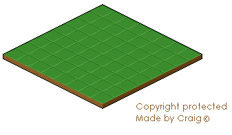
I didn't know you could copyright iso grids -------------
|
Posted By: jalonso
Date Posted: 05 December 2006 at 12:42pm
|
Originally posted by Yoggii ...WHEN YOU ARE USING OTHER PEOPLE'S WORK!!!!!!
I would mind if you asked but you didnt !!!!!! Chill out! You really can't copyright a grid and notice he is drawing over the grid so that when finished your 'original' won't even be there. ------------- |
Posted By: brianna
Date Posted: 05 December 2006 at 1:23pm
| But maybe he copyrighted the color green that's left! Oh, wait... :) |
Posted By: PixelSnader
Date Posted: 05 December 2006 at 2:14pm
|
no he didn't. that is impossible. all your green are belong to me. ------------- ▄▄█ ▄▄█ ▄█▄ ▄█▄ |
Posted By: ceddo
Date Posted: 05 December 2006 at 9:42pm
| I'm patenting reds. If you'd like to use a red in the near future, you can rent one for $100 a month by sending me a message :) |
Posted By: PixelSnader
Date Posted: 06 December 2006 at 2:17am
|
psh
i dont need red
i claim skincolours and anything below 40 saturation should be public use. ------------- ▄▄█ ▄▄█ ▄█▄ ▄█▄ |
Posted By: jalonso
Date Posted: 06 December 2006 at 10:17am
lol, now let's get back on-topic 
------------- |
Posted By: Saint Minor
Date Posted: 07 December 2006 at 11:07am
|
Originally posted by Cryssy this is looking much better but upon zoom in the shadows under the umbrellas are still blur/darkened also jalonso's bit about the umbrellas would make them look much much better :D Okay ill try that and i will extend the town so that it COVERS the template, sorry i didnt know i needed to ask and as jalonso said, once im finished you wount recognise its yours. |
Posted By: Aleiav
Date Posted: 07 December 2006 at 10:57pm
|
What point would there be in making an iso grid if people CAN'T use it?? e_e ------------- |
Posted By: Saint Minor
Date Posted: 12 December 2006 at 1:21pm
Okay people i have another update, C and C please |
Posted By: ceddo
Date Posted: 12 December 2006 at 1:41pm
|
Hey, this is coming out quite nicely! (take off the brushed shadows from the umbrellas and put some real pixel shadows instread please!)
The construction site and church are a cool addition, and You made the crane quite well. Try giving the sand & water area more form, more texture. As it stands now, it just looks like a flat beach with flat water and a little seafoam where the two intersect. A few pixels in the shape of waves would suffice to give the entire piece more of a beachy atmosphere. You can also have a go at texturing the sand (try long, thin dunes of sand), but that's quite hard to do. Keep it up! |
Posted By: Saint Minor
Date Posted: 12 December 2006 at 5:40pm
| Thanks alot for the comments ceddo, i will try to add in waves and sand textures but it will most likley turn out dreaful as i wont have a clue to do it really. Maybe a few hints and tips? |
Posted By: jalonso
Date Posted: 12 December 2006 at 10:54pm
|
looking good :D
------------- |
Posted By: Monkey 'o Doom
Date Posted: 13 December 2006 at 4:41am
|
You've still got some NPA shadows for the beach umbrellas. ------------- http://pixelmonkey.ensellitis.com"> 
RPG is numberwang. |
Posted By: Saint Minor
Date Posted: 14 December 2006 at 3:08pm
| Yes i know i am redoing the umbrella shadows |