WIP- Wicked Sorcerer
Printed From: Pixel Joint
Category: Pixel Art
Forum Name: WIP (Work In Progress)
Forum Discription: Get crits and comments on your pixel WIPs and other art too!
URL: https://pixeljoint.com/forum/forum_posts.asp?TID=5593
Printed Date: 28 October 2025 at 1:20am
Topic: WIP- Wicked Sorcerer
Posted By: Solid Pixel
Subject: WIP- Wicked Sorcerer
Date Posted: 18 December 2007 at 3:14am
|
An old sprite I posted here about a year ago. I wanna finish it so I can move forward with my skillz. Still needs major tinkering here and there, so how about some good'ol criticism? Newest version on the left, old to your right:
  ------------------------------------------------------------------------
@View previous updates by scrolling down "this" thread. Enjoy. ------------------------------------------------------------------------ |
Replies:
Posted By: misterricko
Date Posted: 18 December 2007 at 12:46pm
|
I really love high res sprites,and your is going very fine... Good luck ! |
Posted By: NotSure
Date Posted: 18 December 2007 at 1:29pm
|
One and Two are great, three suffers from a lack of life. One is the most natural pose. This is my favourite. Two is the most impressive porn pose. this does not mean you were making it into porn, but it is an artificial pose that opens the chest for clear viewing. The Porn industry figured these sorts of poses out over one hundred years ago. Three probably cannot be saved. Unless you have created this for an unoriginal game that has every character standing in a perfect line, all looking straight down the camera, and you had limited colours to work with for shading (or antialiasing). On its own, it shows a good grounding in anatomy, but compared to the other, far superior poses you have, it is hard to figure why you put so much more work into this piece. |
Posted By: Hatch
Date Posted: 18 December 2007 at 2:06pm
|
Originally posted by NotSure
compared to the other, far superior poses you have, it is hard to figure why you put so much more work into this piece. Originally posted by Solid Pixel
An old sprite I posted here about a year ago . . . New version on the left, old to your right Anyhow, I really wish you'd try a different palette. It's starting to seem like a cop out.  ------------- |
Posted By: NotSure
Date Posted: 18 December 2007 at 2:34pm
|
Yes Yes Hatch, I noted the order after i wrote it, but I decided that it is still valid and I posted it anyway. I do not care if you take 2 minutes to finish a piece of art, or five years, if it is a work in progress, then it is a good idea not to spend a lot of time rendering an unfinished rough. If the right hand image is it's own finished image, then it does not need to be included in this lineup. I myself have large works that are half done that date a year back, even 25 years back. I will not render them until I am sure the image is as correct as I can get. I will create as many roughs as needed to get the correct image. The roughs can be spread out over decades. I have known many world class artists, and have worked with many of them. I have yet to meet one person who creates a finished work, who then goes back and recreates the same piece years later. It is a work in progress, or it is a finished work. Not one of these artists render until they have done enough roughs and are ready to finish the work. |
Posted By: Doomcreator0
Date Posted: 18 December 2007 at 3:24pm
|
The second looks best in my opinion. The anatomy, and linework are going well right now, but like others said. Different pallete maybe? ------------- 
|
Posted By: Metaru
Date Posted: 19 December 2007 at 12:54am
|
I would use a combination of 1st's pose with 2nd's head. mainly because of the weird appearance of 2nd's arm(it's almost tubular), and 2nd's truly awesome face and haircut(1st's one looks a bit... masculine) but still, these two poses doesn't convince me. there are some problems on the rigth hand of 1st, the top finger doesn't follow the natural line of the knucles. also, its left hand looks a bit ood to, But I asume its just because it is still in an early desing. her breast... maybe is just me, but her nipples are pointing in an unnatural angle. the side's of the chest also needs a revision... it may be the pose, but it looks too linear. considering how is she standing-in both poses- it should curve abit more than it is already, with the rest of her torso, of course. finally, I would suggest you to increase the division in the armpit. edit: i forgot, ignore the comments about the palette.  ------------- I ate leel's babies |
Posted By: Solid Pixel
Date Posted: 19 December 2007 at 1:58am
|
Any other flaws I might have overlooked besides the obvious? Hit me with all ya got.
Originally posted by Hatch Anyhow, I really wish you'd try a different palette. It's starting to seem like a cop out. This is my style Hatch, unless there's a rule stating that I can't use the same palette twice then I'd reconsider, but until then my decision stands unchanged. :)
|
Posted By: greenraven
Date Posted: 19 December 2007 at 7:00am
She reminds me of Witch Hunter Robin.  Anyways, I kinda agree with you and Hatch. I don't really like the palette, but I don't think you should change it. I think the skull on the staff should be at the same level as her head, like it is in the third version at the top. -------------  "pwnage comes with patience, practice and planning." ~ Jalonso "pwnage comes with patience, practice and planning." ~ Jalonso 
|
Posted By: Hatch
Date Posted: 19 December 2007 at 7:09am
|
Originally posted by Solid Pixel
This is my style Hatch, unless there's a rule stating that I can't use the same palette twice then I'd reconsider, but until then my decision stands unchanged. :) Of course there's no rule. My opinion is just an opinion, and you know what they say about those. Now, because we're BOTH stubborn American bastards, I'm going to completely ignore what you said about not changing your decision. 
Maybe you're a master of color, and your repeated use of this palette is completely justified by long study and tremendous experience, but there's really no telling because it's the only palette in your gallery, and if I don't assume you could do better, my critique is worthless. And anyway, if you ARE a master of color, why would you use the same so-so monochrome palette over and over on every piece regardless of emotion? This is a serious question. Ultimately you're not challenging yourself at all. It's such a simple thing to fall into an easy rut and call it style, without even noticing. Just be honest with yourself. ------------- |
Posted By: Metaru
Date Posted: 19 December 2007 at 7:42am
|
why? because he loves those colors. don't you remember my continous affair with you metal palette Hatch? or myself using that damn palette of tarro over and over? there's nothign wrong with using the same colors, just ignore that stubborn north-american bastard. (not all americans are as childish as you buddy  ) )------------- I ate leel's babies |
Posted By: Hatch
Date Posted: 19 December 2007 at 8:18am
|
Pfft. No, there's nothing wrong with thoughtfully reusing a palette when it fits the emotion of the piece. This is not the same as blindly using the same palette over and over on everything.
Anyhoo, SP, I know I've been really harsh. Whatever you decide, it doesn't mean we can't be friends. 
... But not Metaru. ------------- |
Posted By: Metaru
Date Posted: 19 December 2007 at 8:43am
Oh hatch, c'mon, Get over it. You know you left her alone, And she naturaly came to my looking for someone who actually pay attention to her    ------------- I ate leel's babies |
Posted By: NotSure
Date Posted: 19 December 2007 at 11:31pm
|
With the new position you have introduced a big flaw. You have move her off balance. She is now the drunk skank on her way to falling down. Because her screen right leg is bent and outstretched, her weight must be on her screen left leg. That is supporting her weight well, but is so off balance, she will hurt herself (and probably vomit and screw the nearest guy). You need to move her screen left foot/ankle to below her naval (Belly Button). Then she will look like a naughty girl trying to seduce the viewer. I hope this has been helpful. I am not insulting, for the most part, you have done an outstanding job. |
Posted By: Solid Pixel
Date Posted: 20 December 2007 at 2:18am
|
Why would I be insulted? You're only trying to helpout, right? :)
Updated. Anything else wrong with her anatomy that I missed, do share.
 Originally posted by Hatch I understand were your coming from Hatch, but let me tell you something seriously serious; I'm definitely not a master of color, infact I'm the total opposite. :)And anyway, if you ARE a master of color, why would you use the same so-so monochrome palette over and over on every piece regardless of emotion? This is a serious question. The reason for reusing the same palette over and over again is simply because I cannot make up my mind when it comes down to choosing things.
Now see if they all happen to be identical then I'd have nothing to fret about, simple no?
Originally posted by Hatch But on the contrary I am! I don't know if ya notice Hatch but I'm still quite new to pixel art.Ultimately you're not challenging yourself at all. Just be honest with yourself. I make sure I challenge myself just enough everytime when creating a new piece.
An even more so with the monochrome palette I use, even if it's a cop out.
Originally posted by Hatch Indeed we can still be internet buddys regardless of how bias our opinions may get. :)Anyhoo, SP, I know I've been really harsh. Whatever you decide, it doesn't mean we can't be friends. |
Posted By: NotSure
Date Posted: 20 December 2007 at 4:07am
|
You are heading in the right direction now. The staff, unless she is drunk or injured is not to bear her weight, merely holding it for effect. You could now tighten her dress around her screen left leg. I know this is cheating because dresses seldom pull that tight, but you are wanting to show off a little form here ;) Also, the screen right knee is a little too low. Her thigh is too long. This is not hugely out, no more than 10 pixels shorter. About 8 pixels is where I would suggest to start with. You have lost the good groin crease positioning from your last picture. Put it back ;) Once you have this finished, it will look spectacular. |
Posted By: Solid Pixel
Date Posted: 20 December 2007 at 4:40am
|
Super-duper fast update.
None of my pieces would be complete without a cameo appearance by my second persona:
 Originally posted by NotSure You meant it "should" look spectacular. ;)Once you have this finished, it will look spectacular. |
Posted By: Metaru
Date Posted: 20 December 2007 at 10:10am
|
this is looking great. a few point i'd like to mention about the piece in general: that rigth hand of her still looks odd. it appears that you haven't put attention to it yet(the problem of the pointer finger's pose that I mentioned above). also, her left arm looks a bit longer than it should be, and jaggy. i do suggest you to move the staff closer to her so this could be solved in a easy and safe way. her rigth hand appears as if she were holding the staff rigth in front of her. that's produced by the way the hand is displayed in the screen. the [insert name of cloth] covering her nipples appears to be untigth at the bottom. considering that they are holding the bottom part of her dress up, they should be made less jaggy and more linear. the line that represents her left leg below her dress appears to be misplaced. moving it 3 or 4 pixels to the rigth and the knee a few more pixels up will make it more anatomycally correct.(i know how this will affect her pose, but i leave that up to you). that bot of the dress, the part where her dress turns arround her ass at her rigth... if the dress is made of cloth, it should be arround 1px-2px thick(2px as a maximun). it appears that is made of some kind of tubular material rather than a fold of the actual clothing. and, finally, a small suggestion. I believe that, before starting to work with her dress, (and that cameo :D) you should work on her anatomy. so i would take her dress off for now and focus on her anatomy and then draw her dress over the polished lines of her body. or else you will be forced to work on both at the same time. considering that her dress must adapt t her body and not viceversa, that could be a moreconvenient way to work. but again, is a suggestion. (the new skull looks wonderful!) ------------- I ate leel's babies |
Posted By: Solid Pixel
Date Posted: 22 December 2007 at 2:26am
|
Fixed some minor details, however still need to address some other issues that Metaru mentioned above, an then finally I'll start the shading process (in turn will correct the rest).
EDIT: The ripple in the cloth looks like a face grinning. XD
Rough update:
 Originally posted by Metaru so i would take her dress off for now and focus on her anatomy and then draw her dress over the polished lines of her body. The reason for the sloppy anatomy proportions are because some areas I had used myself as a reference and since I'm not built like a female, well, you get the picture. ;)
|
Posted By: Bisque
Date Posted: 22 December 2007 at 3:06am
|
Originally posted by Solid Pixel The reason for reusing the same palette over and over again is simply because I cannot make up my mind when it comes down to choosing things.
Now see if they all happen to be identical then I'd have nothing to fret about, simple no? So you're taking the easy route b/c you dont want to bother? I know palettes can be frustrating sometimes but if you don't atleast -attempt- ..you'll never learn or improve. Why not just give it a shot and continue posting here so we can help you? Personally I love making palettes so if you do decide to give it a try I'll certainly help out and i know others will as well. ------------- Currently I think some of your anatomy is still off. Her boobs and hips are both HUGE in comparison to the rest of her body. Boobs that size -could- be plausible but not with the shape they are right now. They just don't hang right unless you meant for her to look like she has implants. I think it would look better..sexier even if they were smaller. Her hips i think either way should be slimmed down if you want her ribcage to be that small. heres a quick edit to give you an idea of what i mean 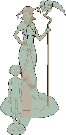 one last thing..that grinning fold looks a little weird with the placement of the lil dude in front. It seems as though his hand is causing the fabric to do that but he is too far forward for that to be possible. ------------- Poor Alice is dead. They cut off her head. But we'll be okay, didn't need her either way. |
Posted By: Solid Pixel
Date Posted: 22 December 2007 at 4:48am
|
Thanks for the advice Bisque. Minor update:
 Originally posted by Bisque Sure I will improve, gradually, but I will, regardless the colour scheme. An besides as long as they fit well together that is all that should really matter.So you're taking the easy route b/c you dont want to bother? I know palettes can be frustrating sometimes but if you don't atleast -attempt- ..you'll never learn or improve. Seriously though lets drop the subject.
Originally posted by Bisque She is a wee-bit bulgy in some areas. She's overweight, sort of. :)Her boobs and hips are both HUGE in comparison to the rest of her body. If its really that bothersome I guess I could reduce her body mass.
|
Posted By: Bisque
Date Posted: 22 December 2007 at 5:17am
|
Sure I will improve, gradually, but I will, regardless the colour scheme. An besides as long as they fit well together that is all that should really matter.
Seriously though lets drop the subject. Your choice. But you're posting to get critique and then refusing some very valid points that would help you improve -now- not later. Is that not the point of getting critique in the first place? :) "She is a wee-bit bulgy in some areas. She's overweight, sort of. :)" (quote function seems to be messing up on this second one here..dunno why) Okay so she's meant to look sort of pudgy? If that's the case then again her anatomy is wrong. There are certain areas of the body that weight will accumulate on first and although the hips are one of them, they will not get to that point w/o weight also being added around the ribs and back, arms etc. ----------- I'm not going to push anything on you... it is your piece and you're welcome to do with it as you will, but I think you could do better now if you wanted to. If you just wait for improvement to happen 'over time' sometimes it just..doesnt. :) g'luck ------------- Poor Alice is dead. They cut off her head. But we'll be okay, didn't need her either way. |
Posted By: Solid Pixel
Date Posted: 22 December 2007 at 5:25am
|
Originally posted by Bisque I never said I was refusing.. I just don't need help in the color department, if I did I would've mentioned it before or sometime after making this here thread.
Your choice. But you're posting to get critique and then refusing some very valid points that would help you improve -now- not later. Is that not the point of getting critique in the first place? :) My main concern overall is female anatomy and clothing wrinkles.
Originally posted by Bisque Gotcha. I'm on it. I'll use the reference pic you provided.There are certain areas of the body that weight will accumulate on first and although the hips are one of them, they will not get to that point w/o weight also being added around the ribs and back, arms etc. Originally posted by Bisque Luckily I'm a slow learner, so I'll manage. ;)If you just wait for improvement to happen 'over time' sometimes it just..doesnt. |
Posted By: NotSure
Date Posted: 22 December 2007 at 12:24pm
|
Do you realise you could put all these pictures into one animation and put it to music? "You put your left foot in. You put your left foot out. you put your left foot in and you shake it all about."
She is either in a standing pose (Screen left foot forward) or she is walking/stepping toward the camera (Screen right foot forward). If you need some help with the lower leg anatomy, just ask. It would take less time to quickly draw up thighs, calves ankles. Do not take the offer of help as an insult because I do not think I have seen anyone nail the feminine form in pixels as well as you have with this unfinished piece... you just seem to be a little scared to get to the knee and then go lower. Your original breast/waist/hip proportions were good. One thing that can save an artist is that all women hold weight differently. Most women add weight to the breasts first, and then either the hips or the stomach. So your woman added weight to her breasts and hips... lucky girl! Any more weight, and she will need a small stomach, a little more weight under her arm to show she has weight to her back (only a pixel at this size), and round shoulders. I do not know what speed people here work, but I would have expected more movement. You do need some tips on the screen right hand. It is an easy fix. The fingers need to have the fingertips move upward. The weight of her arm will be dragging on her hand. I was hoping you were going to fix the legs first. It is always best to get the main anatomy problems fixed before getting onto details like hands. |
Posted By: Solid Pixel
Date Posted: 22 December 2007 at 11:43pm
|
Originally posted by NotSure I need some help with this. :)If you need some help with the lower leg anatomy, just ask. Originally posted by NotSure Your absolutely right. I gotta make up my mind here.She is either in a standing pose (Screen left foot forward) or she is walking/stepping toward the camera (Screen right foot forward). Originally posted by NotSure I was afraid to draw'em because I thought I'd screw the whole peice over, but what the heck, I'll never know until I try. How about now, any better/ worse?It would take less time to quickly draw up thighs, calves ankles. Do not take the offer of help as an insult because I do not think I have seen anyone nail the feminine form in pixels as well as you have with this unfinished piece... you just seem to be a little scared to get to the knee and then go lower.  |
Posted By: Metaru
Date Posted: 22 December 2007 at 11:59pm
|
OT: Originally posted by NotSure I do not know what speed people here work, but I would have expected more movement. its like every one has its own pace. Comparision:  oh, and next time please, when you post a wip avoid using trans untill its fully necesary. it makes edits easier(remember that MSpaint, for example, replaces trans with pure black) ------------- I ate leel's babies |
Posted By: NotSure
Date Posted: 23 December 2007 at 12:55am
|
To me, her weight is neither here nor there. You seem to have the proportions pretty well worked out. You know where to add and subtract weight in this weight range. This includes breast size. Breasts can be any mixture of size, droopiness, angle, resting position on the chest, nipple position etc.
The inner thigh you have highlighted in red is a troubling spot. Especially at the weight the "red pen diet" has her. At lighter weights, there is a tendon that adds a concave curve in the inner groin area, before sloping to a long smooth convex curve. Weight and muscle also does not hang at the knee. Other than that she has great pins! Sorry for asking you to do this extra work, but you should be able to drape any material you want over them now. (even to cover up any flaws in her inner thigh area. Few people are perfect at everything, and disguising things is all too common. I was wondering if you were referring to me with your "trans" comment? I do not know what a trans is. The only joke I made was about the changing pose. Which is not a real problem if you see it as a hobby. If you want to take it further (and if you do not already, I would advise you think about doing this professionally if you can find a good paying job) all you need to do is to put the changes into roughs (rough drawings/sketches) before working on the perfect outline and anatomy. Working professionally is often about speed. Some professional illustrators make a living creating one image every four weeks, but they are outnumbered by illustrators who can create great works in a day or two. There are even a few great artists who can produce real works of art in half a day, but they are rare. It is a fact that I do not know how much time you are putting into this work. You could have spent three hours in total. |
Posted By: Metaru
Date Posted: 23 December 2007 at 1:20am
|
@not sure: Trans is like a short term for "Transparencies". and well, I was indeed refering to solid pixel. about this little thing of time... as you said, when as a hobby time isn't a relevant factor, unless its self imposed. as a paid job, you have a deadline, and missing it means no cash. both statements are valid, and almost a bit obvius, in my opinion. most of the pixel art posted on pixeljoint(lets say arround 75-80%) are non-comercial works made just for the artist pleasure, AKA as a hobby, so, if not for a challenge(wich has a strict deadline), a wip can take from 1 hour to months untill ready and complete. there is no hurry to finish it. the ironic part about your statement lies at the end. i found myself working on entries for challenges wich had one week to complete, and it only took me minutes to finish both pieces. -Back on topic: I find http://el-grimlock.deviantart.com/art/morrigan-10907302 - this work by my comrade M. Herrera a great reference to fix that troubling spot mentioned above by Notsure ------------- I ate leel's babies |
Posted By: Solid Pixel
Date Posted: 23 December 2007 at 2:57am
|
Originally posted by Metaru "Copy" the pic, don't "save picture as".it makes edits easier(remember that MSpaint, for example, replaces trans with pure black) Yet another update. Hopefully I checked off everything thats on your problem list. :)
If not, I'll fix the rest tomorrow.
 |
Posted By: Metaru
Date Posted: 23 December 2007 at 7:50am
|
much much nicer, yet still some problems persist. her old rigth hand was much more atracive through, but her new pose is simply brilliant :D. ------------- I ate leel's babies |
Posted By: Solid Pixel
Date Posted: 07 January 2008 at 6:05am
Still gnawing at this thing..
 |
Posted By: Hatch
Date Posted: 07 January 2008 at 6:51am
|
Looking great. The elder sorcerer's breasts seem to be unnaturally firm and pushed together, though. Doesn't seem like that scrap of cloth would provide much support ------------- |
Posted By: Solid Pixel
Date Posted: 08 January 2008 at 4:33am
Yet another measly attempt. :)
 |
Posted By: Omegavolt
Date Posted: 08 January 2008 at 8:52am
|
Loving the pose so far!
Looks like that bothersome left hand of hers is still a bit off. Right now it looks like theres a handle on the back of the skull and she is holding onto that handle.
Do you intend for her to palm the skull, like a basketball? Her fingers will need to wrap around if so and the tips of the fingers will need to bend inward to show she's applying pressure.
Or perhaps you just want her to hold the skull in her hand? Then her hand should be under the skull to resist the force of gravity.
Either way, its a great piece and I look forward to seeing it complete. :) ------------- http://www.ongamedev.com/ - OnGameDev |
Posted By: Solid Pixel
Date Posted: 10 January 2008 at 2:27am
|
Finally satisfied with the background, now onto shading.
If anything else looks out of proportion let me know, ok?
 Heading a bit off-topic; I recently updated "Timid drawing", renamed timid girl, and "Occupied Slime Trio". Both can be viewed in the gallery section.
Originally posted by Omegavolt Looks like that bothersome left hand of hers is still a bit off. Right now it looks like theres a handle on the back of the skull and she is holding onto that handle. She's stroking the skull, of course you woulden't have known this since I failed to mention that little piece of information earlier. :)
|
Posted By: leel
Date Posted: 10 January 2008 at 7:43am
|
the folds on her crotch thing are unnatural. Any reasonable fabric would just obey gravity and fall down in vertical folds, unless there was something getting in the way - causing other kinds of folds and bumps and things. There's nothing between her legs that cause a random diagonal fold. Once it hits the ground, you can play around with different shapes.
------------- |
Posted By: GeorgiePie
Date Posted: 10 January 2008 at 9:24am
|
Man the changes you make to your art is amazing sometimes, shes nothing like she was in the beginning!
I totally love where this is going btw.
Oh and it top wouldn't stay on like that, the open, holding from the sides makes more sence. ------------- |
Posted By: Solid Pixel
Date Posted: 11 January 2008 at 2:02am
|
Originally posted by leel Don't know how I overlooked that. Anything else amiss?There's nothing between her legs that cause a random diagonal fold. Originally posted by GeorgiePie Yeah, can't believe I made that many edits either, then again thats what improving is all about, right? :)Man the changes you make to your art is amazing sometimes, shes nothing like she was in the beginning! Update; fixed some minor issues, started shading.
 |
Posted By: Akira
Date Posted: 11 January 2008 at 3:46pm
|
You need to watch your anatomy. Her left shoulder needs to be pulled out a bit. Her right arm is stick thin in comparison with her left and the arm isn't shaped correctly. The knees are at different heights and the thighs are of different widths. The left side of the ribcage has no depth, making her appear flat. The transition from torso through to hips needs work.
I can see attempts at foreshortening but it isn't really working. The general structure of the pose is good but you have to build proper muscle and bone forms on top of the pose. Make use of references! This piece is very strong and you seem to be technically able, but the anatomy is really letting the piece down. Also I'm not sure of the anime head in the background, The girls face looks much more western influenced and it doesn't really fit. It isn't adding anything to the composition either. This post might sound quite negative but really I think it's a great piece, it could just be a little bit better :D If you need any help I could probably sketch up a quick edit. |
Posted By: Solid Pixel
Date Posted: 12 January 2008 at 1:11am
|
Originally posted by Akira You need to watch your anatomy. I created a ton of edits so I'm not really all that surprised they're still anatomy problems.
Plus in my defence I'm still fairly new at art. :)
Originally posted by Akira I'm not offended, more like greatly appreciative.This post might sound quite negative but really I think it's a great piece, it could just be a little bit better :D An I agree with ya, it could be much, much better. Originally posted by Akira Sure, go on right ahead.If you need any help I could probably sketch up a quick edit. Fixed some issues you (Akira) pointed out. I'd like to think I got'em all but that ain't gonna happen.. so tomorrow I'll finish whatever I missed.
 |
Posted By: Metaru
Date Posted: 12 January 2008 at 6:05am
|
Originally posted by leel There's nothing between her legs that cause a random diagonal fold. Originally posted by leel unless there was something getting in the way . . .  ------------- I ate leel's babies |