CHALLENGE 5/25/2009: Scenes from the Futu
Printed From: Pixel Joint
Category: Pixel Art
Forum Name: Collaborations/Challenges
Forum Discription: Submit pixel art project ideas/templates or contribute to an existing pixel art collaboration.
URL: https://pixeljoint.com/forum/forum_posts.asp?TID=8436
Printed Date: 02 May 2026 at 8:49pm
Topic: CHALLENGE 5/25/2009: Scenes from the Futu
Posted By: administrator
Subject: CHALLENGE 5/25/2009: Scenes from the Futu
Date Posted: 25 May 2009 at 4:07am
CHALLENGE: Scenes from the FutureYou are invited to revisit our http://pixeljoint.com/pixels/challenge_item.asp?id=1031 - Tales from the Future cyberpunk challenge and pixel a mock up game scene based on both the palette and the title theme from the 3 winners of that challenge. Canvas Size - Exactly 320 x 240. CHALLENGE RULES
CHALLENGE JUDGING
CHALLENGE PRIZES/GOODIES
CHALLENGE VOTING/pixels/poll.asp?id=1139' name='vote' target='_blank'>Vote now for your favorite pixelart in this week's challenge!CHALLENGE AWARDSThe Scenes from the Future pixel art challenge is complete and we have three new champions. This week's challenge awards go to the following pieces:/pixelart/43377.htm' target='_blank'>  Pixelblink - Failsafe by /p/3171.htm' target='_blank'>Adarias Pixelblink - Failsafe by /p/3171.htm' target='_blank'>Adarias/pixelart/43398.htm' target='_blank'>  scenes from the future challenge by /p/17109.htm' target='_blank'>ramazing scenes from the future challenge by /p/17109.htm' target='_blank'>ramazing/pixelart/43362.htm' target='_blank'>  Stickman Vs Tomic - HellDriver! by /p/9784.htm' target='_blank'>Stickman Stickman Vs Tomic - HellDriver! by /p/9784.htm' target='_blank'>StickmanThanks so much to all who took the time to vote and participate in the challenge! /pixelart/43385.htm' target='_blank'>  Failsafe!! by /p/18675.htm' target='_blank'>birkwood Failsafe!! by /p/18675.htm' target='_blank'>birkwood/pixelart/43420.htm' target='_blank'> Failsafe. by /p/11318.htm' target='_blank'>Reo/pixelart/43399.htm' target='_blank'> Scenes From the Future by /p/19479.htm' target='_blank'>TBox/pixelart/43430.htm' target='_blank'> Hell Driver screenshot by /p/21999.htm' target='_blank'>washburn/pixelart/43299.htm' target='_blank'> Future W PSP by /p/21798.htm' target='_blank'>jiipm/pixelart/43336.htm' target='_blank'> Mock up by /p/20053.htm' target='_blank'>RollerKingdom/pixelart/43396.htm' target='_blank'> Weekly Compeition. by /p/22185.htm' target='_blank'>arkan-ark/pixelart/43367.htm' target='_blank'> Outside lab 6 by /p/22334.htm' target='_blank'>zch/pixelart/43386.htm' target='_blank'> Future W by /p/21743.htm' target='_blank'>FrostedMayhem/pixelart/43323.htm' target='_blank'> Cyberpunk - Futureslug Heroes by /p/21881.htm' target='_blank'>robnoyce/pixelart/43417.htm' target='_blank'> Cyberpunk-man by /p/22091.htm' target='_blank'>Nika/pixelart/43329.htm' target='_blank'>
Failsafe by /p/17383.htm' target='_blank'>[Ryan_6666] |
Replies:
Posted By: arkan-ark
Date Posted: 25 May 2009 at 5:43am
|
cool! im doing the first one now :) future w ftw!!! ;D |
Posted By: CrazyPixel
Date Posted: 25 May 2009 at 5:48am
I'm using the Failsafe palette.
I've still got a load of line art to be done with, so I better get to it! 
|
Posted By: CrazyPixel
Date Posted: 25 May 2009 at 5:50am
| Oh, and also, I'm wondering wether to keep the palette on the scene or to get rid of it after. If I get rid of it I'll have to to more line art and colour because I'm doing it on Ms Paint. That means once I get rid of the palette I have a nice white blob in the corner of the picture. Meh. I think I'll leave it there. |
Posted By: r1k
Date Posted: 25 May 2009 at 6:32am
| just make the canvas size a little bit bigger than the actual image, making the part of the canvas not intended for the actual image a color not in the pallet and throw your pallet into that space. Just get rid of the extra space when your done. |
Posted By: Dhr. Bosch
Date Posted: 25 May 2009 at 8:05am
|
Originally posted by administrator pixel a mock up game scene ingame scene or is a splashscreen/openingscreen also okay? ------------- Vanitas, vanitatum omnia vanitas |
Posted By: greenraven
Date Posted: 25 May 2009 at 9:07am
|
It's funny, I was thinking Shadowrun long before I even read it. XD
-------------  "pwnage comes with patience, practice and planning." ~ Jalonso "pwnage comes with patience, practice and planning." ~ Jalonso 
|
Posted By: skamocore
Date Posted: 25 May 2009 at 1:09pm
|
Originally posted by Dhr. Bosch Originally posted by administrator pixel a mock up game scene ingame scene or is a splashscreen/openingscreen also okay? Ingame scene. We already have title screens... ------------- |
Posted By: RollerKingdom
Date Posted: 25 May 2009 at 1:25pm
|
So is it just based on a mock up by the given themes? can it be any style? like a gameboy scene |
Posted By: Pixelarg
Date Posted: 25 May 2009 at 3:59pm
|
i can't understand T_T anyone speak spanish? |
Posted By: RollerKingdom
Date Posted: 25 May 2009 at 4:37pm
|
SOrry Pixelarg, i only speak portuguese but i could try explaining: Yo creo que usted tienes que criar una cena para un dos tres themes, pero tienes que usar la paleta abajo.. LOL FAILZ xD |
Posted By: jalonso
Date Posted: 25 May 2009 at 6:37pm
|
No asi llo creo :/ Escojes uno de los tres titulares y entonces dibuja un 'screen' de ese juego con los colores asignados solamente. No agregar colores pero puedes quitar colores. El tema es el titular. *Titular = Title screen < made up word  Each palette is attached to its own title and you are only allowed to use that single palette. Fewer colours may be used but no more than are listed. Cada titulo tiene su uniquo color palette. Solo puedes usar el palette de ese titulo. Puedes uar menos colores pero no poner mas colores. You are encouraged to be original, whilst still invoking the spirit of cyberpunk classics such as http://www.mobygames.com/game/snes/shadowrun_ - Shadowrun , http://www.mobygames.com/game/syndicate - Syndicate , http://www.mobygames.com/game/beneath-a-steel-sky - Beneath a Steel Sky , and other purely awesome games from days of yore. Sea original pero toma inspiracion de clasicos juegos en estilo cyberpunk come los links ensenan. Remember that " http://en.wikipedia.org/wiki/Cyberpunk - cyberpunk " is the main theme here. Lo mas importante es el tema principal. phob ../files/icons/full/futurew.png"> Pixelblink ../files/icons/full/failsafe2.gif"> tomic ../files/icons/full/tomic_hell_driver.png"> ------------- |
Posted By: Pixelarg
Date Posted: 25 May 2009 at 7:34pm
|
really thanks jalonso and dusanvf (dusanvf send me a MP :)) and I have to make the game on the cover? or I can make a game that does not have to do with the cover but in cyberpunk style? edit: and is only one screen? :P |
Posted By: jalonso
Date Posted: 25 May 2009 at 8:13pm
|
I think you would make a screen that would fit the title, yes? Platformer, iso, top-down, whatever but thinking that's the title screen for the game. And yes just one screen an in-game screen. That's what I understand it to be anyhow. ------------- |
Posted By: Pixelarg
Date Posted: 25 May 2009 at 11:00pm
| oh! :P okey, be fun :) |
Posted By: darchangel
Date Posted: 26 May 2009 at 1:23am
|
*Titular = Title screen < made up word Not made up, titular = to title, you were close enough |

Posted By: RollerKingdom
Date Posted: 26 May 2009 at 3:19am
|
Originally posted by jalonso I think you would make a screen that would fit the title, yes? Platformer, iso, top-down, whatever but thinking that's the title screen for the game. And yes just one screen an in-game screen. That's what I understand it to be anyhow. Did you mean make a scene for one of the titles given? |
Posted By: Master-pt
Date Posted: 26 May 2009 at 4:12am
| Well, i thinking of trying to participate on this week challenge, using the Failsafe palette, let's see if i have time to work on this... cheers everyone! |
Posted By: darchangel
Date Posted: 26 May 2009 at 4:14am
|
The way I understood it is to make an ingame scene from one of the given titles...kind of like the Game Boy Challenge. |
Posted By: FrostedMayhem
Date Posted: 26 May 2009 at 9:51am
 Very early WIP
 The black swirls around the edge are suposed to be wires and the box and stuff there are stuff for the wires to go into to =) I planning to do the wires ect. in a seperate color to the main screen (if that makes any sense...) but I'm not sure whether I should do the wires in red and the background in blue or vise versa...
And I am using the Future W palette btw...
|
Posted By: darchangel
Date Posted: 26 May 2009 at 11:55am
|
I think you should do them in a darker blue and use the reds as light reflections...like maybe the wire that's cut off and hanging down could be shooting off red sparks. Maybe some red lights on the right corner box, then some red reflecting off the wires themselves...or even make a few parts of the wire reddish, like their plastic cover had been stripped off and what surges through the wire is red energy. |
Posted By: RollerKingdom
Date Posted: 26 May 2009 at 12:40pm
|
Originally posted by FrostedMayhem Very early WIP
The black swirls around the edge are suposed to be wires and the box and stuff there are stuff for the wires to go into to =) I planning to do the wires ect. in a seperate color to the main screen (if that makes any sense...) but I'm not sure whether I should do the wires in red and the background in blue or vise versa...
And I am using the Future W palette btw... Are you making like a location or a scene from the game? i think this is very confusing.. maybe should been explained better or given an example >_> |
Posted By: susuwataris
Date Posted: 26 May 2009 at 1:55pm
|
Originally posted by RollerKingdom
Originally posted by FrostedMayhem Are you making like a location or a scene from the game?i think this is very confusing.. maybe should been explained betteror given an example >_>Very early WIP
The black swirls around the edge are suposed to be wires and the box and stuff there are stuff for the wires to go into to =) I planning to do the wires ect. in a seperate color to the main screen (if that makes any sense...) but I'm not sure whether I should do the wires in red and the background in blue or vise versa...
And I am using the Future W palette btw... I don't think it's that confusing, to me it sems like a border, and the game will be inside. |
Posted By: RollerKingdom
Date Posted: 26 May 2009 at 2:28pm
|
Originally posted by susuwataris Originally posted by RollerKingdom
Originally posted by FrostedMayhem Are you making like a location or a scene from the game?i think this is very confusing.. maybe should been explained betteror given an example >_>Very early WIP
The black swirls around the edge are suposed to be wires and the box and stuff there are stuff for the wires to go into to =) I planning to do the wires ect. in a seperate color to the main screen (if that makes any sense...) but I'm not sure whether I should do the wires in red and the background in blue or vise versa...
And I am using the Future W palette btw... I don't think it's that confusing, to me it sems like a border, and the game will be inside. I didn't mean this is confusing i was talking about the theme given >:o |
Posted By: RollerKingdom
Date Posted: 26 May 2009 at 3:32pm
My sketch: It will be my first entry so im planning to do Failsafe on the scene upthere would be the character walking through wires and some dark color around it to give it a feeling of darkness.. If you guys could help me out id be glad to work through this week |
Posted By: Pixelarg
Date Posted: 26 May 2009 at 5:47pm
i make a lil gif wip :): like or not? :) |
Posted By: washburn
Date Posted: 26 May 2009 at 5:50pm
|
Hey pixel people! I'm forum illiterate.How can I upload a picture of my wip and attach it to a post? ------------- www.matwashburn.com |
Posted By: Dr D
Date Posted: 26 May 2009 at 5:52pm
|
@Pixelarg Uhh, is that related to the challenge? I'm not quite sure if that would end up being accepted under the challenge rules. Maybe you misunderstood (or I misunderstood). I believe you're supposed to create a game mock-up based on the title screen of one the 3 examples. Translator: Uhh, que está relacionado con el reto? No estoy muy seguro si es que terminan siendo aceptadas en el marco del desafío normas. Tal vez mal entendido (o he entendido mal). Creo que supone crear un modelo de juego basado en la pantalla de título de uno de los 3 ejemplos. @ wash Upload to a file hosting site such as Imageshack or Photobucket (if you use Photobucket, make sure you don't upload BMP files, they get converted to JPEG which is a huge quality loss.) Then use the links given and paste it here. (Imageshack will have a 'post in forum' section, and Photobucket will have an [IMG] tag section. Use those.) |
Posted By: Pixelarg
Date Posted: 26 May 2009 at 5:58pm
|
yes yes, i know, but i make the mockup in game and intro screen :) You like the gif? :) a and washburn: upload you image at www.imageshack.us and in the reply of this forum press this buttom:  , and paste the link :P , and paste the link :PEDIT: I used my wip to make only the "in game screen", style of the lil face of doom |
Posted By: jalonso
Date Posted: 26 May 2009 at 6:12pm
|
This week is gonna be tough guys. Its a retro inspired game screen, see the refs. washburn, I like tinypic.com. ------------- |
Posted By: washburn
Date Posted: 26 May 2009 at 6:20pm
 Thanks Dr D and Pixelarg! So I had to go with "HELL DRIVER". As soon as I saw the picture I wondered what his car looked like from the outside. So this is my interpretation of the car and the beginnings of some HUD stuff. ------------- www.matwashburn.com |
Posted By: RollerKingdom
Date Posted: 26 May 2009 at 7:07pm
| thats looking good washburn |
Posted By: susuwataris
Date Posted: 26 May 2009 at 7:55pm
| tough challenge, I'm not that much into mockups, but i'll join anyway <3 |
Posted By: RollerKingdom
Date Posted: 26 May 2009 at 8:21pm
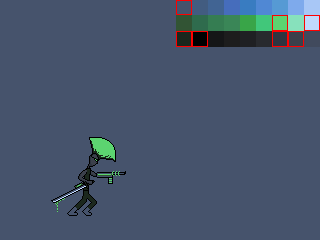
 DO you guys think this is looking as the main charcter from failsafe? i see there is a red stray but i am fixing it |
Posted By: jalonso
Date Posted: 26 May 2009 at 8:43pm
|
Originally posted by RollerKingdom I'm not seeing cyberpunk...at least yet. Originally posted by washburn Thanks Dr D and Pixelarg! So I had to go with "HELL DRIVER". As soon as I saw the picture I wondered what his car looked like from the outside. So this is my interpretation of the car and the beginnings of some HUD stuff. Damm!, onto Plan B ------------- |
Posted By: RollerKingdom
Date Posted: 27 May 2009 at 3:24am
|
Ugh I might give up this theme LOL, it'super hard and what is cyberpunk style O_o? I might try out something else >_< if that isn't cyberpunk style then i am doomed |
Posted By: darchangel
Date Posted: 27 May 2009 at 4:30am
|
Check the link to the cyberpunk wiki...better yet, here is a link to a list of cyberpunk games
http://en.wikipedia.org/wiki/List_of_cyberpunk_works#List_of_computer_and_video_games - http://en.wikipedia.org/wiki/List_of_cyberpunk_works#List_of_computer_and_video_games
Google images for said games to get a better idea.
|
Posted By: smk
Date Posted: 27 May 2009 at 5:12am
 Wip, dunno if I'll ever finish it ;S |
Posted By: Perkele
Date Posted: 27 May 2009 at 8:00am
Done with the sprite, I obviously chose Failsafe. Don't know whether I'll finish this, would be still a lot of work.. |
Posted By: jalonso
Date Posted: 27 May 2009 at 8:43am
|
At its simplest: cyberpunk = 20th century aesthetics with futuristic technology steampunk = futuristic easthetics with 19th century steam engine/rail technology ------------- |
Posted By: FrostedMayhem
Date Posted: 27 May 2009 at 10:30am
|
@ darchangel
Thanks =) I hadn't really thought about using different colours as light reflections (despite the fact that they are used like that in the title screen...) so I think I shall do it something like you said. Probably wont do the bit about the wire having their covers stripped off as that seems too confusing, though
|
Posted By: Perkele
Date Posted: 27 May 2009 at 10:47am
|
Okay, now I got it, thanks Jal. Nevertheless, I won't change the sprite, cause it was totally inspired by the title screen.. EDIT: A steampunk competition would still be more interesting  |
Posted By: RollerKingdom
Date Posted: 27 May 2009 at 11:25am
| i was doing a sprite like perkele.. but i guess i have a better idea! |
Posted By: washburn
Date Posted: 27 May 2009 at 4:22pm
|
When I think of Cyberpunk I think 80's Sci-Fi and sweet movies like Total Recall and Blade Runner. My favorite Cyberpunk game was Flashback:Quest for Identity. ------------- www.matwashburn.com |
Posted By: jalonso
Date Posted: 27 May 2009 at 5:35pm
|
I think cyberpunk WAS created in the 80s (Blade Runner being the first major movie using it.) Compys and technology was a new thing so the imagination went wild with its possibilities. I suppose this is exactly how steampunk was created too in the 1910s...don't remember exactly :p ------------- |
Posted By: Frost
Date Posted: 27 May 2009 at 6:01pm
|
It's a shame I don't have time to participate in this challenge 'cos I'm a big fan of cyberpunk. But i can give some tips on cyberpunk... If you don't have read William Gibson's "Neuromancer", do it! It is the cyberpunk novel. At least read the plot summary. Think, as it says on wikipedia, "high thec, low life" in a near and often dystopic future with big ass corporations more or less ruling. Low life hackers hooked on drugs and with cool implants like neurointerfaces (computer linkups to the central nerve system) and such. Blade runner is a pretty good visual representation of cyberpunk. Oh, almost forgot! Cyberspace is a big part of cyberpunk and I think that game scenes taking place in CS would be cool! Well, I should stop blabbering and make myself some pixel graphics and chip-music for the upcoming demoparty...  |
Posted By: Dr D
Date Posted: 27 May 2009 at 6:41pm
| Cyborgs. |
Posted By: Frost
Date Posted: 27 May 2009 at 7:27pm
|
Originally posted by Dr D Cyborgs. Cyborgs isn't so cyberpunk, more like post-cyberpunk. At least not as CP as Artificiall intelligences going half mad.  Oh, I totally forgot! The most important cyberpunk attribute is mirrorshades. No cyberpunk picture is complete without mirrored shades! This just reminded me that I have a couple of cyberpunk-pixels that I dont have uploded to PJ yet... have to fix that.  |
Posted By: jalonso
Date Posted: 27 May 2009 at 8:06pm
|
Still a little OT... The movie Brazil by Terry Gilliam is an awesome cyberpunk visual symphony. ------------- |
Posted By: RollerKingdom
Date Posted: 27 May 2009 at 8:33pm
 this is how is mine coming so far.. I know i am not an experienced pixel artist but id like to try out new things.. should i highlight the sprite with a lighter color ?? i would really like your opinion + the big black on the bottom ill be making something like status bar of the sprite. |
Posted By: Frost
Date Posted: 27 May 2009 at 8:44pm
|
Originally posted by RollerKingdom this is how is mine coming so far.. I know i am not an experienced pixel artist but id like to try out new things.. should i highlight the sprite with a lighter color ?? i would really like your opinion + the big black on the bottom ill be making something like status bar of the sprite. Yeah, you should highlight the sprite some to make it pop out a bit from the background. You should also try to make the sprite's stance a bit more dynamic. Now it looks a bit like it just stands there and wait fore something. You can also make the contour of the ground a bit lighter. I would like to se some badass punks with chains or something attacking the main character... |
Posted By: jiipm
Date Posted: 28 May 2009 at 1:54am
|
Originally posted by RollerKingdom this is how is mine coming so far.. I know i am not an experienced pixel artist but id like to try out new things.. should i highlight the sprite with a lighter color ?? i would really like your opinion + the big black on the bottom ill be making something like status bar of the sprite. I suggest to redo the legs for the sprite. The background could work as a brighter version with a lower contrast. The ground-part is too high for my taste. You should concentrate more on the upper part. and maybe the character should be in the center. Also add a point of interest to the scene, so it won't be just the character in a tunnel. Here is my piece for the contest: http://www.pixeljoint.com/pixelart/43299.htm#c241624 - http://www.pixeljoint.com/pixelart/43299.htm#c241624 |
Posted By: RollerKingdom
Date Posted: 28 May 2009 at 3:38am
|
@Frost - Alright ill update with your tips, and also i am planning to make a punk villain @Jiimp - Alright ill make the bkg a brighter version.. the groud is too high but on the bottom ill be adding a status bar with the main sprite face and enegery etc... I will the character on the center and give it a new pose Thank you for the suggestions.. Ill update it today.. |
Posted By: jiipm
Date Posted: 28 May 2009 at 3:44am
| Okay. Be sure to show us your WIP, if you want. |
Posted By: jalonso
Date Posted: 28 May 2009 at 10:03am
|
Sprite can be outlined with the lightest color too. I also think the legs need a rework. Thinner, more proportional or more cyborg. The BG can be more angular/straight edge this soft outline isn't very retro looking.
------------- |
Posted By: Lahra
Date Posted: 28 May 2009 at 10:45am
Thats my Cyperpunk :)

|
Posted By: Perkele
Date Posted: 28 May 2009 at 11:03am
|
I'll just explain Lahra the sense of the challenge. [german]Erst lesen, dann posten. Die Aufgabe ist es nicht einen "Cyberpunk" zu pixeln, sondern ein Mockup (Spielscreen) für eines der drei vorgegebenen Spiele zu kreieren (dabei nur die Palette benutzen). Das ganze sollte im Stile des "Cyberpunk" gehalten werden, der absolut nichts mit Punks am Hut hat.[/german] |
Posted By: jalonso
Date Posted: 28 May 2009 at 11:07am
|
tank-e-chain
------------- |
Posted By: RollerKingdom
Date Posted: 28 May 2009 at 12:07pm
|
Originally posted by jalonso Sprite can be outlined with the lightest color too. I also think the legs need a rework. Thinner, more proportional or more cyborg. The BG can be more angular/straight edge this soft outline isn't very retro looking. i am prob reworking the whole pose and making it different + what you mean on the bkg? that's like one thing i can struggle a lot too & ill make sure to keep posting my WIPs |
Posted By: Ergg
Date Posted: 28 May 2009 at 12:10pm
This is mine : It don't really looks as a game for the moment but it will evolved ^^. |
Posted By: Reo
Date Posted: 28 May 2009 at 1:43pm
| That looks ace so far Ergg! |
Posted By: God_Is_Evil
Date Posted: 28 May 2009 at 4:07pm
|
It's already looking good, it looks like a abe's odyssey screen. ------------- |
Posted By: Frost
Date Posted: 28 May 2009 at 5:15pm
| Ergg: That reminds me of both Flashback and Beneath a Steel Sky and that is a good thing. Keep it up! |
Posted By: washburn
Date Posted: 28 May 2009 at 7:17pm
|
Love that bg Ergg! Can't wait to see the characters! Thanks for the compliment RollerKingdom! Not sure if it's the right way,but when I shade my characters I like to imagine a light source above them.(the sun, or a spotlight.) So I use the brightest colors outlining the top,and the darkest outlining the bottom.That way you can see the character if they're standing in front of light or dark objects. ------------- www.matwashburn.com |
Posted By: washburn
Date Posted: 28 May 2009 at 7:23pm
|
Some baddies for Hell Driver.Going for an absurd dystopia.So far it's looking like Contra:Hard Corps and Earthworm Jim had a baby. ...a red and blue baby. 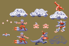 ------------- www.matwashburn.com |
Posted By: TBox
Date Posted: 29 May 2009 at 6:50am
I started making two pics and now I cant decide witch one to finish. Here are the WIPs :

and the other one 
Please, help. |
Posted By: monotov
Date Posted: 29 May 2009 at 11:48am
|
@Tbox; re-upload the firsth image http://img139.imageshack.us/img139/2093/fswip06:) cool menu |
Posted By: TBox
Date Posted: 29 May 2009 at 12:10pm
Here is first one again.

|
Posted By: FrostedMayhem
Date Posted: 29 May 2009 at 1:47pm
| Hmmm...I think you should do the first one (as aposed to the one with the menu thing...) simply because it looks more...game like. I dunno though xD |
Posted By: Dr D
Date Posted: 29 May 2009 at 2:21pm
|
Definitely the first one. It looks nicer, and more complete. Besides, the second is just a menu, not really what I would consider a game mock-up. |
Posted By: jalonso
Date Posted: 29 May 2009 at 2:23pm
|
Remember guys/gals you can enter more than one piece. Just give us quality over quantity. ------------- |
Posted By: jok
Date Posted: 31 May 2009 at 6:48am
|
Q: What does it mean for me (12AM Pacific) ? Now in poland is 15:40 (UTC+2:00), In other words how many time I have? ;) Or its to late?
|
Posted By: FrostedMayhem
Date Posted: 31 May 2009 at 7:05am
| I think it ends at the same time, whatever the time zone. Whatever time it says on the count-down timer thing for the weekly challenge is how long you've got left =) |
Posted By: jalonso
Date Posted: 31 May 2009 at 8:49am
|
The challenge runs based on California, USA(main server) time. When its midnight in the Western US the challenge closes. You may be in another zone but the time is the same. The forum and gallery have preferences that you set in your profiles that you can put your individual time zone. When you do this, the clock shown will be accurate for you. If you leave the default on then the time shown is US time. I'm pretty sure this is how it works. Whatever the case everyone gets exactly 7 days in challenges and wherever you are it closes at midnight.
------------- |
Posted By: jok
Date Posted: 31 May 2009 at 9:12am
| Ok, thanks :) |