| Active TopicsSearchRegisterLogin |
| Collaborations/Challenges | |
| |
  |
| Author | Message |
|
administrator
Admiral 
Joined: 03 March 2005 Online Status: Offline Posts: 0 |
  Topic: CHALLENGE 4/21/2008: Label It Topic: CHALLENGE 4/21/2008: Label ItPosted: 21 April 2008 at 12:08am |
CHALLENGE: Label ItPixel the label for a fictional beverage (Only the label itself not the bottle/can/container).Think about the product you are creating as well as who you are marketing it to. Create an original logo while refraining from using existing fonts. Rules:
CHALLENGE RULES
CHALLENGE JUDGING
CHALLENGE PRIZES/GOODIES
CHALLENGE VOTINGVote now for your favorite pixelart in this week's challenge!CHALLENGE AWARDSThe Label It pixel art challenge is complete and we have three new champions. This week's challenge awards go to the following pieces:Thanks so much to all who took the time to vote and participate in the challenge!  Tasty Milk by AshesTomato Juice by Oke Tasty Milk by AshesTomato Juice by OkeEdited by pixelblink - 21 April 2008 at 12:12am |
|
 IP Logged IP Logged |
|
|
Lazy Kat
Seaman 
Joined: 17 April 2008 Online Status: Offline Posts: 8 |
Posted: 21 April 2008 at 5:22am |
 --> -->  --> --> 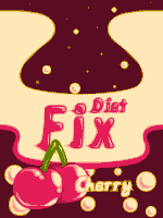 First time attempting a challenge; I think it will be fun. Anyone that drinks as much soda as I do can't envision missing this challenge. .. XD I have to think of a name for this darned soda. Final work (sort of... made a small edit after uploading but not that much) at the end. "This is definitely a cheap generic soda, the varnish used on the cans probably tastes more like cherries than the actual soda inside. But hey; what do you expect for $1.50 a 12-pack?" Edited by Lazy Kat - 21 April 2008 at 2:39pm |
|
|
IP Logged |
|
|
skamocore
Admiral
Joined: 07 April 2021 Online Status: Offline Posts: 3866 |
Posted: 21 April 2008 at 11:50am |
|
OK guys...I'm a bit stuck...any ideas
 |
|
|
IP Logged |
|
|
Blick
Commander 
Joined: 21 June 2014 Online Status: Offline Posts: 389 |
Posted: 21 April 2008 at 1:31pm |
  Edited by Blick - 21 April 2008 at 6:39pm |
|

|
|
|
IP Logged |
|
|
taquito143
Seaman
Joined: 09 April 2008 Online Status: Offline Posts: 36 |
Posted: 21 April 2008 at 4:43pm |
|
emmm... mexico fizz ?
jeje no alcohol drink  |
|
|
IP Logged |
|
|
Jaeden
Seaman
Joined: 16 October 2021 Online Status: Offline Posts: 18 |
Posted: 21 April 2008 at 6:12pm |
|
barcode can fill some empty space and give authenticity... otherwise, its a pretty witty piece. My husband got a good laugh out of it. |
|
|
IP Logged |
|
|
JerryPie
Rear Admiral 
Joined: 01 October 2024 Online Status: Offline Posts: 232 |
Posted: 22 April 2008 at 3:18am |
 |
|
|
IP Logged |
|
|
de Thch
Midshipman 
Joined: 24 May 2005 Location: Italy Online Status: Offline Posts: 52 |
Posted: 22 April 2008 at 4:39am |
|
Hello,
I would want to have still an explanation,
what means "No existing fonts allowed"
Sorry, my bad English, often puts me in difficulty.  |
|
|
IP Logged |
|
|
JerryPie
Rear Admiral
Joined: 01 October 2024 Online Status: Offline Posts: 232 |
Posted: 22 April 2008 at 4:48am |
|
This means, you have to create you're own Font.
Font is: ABCDEFG ABCDEFG ABCDEFG ABCDEFG You have to make your own. Draw your own letters. Does this help?  |
|
|
IP Logged |
|
|
de Thch
Midshipman
Joined: 24 May 2005 Location: Italy Online Status: Offline Posts: 52 |
Posted: 22 April 2008 at 4:53am |
|
Thanks I have understood, I must realize the font that I use.
Can iI nsert the text in various language from English?
|
|
|
IP Logged |
|
|
JerryPie
Rear Admiral
Joined: 01 October 2024 Online Status: Offline Posts: 232 |
Posted: 22 April 2008 at 4:56am |
|
You can write in English. Yes.
You can not use text from the computer. |
|
|
IP Logged |
|
|
Jaeden
Seaman
Joined: 16 October 2021 Online Status: Offline Posts: 18 |
Posted: 22 April 2008 at 7:05am |
|
Originally posted by FlyGuy
Good luck cropping this to the size restrictions. Its awesome both my husband and I got a good laugh out of this.
|
|
|
IP Logged |
|
|
bunnyRAGE
Seaman
Joined: 30 November 2007 Online Status: Offline Posts: 3 |
Posted: 22 April 2008 at 10:31am |
 WIP. I just don't know what else to put onto it |
|
|
IP Logged |
|
|
Taikon
Seaman
Joined: 31 March 2008 Online Status: Offline Posts: 11 |
Posted: 22 April 2008 at 10:46am |
|
Nvm, not going to join in this one.
Edited by Taikon - 25 April 2008 at 6:00pm |
|
|
IP Logged |
|
|
cure
Commander
Joined: 23 March 2022 Online Status: Offline Posts: 2859 |
Posted: 22 April 2008 at 11:22am |
|
Actually, by existing fonts, it means you shouldn't use, say, the distinctive coca-cola font, as if it were a parody. Pixelling your own font goes without saying, of course.
Edited by ThereIsNoCure - 22 April 2008 at 11:24am |
|
|
IP Logged |
|
|
jbnd05
Seaman
Joined: 29 March 2007 Online Status: Offline Posts: 1 |
Posted: 22 April 2008 at 12:58pm |
|
Ok so this is the first challenge I'm trying.
This WIP label is intended for a tall bottle of a lemon drink. 
Does anyone have any opinions? |
|
|
IP Logged |
|
|
JerryPie
Rear Admiral
Joined: 01 October 2024 Online Status: Offline Posts: 232 |
Posted: 22 April 2008 at 2:48pm |
|
Originally posted by Jaeden [Quote] Good luck cropping this to the size restrictions. Its awesome both my husband and I got a good laugh out of this. wow im an idiot..i will fix this |
|
|
IP Logged |
|
|
soda
Commander
Joined: 19 May 2007 Online Status: Offline Posts: 224 |
Posted: 22 April 2008 at 3:47pm |
|
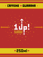
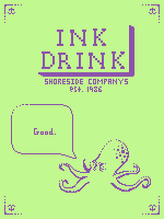
DRINK INK!

|
|

|
|
|
IP Logged |
|
|
ZxC
Seaman
Joined: 07 September 2006 Online Status: Offline Posts: 5 |
Posted: 22 April 2008 at 6:18pm |
|
IP Logged |
|
|
JerryPie
Rear Admiral
Joined: 01 October 2024 Online Status: Offline Posts: 232 |
Posted: 22 April 2008 at 7:14pm |
|
Originally posted by ZxC Originally posted by FlyGuy Oasis juice already exists http://www.oasishealthbreak.com/ actually no not "oasis juice" Juice is part of the name, as in Juicy Juice. Thanks for informing me of that though. I don't think that should be an issue though, because the name is just one I thought of and it doesn't match any current marketed product. |
|
|
IP Logged |
|
|
taquito143
Seaman
Joined: 09 April 2008 Online Status: Offline Posts: 36 |
Posted: 22 April 2008 at 8:43pm |
 Sorry by twice Post Sorry by twice Post I want to tell you that I was forced to remove the picture of PJ, because the idea of "fizz" was used ¬ ¬ (there are people who do not read the forum) Because of this, I had to make another picture. Want CRITICAL TO RESPECT. THANKS New Picture Edited by taquito143 - 22 April 2008 at 8:47pm |
|
|
IP Logged |
|
|
pixelblink
Commander
Joined: 19 February 2023 Online Status: Offline Posts: 2865 |
Posted: 22 April 2008 at 11:07pm |
|
Taquito: it was not sent back because of the word "fizz" - there's nothing wrong with that word at all. It was sent back because you need to spend more time on your pieces before submitting them... same as this current one.
|
|
|
IP Logged |
|
|
JerryPie
Rear Admiral
Joined: 01 October 2024 Online Status: Offline Posts: 232 |
Posted: 23 April 2008 at 1:56am |
 update. Shrunk the image to challenge size (150x200) because im a moron and didn't notice that in the first place. Also removed the amateur red bubble around the 100% bong juice. Crits please! |
|
|
IP Logged |
|
|
Setzer
Commander
Joined: 18 December 2016 Location: United States Online Status: Offline Posts: 780 |
Posted: 23 April 2008 at 9:35am |
 quick sketch, I know i wont get this one done :( I've wanted to practice text/logos for awhile now so maybe i'll work some of it. Edited by Setzer - 23 April 2008 at 9:40am |
|

|
|
|
IP Logged |
|
|
taquito143
Seaman
Joined: 09 April 2008 Online Status: Offline Posts: 36 |
Posted: 23 April 2008 at 1:45pm |
|
mi nueva "label" quiero que comenten esta foto a ver que falta asi la posteo ... va a ser definitiva esta, por eso necesitaria la mayor ayuda de su parte, asi queda linda :D
 EDIT 8 : In my previous image, not shelved by what I said pixelblink, but that another had already used that word .. and I do not want to "copy" to anybody. Because of this I rush to do another label, but also fails, is still trying to now put this in the forum before Post, so you tell me who is missing, and things relating to the .. so I can improve 100% and then post Edited by taquito143 - 23 April 2008 at 1:51pm |
|
|
IP Logged |
|
|
soda
Commander
Joined: 19 May 2007 Online Status: Offline Posts: 224 |
Posted: 23 April 2008 at 5:08pm |
|
I'm done. The font seems a little outa place though.
|
|
|
|
|
|
IP Logged |
|
|
JerryPie
Rear Admiral
Joined: 01 October 2024 Online Status: Offline Posts: 232 |
Posted: 23 April 2008 at 5:45pm |
|
Soda - I really love your style of art dude. I don't know why, it seems so vintage.
Edited by FlyGuy - 23 April 2008 at 5:45pm |
|
|
IP Logged |
|
|
Larwick
Commander
Joined: 18 July 2024 Online Status: Offline Posts: 4015 |
Posted: 23 April 2008 at 6:57pm |
 |
|
 
|
|
|
IP Logged |
|
|
tw1tchy
Seaman
Joined: 23 April 2008 Location: Australia Online Status: Offline Posts: 1 |
Posted: 23 April 2008 at 7:06pm |
|
Hmm, I might enter this comp :P
It IS my first one here but not my 1st comp! I thought i registered here before...  Anyway, my idea is "Fuzzy Fizz" and its coming along nicely. You will see a lot more of me at this place :) |
|
|
IP Logged |
|
|
taquito143
Seaman
Joined: 09 April 2008 Online Status: Offline Posts: 36 |
Posted: 23 April 2008 at 8:13pm |
|
OoooooHHHhhh Larwick..
That is incredible.. Look at my label and make a criticism of the connection, I need! |
|
|
IP Logged |
|
|
Jaeden
Seaman
Joined: 16 October 2021 Online Status: Offline Posts: 18 |
Posted: 24 April 2008 at 9:28am |
|
Question :
Are we allowed to reference fonts to come up with a design of our own? Id like to do a vintage european type font, or perhaphs italian with alot of scroll work and Id like to use a reference....
Lemme know ^_^
|
|
|
IP Logged |
|
|
Reo
Rear Admiral
Joined: 07 April 2021 Online Status: Offline Posts: 679 |
Posted: 24 April 2008 at 9:48am |
|
You have won my heart Larwick!
...again! |
|
|
IP Logged |
|
|
Larwick
Commander
Joined: 18 July 2024 Online Status: Offline Posts: 4015 |
Posted: 24 April 2008 at 10:49am |
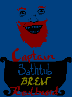
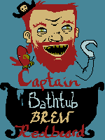
 Thanks guys. Crits? @Jaeden, i imagine that's okay. If you reference it really heavily though i'd suggest linking to the font in the submissions' description to avoid confusion. :) EDIT:  WIP ANIMATION Edited by Larwick - 24 April 2008 at 11:58am |
|
|
|
|
|
IP Logged |
|
|
Jaeden
Seaman
Joined: 16 October 2021 Online Status: Offline Posts: 18 |
Posted: 24 April 2008 at 12:56pm |
|
EDIT: WIP ANIMATION [/QUOTE] I liked the green font more for 'crunchy soda' the aa of the orange font (the red) looks funky on my moniter and out of place. however, if you were trying to cut down on your color count i can see why you did that.
it looked like a soda label befor, now it reminds me of poprocks :-D
|
|
|
IP Logged |
|
|
Reo
Rear Admiral
Joined: 07 April 2021 Online Status: Offline Posts: 679 |
Posted: 24 April 2008 at 1:47pm |
|
I agree with Jaeden green font FTW!
|
|
|
IP Logged |
|
|
Larwick
Commander
Joined: 18 July 2024 Online Status: Offline Posts: 4015 |
Posted: 24 April 2008 at 2:09pm |
|
Thanks! I'm having problems with choosing the right colours for the right stuff on this pic, as you can notice from the WIP anim. I'll stick with green for the mo then. Every now and then i suddenly feel like an older palette is better and so change it then change it back and blah blah blah.
@Blick, f**king love that. |
|
|
|
|
|
IP Logged |
|
|
Jaeden
Seaman
Joined: 16 October 2021 Online Status: Offline Posts: 18 |
Posted: 24 April 2008 at 2:18pm |
|
Ive done that about 10-15 times myself already. Im ALMOST done though if I can find happiness with my antialiasing.
Id share mine but.. I think it would kill the comedic impact.
from the moment i saw 'label' something somewhat gross came to mind. I hope ya'll end up liking it lol
|
|
|
IP Logged |
|
|
Nora
Seaman
Joined: 08 March 2008 Online Status: Offline Posts: 7 |
Posted: 25 April 2008 at 11:35am |
 Based on the 'new' clip from Tyga ft. Travis McCoy - Coconut Juice I don't know if that is against the rules, but I'll finish it anyway. I kinda need help on the background, it's way too dull. Edited by Nora - 25 April 2008 at 11:40am |
|
|
So you can go shave your back now.
|
|
|
IP Logged |
|
|
JerryPie
Rear Admiral
Joined: 01 October 2024 Online Status: Offline Posts: 232 |
Posted: 25 April 2008 at 5:26pm |
|
Originally posted by Nora Based on the 'new' clip from Tyga ft. Travis McCoy - Coconut Juice I don't know if that is against the rules, but I'll finish it anyway. I kinda need help on the background, it's way too dull. Cool man. I love the beach, so you won my heart with this one. I suggest some very faint outlines of palm trees maybe. or super faint mountains, using a very light shade of blue, only slightly darker than the blue you have here. What you should do is adjust the color of the sky and sand. They are WAY to bright. It is important that you make the actual coconut and writing stand out. They need to be the center of attention. So dim down the sand and sky, try to add a couple silhouettes of some palm trees or something. Cool job so far |
|
|
IP Logged |
|
| |
||
Forum Jump |
You cannot post new topics in this forum You cannot reply to topics in this forum You cannot delete your posts in this forum You cannot edit your posts in this forum You cannot create polls in this forum You cannot vote in polls in this forum |
|
 Crunchy Soda
 Yellow Snow
 Oasis Juice