| Active TopicsSearchRegisterLogin |
| Collaborations/Challenges | |
| |
  |
| Page of 2 Next >> |
| Author | Message |
|
administrator
Admiral 
Joined: 03 March 2005 Online Status: Offline Posts: 0 |
  Topic: CHALLENGE 1/19/2009: Old. Topic: CHALLENGE 1/19/2009: Old.Posted: 19 January 2009 at 12:02am |
CHALLENGE: Old.The one and only Lollige challenges you to draw something old of your liking (old people, old technology, old buildings, etc...), using just black, white and one other color of your choice.Canvas Size- Exactly 100x100. Colors - Exactly 3. One black (#000000), one white (#ffffff), and one of your choice. Animation - Optional. Transparency - No. CHALLENGE RULES
CHALLENGE JUDGING
CHALLENGE PRIZES/GOODIES
CHALLENGE VOTINGVote now for your favorite pixelart in this week's challenge!CHALLENGE AWARDSThe Old. pixel art challenge is complete and we have three new champions. This week's challenge awards go to the following pieces:Thanks so much to all who took the time to vote and participate in the challenge!  Small dino by ElwinIronbreaker by AdamWhale - Old by GuiZ Small dino by ElwinIronbreaker by AdamWhale - Old by GuiZ |
|
 IP Logged IP Logged |
|
|
Savaril
Midshipman 
Joined: 03 November 2008 Location: Canada Online Status: Offline Posts: 19 |
Posted: 19 January 2009 at 2:49am |
 WIP of a pocket watch. |
|
|
~ tilde ~
|
|
|
IP Logged |
|
|
NotlikeTheOther
Midshipman
Joined: 18 November 2008 Location: United States Online Status: Offline Posts: 70 |
Posted: 19 January 2009 at 8:49am |
|
I like this idea, and your color choice.
My only critique is that some of your eddges on the watch seem a little fuzzy to me.
|
|
|
IP Logged |
|
|
Tapiokaman
Seaman 
Joined: 19 January 2009 Location: France Online Status: Offline Posts: 1 |
Posted: 19 January 2009 at 10:14am |
|
So, if I've understood, I post my work here?

Here it is, sorry if it's not the good place to post, I'm French and don't understand everything >< Edited by Tapiokaman - 19 January 2009 at 10:17am |
|

|
|
|
IP Logged |
|
|
minipuck
Commander 
Joined: 23 August 2008 Online Status: Offline Posts: 185 |
Posted: 19 January 2009 at 10:57am |
|
it's the perfect place! but if its finished you still have to upload it to the gallery!
It looks really cool, way better then my entry T.T |
|

please click it, otherwise it will die, and it seems special. |
|
|
IP Logged |
|
|
RobbieE
Seaman
Joined: 21 August 2007 Online Status: Offline Posts: 8 |
Posted: 19 January 2009 at 9:45pm |
 You'll have to forgive me for two things. First not being able to control my urge to make a your mum joke and secondly for my terrible attempt at wordplay. edit: Also this is my first ever time attempting to AA, which was a bit of a challenge with just one extra shade. Edit2: More seriously here's my initial sketchy line-art thingy.  Ref. http://en.wikipedia.org/wiki/Sacred_Heart_Cathedral,_Bendigo Edited by RobbieE - 20 January 2009 at 12:23am |
|
|
IP Logged |
|
|
pigus123
Midshipman
Joined: 28 June 2017 Online Status: Offline Posts: 20 |
Posted: 20 January 2009 at 9:45am |
|
WIP
it's "korbash" ? i don't know what is the name of this weapon in english >_< i'm thinking about this >> http://upload.wikimedia.org/wikipedia/commons/thumb/2/2a/Rincak.jpg/180px-Rincak.jpg  i have no idea for bkg and how to end this "ball" :) argh >_< i have thesame colors as Savaril anyway please comments :) PS: sorry for my bad english, i'm from poland, and my engglish teacher sux :P |
|
|
IP Logged |
|
|
jeremy
Rear Admiral 
Joined: 25 November 2024 Location: New Zealand Online Status: Offline Posts: 1704 |
Posted: 20 January 2009 at 12:09pm |
|
I think the word you're going for is "flail" and it's looking good
 I think you could probably reuse the brown on the ball. Perhaps for a background you could do something abstract, or have an arm holding it or something. I think you could probably reuse the brown on the ball. Perhaps for a background you could do something abstract, or have an arm holding it or something.
|
|
|
IP Logged |
|
|
Igor K.
Seaman
Joined: 04 November 2016 Online Status: Offline Posts: 28 |
Posted: 20 January 2009 at 1:53pm |
 gonna animate this, any suggestion? Edited by Igor K. - 20 January 2009 at 1:53pm |
|
|
IP Logged |
|
|
jeremy
Rear Admiral
Joined: 25 November 2024 Location: New Zealand Online Status: Offline Posts: 1704 |
Posted: 20 January 2009 at 4:19pm |
|
You know you aren't allowed transparency, right?
|
|
|
IP Logged |
|
|
Igor K.
Seaman
Joined: 04 November 2016 Online Status: Offline Posts: 28 |
Posted: 20 January 2009 at 4:25pm |
|
I know, wanted only to show the train, have more thinks
|
|
|
IP Logged |
|
|
blue
Midshipman
Joined: 08 June 2005 Location: United States Online Status: Offline Posts: 67 |
Posted: 20 January 2009 at 5:19pm |
 It might be done...dunno...I'll sit on it for a bit. >.> Old penny! Reference Edited by blue - 20 January 2009 at 5:43pm |
|
|
IP Logged |
|
|
RollerKingdom
Commander
Joined: 11 January 2009 Online Status: Offline Posts: 388 |
Posted: 20 January 2009 at 6:04pm |
|
I decided to create an old phone
but i am having trouble on the top part.. anyone with tips? and this is my first time entrying and creating something like this..  |
|
|
IP Logged |
|
|
jeremy
Rear Admiral
Joined: 25 November 2024 Location: New Zealand Online Status: Offline Posts: 1704 |
Posted: 20 January 2009 at 6:15pm |
|
These all look great
 (Everyone's using a similar third colour though T_T) (Everyone's using a similar third colour though T_T)
Igor, I'd say that you'll probably have to do a b/w outline to show definition from the bg.
Here's mine:
Edited by Jeremy - 20 January 2009 at 6:15pm |
|
|
IP Logged |
|
|
Igor K.
Seaman
Joined: 04 November 2016 Online Status: Offline Posts: 28 |
Posted: 20 January 2009 at 6:18pm |
|
perfect, but you should put other color like brown.
|
|
|
IP Logged |
|
|
blue
Midshipman
Joined: 08 June 2005 Location: United States Online Status: Offline Posts: 67 |
Posted: 20 January 2009 at 6:37pm |
|
I think the similar color is due to the theme...old things seem frequently to be brown, or other 'neutral' colors, worn by age...
|
|
|
IP Logged |
|
|
jeremy
Rear Admiral
Joined: 25 November 2024 Location: New Zealand Online Status: Offline Posts: 1704 |
Posted: 20 January 2009 at 9:07pm |
|
@Igor: I did try several diiferent colours, I think that the blue (Surprisingly) is the second best.
Woo, popart pixel
 |
|
|
IP Logged |
|
|
kwigbo
Commander
Joined: 18 February 2021 Online Status: Offline Posts: 346 |
Posted: 20 January 2009 at 9:26pm |

|
|
|
IP Logged |
|
|
r1k
Commander
Joined: 01 April 2014 Online Status: Offline Posts: 336 |
Posted: 20 January 2009 at 9:37pm |
|
What's older than the earth?
the sun?  (not a real entry, doesnt meet color requirments anyway) |
|
|
IP Logged |
|
|
skamocore
Admiral
Joined: 07 April 2021 Online Status: Offline Posts: 3866 |
Posted: 20 January 2009 at 9:44pm |
|
WHAT ABOUT THE BIG BANG!11 :O
 (not a real entry, because it is far too awesome for this challenge :3) |
|
|
IP Logged |
|
|
ProgZmax
Seaman
Joined: 23 February 2008 Online Status: Offline Posts: 12 |
Posted: 21 January 2009 at 12:53am |
|
A Jeep carries a family around an old, deserted mountain pass...but to where?
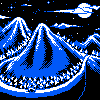 Sorry for the lack of originality, but this was the best I could think of at 12 am. I'll work on it some more if I have time :). The third color was taken from the NES palette since I've been using it lately and I thought it fit the scene well. |
|
|
IP Logged |
|
|
Igor K.
Seaman
Joined: 04 November 2016 Online Status: Offline Posts: 28 |
Posted: 21 January 2009 at 5:02am |
|
I liked the brown :D
|
|
|
IP Logged |
|
|
RollerKingdom
Commander
Joined: 11 January 2009 Online Status: Offline Posts: 388 |
Posted: 21 January 2009 at 12:55pm |
|
Originally posted by RollerKingdom I decided to create an old phone but i am having trouble on the top part.. anyone with tips? and this is my first time entrying and creating something like this.. can anyone help me out with the top part of the telephone? |
|
|
IP Logged |
|
|
RobbieE
Seaman
Joined: 21 August 2007 Online Status: Offline Posts: 8 |
Posted: 21 January 2009 at 1:45pm |
|
Neeearly finished.
 |
|
|
IP Logged |
|
|
RollerKingdom
Commander
Joined: 11 January 2009 Online Status: Offline Posts: 388 |
Posted: 21 January 2009 at 9:08pm |
|
updated:
 |
|
|
IP Logged |
|
|
ProgZmax
Seaman
Joined: 23 February 2008 Online Status: Offline Posts: 12 |
Posted: 21 January 2009 at 10:06pm |
|
Did some more work to it, mainly cleaning up some dithering, adding some trees around the bottom of the mountain and a nice lake. I think I'm pretty much done with this, and the most important part was I had fun working on it :).
 I also made a quick animated car version.
 Edited by ProgZmax - 21 January 2009 at 11:14pm |
|
|
IP Logged |
|
|
Bwian
Seaman
Joined: 24 March 2008 Online Status: Offline Posts: 31 |
Posted: 21 January 2009 at 10:22pm |
|
This started as a work in progress
I was really annoyed by my over-use of dithering then, after a while, it reminded me of old b&w prints that specifically abused of dithering and I got to like it The composition is also a bit typical, especially with the cheesy candle lol But for a first submission, I'm happy with it, so I'll go with this one. I hope I submitted it well, it's still waiting for approval, we'll see.  Although I'm submitting it, I would be very happy to hear your comments about it so that I won't do the same mistakes twice :) thanks |
|
|
IP Logged |
|
|
ProgZmax
Seaman
Joined: 23 February 2008 Online Status: Offline Posts: 12 |
Posted: 21 January 2009 at 11:19pm |
|
The only thing I would recommend is to make better use of your third color. Right now you have a color that is only used on the paper and doesn't contrast very much from the other colors. If you picked a different shade, something more yellow/orange, you could then use that color to shade the candle and serve as a midtone between the white and the black, reducing your need to dither so much. I still think it looks quite good, though!
|
|
|
IP Logged |
|
|
Bwian
Seaman
Joined: 24 March 2008 Online Status: Offline Posts: 31 |
Posted: 21 January 2009 at 11:47pm |
|
Originally posted by ProgZmax
The only thing I would recommend is to make better use of your third color. Right now you have a color that is only used on the paper and doesn't contrast very much from the other colors. If you picked a different shade, something more yellow/orange, you could then use that color to shade the candle and serve as a midtone between the white and the black, reducing your need to dither so much. I still think it looks quite good, though! Thanks, that's a good comment
I was kind of thinking the same thing
|
|
|
IP Logged |
|
|
Spirou
Seaman
Joined: 21 January 2009 Online Status: Offline Posts: 29 |
Posted: 22 January 2009 at 6:52am |
|
EDIT new
 FInish FInish Edited by Spirou - 22 January 2009 at 7:22am |
|
|
IP Logged |
|
|
mechast
Seaman
Joined: 06 August 2006 Online Status: Offline Posts: 26 |
Posted: 22 January 2009 at 10:28am |
|
WIP
What do you think? What should I improve?  |
|
|
IP Logged |
|
|
Hysteria
Seaman
Joined: 18 January 2009 Online Status: Offline Posts: 9 |
Posted: 22 January 2009 at 11:04am |
|
If thats a piano... i think that every key should be black and white
Edited by Hysteria - 22 January 2009 at 11:05am |
|
|
IP Logged |
|
|
mechast
Seaman
Joined: 06 August 2006 Online Status: Offline Posts: 26 |
Posted: 22 January 2009 at 11:59am |
|
Originally posted by Hysteria If thats a piano... i think that every key should be black and white That's a piano yes. This is all about luminosity, not colour. Look how the light scatters. The brownish colour is brownish because, it gives the picture a good ambience. It could be a dull grey colour. And anyways it could be a broken old piano. Edited by mechast - 22 January 2009 at 12:01pm |
|
|
IP Logged |
|
|
Hysteria
Seaman
Joined: 18 January 2009 Online Status: Offline Posts: 9 |
Posted: 22 January 2009 at 12:30pm |
|
Yeah i know that u worked there with the room luminosity, but it was hard to tell, at least for me, that it was a piano, first i thought it was a bed :P... but then i saw the chair and I figured it out.
|
|
|
IP Logged |
|
|
jeremy
Rear Admiral
Joined: 25 November 2024 Location: New Zealand Online Status: Offline Posts: 1704 |
Posted: 22 January 2009 at 3:09pm |
|
I immediately IDed it as a piano 
|
|
|
IP Logged |
|
|
ProgZmax
Seaman
Joined: 23 February 2008 Online Status: Offline Posts: 12 |
Posted: 22 January 2009 at 3:16pm |
|
awesome! :D
|
|
|
IP Logged |
|
|
Hapiel
Rear Admiral
Joined: 30 June 2023 Online Status: Offline Posts: 3266 |
Posted: 22 January 2009 at 3:44pm |
|
I find the piano very readable and nice!
What to improve? The door looks messy The wallpaper looks great, so does the floor! |
|
|
IP Logged |
|
|
mechast
Seaman
Joined: 06 August 2006 Online Status: Offline Posts: 26 |
Posted: 22 January 2009 at 4:38pm |
|
And how does the door look messy? Sorry, maybe I just got used to how it looks. It was intended to be so rough. Maybe it shouldn't be that much uneven? Or the shading on the lower part is messy? Thanx for the help!
 |
|
|
IP Logged |
|
|
jeremy
Rear Admiral
Joined: 25 November 2024 Location: New Zealand Online Status: Offline Posts: 1704 |
Posted: 22 January 2009 at 4:44pm |
|
Posted an explanation on your WIP thread

|
|
|
IP Logged |
|
|
BluePixel
Seaman
Joined: 16 January 2009 Online Status: Offline Posts: 2 |
Posted: 22 January 2009 at 6:30pm |

Meh.
|
|
|
IP Logged |
|
|
006
Seaman
Joined: 05 October 2008 Online Status: Offline Posts: 3 |
Posted: 22 January 2009 at 6:48pm |
|
Here's my suck-y wip of the challenge, its an old forest path way. Its pretty bad, I just hope I'll be able to finish it by tomorrow.
 |
|
|
IP Logged |
|
|
metaldev
Seaman
Joined: 25 August 2020 Location: United States Online Status: Offline Posts: 14 |
Posted: 23 January 2009 at 7:42am |
|
Igor K. :
ha i was going to make the same exact subject, but i settled on an old man instead. here are my suggestions: make the smoke go in the other direction from this vantage point it would be easy to animate a 3d scrolling clouds and ground too (and the steam of course too) if you swap some of the dithering for solid lines it might feel more like a shiny steam engine (i think there's too much dithering) Edited by metaldev - 23 January 2009 at 7:43am |
|
|
IP Logged |
|
|
RA/pdx
Seaman
Joined: 02 September 2023 Online Status: Offline Posts: 2 |
Posted: 23 January 2009 at 9:07am |
|
So this is my final entry - no more time the next two days for further improvements.
Edited by RA/pdx - 23 January 2009 at 9:24am |
|
|
IP Logged |
|
|
Spirou
Seaman
Joined: 21 January 2009 Online Status: Offline Posts: 29 |
Posted: 24 January 2009 at 9:06am |

|
|
|
IP Logged |
|
|
tuaarita
Commander
Joined: 04 December 2015 Online Status: Offline Posts: 1049 |
Posted: 24 January 2009 at 10:47am |
|
I think I see a dragon there and if I do, it's kinda cool.
|
|
|
I'm running in the desert,
running in to the sun, running out of blood and I'm going numb. |
|
|
IP Logged |
|
|
Bubu
Seaman
Joined: 28 March 2007 Online Status: Offline Posts: 28 |
Posted: 24 January 2009 at 10:50am |
|
Thought I'd stop lurking for once and enter a challenge :D
Not had that much time to work on this but this is my entry :) 
|
|
|
IP Logged |
|
|
Igor K.
Seaman
Joined: 04 November 2016 Online Status: Offline Posts: 28 |
Posted: 24 January 2009 at 12:59pm |
|
Its cool :)
w00t about mine? Edited by Igor K. - 24 January 2009 at 1:19pm |
|
|
IP Logged |
|
|
Metaru
Commander
Joined: 28 December 2025 Online Status: Offline Posts: 3305 |
Posted: 24 January 2009 at 1:08pm |
|
you really need to rework those wheels if you want to make your animation credible. instead of using only two segments, each car should be animated acording to the flow of the train. and dont be afraid of using more frames.
it has potential, but needs far more work if you really want to make as it should be. |
|
|
I ate leel's babies
|
|
|
IP Logged |
|
|
Igor K.
Seaman
Joined: 04 November 2016 Online Status: Offline Posts: 28 |
Posted: 24 January 2009 at 1:28pm |
|
w00t about now?
 Edited by Igor K. - 24 January 2009 at 1:28pm |
|
|
IP Logged |
|
|
Savaril
Midshipman
Joined: 03 November 2008 Location: Canada Online Status: Offline Posts: 19 |
Posted: 24 January 2009 at 1:39pm |
|
I think it would be better without the animation, honestly.
|
|
|
~ tilde ~
|
|
|
IP Logged |
|
| Page of 2 Next >> |
| |
||
Forum Jump |
You cannot post new topics in this forum You cannot reply to topics in this forum You cannot delete your posts in this forum You cannot edit your posts in this forum You cannot create polls in this forum You cannot vote in polls in this forum |
|
 old car
 Old Man
 One Tough Old Geezer
