| |||||||||||||
Well... I don't know about saturation, but the image is a little bit too darker ihmo. For the washed out appearence it's one purpose since it's look more ghostly.
Thank you for the feedback anyway :)
Great work, my only critique would be the dull and washed out look of the colors.
I think you need a little more saturation on some parts.
The preview doesn't seem to compliment this piece properly :(
You could have fixed it in about 5 seconds adding a slight outline on the dark side.
Superbe pièce !
L'image semble morte, ça a vraiment un aspect fantomatique, ce qui me plait beaucoup personnellement ! Vraiment, la grande classe ya pas à dire :)
C'est très agréable à regarder et quelle dimension ! Toutefois le manque de couleur se fait sentir. La scène serait plus "vivante".
lulz! It's not! It seems I fail to render correct perspective :p
Heh nice surprise. But why is the middle ship cut in half?
WoW. Puissant dans la composition, admirable dans le gestion des couleurs et du dithering. Je suis moins convaincu par le ciel, neanmoins.
Ca reste superbe.
Almost didn't click on this, but I'm glad I did! Lovely job!
The piece is sadly quite overdithered, and mostly the dithering has a sort of banding effect instead of being a transistion between colors.
The Dithering works best with the clouds by the moon, the saill are an overdithered pillowy mess
The scope of it all is very impressive though. And the ''underlying drawing'' is great! Very cool subject matter!
I've serious probleme with my palette, totally monotone :/
I've to change it for next piece
I'm most likely wrong to doubt you, but this does look a lot like it was a render or based off a render at some point. If not, my apologies!
I think the clouds could do with some highlights.
Ceci dit j'aime beaucoup la palette sourde de ta série. :)


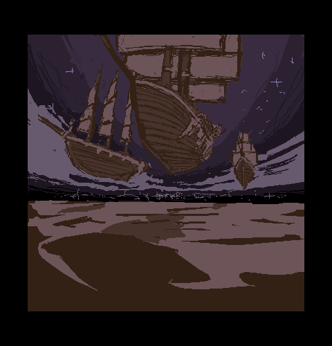
Wow! Those clouds... cool!