| Active TopicsSearchRegisterLogin |
| Collaborations/Challenges | |
| |
  |
| Page of 2 Next >> |
| Author | Message |
|
administrator
Admiral 
Joined: 03 March 2005 Online Status: Offline Posts: 0 |
  Topic: CHALLENGE 1/10/2011: Unportraitable Topic: CHALLENGE 1/10/2011: UnportraitablePosted: 10 January 2011 at 12:15am |
CHALLENGE: UnportraitableOnce again, you have a randomly generated palette. Use at least 4 of the colours shown below to create a portrait. Optional Bonus Challenge: Use all the colours!
CHALLENGE RULES
CHALLENGE JUDGING
CHALLENGE PRIZES/GOODIES
CHALLENGE VOTINGVote now for your favorite pixelart in this week's challenge!CHALLENGE AWARDSThe Unportraitable pixel art challenge is complete and we have three new champions. This week's challenge awards go to the following pieces:Thanks so much to all who took the time to vote and participate in the challenge! Why would you by H|F
|
|
 IP Logged IP Logged |
|
|
Justincrdibl
Seaman 
Joined: 24 August 2009 Online Status: Offline Posts: 36 |
Posted: 10 January 2011 at 2:29am |
|
Hmm interesting colors...
Here's what all the 1:1 mixes look like in case anyone is wondering  |
|
|
IP Logged |
|
|
Kiwi
Seaman
Joined: 31 August 2010 Online Status: Offline Posts: 22 |
Posted: 10 January 2011 at 10:28am |
|
It must be a human portrait or can I do a imaginary character? And it must be in a style close to reality or also more toony-stylized?
|
|
|
IP Logged |
|
|
Mis-BUG
Seaman
Joined: 09 December 2024 Location: Italy Online Status: Offline Posts: 39 |
Posted: 10 January 2011 at 11:36am |
|
I don't know if I'm going to submit this, but I always wanted to make a E.A. Poe portrait with fancy colours... :P
 |
|
|
IP Logged |
|
|
ellie-is
Commander 
Joined: 12 September 2021 Online Status: Offline Posts: 706 |
Posted: 10 January 2011 at 11:45am |
|
Man, post that, it looks great.
I'll probably join this one. Seems interesting enough. =] |
|
|
IP Logged |
|
|
fawful
Commander
Joined: 06 July 2023 Online Status: Offline Posts: 122 |
Posted: 10 January 2011 at 12:01pm |
|
Yes it does.mad skills
|
|
|
IP Logged |
|
|
jalonso
Admiral
Joined: 29 November 2022 Online Status: Offline Posts: 13537 |
Posted: 10 January 2011 at 12:39pm |
|
@kiwi, In general art terms a 'portrait' is generally a chest and up (roughly) picture. With an emphasis on the face.
In pixelart the term 'portrait' is commonly a game development term to show a sprite's appearance in more detail for the player's mind to 'add details' to a game. PORTRAIT I did not have anything to do with this challenge but I think some variations of the portrait idea is cool provided that it remains a face/expression kind of thing. imo, not a portrait portraits my fave gallery portrait Edited by jalonso - 10 January 2011 at 12:40pm |
|
|
|
|
|
IP Logged |
|
|
fawful
Commander
Joined: 06 July 2023 Online Status: Offline Posts: 122 |
Posted: 10 January 2011 at 1:27pm |
 TURBANTURBANTURBAN TURBANTURBANTURBAN TURBANTURBANTURBAN TURBANTURBANTURBAN |
|
|
IP Logged |
|
|
cure
Commander
Joined: 23 March 2022 Online Status: Offline Posts: 2859 |
Posted: 10 January 2011 at 2:02pm |
|
@fawful: take a look at human skulls and note the protrusion of the maxilla. also, your eye sockets seem to flare upwards at the ends.
@mis-BUG: submit! looks great. |
|
|
IP Logged |
|
|
fawful
Commander
Joined: 06 July 2023 Online Status: Offline Posts: 122 |
Posted: 10 January 2011 at 4:08pm |
|
I see
|
|
|
IP Logged |
|
|
Paulo Peres
Seaman
Joined: 26 February 2023 Online Status: Offline Posts: 23 |
Posted: 10 January 2011 at 5:54pm |
|
WIP!
 Edited by Paulo Peres - 10 January 2011 at 5:54pm |
|
|
IP Logged |
|
|
FelipeFS
Midshipman 
Joined: 29 June 2017 Online Status: Offline Posts: 29 |
Posted: 11 January 2011 at 4:26am |
|
My entry is done! I'm thing about make another.
Took all day to be done (including the idea and the process). Transcedence
|
|
|
IP Logged |
|
|
fawful
Commander
Joined: 06 July 2023 Online Status: Offline Posts: 122 |
Posted: 11 January 2011 at 12:13pm |
|
skull has been modified a bit
 |
|
|
IP Logged |
|
|
Hiuru
Midshipman
Joined: 13 October 2023 Online Status: Offline Posts: 42 |
Posted: 11 January 2011 at 3:26pm |
|
Originally posted by FelipeFS My entry is done! I'm thing about make another. Took all day to be done (including the idea and the process). WOW. I love this so so so so much! Edited by Hiuru - 11 January 2011 at 3:26pm |
|
|
IP Logged |
|
|
cure
Commander
Joined: 23 March 2022 Online Status: Offline Posts: 2859 |
Posted: 11 January 2011 at 10:06pm |
|
Originally posted by fawful edit:  feel your cheekbones. they probably poke out most below your eye sockets and slightly towards the sides. remember that the eye sockets flow into the cheekbones, they're very interrelated. nose was a bit thin, and the separation between the ball of the nose and the nostril seemed extreme. ear looked a little long and low to me. there's a somewhat significant indention (in most folks) above the top of the nose, between the tops of the eye sockets. the chin protruded quite drastically so i moved it in some. he lacked lips. due to the prominent chin, as well as the placement of the indention in the upper lip, the maxilla still seemed recessed. trapezius muscles were underdeveloped and the shoulders seemed to slope off too suddenly. Turning out nice though, you're making good use of the palette Edited by cure - 11 January 2011 at 10:13pm |
|
|
IP Logged |
|
|
FelipeFS
Midshipman
Joined: 29 June 2017 Online Status: Offline Posts: 29 |
Posted: 12 January 2011 at 2:47am |
|
Thank you, Hiuru.
|
|
|
IP Logged |
|
|
orenshtiv
Commander
Joined: 28 May 2009 Location: Israel Online Status: Offline Posts: 146 |
Posted: 12 January 2011 at 6:38am |
|
Thought to give it a try ..
but my computer is stupid so it was really hard to make I miss paint ;__; http://www.pixeljoint.com/pixelart/58816.htm |
|
|
░▒▓█▓▒░ ◘The power is in our hands!◘░▒▓█▓▒░
|
|
|
IP Logged |
|
|
fawful
Commander
Joined: 06 July 2023 Online Status: Offline Posts: 122 |
Posted: 12 January 2011 at 9:46am |
|
I've had a look at what you've done and it's really helped a lot.I couldn't see the problems until you pointed them out.
 there's bound to be somethings still wrong but it's a noticeable improvement |
|
|
IP Logged |
|
|
Kiwi
Seaman
Joined: 31 August 2010 Online Status: Offline Posts: 22 |
Posted: 12 January 2011 at 10:46am |
|
@Jalonso: Thank you so much! I didn't expect such a big and complete reply :D, thank you.
Anyway my doubts are gone, and here is my WIP: 
|
|
|
IP Logged |
|
|
Manupix
Commander
Joined: 07 May 2026 Online Status: Offline Posts: 771 |
Posted: 12 January 2011 at 12:09pm |
|
Someone needs inspiration?
Bernard Pras (slow loading, click Galerie then 1999-2000 for the most iconic pieces) Victor Molev @ Kiwi: looks interesting, but you have a bad workflow! Block out basic shapes > color and shade according to light source > detail and refine (includes textures, dithering, AA). The shape and shading of the face are still very off, so your effort on the beard and hair might be wasted if you have to redo them. Also take care of dithering, with this incredibly contrasted palette it will be searing. See how Mis-Bug didn't dither the face at all. Did the Masked Cucumber grow a beard? sorry XD  |
|
|
IP Logged |
|
|
Mochimandias
Seaman
Joined: 03 January 2011 Online Status: Offline Posts: 6 |
Posted: 12 January 2011 at 12:28pm |
|
This is my submission for the challenge
What do you think? it´s my first portrait too ^ ^ I need more practice, but I enjoyed a lot doing this! 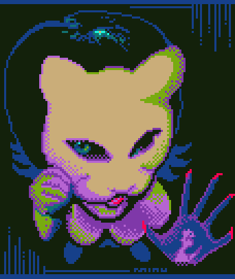
|
|
|
IP Logged |
|
|
cure
Commander
Joined: 23 March 2022 Online Status: Offline Posts: 2859 |
Posted: 12 January 2011 at 1:36pm |
|
looks good, has some strong banding though (especially along the top)
|
|
|
IP Logged |
|
|
Kiwi
Seaman
Joined: 31 August 2010 Online Status: Offline Posts: 22 |
Posted: 12 January 2011 at 2:04pm |
|
@Manupix: About the searing dithering, I wanted it, I wanted to make a piece pretty hard to look at XD
I also like the shape of the nose, but I have to change something inside. I also have to change the lips, because now I see they're so verily off XD |
|
|
IP Logged |
|
|
Mochimandias
Seaman
Joined: 03 January 2011 Online Status: Offline Posts: 6 |
Posted: 12 January 2011 at 2:08pm |
|
Thanks! you´re right... have to fix that and the preview...
|
|
|
IP Logged |
|
|
Adcrusher
Commander
Joined: 04 January 2016 Online Status: Offline Posts: 148 |
Posted: 12 January 2011 at 3:47pm |
 Romana from Scott Pilgrim Vs. the World. Still a WIP |
|
|
IP Logged |
|
|
RedSnake
Seaman
Joined: 05 July 2010 Online Status: Offline Posts: 5 |
Posted: 12 January 2011 at 4:08pm |
 Here's my WIP! I call him the Flamboyant Lord :D I don't know if I should add dithering to the skin.. And disregard the hat, I just filled it with random colors! Edited by RedSnake - 12 January 2011 at 4:08pm |
|
|
IP Logged |
|
|
Manupix
Commander
Joined: 07 May 2026 Online Status: Offline Posts: 771 |
Posted: 12 January 2011 at 5:30pm |
|
I'll take the opportunity to practice portrait from life > autoportrait.
Step 1: sketches.  <1 <1  <2 <21: today's; to compare with 2 = last years for the Fibonacci Faces challenge. None of these look like me, but surprisingly mixing the three does! 0.0  < mix < mixI might pixel from that, but I'll sketch more anyway. Practicepracticepractice! Adcrusher: looks good, something looks a bit off with the eyes position, the nose shape too, and shading on the left side cheek / cheekbones. I can't point what precisely. Redsnake: no dithering, this palette can't stand it! But you need to give volume to that face with shading: it's all flat now. Use references, yourself in the mirror, have someone pose, anything. No prob with the hat colors I think. |
|
|
IP Logged |
|
|
Paulo Peres
Seaman
Joined: 26 February 2023 Online Status: Offline Posts: 23 |
Posted: 12 January 2011 at 6:01pm |
|
Good portrait studies, Manupix.
|
|
|
IP Logged |
|
|
almostpeaceful74
Seaman
Joined: 06 August 2014 Online Status: Offline Posts: 5 |
Posted: 12 January 2011 at 7:45pm |
|
Love the challenge! Anyway I thought I'd take the chance to pay tribute to one of the best (and most underaprreciated) cartoons ever.
here's my WIP  I'm a bit suspicious that I've gone dithering-crazy, but it seems alright... Let me know if i'm wrong lol Edited by almostpeaceful74 - 12 January 2011 at 7:46pm |
|
|
IP Logged |
|
|
Adcrusher
Commander
Joined: 04 January 2016 Online Status: Offline Posts: 148 |
Posted: 12 January 2011 at 8:01pm |
|
I'm not quit sure what's going on. Either that's his back and he's spinning his head around or a really weird chest. Both ways it looks kind of funky, do you have a reference? And I think you did go overboard with the dithering. Personally, I think you should only dither at the very end when you have done all you can with the colors you have. So fix the body and it will look a lot better.
|
|
|
IP Logged |
|
|
eliotfellow
Midshipman
Joined: 23 March 2010 Online Status: Offline Posts: 61 |
Posted: 12 January 2011 at 10:29pm |
|
Lot of cool stuff going on!! This is an exciting challenge. Here's what I've got so far but I need a little advice to finish it up, I don't know what it needs but I know it needs something! Advice/crit?

It's a self-portrait, here's my reference. |
|
|
IP Logged |
|
|
Manupix
Commander
Joined: 07 May 2026 Online Status: Offline Posts: 771 |
Posted: 13 January 2011 at 10:42am |
|
eliotfellow: looks good, but I think you made a common mistake in your choice of a ref with very diffuse light. It makes it very hard to draw a good shading and volume when the ref doesn't have them.
Anyway, I don't recognize the contour of your face, and you should show some forehead betwenn those hair strands. |
|
|
IP Logged |
|
|
fawful
Commander
Joined: 06 July 2023 Online Status: Offline Posts: 122 |
Posted: 13 January 2011 at 12:22pm |
 finished? |
|
|
IP Logged |
|
|
alcheim
Seaman
Joined: 20 March 2010 Online Status: Offline Posts: 6 |
Posted: 13 January 2011 at 5:20pm |
|
Just finished my entry for this. However my entry isn't showing up in the weekly challenge gallery. Is there something wrong with it?
http://www.pixeljoint.com/pixelart/58841.htm Edited by alcheim - 13 January 2011 at 6:20pm |
|
|
IP Logged |
|
|
Manupix
Commander
Joined: 07 May 2026 Online Status: Offline Posts: 771 |
Posted: 13 January 2011 at 8:58pm |
|
step 2: more sketches, different angle (not easy to make self-portraits other than facing!). Again, 2 tries that don't look like me, and a mix that does a little more. Uncanny!
 step 3: start pixelling, blocking out shapes and basic shading.  Proportions are a bit off; I can't say I like the color use but I don't think I can do better. Fawful: the shading doesn't really look like the actual effect of a light-source on an actual volume. With light coming from above as dark eye sockets indicate, there wouldn't be that highlight on the chin, the chin and jaw underside (= lower half) would be dark, the lower lip would cast a shadow on the chin (it always does), the forehead would cast a shadow on the nose bridge, etc. Use refs! alcheim: the dithering in the mouth makes it undecided: lip or tongue? The chin is very pointy, and the right side (ours) cheek / cheekbone line looks a bit off, by a very few pixels probably. The hair would cast more shadow on the forehead. |
|
|
IP Logged |
|
|
alcheim
Seaman
Joined: 20 March 2010 Online Status: Offline Posts: 6 |
Posted: 13 January 2011 at 9:50pm |
|
thanks for the tips. i'll fix them up shortly.
|
|
|
IP Logged |
|
|
jeremy
Rear Admiral 
Joined: 25 November 2024 Location: New Zealand Online Status: Offline Posts: 1704 |
Posted: 13 January 2011 at 10:31pm |
|
@fawful:
 @eliotfellow: Your piece looks wayyy more androgynous than the ref. some tonal change using perhaps the light green might help. @Manu (and generally): The peachy colour really is the perfect intermediate. the pale green + light purple are fairly similar value wise so they mix quite well, even using dither. I edited yours too, lightened it a bit. The cyan does seem the most unpaletteable x_x  I had a little go at it earlier, dimensions are different and the colours may be different slightly:  Edited by Jeremy - 13 January 2011 at 10:32pm |
|
|
IP Logged |
|
|
ellie-is
Commander
Joined: 12 September 2021 Online Status: Offline Posts: 706 |
Posted: 13 January 2011 at 10:50pm |
|
Damn, Manu, you're old.
And also amazing at pencil drawing. I found this one to be simply awesome. Great work there man. |
|
|
IP Logged |
|
|
Manupix
Commander
Joined: 07 May 2026 Online Status: Offline Posts: 771 |
Posted: 14 January 2011 at 5:41am |
|
Jeremy: thanks! I really want to avoid using the light brown as main skin color, it's off by just the wrong dose (too much to be natural, not enough to be deliberate crazy). And I found the perfect excuse to be green! ;)
Lucas: stfu. And thanks! XD |
|
|
IP Logged |
|
|
Cilein
Seaman
Joined: 26 June 2021 Location: Ireland Online Status: Offline Posts: 32 |
Posted: 14 January 2011 at 10:48am |
|
@Manupix
I like the abstract coloring better too, great sketches there too! A self portrait never even crossed my mind when thinking about this one, I tried some sketches earlier - it's a brilliant way to practice drawing, you know where you're going wrong way more acutely. @Fawful The headdress is fantastic, but the face is still letting it down, the chin looks like its dislocated off to the left, flattening the piece (the cheek and chin lighting might need touched to help with this too, I don't think you need more than one highlighting color really here). That and the eyes sockets, even if there are to be no eyes in them they look unfinished being just a solid band of black, check Cure's great edit again for ideas. The headdress and color usage is lovely, go the extra bit now and do yourself justice! Edited by Cilein - 14 January 2011 at 10:55am |
|
|
-Building an engine-
|
|
|
IP Logged |
|
|
Photocopier
Midshipman
Joined: 08 July 2014 Online Status: Offline Posts: 41 |
Posted: 14 January 2011 at 3:06pm |

C+C guys? I'm not really sure what I want to do for the background yet either... |
|
|
IP Logged |
|
|
Guest666
Seaman
Joined: 25 April 2009 Online Status: Offline Posts: 4 |
Posted: 14 January 2011 at 4:19pm |
 My WIP of Hunter Van Pelt ref http://fc09.deviantart.net/fs43/f/2009/095/a/d/Jumanji_Van_Pelt_by_Garvals.jpg |
|
|
IP Logged |
|
|
fawful
Commander
Joined: 06 July 2023 Online Status: Offline Posts: 122 |
Posted: 14 January 2011 at 6:21pm |
 changed some stuff.The eyes still need revisiting |
|
|
IP Logged |
|
|
ellie-is
Commander
Joined: 12 September 2021 Online Status: Offline Posts: 706 |
Posted: 14 January 2011 at 9:18pm |
|
Originally posted by Guest666
My WIP of Hunter Van Pelt ref http://fc09.deviantart.net/fs43/f/2009/095/a/d/Jumanji_Van_Pelt_by_Garvals.jpg
That looks awesome. Please finish it. :P |
|
|
IP Logged |
|
|
Manupix
Commander
Joined: 07 May 2026 Online Status: Offline Posts: 771 |
Posted: 14 January 2011 at 9:31pm |
 That's it for tonight (step 4). That's pretty difficult for me. I see many things are off but I can't tell how. And I look like a madman! Pixelled a bg to take a rest from the stressful stuff. ;) Photocopier: awesome cloth, the face looks flat by comparison, as if they didn't share the same light source. Also why does the eye patch string cross his face? Guest666: great! Update:  Edited by Manupix - 15 January 2011 at 6:58am |
|
|
IP Logged |
|
|
IEvangeline
Seaman
Joined: 15 January 2011 Online Status: Offline Posts: 1 |
Posted: 15 January 2011 at 7:46am |
|
*kicks at the ground shyly* Hiya, this is my first post to PJ and my first submission. :3 I hope it looks alright, I don't handle criticism well but I'll try. :3

|
|
|
IP Logged |
|
|
Manupix
Commander
Joined: 07 May 2026 Online Status: Offline Posts: 771 |
Posted: 15 January 2011 at 10:08am |
 Fixin' stuff. IEvangeline: welcome! =) Looks good, did you use a reference? The hair could use more shading / highlights, it's hard to feel its volume. Are the green patches supposed to be waves? You'll find C&C is the driving force of PJ, it's a wonderful motivation and progress tool that benefits all. You're expected to give it too! Beware, it's addictive ;) |
|
|
IP Logged |
|
|
Kiwi
Seaman
Joined: 31 August 2010 Online Status: Offline Posts: 22 |
Posted: 15 January 2011 at 11:59am |
|
@Manupix: The only small problem I see is that you look sad XD, try not to stress too much the small shadow near to the upper lip(I'm not sure the focus of the problem is there, but that's what I would do)
@Guest666:AWESOME I LOVE IT :D anyway, I've re-done my work. 
Better? I think so, but the light blue part needs revision. Edit: Version 2  Edited by Kiwi - 15 January 2011 at 12:18pm |
|
|
IP Logged |
|
|
eliotfellow
Midshipman
Joined: 23 March 2010 Online Status: Offline Posts: 61 |
Posted: 15 January 2011 at 12:23pm |
|
@Manu, coming along nicely, and thanks for your critique (again!). I definitely like the red background better because it has a cool effect with the green, the push-and-pull thing. But I'm not sure I like the cyan clouds. . . they feel a little jarring and distracting to me. Everything else comes together nicely except that, I think.
You were definitely right about picking a poor reference pic, but it's too late now. I guess I picked it because I know my hair won't look that good again for quite some time, ha ha. @IEvangeline: Get used to crit, honey! That's what it's all about! I like the face, but I would suggest adding some texture to the hair. It's kind of uncertain right now. And welcome to PJ! Edited by eliotfellow - 15 January 2011 at 12:27pm |
|
|
IP Logged |
|
|
fawful
Commander
Joined: 06 July 2023 Online Status: Offline Posts: 122 |
Posted: 15 January 2011 at 1:04pm |
 |
|
|
IP Logged |
|
| Page of 2 Next >> |
| |
||
Forum Jump |
You cannot post new topics in this forum You cannot reply to topics in this forum You cannot delete your posts in this forum You cannot edit your posts in this forum You cannot create polls in this forum You cannot vote in polls in this forum |
|

