| |||||||||||||
Thanks guys, good points =)
I've struggled with this, and I'm still undecided!
The midtone pinks are definitely too saturated. I blame Super17 
I kept the saturated bright tones because of how vision works: saturated colors in artwork can be perceived as 'brighter than white'. Deliberate overexposure from digital manipulation can result in something similar. As a photographer ;) I was more interested in exploring this aspect than the usual washed out overexposed photo.
Whether I succeeded or not is another matter entirely! (hint: probably not)
I agree with DawnBringer. While the image itself is outstanding, it really doesn't show overexposure and in my opinion shouldn't have placed in the contest. In overexposed photos, lighter, unsaturated shades should be the prominent color choice. All of the originally bright area in the normal exposure should all blend together in almost white.
Here is a quick color swap I did: http://snag.gy/DlYbY.jpg (Sorry this is the best way I know how to add a picture to the comments).
The colors are a bit too saturated to read as overexposure, but the original is really cool & radical!
Thanks kiddo, that's very kind of you to say 
I didn't have any idea I managed anything of the kind, I never thought of my pieces as having any of that elusive quality.
It is on twitter btw ;)
Holy shit son of a gun! Why didn't you put this on twitter.
I find this piece gloomier than you other ones (which always lift my spirit and have a "kindness" and "sunny" feel to it.
This one feels more like "mysterious techno wonder" to me.
I like how you manage to convey emotions in your pieces. They're not only interesting to look at, they make you feel something. They're an experience. I find you're one of the only artists around here that manage to pull it off. Other artists make nice things to look at but they don't convey anything. It's cold and meaningless.
Keep at it old man!
oh wow this is beautiful! didn't expect such an industrial look from the preview, it's awesome! such contrast in the lighting, it's very dramatic. great work n_n
Thanks Fabian, I've uploaded a very slightly brighter version to appease you, also added the 'correct exposure' in the description. As a photographer, if I sent this to a client I wouldn't expect to hear from them ever again =)
Thank you people!
I would say it is a perfect example of artistically calculated use of overexposure without white-washing the entire photo. The central white and blue highlights hide the details of the object that are clearly seen in its upper portion. bravo, well done!


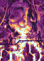

I think the original version is fine. When I read up on overexposure in Wikipedia for the challenge, I saw examples of otherwise normal photographs with loss of detail around only the lighted areas for a bloom effect. These were examples of artistic overexposure, as Yahkehbu referred to, in contrast to the unintentional washing out of the whole image. Wikipedia defined overexposure as the "important bright parts of an image are 'washed out'", and I think the original version of this piece has that.