


that's very kind of you. Keep in mind that I'm always open if people want ot reach out and talk pixels and learn more. I'm lifelong honourbound to help my peers. Hit me up on bluesky if you need a chat about pixel art.

I was hoping to see the whole piece after it briefly appeared in the queue the other week and it was worth the wait. The concept is really strong and striking and, as always, there's so much to learn from your rendering. The right hand is a particular highlight for me.



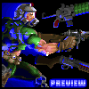

Amazing work! The colors choices here are wonderful and I really like the subtle lighting effect! I it looks amazing and I am really impressed by it!
The character's pose is also a really strong highlight for me as I really like how dynamic it is!
I also love the starting transition and how you ease in to all of the colors, going from white slowly toward the character's main color scheme, it is masterfully done!
Though one thing that I am a personally a little confused about is the color count, I personally believe that it is way to high! Of course your understanding of color is way better than mine but still I wanted to mention it as I did went and anylized certain parts of the image and found some example were there was a bunch of colors really similar to each other.
One strong example of this is in the font where the yellow meets the white, where there are 6 different colors that compose the transition!
So I was wondering, was each and every color handpicked for this piece, or was there any use of software tools to create certain effects?
(Though to be honest, I think that it would have been totally possible for every color to be handpicked as I believe that software tools, such as the blur tool, create way worse color transitions than those dipicted in the image, and taking into account how skilled you are, this would have been definitely possible to do!)
(I also did read the discription and saw the mention of the doom pallet, but I was not really familiar with it, so I though I might ask. I hope you don't find my question offensive, as no offense is meant!)

Another thing I wanted to point out, is a line that starts from the top part of the right shoulder, that seems to go towards the chest. I found it a little distracting and didin't really understand it's purpose, but that might just be me!
Regardless, awesome work as always, and another piece for me to study!