the road to freedom - cave

the road to freedom - cave

You need to be logged in to rate pixel art.


Pixel Art Details

the road to freedom - cave


user
Title: the road to freedom - cave
Pixel Artist: Merez  (Level 6 Hitman :: 6059 points)
Posted: 6/4/2012 09:56
Statistics:  47 comments    49 faves    0 avatars

 well, I had to finish fast for competition Pixelaria, so ... I do not know. I just want to evaluate, hehe 

thanks Jinn


Discussion

If you would like to comment you will need to be logged in. Register now. It only takes a moment and it's free.


user
JustinGameDesign (Level 8 Marshal) @ 4/1/2014 15:29

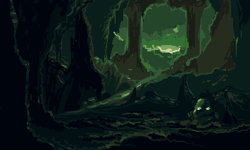
That's a nice level of depth.


user
AtskaHeart (Level 8 Regional Boss) @ 8/14/2013 03:31

Awesome as a videogame background, nice details!


user
Muziak (Level 3 Enforcer) @ 9/11/2012 15:08

beautiful pallette...


user
Sublyme (Level 4 Murderer) @ 7/12/2012 17:26

wow, amazing colours


user
Complix (Level 1 Rookie) @ 7/11/2012 08:08

Very nice, Very nice


user
Luan-castro (Level 1 Rookie) @ 7/10/2012 15:23

 fav it


user
Merez (Level 6 Hitman) @ 6/28/2012 06:18

 Well, I edited again, so I think it was beautiful pixel-art, and became the face of my style. Thanks to everyone who helped. Thanks Jinn


user
StarQueen (Level 1 Depressed) @ 6/8/2012 17:18

 Very Good Merez,or Ricardo.


user
Merez (Level 6 Hitman) @ 6/8/2012 14:47

 For me its color was the issue that most pleased me far, I'll use. Thanks!


user
DawnBringer (Level 10 Pixel artist) @ 6/8/2012 12:09

Well, if everyone else is making a color-edit then I'm gonna do one too,darn it! :D

Also got rid of some stray and redundant colors. Count is now 10.


user
neota (Level 8 Shodan) @ 6/6/2012 23:11

I have to say, those two small bright spots make it really hard not to see that area as a limp squid.

This image is really kind of Henk Nieborg-ish,   aside from the fact that you use only one color ramp. Very interesting and polished style.


user
philippejugnet (Level 6 Hitman) @ 6/6/2012 13:17

 way better, I would go for my edit anyways.


user
philippejugnet (Level 6 Hitman) @ 6/6/2012 09:03

 there is no difference.


user
Merez (Level 6 Hitman) @ 6/6/2012 08:47

 the road to freedom - cave

what do you think? thanks philippejugnet


user
philippejugnet (Level 6 Hitman) @ 6/6/2012 08:07

 he said he was going for my edit =D hope he finishes it.


user
Adam (Level 9 Human) @ 6/6/2012 01:04

The possibilities are unlimited.

I suggest you to just play with the colors a bit (there are just a few, so you can do it manually). I would stick to changing the hues in one direction at first (the classic example: the darker the shade the more magenta it is). It is simple enough, but can achieve a lot.

Oh, and I noticed one or two really unexploited colors while doing the edits.

And I just have to add that the subtle dithering looks really professional.


user
iMoose (Level 6 SWAT) @ 6/6/2012 00:17

 Guys. Let's stop calling each other idiots and talk about art, shall we? 

The layers and textures are fantastic, and if not for the monochrome I'd say the same for the colors. I like the blue theme, but the slight hue variations that Jinn and Jetrel showed examples of really add a lot to the effect. Also as a3um mentioned, that little rock in the center is way too dark for where it is, it should either be lighter or just taken out. I didn't notice it at first but now that I see it I can't take my eye off it. Overall really great piece, but yeah I highly suggest shifting the hues a little bit.


user
Jetrel (Level 1 Intern) @ 6/5/2012 21:12

 Jinn's colors are pretty nice.

Also: http://imgur.com/VMIV2


user
philippejugnet (Level 6 Hitman) @ 6/5/2012 18:01

 Rique -  "you are the idiot here, you don't accept critiques about your piece" Second, I do, but your critique is nonsense and pointless. Just stop bothering the members.


user
RiquePixel (Level 2 Dealer) @ 6/5/2012 17:00

 The idiot here are you, who dont accept bad words about your piece. 


user
Battle (Level 2 Flatfoot) @ 6/5/2012 16:29

Muito legal.


user
JuninFC (Level 3 Hatchet Man) @ 6/5/2012 15:19

Rique , you are a idiot !! Zoa , tá muito bom isso ai vei


user
philippejugnet (Level 6 Hitman) @ 6/5/2012 13:50

 @Rique - you are just idiot.  My edit was to help I don't even care about your oppinion, no one here does btw. Stop bothering members.


user
Merez (Level 6 Hitman) @ 6/5/2012 13:44

 I think this is not prohibited. I only ask, does not oblige, a favorite if you really like, if not, don't need. I'm not doing anything wrong, I would be wrong if you were using fakes. 


user
RiquePixel (Level 2 Dealer) @ 6/5/2012 12:41

 this guy ask me all the time to vote and fave...unfair.


user
Shanx (Level 1 Depressed) @ 6/5/2012 12:31

 I like it , nice evolution 

ಬಿಚ್ ಆಫ್ ಬಾಯ್ ಸನ್ ಅಭಿನಂದನೆಗಳು 

Merez Ricardo punk bitch

Bye


user
TheoVision (Level 8 Regional Boss) @ 6/5/2012 12:07

It could be a screen from a adventure game!


user
RiquePixel (Level 2 Dealer) @ 6/5/2012 11:01

 Philipe, i didnt like your edit.


user
TheInquisitor (Level 4 Shichikyu) @ 6/5/2012 03:55

A bit of colour mixing would give this so much more punch. It's nice pixel work but tweaking the palette could make all the difference.


user
toxotes (Level 2 Flatfoot) @ 6/4/2012 20:53

 Your use of contrast [and lack of contrast] conveys depth in a spot-on way. Very well done!


user
a3um (Level 4 Shichikyu) @ 6/4/2012 18:05

 Nice! Just get rid of that stone in the center


user
reis (Level 6 Serial Killer) @ 6/4/2012 17:05

 Amazing!


user
Dont (Level 6 Garbage) @ 6/4/2012 15:50

 lido


user
Cyangmou (Level 9 Federal Agent) @ 6/4/2012 14:49

my my that's pretty good, the things which joe and angel pointed out are somewhat to think about, they are really hitting the nail. You could also increase the glowing light from the shrooms in the front to add a bit more light and make the foreground more interesting.

The perspective of the water source which is flowing over the middle-ground rocks is a bit distracting, there is somewhat of with the pillar/stallagmite and distance which hurts the depth.

also good luck =)


user
philippejugnet (Level 6 Hitman) @ 6/4/2012 14:21

 Little edit:


user
MrBeast (Level 3 Dryad) @ 6/4/2012 14:18

 Thats pretty cool.


user
philippejugnet (Level 6 Hitman) @ 6/4/2012 13:13

 aew ricardo ^^


user
Jinn (Level 11 Cthulhu (The Call of Cthulhu)) @ 6/4/2012 13:11

Você está evoluindo bem rápido, rapaz. Só acho que você poderia dar uma encorpada nessas cores: http://i.imgur.com/bMW3u.png


user
Merez (Level 6 Hitman) @ 6/4/2012 13:09

 Friends, I do not know how to exit the "monochrome", I can only work so I can not make the color transition? Could you help me? Thanks to all who commented. 


user
Geoglatico (Level 6 SWAT) @ 6/4/2012 13:07

esta muito bom ricardo, você está melhorando cada vez mais, gostei das cores também ;)


user
Elk (Level 5 Assistant Manager) @ 6/4/2012 12:48

 Very moody and clear picture, good use of techniques!


user
Joe/Wrath Designs (Level 7 Sheriff) @ 6/4/2012 12:44

I like the basic set of atmosphere. Although you could have used the darkest color in order to give some other hue to the main figure. Also, as the light source in the background gives more warmth to the surrounding, perhaps one should try another set of color tones. The most difficult but awarding is to differentiate background and foreground with some kind of focal point, giving more or less detail to the close surrounding which you have started. However you've given us a snapshot with infinity in one way, cut by high frequencies of "bright light". It looks ok, but not close to the eye, which adapts to both conditions then. I'm saying this since I normally fall into the same dilemma of overdithering all, regardless of its position in space. I'd use more blur in the distance somehow...

Good luck in the competition by the way!


user
Neela (Level 2 Flatfoot) @ 6/4/2012 12:15

It looks really good. But I must agree with the others that it would look even better with some variation in hue. 


user
AngelOTG (Level 1 Rookie) @ 6/4/2012 11:59

 This is actually exactly how this would look if you were standing in this cave from the perspective of this picture. The cave is dark inside, and light outside. Also your ability to pick up details with your eyes decreases with distance, so the picture loses contrast the further back. It's a good example of depth.

On that note, the only critique I have is with your color choices. It would be much better if you had some hue shifts in your palette. Maybe from a dark blue/purple to a slight orange/red.


user
Adam (Level 9 Human) @ 6/4/2012 11:42

Not if you are looking out from the cave. I think this piece is superb. The only thing I miss is some variation in hue, but awesome work overall.


user
Alex Pang (Level 7 Underboss) @ 6/4/2012 11:15

 the depth is messed up. The light / neutral stuff is far from the player, the dark/ saturated close to the player.


user
BearJEFF (Level 1 Rookie) @ 6/4/2012 10:02

 I like this!


Related & Tags


the road to freedom - cave avatars, the road to freedom - cave icons, the road to freedom - cave pixel art, the road to freedom - cave forum avatars, the road to freedom - cave AOL Buddy Icons

Sponsored Products

Donate

Want to give some dough back to all those amazing pixel artists? Donations provide prize money for contests, help cover hosting costs and support new initiatives.

Play party games with QuizBash app

Report Problem

If you are going to report an issue with this piece please provide relevant URLs/Images to back up your claim.

Register

If you would like to be a team player why not register? It's quick and easy and you'll be able to comment on, rate and upload pixel art.

Already Registered?