 | Friend @ 3/9/2018 18:30 commented on The AAP-64 Color Palette Holy shit that description. I'm sold, and take my kidney and my 3 children!
|
|---|
 | Friend @ 7/1/2017 09:01 commented on Incommunicado it is a beautiful piece, but I feel less controlled pixels have been rejected many times over for that very reason. I like breaking the mold as much as the next guy, but where others have been declined, you seem to get a free pass to do so
|
|---|
 | Friend @ 6/1/2017 06:04 commented on Distribution station it's like across the whole image but it only happens mostly at 1x view. It almost looks like it has bilinear filtering. At 2x this blur effect mostly disappears. The only places that dont look bilinearly filtered at 1x to me are the blue laser beams. I think what you might have going on is a strange kind of banding with straight lines of darkening hues around brighter colors that emulates filtering and the eye perceives it as blurry at 1x. but at 2x it looks great. Maybe play with reducing and or tweaking the colors. Maybe slightly brighter base colors would lessen the blur effect? dunno
|
|---|
 | Friend @ 5/31/2017 10:06 commented on Distribution station whoa the blurry is so weird. at first i thought the resolution was messed up
|
|---|
 | Friend @ 4/26/2017 09:40 commented on Lullaby this piece works better as oekaki. it's beautiful
|
|---|
 | Friend @ 3/25/2016 12:44 commented on Old Stuff #1 you posted it before and the main crit was that you used the grass to avoid feet xd
|
|---|
 | Friend @ 3/25/2016 12:36 commented on girl with mushrooms wow aawesome iidea, and i like how you went with more saturated colors than usual
|
|---|
 | Friend @ 3/13/2016 13:46 commented on Four Colour Assassin im luvin ur stuff
|
|---|
 | Friend @ 3/13/2016 13:43 commented on No Pain No Gain much better
|
|---|
 | Friend @ 3/5/2016 15:11 commented on Planets AA ;)
|
|---|
 | Friend @ 2/23/2016 16:59 commented on Mabel's groove really cool. i find the composition a little confusing though. bits at the side are oddly cut, not sure i get the pig being where he is. other than that insane animation skills
|
|---|
 | Friend @ 2/22/2016 12:48 commented on Orange Ball Avatar too kirbylike
|
|---|
 | Friend @ 2/16/2016 10:15 commented on From Whole to Individual well this is a vastly different take than im used to on this topic xD you nailed the execution. subtle color blending/rendering/shaarpness achieved is all high quality
|
|---|
 | Friend @ 2/14/2016 16:13 commented on dripping wow!!!!!!! maybe the handle is slightly off perspective, but i LOVE this
|
|---|
 | Friend @ 2/11/2016 09:10 commented on Deadpool portrait nice rendering.
|
|---|
 | Friend @ 2/9/2016 13:25 commented on Flora Fauna really weird, feels half like pixel art, but immediately intriguing
|
|---|
 | Friend @ 2/9/2016 13:22 commented on Curse of the Caves mockups this is amazing
|
|---|
 | Friend @ 2/7/2016 15:00 commented on Full Moon over the Bamboo Forest um
|
|---|
 | Friend @ 2/2/2016 11:58 commented on Ambassador Of Happiness too much of the detail in the face seems to be causing banding :/ the result is it looks messier than it is on the pixel level. prettty cool though :)
|
|---|
| | Friend @ 1/27/2016 14:45 commented on Big Bird but this is a PIXEL ART site. so we already know what the gallery is for. and when a hybrid pixel is not accepted where any pure piece is, it automatically creates an unspoken dichotomy of pure vs hybrid with pure on top. which is a problem.
|
|---|
| | Friend @ 1/27/2016 14:30 commented on Big Bird i think you missed my point :/ i dont think in any way do you personally categorize hyybrids as inferior. just that they are not accepted into the gallery and that they are not considered "pure" leads to an inferior connotation.
|
|---|
| | Friend @ 1/27/2016 14:01 commented on Big Bird but the sight is already skewed towards ppure because it is what the gallery displays, even if you can link the hybrid. this and the word pure itself paints hybrids as inferior when we have established is not the case
|
|---|
| | Friend @ 1/27/2016 13:53 commented on Big Bird how about strict vs mixed pixel art? mixed could refer to mixing of tools, the mixing effect it has on the pixel level, while not being pejorative.
strict pixel art refers to strict tools and generally includes stricter restrictions. while strict is more negative in connotation than mixed, i think it is balanced by the fact the it is in a way better tied to the essence of the medium, which focuses heavily on restrictions
also, because there is no sense of which is "better" between strict and mixed, both can live in perfect harmony without one needing to be better. it would also mean the label is unimportant, which also means that we can actually label what is strict or mixed based on actual tools used in the process, and not the somewhat arbitrary difference in end result.
it would then be easy to come up with a quantitative list of what tools are allowed to be considered strict and which tools automatically lead to it being mixed
|
|---|
 | Friend @ 1/27/2016 13:29 commented on Walk Softly WUT ONLY 4TH PLACE????
|
|---|
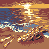 | Friend @ 1/27/2016 12:37 commented on Some bones by the sea it's not that messy at all. just could use a final clean up of clusters and some AA. love thissssss
|
|---|