| Active TopicsSearchRegisterLogin |
| Collaborations/Challenges | |
| |
  |
| Author | Message |
|
administrator
Admiral 
Joined: 03 March 2005 Online Status: Offline Posts: 0 |
  Topic: CHALLENGE 6/16/2014: Who's the Boss? Topic: CHALLENGE 6/16/2014: Who's the Boss?Posted: 16 June 2014 at 12:00am |
CHALLENGE: Who's the Boss?Create a game mockup showing the final boss encounter of a turn-based game. CHALLENGE RULES
CHALLENGE JUDGING
CHALLENGE PRIZES/GOODIES
CHALLENGE VOTINGVote now for your favorite pixelart in this week's challenge!CHALLENGE AWARDSThe Who's the Boss? pixel art challenge is complete and we have three new champions. This week's challenge awards go to the following pieces:Thanks so much to all who took the time to vote and participate in the challenge! |
|
 IP Logged IP Logged |
|
|
Eggy
Commander 
Joined: 01 October 2020 Online Status: Offline Posts: 354 |
Posted: 16 June 2014 at 3:33am |
|
I'm so in :3 Planning on doing an Earthbound battle screen inspired mockup.

This is what I have so far. The little "backgrounds" on the cards are supposed to represent the elements of the two player characters (fire and water, respectively). I have yet to decide on the characters' names (I plan on having the names above the cards) and what the final boss is going to look like; so far, I have no idea. I'm open to comments, suggestions etc. |
|
|
IP Logged |
|
|
Temessis
Midshipman 
Joined: 21 August 2021 Online Status: Offline Posts: 54 |
Posted: 16 June 2014 at 6:08am |
|
I don't know that I understood, so, is it ok with rules, this style?
    
// Edit, adding... eghmm... something... // Edit 2, something added or change, I'll try with color palette at the end // Edit 3, last image - 17 colors Edited by Temessis - 19 June 2014 at 9:11am |
|
|
IP Logged |
|
|
skittle
Commander
Joined: 20 July 2021 Online Status: Offline Posts: 350 |
Posted: 16 June 2014 at 9:09am |
|
Hopefully I'll be able to add tentacles.

EDIT: I'm trying to make the lightsource appear from the bottom, but I'm afraid that it might look pillow shaded if I do it that way.  Edited by ADrawingMan - 16 June 2014 at 10:18am |
|
|
IP Logged |
|
|
FrostPumpkin
Commander
Joined: 18 January 2022 Online Status: Offline Posts: 188 |
Posted: 16 June 2014 at 11:06am |
|
I'm pretty excited with this challenge ! Started working on some sprites

focusing on characters right now, I wanted some kind of retro stupid design for the boss character, with silly flashy robot armor stuff. I absolutely don't know what I'll do with background or UI tho |
|
|
IP Logged |
|
|
skittle
Commander
Joined: 20 July 2021 Online Status: Offline Posts: 350 |
Posted: 16 June 2014 at 12:40pm |
|
@Eggy
Interesting idea, will the boss also be a card? @Temessis I'm pretty sure that would be okay since you have already added the command menu so it sorta hints at it being turn based (dunno though, it should be fine though). Looking forward to seeing how the spider turns out. @FrostPumpkin Looks great man! Really loving the design on both of the characters! 
Accidentaly turned it into a robot thingy. (Sorry for posting shortly after my previous post.) Edited by ADrawingMan - 16 June 2014 at 12:41pm |
|
|
IP Logged |
|
|
Skoby
Seaman 
Joined: 15 June 2014 Location: United Kingdom Online Status: Offline Posts: 34 |
Posted: 16 June 2014 at 12:53pm |

A bit of fun :) |
|
|
IP Logged |
|
|
Pajama-Sam
Seaman
Joined: 20 June 2022 Online Status: Offline Posts: 3 |
Posted: 16 June 2014 at 3:25pm |
|
As soon as I saw boss I started getting Giygas vibes, this is what I've come up with so far...

|
|
|
IP Logged |
|
|
Meapers
Midshipman
Joined: 05 June 2024 Online Status: Offline Posts: 46 |
Posted: 16 June 2014 at 7:09pm |
|
Heres a little WIP

Not sure who or what I am going to make as the protagonist for this. I might do someone who is trying to defeat their emotions or something along the lines of that I suppose. EDIT:  Edited by Meapers - 17 June 2014 at 9:48am |
|
|
IP Logged |
|
|
Teban100
Seaman
Joined: 29 March 2018 Online Status: Offline Posts: 7 |
Posted: 16 June 2014 at 8:53pm |
|
Here's a wip, I guess.

|
|
|
IP Logged |
|
|
Eggy
Commander
Joined: 01 October 2020 Online Status: Offline Posts: 354 |
Posted: 17 June 2014 at 9:08am |
|
@ADrawingMan Thanks :) Well, no, the boss isn't going to be a card.
Progress! 
I figured that having the cards, the boss sprite and the dialogue box (not added yet) in the middle would obscure the boss' sprite (I can't have him in front of the dialogue box and/or cards), so I decided to shift the position of the cards and the boss sprite. The current position isn't set in stone, though; I still need to experiment with the positions to make it appealing to the eyes, because right now it doesn't look well in this position. Any suggestions on this? EDIT: More progress: 
Figured I could just shrink the battle screen and make it like that. Also added a dialogue box and a (currently empty) menu box. I still need to figure out what to do with the background, though... any suggestions? Edited by Eggy - 17 June 2014 at 12:57pm |
|
|
IP Logged |
|
|
JustinGameDesign
Commander
Joined: 26 July 2016 Online Status: Offline Posts: 74 |
Posted: 17 June 2014 at 11:07am |
 Here's what I've got so far. Names, attacks, etc are just place-holders. Character designs will be subject to change. |
|
|
IP Logged |
|
|
jalonso
Admiral
Joined: 29 November 2022 Online Status: Offline Posts: 13537 |
Posted: 17 June 2014 at 1:09pm |
|
Lots of great ideas and WIPs from all

|
|
|
|
|
|
IP Logged |
|
|
AirStyle
Commander
Joined: 13 November 2017 Online Status: Offline Posts: 376 |
Posted: 17 June 2014 at 2:25pm |
|
WiP POST:
I'm going for a Risk of Rain type of thing. Identify the characters, please. I want to see if they're readable. I can't decide which one looks better from the two: This one:  or this one:  What you think? |
|
|
IP Logged |
|
|
Tricxta
Seaman
Joined: 03 June 2014 Online Status: Offline Posts: 1 |
Posted: 17 June 2014 at 3:27pm |
|
definitely the top one IMO, the boss is alot more readable
|
|
|
IP Logged |
|
|
7heSama
Midshipman
Joined: 30 April 2020 Online Status: Offline Posts: 46 |
Posted: 17 June 2014 at 4:12pm |
|
Think I finished the layout
 AirStyle: Def. top, assuming the only difference is the purple guy. FrostPumpkin: That looks incredibly rad already. Meapers: Looks really good, but the arms don't really blend well with the mouth. Seems like they're two separate creatures. edit: Things got a little messy -  The standing people I drew before the competition started. Trying to draw the chick crouching, with different hair and a rifle. Pose is tough. Also, she blends into the tiles. I'll fix that once the stance is decent... also, random little lizard guy that isn't good enough to keep. edit: Colors are still presenting problems but the people are looking better. Reused the legs purposefully cuz I want it to look game-ish.  edit: Not much here but I'm done for the night so I thought I might as well. Don't want to start on the enemies...  Edited by 7heSama - 18 June 2014 at 12:57am |
|
|
IP Logged |
|
|
Eggy
Commander
Joined: 01 October 2020 Online Status: Offline Posts: 354 |
Posted: 18 June 2014 at 12:05pm |
|
More progress:

Note: Now that I look at the move choices, I think of two amusing sentences composed from those words: "Tackle special item guard" and "Flee autofight". I still need to figure out the background... can someone provide suggestions, please? :) |
|
|
IP Logged |
|
|
AirStyle
Commander
Joined: 13 November 2017 Online Status: Offline Posts: 376 |
Posted: 18 June 2014 at 12:08pm |
|
Update:
Took some liberty with the boss, and edited the environment. It's looking ok, but I don't know what to do with the mountains. I'm afraid that if I look at them long enough, I'll start liking them. Here's what I got so far:  Yeah, it's purple...all over... I need some outside input. What do you guys think? |
|
|
IP Logged |
|
|
Skoby
Seaman
Joined: 15 June 2014 Location: United Kingdom Online Status: Offline Posts: 34 |
Posted: 18 June 2014 at 2:10pm |
|
Quick update, nearly there just got to figure out what text to put in and some final touches.

|
|
|
IP Logged |
|
|
jalonso
Admiral
Joined: 29 November 2022 Online Status: Offline Posts: 13537 |
Posted: 18 June 2014 at 2:56pm |
|
Originally posted by 7heSama
I like this layout and while not bad I think maybe its getting to busy and textury in the last version. Keep yourself in check with going for too much pixels. I like the cleaner 3rd version because its so clear to read and understand the players. Edited by jalonso - 18 June 2014 at 2:57pm |
|
|
|
|
|
IP Logged |
|
|
7heSama
Midshipman
Joined: 30 April 2020 Online Status: Offline Posts: 46 |
Posted: 18 June 2014 at 3:03pm |
|
So it's a bit cluttered... I'm fairly happy with the enemy sprites, though they blend in a lot. Now I have no choice but to start the big bad :c
 Jalonso: Definitely right, although as you can see I've only made it worse, heh. I feel like it would be easier to go back and clarify it once it's all finished, so it's gonna keep being busy for a while. I really want some texture on the hexes though, since they looked so plain with just the shadow. Unfortunately, my palette is really limited to be trying that. Thanks for the advice. Skoby: Consider adding a bit of detail to the carpet/walls, like texture or baseboard. AirStyle: Your perspective looks really off. For one, I don't think you can have the moon there considering the isometric viewpoint. As for the mountain, I would try to get more of the foothills in. FrostPumpkin: I hope you haven't given up! I wanna see the finished version! Edited by 7heSama - 18 June 2014 at 3:09pm |
|
|
IP Logged |
|
|
skittle
Commander
Joined: 20 July 2021 Online Status: Offline Posts: 350 |
Posted: 18 June 2014 at 4:53pm |
|
@7heSama
Fantastic idea! Really digging the layout of everything. 
Trying to give it wings of some sort. Kind of struggling with that atm. Edited by ADrawingMan - 18 June 2014 at 4:53pm |
|
|
IP Logged |
|
|
7heSama
Midshipman
Joined: 30 April 2020 Online Status: Offline Posts: 46 |
Posted: 18 June 2014 at 6:36pm |
|
Thanks DrawingMan! I liked the layout too, before I tried to draw sprites over it!
I feel like the wings would look better if they were a little more organic, since the dude's body is so rounded. Are you still trying to go for a lower light source? It looks pretty centered in front of him right now (not pillow shaded, though!). Improved the UI, it actually looks usable now. Gonna have a couple icons in the two blank spaces. The boss health bar looks a lot better too, not taking up so much room and it just fits more. Tried to decrease the noise from the textures with color swapping.  Anyone have any ideas about what to do with all this white space...? Also, is the boss' name legible? |
|
|
IP Logged |
|
|
AirStyle
Commander
Joined: 13 November 2017 Online Status: Offline Posts: 376 |
Posted: 18 June 2014 at 8:32pm |
|
@7heSama: Actually, now that I look at it, I can't stand the sight of it. Everything looks bad. I might start over, but I'm not sure if I want to spend time fixing all the flaws in this.
To be honest, I didn't have a clear perspective. I drew some guidelines, and tried to stick to them, but they weren't 2:1 or anything: just lines. Like I said, I might start over. This piece just completely rubs me the wrong way now. ...maybe make it simpler next time. |
|
|
IP Logged |
|
|
7heSama
Midshipman
Joined: 30 April 2020 Online Status: Offline Posts: 46 |
Posted: 19 June 2014 at 1:29am |
|
Hypothetical design for the boss -
 I feel like none of the sprites have any serious character at the moment. Like, it's okay to look at, but none of these guys make you remember them. The low-contrast palette and cluttered nature The boss (and little guys) are supposed to be intelligent scavengers. They keep their mouth to the ground and suck up whatever bio-matter they can. Though scavengers, they're not cowards - hence the fight with the soldiers. They're also intelligent - the big guy is wielding two stolen guns with his extra limbs. Also, he melted the face of the their member of their squad (hopefully that's how it looks, too). I'm gonna spice up the stances in the portraits, and may try to dramatize the boss' pose. Airstyle: Harsh lol. I like the stance of the little dudes (boss is very static though), and the individual elements are good ... they just all have different perspectives so yeah ... it doesn't fit together all that well. Maybe you could try putting a UI instead of mountains in the top left, or move them to a bridge and be looking down on something? Edited by 7heSama - 21 June 2014 at 3:55am |
|
|
IP Logged |
|
|
felchqueen
Midshipman
Joined: 18 May 2014 Online Status: Offline Posts: 88 |
Posted: 19 June 2014 at 2:29am |
|
@7heSama - The design really reminds me of the last stage/boss battle in Mass Effect 2 where you have to jump over levitating platforms which I think were hexagonal.
@ADrawingMan - I really like what you've done, has really got that JRPG feel about it! @Skoby - Really unique take on the format. I think the desk/laptop need to be slightly bigger to suit the 'Boss' |
|
|
IP Logged |
|
|
felchqueen
Midshipman
Joined: 18 May 2014 Online Status: Offline Posts: 88 |
Posted: 19 June 2014 at 4:22am |
|
Here's where I am, I'm finding this really difficult, too many different elements. I'm using the brilliant DB32 pallette
 It's a mash up of SNES Area88/unsquadron and advance wars. I'm not happy about the villains face, it looks a bit washed out. That's not the only thing I have issues with, any advice greatly appreciated. |
|
|
IP Logged |
|
|
Skab
Seaman
Joined: 28 May 2024 Online Status: Offline Posts: 6 |
Posted: 19 June 2014 at 9:33am |
|
Noobie here!

|
|
|
IP Logged |
|
|
AirStyle
Commander
Joined: 13 November 2017 Online Status: Offline Posts: 376 |
Posted: 19 June 2014 at 12:04pm |
|
@7heSama: The for the pep-talk for my piece. :)
I might see if I can revive it. I might not have enough time to do it for the challenge, but I can keep working on it, and if I run out of time, I'll just post a WiP thread for it. However, I fell like I jumped in a little too deep. I didn't know how to do mountains ( and still don't, yet), and make vivid fire, other than turning everything into the shape of Hershey's kisses. That's why I wanted to start over. I ran out of colors on this one, and I think I want to start from a different perspective. I use a lot of purple here. In the game, unless the boss is attacking he's supposed to just float inside the flame. So, he's not really supposed to look like he's attacking. Maybe I can take a few more liberties with the boss... However, I don't like that he doesn't fit well into the fire. The green is blinding, but when I tried other colors, he almost disappeared. How is scale represented in games? This boss is supposed to be three times the size of the heroes/explorers. I tried to show that here even if he's only twice as tall. |
|
|
IP Logged |
|
|
7heSama
Midshipman
Joined: 30 April 2020 Online Status: Offline Posts: 46 |
Posted: 21 June 2014 at 3:54am |
|
bleaagghhh
 probably gonna go with something like bottom right, but more insect, less zombie. felchqueen: Well, I hope you like ME2! I like the direction you went with the piece (big Advance Wars fan), but, I don't know, it just feels ... off. I would try to add more details (like on the side of the plane and fortress - and why are there no explosions?!), possibly reduce the color palette (definitely merge the two sides together better - for instance why are the green bars different colors?). I like the villains face, but maybe he can be a more threatening color than baby blue? Looks too Dr. Evil. Skab: Nice start but I'd refine the robot with more detail and industrial edges. Also, get (or copy) a more consistent pixel font. AirStyle: Looks like he's passively standing more than floating. Why do you think you ran out of colors? Doesn't look that way to me. The fire is off to a v. nice start, but then you went and made the edges darker rather than lighter. It shouldn't be black against the sky unless the sky, too, is black. Unless you're going for some kind of ethereal demon flame (which the purple stuff usually is). Btw, I like how you did the grass at the very edge, by swapping the shadow/highlight colors. Looks good. edit: Temessis, I didn't notice you were editing in updates! It's coming along. The spider and the night both need lots more detail, or at least contrast in what you have. I don't like that the sword in the top UI bar lines up directly with that tree, really splits the scene in two. But, your general outlines and spriting are really clean and readable. edit: Rough of the boss + refined red outline above it -  sorry if I'm posting too many of these, but I want to make one of those timelapse gifs (mostly for own benefit). Anyways, went with some weird spider-centaur thingy which isn't what I wanted to start with but, oh well. Stuff left to do: -finish the boss, obviously -figure out what to do about the texture issue -background and UI improvements -re-pose portraits, and refine some of the details on the soldiers edit: Detailed the boss, changed the portraits, hopefully improved the textures on the tiles (not sure about the boss', though). Boss' gun is awful, gonna scrap it.  Edited by 7heSama - 21 June 2014 at 6:55pm |
|
|
IP Logged |
|
|
Eggy
Commander
Joined: 01 October 2020 Online Status: Offline Posts: 354 |
Posted: 21 June 2014 at 12:21pm |

Finally done. I thought I'd do a starry/outer space-like background. |
|
|
IP Logged |
|
|
DawnBringer
Commander
Joined: 11 August 2024 Online Status: Offline Posts: 568 |
Posted: 21 June 2014 at 3:52pm |
|
@fq: You could always add a streak of darker shadow.

|
|
|
IP Logged |
|
|
Kerberos
Seaman
Joined: 12 September 2019 Online Status: Offline Posts: 5 |
Posted: 22 June 2014 at 1:34am |
|
Am I allowed to use my new sprite?:
Edited by Kerberos - 22 June 2014 at 1:34am |
|
|
IP Logged |
|
|
7heSama
Midshipman
Joined: 30 April 2020 Online Status: Offline Posts: 46 |
Posted: 22 June 2014 at 3:33am |
|
Okay.
I can submit it now.  But I'm not happy with it. It's still too colored, and it blends together. Any ideas? Also, that's not a dick he's flipping around, it's a bird. Leaving it like that because it's funny. I touched up the lil' guys to make them be less noisy, and I think I may adjust the palette so the gray and the tan don't blend together as much. Really tired of this piece, tho. @Kerberos: If you made it within the past week, yea. |
|
|
IP Logged |
|
|
jalonso
Admiral
Joined: 29 November 2022 Online Status: Offline Posts: 13537 |
Posted: 22 June 2014 at 4:32am |
|
Originally posted by Kerberos Am I allowed to use my new sprite?: If you designed and pixelled your sprite this week then you could. If you started before last Sunday then its not fair, k. |
|
|
|
|
|
IP Logged |
|
|
Kerberos
Seaman
Joined: 12 September 2019 Online Status: Offline Posts: 5 |
Posted: 22 June 2014 at 4:42am |
|
@7theSama&jalonso
Ok, thanks  Edited by Kerberos - 22 June 2014 at 10:12am |
|
|
IP Logged |
|
|
skittle
Commander
Joined: 20 July 2021 Online Status: Offline Posts: 350 |
Posted: 22 June 2014 at 8:15am |
|
@7heSama
Looks great and unique! Awesome concept, definitely going to be voting for this. Tried doing more organic wings, but they just didn't fit right, so I gave it more geometric wings (more like spikes that just stick out). I really need to start working on the background, menu and main character now (my fault for procrastinating). 
I really regret making the thing so busy and using so many colours on it. Edited by ADrawingMan - 22 June 2014 at 10:02am |
|
|
IP Logged |
|
|
7heSama
Midshipman
Joined: 30 April 2020 Online Status: Offline Posts: 46 |
Posted: 22 June 2014 at 4:24pm |
|
DrawingMan, it's definitely a pain to work with so many colors, but yours doesn't look busy at all. Your colors blend together really well, and the shading is great.Didn't quite get the under-lighting you were going for, but it doesn't look bad. I like the vents on his shoulders a lot. Hopefully you can make the PC/menus without getting too many colors, that's my only concern.
And thanks for the support! |
|
|
IP Logged |
|
|
Zombie-Kawakami
Seaman
Joined: 18 November 2017 Online Status: Offline Posts: 2 |
Posted: 22 June 2014 at 6:02pm |
|
Somehow managed not to visit PJ all week, I've got exactly 6 hours. Time to do something odd.
|
|
|
IP Logged |
|
|
Marina
Seaman
Joined: 11 August 2014 Online Status: Offline Posts: 21 |
Posted: 23 June 2014 at 2:48pm |
|
Hi there, I just upload the video with the process of my piece for this challenge. http://youtu.be/nRiU3NFMHDU Here's the final result: 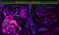 Edited by Marina - 23 June 2014 at 2:53pm |
|
|
IP Logged |
|
| |
||
Forum Jump |
You cannot post new topics in this forum You cannot reply to topics in this forum You cannot delete your posts in this forum You cannot edit your posts in this forum You cannot create polls in this forum You cannot vote in polls in this forum |
|
